
The first time I rolled a navy onto a north-facing study, I thought I had ruined the room. At 9am the walls looked like wet slate, almost black, and the client texted me a worried photo. By 2pm, with low winter sun bouncing off the desk, that same wall had opened into a deep, velvety blue you wanted to sit inside. That is the whole story of blue paint in one afternoon: no other color family swings this hard between rooms, hours, and bulbs. Pick the right shade and blue is the most calming, most quietly expensive-looking color you can put on a wall. Pick the wrong one and you get a dentist's waiting room. This guide sorts the family into the three groups that matter indoors, navy, blue-gray, and soft blue, and tells you which rooms each one belongs in.
Quick orientation. Blue is a cool color by definition, but how cool it reads depends on its undertone (the secondary pigment underneath) and on your LRV, the Light Reflectance Value that tells you how much light a color throws back. A pale sky blue at LRV 70 brightens a small bathroom; a true navy at LRV 6 swallows the same room whole. This explainer sits inside our wider interior paint color families guide, which maps how blues relate to the greens, grays, and neutrals next door.
Upload a photo of your actual room and preview navy, blue-gray or soft blue under your own light in about 30 seconds, free.
The three blue families, and why the split matters
Most people walk into a paint aisle, see two hundred blue chips, and freeze. The trick is to stop thinking about names and start thinking about depth. Almost every usable interior blue falls into one of three buckets, and the bucket decides the room far more than the exact shade. Here is the cheat sheet:
| Family | Typical LRV | Common undertone | Best rooms |
|---|---|---|---|
| Navy and deep blue | 3 to 12 | Black, slate, or violet base | Accent walls, dining rooms, studies, cabinetry |
| Blue-gray (mid) | 25 to 55 | Gray body, blue or green pull | Whole-home, living rooms, bedrooms, halls |
| Soft and pale blue | 60 to 78 | Green (sky) or violet (powder) | Bathrooms, nurseries, small bedrooms |
Sources: Benjamin Moore and Sherwin-Williams color data 2026; designer field reports and LRV references compiled by FacadeColorizer.
Read that table again before you sample anything. Get the family right and even an imperfect shade works; get it wrong and no touch-up saves it.
Navy and deep blue: the family that acts like a neutral
Here is the opinion that surprises people: navy is not a bold color. It behaves like a dark neutral, the way charcoal does, which is why it has been on every trend list for a decade. At an LRV in the single digits a deep navy reads almost black in low light and only reveals its blue when sun or a warm lamp hits it. That dual personality is the appeal: grounded and tailored, like a good wool suit.
The benchmark everyone measures against is Benjamin Moore Hale Navy (HC-154), a slightly grayed, slightly muddy navy with an LRV around 6 that almost never goes garish. It is the safe deep blue, and our Benjamin Moore Hale Navy HC-154 review breaks down how it reads on walls versus cabinets versus a front door. Other deep blues worth sampling: SW Naval (SW 6244), a cleaner, more saturated navy, and SW Salty Dog for a brighter, more nautical hit.
Where navy actually works
Navy earns its keep on a single feature wall behind a bed or sofa, on kitchen island cabinetry, in a moody home office, and in dining rooms (a windowless dining room is one of the few places a near-black blue genuinely flatters, since you use it after dark under warm light). For placement ideas, our roundup of blue room paint color ideas shows navy next to lighter schemes.
Where navy falls flat
Skip true navy in a small, dim, daytime room: it reads as flat dark gray and steals what light you have. And cut in carefully, because a deep blue shows roller lap marks far more than a mid-tone does. Plan on a quality second coat; thin coverage looks patchy and cheap.
Free AI visualizer. Test Hale Navy and other deep blues on your real walls before buying a single sample pot.
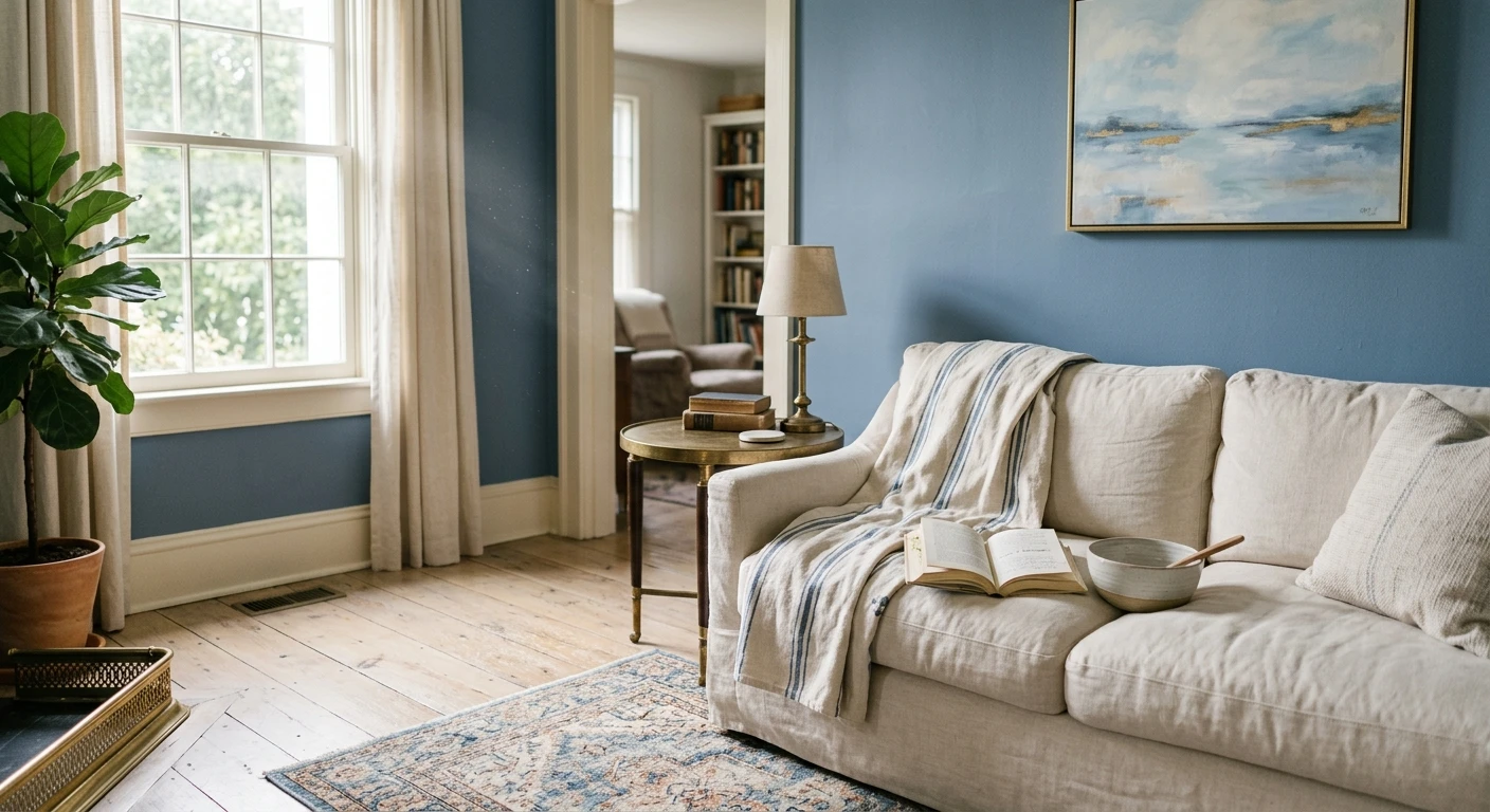
Blue-gray: the quiet middle that does the heavy lifting
If navy is the statement, blue-gray is the workhorse. These read as a soft gray from across the room and only whisper their blue when you stand close or the light shifts. With LRVs in the 25 to 55 range they hold their color without darkening a space, which is why blue-gray is the one blue family you can confidently run through a whole house: the closest thing blue has to a go-anywhere neutral.
The catch is the undertone. Some blue-grays pull green (dusty, slightly muted) and some pull true blue or even a hint of violet, and that pull is what makes one look right in your living room and another look cold and steely. Because the undertone is the entire game here, our blue-gray paint colors undertone guide walks through how each one reads north versus south. Standouts to sample: BM Van Deusen Blue (a richer mid blue-gray), SW Krypton (a pale, almost-gray blue), BM Smoke (soft and airy), and SW Mineral Deposit for a barely-there blue-gray that behaves like a cool greige.
Best rooms for blue-gray
Living rooms and primary bedrooms are the sweet spot: blue-gray is calming without being cold, and it flatters both warm wood and cool stainless. It is also excellent in a hallway, more interesting than plain gray but never demanding attention. Be wary of a strongly blue-leaning blue-gray in a north room under cool LEDs: it tips from serene to chilly fast, and a 2700K bulb pulls it back.
See the undertone shift across your own room before you commit, free.
Soft and pale blue: light, airy, and easy to get wrong
Pale blues are what people reach for when they want a room to feel fresh and open: bathrooms, nurseries, small bedrooms, and porch ceilings. With LRVs in the 60s and 70s they reflect a lot of light. But this is also where the most expensive mistakes happen, because at high LRV the undertone is all you have, and a half-step the wrong way shows immediately.
Two camps to know. Green-leaning soft blues (sky, sea-glass, spa shades) read fresh, coastal, and warm-friendly, the safer choice for living spaces. Violet-leaning soft blues (powder, periwinkle, baby blue) look crisp in a south room and surprisingly cold, even gray, in a north one. My honest take: in a dim north bathroom, a violet-pale blue is the single riskiest blue you can pick, the one most likely to make you repaint. Reliable pale blues to sample: SW Sea Salt (technically a blue-green but the coastal default), BM Palladian Blue, SW Rainwashed, and BM Constellation for a cleaner powder blue.
The ceiling trick worth knowing
Pale blue on a ceiling is the one place blue is nearly foolproof. A whisper of sky blue overhead reads as a soft, sunny "almost white" and brightens the room; on a porch it is the classic Southern haint-blue look. Keep it very pale (LRV 70 plus) so it never feels heavy.
Free AI visualizer. Catch the undertone before you buy the paint, not after.
Trim, ceiling, and decor pairings for blue
Blue lives or dies on its white. Most people rush this step, and it is the difference between a room that looks designed and one that looks like a swatch got loose. How to pair across all three families:
- Crisp white trim (the classic): a clean white like BM White Dove (OC-17) or SW Pure White against a navy or blue-gray gives that timeless, fresh contrast. The safe default for almost any blue.
- Warm white trim (softer): a creamier white like BM Simply White warms a cool blue-gray and keeps it from feeling clinical. Good in north rooms.
- Avoid: a stark, blue-based bright white next to a violet-leaning pale blue. Two cool colors fighting each other reads cold and sterile.
- Brass, warm wood, and floors: the best decor move with any blue. Brass hardware, oak, walnut, and rattan keep navy and blue-gray from going chilly; cool gray-washed floors leave a blue-gray room feeling flat.
For accent colors and complementary tones that flatter every depth of blue, our guide to colors that go with blue interiors is the companion piece: this page picks the blue, that one builds the palette around it.
Preview a blue with two different white trims, side by side, free.
How to choose and test a blue before you commit
A 3-inch fan-deck chip is the number-one reason people pick a blue that disappoints. It is too small to show the undertone and reads lighter than a rolled wall, so a navy that looks rich on the chip can land murky. Work it in this order:
- Pick the family first, then the shade. Use the table above to decide navy, blue-gray, or soft blue by the room and its light. That eliminates 90 percent of the chips instantly.
- Check the undertone in your light. Hold two candidates side by side; the green-leaning and violet-leaning ones separate immediately, and one will obviously suit the room better.
- Roll a large swatch. Paint a 12-by-12-inch sample (or a peel-and-stick) on two walls and check it mid-morning, mid-afternoon, and at night under your normal bulbs. Deep blues shift the most.
- Preview it digitally first. Upload a real photo and apply a navy, a blue-gray, and a soft blue before buying samples, narrowing three contenders to one. For budgeting, see our interior house painting cost guide for 2026.
Preview navy, blue-gray, and soft blue side by side on your real walls, free.
Frequently asked questions
What are the best blue paint colors for interiors in 2026?
Three benchmarks cover most needs: Benjamin Moore Hale Navy (HC-154) for a deep, near-neutral navy on accent walls and cabinetry; a mid blue-gray such as BM Van Deusen Blue or SW Krypton for whole-home and living spaces; and a soft coastal blue like SW Sea Salt or BM Palladian Blue for bathrooms and bedrooms. Choose the family by the room's light first, then the exact shade.
Is blue paint warm or cool?
Blue is a cool color by definition, but its undertone changes how cool it feels. Green-leaning blues (sky and sea-glass shades) read warmer and friendlier, while violet-leaning blues (powder and periwinkle) read crisper and colder, especially in north light. Pairing any blue with warm white trim, brass hardware, and natural wood pulls it back toward warm.
What LRV should I look for in a blue paint?
Match the LRV to the job. Deep navies sit around LRV 3 to 12 and read almost black in low light, so they suit accent walls and well-lit rooms, not dim ones. Blue-grays at LRV 25 to 55 hold their color without darkening a space and work whole-home. Soft pale blues at LRV 60 to 78 reflect lots of light and brighten small baths, bedrooms, and ceilings.
What white trim goes best with blue walls?
A clean crisp white like Benjamin Moore White Dove (OC-17) or SW Pure White is the classic, safe partner for navy and blue-gray and gives that fresh nautical contrast. In a cooler north-facing room, a warmer creamy white such as BM Simply White softens a blue and keeps it from feeling clinical. Avoid pairing a stark blue-based white with an already cool, violet-leaning blue.
Which blue is best for a small or north-facing room?
For a small room you use in daytime, skip true navy (it reads as flat dark gray and eats the light) and choose a light blue-gray or a green-leaning soft blue, which keep the space feeling open. In a north-facing room, lean toward warmer green-based blues over violet-based ones, and use 2700K bulbs; a violet pale blue in a dim north bathroom is the most likely blue to disappoint and get repainted.
Preview navy, blue-gray, and soft blue on your actual walls under your own light before buying a single sample.
Disclaimer: Benjamin Moore, Hale Navy (HC-154), White Dove (OC-17), Simply White, Van Deusen Blue, Smoke, Palladian Blue, and Constellation are trademarks of Benjamin Moore & Co. Sherwin-Williams, Naval (SW 6244), Salty Dog, Krypton, Mineral Deposit, Sea Salt, Rainwashed, and Pure White are trademarks of The Sherwin-Williams Company. FacadeColorizer is an independent paint visualization service and is not affiliated with, endorsed by, or sponsored by Benjamin Moore or Sherwin-Williams. Color reproduction on screens approximates the manufacturer's chip; always confirm with a sample under your own light before purchase. Sources: Benjamin Moore and Sherwin-Williams color data 2026; LRV references compiled by FacadeColorizer.
Trademarks mentioned (Sherwin-Williams, Benjamin Moore, Behr, Caparol, Brillux, Sto, Alpina, Valspar, PPG, Glidden, Dulux, Crown Trade, Sandtex, Farrow & Ball, Johnstone's, Leyland) are property of their respective owners. FacadeColorizer is independent and not affiliated with any of them. Nominative fair use under Lanham Act §1125.


