Try it on your room

Ask people to name the color of a beach house bathroom and half of them are picturing Sherwin-Williams Rainwashed (SW 6211) without knowing its name. It is the soft green-blue that reads like sea glass: watery, calm, and unmistakably coastal. Shoppers usually meet it while sampling its famous sister Sea Salt, then notice that Rainwashed does something the sister does not: it commits. Where Sea Salt swings between green, blue, and gray all day, Rainwashed holds its spa-blue character far more steadily, which is exactly why many designers reach for it when the client says "I want that color to still be there at 6 pm."
This profile covers Rainwashed indoors: the published numbers, how its green-blue balance behaves by orientation, the rooms it flatters, and the trim and finishes that keep it crisp instead of chilly. It sits among the soft hues in our wider Sherwin-Williams interior paint colors guide, and you can see how it stacks up against every family in our best interior paint colors for 2026 roundup.
Upload one photo and preview SW Rainwashed under your room's actual light in about 30 seconds, free.
The numbers behind Rainwashed SW 6211
Start with the published data; these figures predict the wall better than any fan-deck chip. They come from the Sherwin-Williams color tools:
| Spec | Value |
|---|---|
| SW code | SW 6211 Rainwashed |
| HEX (screen approximation) | #C2CDC5 |
| RGB approximation | 194, 205, 197 |
| LRV (Light Reflectance Value) | 59 |
| Hue family | Soft green-blue, coastal sea-glass character with a gray base |
| Closest SW cousins | Sea Salt (SW 6204), Comfort Gray (SW 6205), Silvermist (SW 7621) |
Try it on your house
No photo? Try a sample
Sources: Sherwin-Williams SW 6211 Rainwashed color data, retrieved 2026; The Spruce paint undertone references.
The LRV of 59 places Rainwashed in the light mid-tone band, a step deeper than Sea Salt at 63. Four points of LRV sounds trivial on paper, but on a whole wall it is the difference between "tinted white with a whisper of color" and "a real color that still keeps the room bright." Rainwashed has enough body to read as a deliberate green-blue even in a sun-blasted room, yet stays light enough that a small bathroom will not close in. If you want the whole method for reading numbers like these before you buy a sample, our guide on how to compare paint colors the right way walks through LRV, undertones, and side-by-side testing step by step.
Undertones: a green-blue that leans blue
Rainwashed carries two pigment directions over a soft gray base: a clear blue and a quieter green. Unlike its sister Sea Salt, the balance is not even. The blue side is dominant, and the green acts as a stabilizer that keeps the color from tipping into a plain baby blue. In practice that means:
- The spa-blue read (most of the time). In average and cool light, Rainwashed reads as a pale, watery blue-green, the sea-glass version people picture. This is its default and it holds it for most of the day.
- The green-sage read (warm light). Under direct sun or warm 2700K bulbs, the green steps forward and Rainwashed softens toward a gentle green-blue sage. It never goes fully green the way Sea Salt can; it just warms up.
- The gray-blue read (dim light). At dusk or in a dim hallway, the gray base rises and Rainwashed settles into a quiet gray-blue. It stays recognizably cool rather than disappearing into neutral.
That steadiness is the practical difference between the sisters. Rainwashed shifts less, so what you approve on the sample board is closer to what you live with. Here is the typical behavior across the four Northern Hemisphere orientations:
| Room orientation | Daylight character | How Rainwashed reads |
|---|---|---|
| South-facing | Warm, abundant midday light | Softest, warmest version, a balanced green-blue with a sage tilt |
| West-facing | Cool by day, very warm at sunset | Spa-blue through the day, a warm green-blue glow in late afternoon |
| East-facing | Warm early sun, neutral later | Gentle green-blue in the morning, cooler and bluer after midday |
| North-facing | Cool, indirect, no direct sun | Bluest and coolest version; crisp spa-blue, can feel icy without warm wood or linen nearby |
Sources: American Institute of Architects daylight reference; Sherwin-Williams SW 6211 color data; designer notes on soft blue-greens.
The rooms Rainwashed was made for
Rainwashed is a mood color, and the mood is exhale. Its watery softness steers it toward the rooms where you want the day to slow down:
- Bathrooms: the signature use. The spa-blue read is tailor-made for white tile, marble-look counters, and chrome or brushed nickel. It makes a builder-grade bath feel like a deliberate design choice.
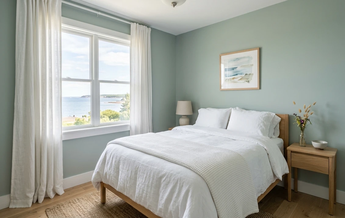
- Bedrooms: arguably its best room. Against white or natural-linen bedding and light oak furniture, Rainwashed delivers a coastal-calm envelope that stays restful under evening lamplight instead of going flat.
- Coastal living rooms and sunrooms: in bright, view-heavy spaces it echoes water and sky without competing with them. It pairs naturally with rattan, jute, and weathered wood.
- Kitchen cabinets and islands: a soft green-blue island under warm wood counters reads custom and beachy against white uppers. The color has enough gray in it to feel grown-up rather than themed.
- Nurseries and kids' rooms: gender-neutral, soothing, and light enough to keep a small room open.
Where to be careful: a windowless powder room under warm builder bulbs can dull its freshness toward gray-green, and in a large open-concept space wall-to-wall Rainwashed can read like a lot of cool color; many designers keep it to the room where calm matters most and bridge the rest with a warm neutral.
Free AI visualizer: test Rainwashed in a bathroom, bedroom, or on cabinets before you buy a sample.
Trim, ceiling, and decor that keep it crisp
Rainwashed is a soft color, not a neutral, so the white beside it decides whether the room reads spa-fresh or washed out. Clean whites win:
- Best all-around trim: Sherwin-Williams Pure White (SW 7005, LRV 84). Bright with only a faint warmth, it frames Rainwashed cleanly and sharpens its sea-glass quality. The default designer pairing.
- For a warmer scheme: SW Alabaster (SW 7008). The creamy cast nudges Rainwashed toward its softer green-sage side, a good move in bedrooms and warm-light baths.
- Ceiling: flat white overhead keeps the watery wall color feeling airy. Skip Rainwashed on a low ceiling; cool color overhead compresses the room.
- Deeper coordinating tones: for a vanity, built-in, or accent, SW Comfort Gray (SW 6205) is the natural in-family step down, and a deep navy anchors it beautifully.
- Decor and finishes: white oak, rattan, natural linen, crisp white ceramics, and both nickel and unlacquered brass flatter it. Heavy cool grays and gray-washed floors drag it toward murky; warm texture is what keeps it alive.
Rainwashed vs the colors people cross-shop
Rainwashed almost never gets sampled alone. Three names share the shortlist, and the differences are worth a minute:
- vs SW Sea Salt (SW 6204): the classic sibling rivalry. Sea Salt is lighter (LRV 63 vs 59) and greener, and it shifts dramatically between sage, spa-blue, and gray as the light changes. Rainwashed is a touch deeper, clearly bluer, and far steadier. Pick Sea Salt if you love the chameleon act and its famous sage read; pick Rainwashed if you want the spa-blue to still be spa-blue at dinner. The full story of the shape-shifting sister is in our SW Sea Salt undertones and rooms profile, and the full head-to-head is in Sea Salt vs Rainwashed: the coastal duel.
- vs SW Comfort Gray (SW 6205): the moodier member of the same family. Comfort Gray is deeper and grayer, trading Rainwashed's watery freshness for a muted, enveloping calm. Choose it when the brief says cozy rather than airy.
- vs BM Palladian Blue (HC-144): the standard Benjamin Moore cross-shop. Palladian Blue sits in the same soft spa-blue territory with its own green undercurrent. The honest answer is that in many rooms they land remarkably close, and the deciding factors are usually the trim color and which brand your painter prefers.
How to test Rainwashed before you commit
Even a steady color deserves a proper audition. The fan-deck chip is too small to show how a green-blue fills a wall, and store lighting near 4000K splits the difference between the reads you will actually get at home. The reliable method: a large peel-and-stick sample on two different walls, checked mid-morning, mid-afternoon, and after dark under your normal bulbs. Pay special attention to the evening check; the lamplit version is the one you live with most. The faster first pass is digital: upload a photo of your actual room and apply Rainwashed next to a greener option (Sea Salt) and a grayer one (Comfort Gray). Seeing the trio side by side under your own light usually settles in two minutes what sample pots settle in a week.
Preview Rainwashed beside a greener and a grayer alternative under your real light, free.
Frequently asked questions
Is Sherwin-Williams Rainwashed blue or green?
Both, with blue in charge. Rainwashed (SW 6211) is a soft green-blue over a gray base, and the blue side dominates in most lighting, giving it a watery, sea-glass character. Warm light coaxes out its quieter green side and it softens toward a gentle green-blue sage, but it never reads as a true green. Compared to its sister Sea Salt, it stays blue far more consistently through the day.
What is the LRV of SW Rainwashed?
Rainwashed has a Light Reflectance Value of 59, a light mid-tone. That is bright enough to keep a small bathroom or bedroom feeling open, but deep enough to read as a deliberate color rather than a tinted white, even in a very sunny room. It sits a step below its sister Sea Salt (LRV 63), which is part of why Rainwashed looks a touch more saturated on the wall.
What is the difference between Rainwashed and Sea Salt?
They are sister colors from the same Sherwin-Williams family, but they behave differently. Sea Salt (SW 6204) is lighter and greener, and it shifts noticeably between sage green, spa-blue, and gray as the light changes. Rainwashed (SW 6211) is slightly deeper, clearly bluer, and much steadier: it holds its soft spa-blue read through most of the day. Choose Sea Salt for the color-shifting sage effect, Rainwashed for a dependable coastal blue-green.
What trim color goes with Rainwashed?
Sherwin-Williams Pure White (SW 7005, LRV 84) is the most reliable pairing. It is bright with only a faint warmth, so it frames Rainwashed crisply and keeps the sea-glass color fresh instead of dingy. For a softer, warmer scheme, SW Alabaster (SW 7008) nudges Rainwashed toward its green-sage side. Keep the ceiling a flat white so the watery wall color stays airy.
See SW Rainwashed under your real light, beside a greener and a grayer alternative, before you buy.
Disclaimer: Sherwin-Williams and SW 6211 Rainwashed are trademarks of The Sherwin-Williams Company. Benjamin Moore is a trademark of its respective owner. FacadeColorizer is an independent paint visualization service and is not affiliated with, endorsed by, or sponsored by Sherwin-Williams or Benjamin Moore. Screen color approximates the manufacturer's sample; always confirm with a physical sample before purchase. Sources: Sherwin-Williams SW 6211 Rainwashed color data 2026, Sherwin-Williams Sea Salt SW 6204, Comfort Gray SW 6205, Pure White SW 7005 and Alabaster SW 7008 color data, Benjamin Moore Palladian Blue HC-144 color data, The Spruce paint undertone references, and designer notes on soft blue-greens.
Trademarks mentioned (Sherwin-Williams, Benjamin Moore, Behr, Caparol, Brillux, Sto, Alpina, Valspar, PPG, Glidden, Dulux, Crown Trade, Sandtex, Farrow & Ball, Johnstone's, Leyland) are property of their respective owners. FacadeColorizer is independent and not affiliated with any of them. Nominative fair use under Lanham Act §1125.