
Sherwin-Williams White Duck (SW 7010) is the off-white people reach for when plain white feels too stark and cream feels too yellow. It is soft, warm, and quietly grounded by a faint green-gray cast that stops it from ever reading buttery. That cast is also why White Duck can surprise you: on a bright south wall it can look almost white, and in a dim north room it can drift toward a soft greige. Neither is a mistake. It is the same gentle, complex off-white doing what off-whites do under different light.
This profile is for the homeowner already drawn to White Duck and trying to predict how it will actually behave: how its undertones surface, the published LRV, the rooms it suits, and the trim and decor that keep it looking intentional rather than dirty. It is one of the soft off-whites in our wider Sherwin-Williams interior paint colors guide, and you can see where it sits among the wider field in our best interior paint colors for 2026 roundup.
Upload one photo and preview SW White Duck under your room's actual light in about 30 seconds, free.
The numbers behind White Duck SW 7010
Start with the published data; for a soft off-white these figures predict the wall far better than a fan-deck chip held against a white card. They come from the Sherwin-Williams color tools:
| Spec | Value |
|---|---|
| SW code | SW 7010 White Duck |
| HEX (screen approximation) | #E5DFD1 |
| RGB approximation | 229, 223, 209 |
| LRV (Light Reflectance Value) | 74 |
| Hue family | Warm off-white with a subtle green-gray (greige) undertone |
| Collection | Part of the SW White & Pastel and a frequent designer off-white |
| Closest SW cousins | Shoji White (SW 7042), Natural Choice (SW 7011), Alabaster (SW 7008) |
Sources: Sherwin-Williams SW 7010 White Duck color data, retrieved 2026; The Spruce off-white undertone references.
The LRV of 74 is the figure that matters most here. That places White Duck firmly in off-white territory: light and reflective enough to brighten a room and keep it feeling open, but a clear step below a true clean white like SW Pure White (LRV 84) or even creamy Alabaster (LRV 82). Those few points of reflectance are exactly why White Duck reads as a soft, lived-in color rather than a bright wall of white. It has enough body to show its warmth without becoming the saturated greige of something like SW Agreeable Gray (LRV 60), which is a true mid-tone neutral, not an off-white.
White Duck's undertones, decoded
White Duck is what designers call a complex off-white: it is not a single warm note but a layered mix that keeps it from feeling flat. Three things are happening under the surface.
- A warm beige base. The dominant read is gentle warmth, a soft, creamy off-white that feels welcoming rather than crisp. This is the side most people picture and the reason it pairs so easily with wood and natural materials.
- A green-gray cast. The crucial detail. White Duck carries a quiet green-gray (greige) undertone that mutes the warmth and stops it from tipping into yellow or cream. This is what separates it from a pure warm white and gives it that grounded, slightly weathered look.
- A touch of softness, never stark. Because of that green-gray, White Duck almost never reads bright or clinical. In dim light it can lean noticeably greige; in strong warm light the green retreats and the creamy warmth comes forward.
The practical takeaway: White Duck is a warm off-white that behaves more like a soft neutral than a white. Because that green-gray undertone is light-sensitive, the orientation of the room moves it more than it would move a flat, fully saturated paint, as the interior color families guide explains. Typical behavior across the four Northern Hemisphere orientations:
| Room orientation | Daylight character | How White Duck reads |
|---|---|---|
| South-facing | Warm, abundant midday light | Lightest and warmest, almost reads as a soft white, green cast nearly invisible |
| West-facing | Cool by day, very warm at sunset | Slightly greige by day, glowing creamy off-white in late-afternoon sun |
| East-facing | Warm early sun, neutral later | Warm and creamy in the morning, settling to a soft greige by afternoon |
| North-facing | Cool, indirect, no direct sun | Coolest and most muted, the green-gray cast is most visible, can read as soft greige |
Sources: American Institute of Architects daylight reference; Sherwin-Williams SW 7010 color data; designer field notes on complex off-whites.
How light bulbs change White Duck
Daylight is only half the story; the bulbs you live with at night decide what White Duck looks like after dark, and the difference is real.
- Warm bulbs (2700K, soft white): push White Duck toward its creamy, beige side. The green-gray largely disappears and the wall feels cozy and inviting. This is the most flattering choice for bedrooms and living rooms and the lighting most homeowners already have.
- Neutral to cool bulbs (4000K and up): bring the green-gray undertone forward, so White Duck reads more clearly as a soft greige and less as a warm off-white. In a kitchen or bath with bright daylight LEDs, expect the cooler, more muted version. If you want it to stay warm and creamy, stay at 2700K to 3000K.
This bulb sensitivity is the single most common reason White Duck disappoints: a homeowner falls for the warm, creamy chip in the store, paints a north room lit with 5000K daylight bulbs, and ends up with a cooler greige than they pictured. If you love the warm read, control the light to keep it.
The rooms White Duck was made for
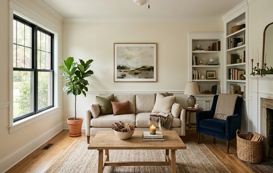
White Duck is a workhorse whole-home off-white, the kind of color that flows from room to room without fighting your furniture. It shines in a clear set of spaces:
- Living rooms and open-concept main floors: its biggest strength. The warm-but-grounded off-white feels calm wall to wall and flatters almost any decor, from modern farmhouse to warm minimalism. See how it sits with other soft whites in our white living room paint ideas.
- Bedrooms: under warm bulbs it is genuinely cozy, layering beautifully under cream, oatmeal, and natural-linen bedding and loving light oak furniture.
- Kitchens, on cabinets: a popular soft alternative to bright white cabinets. White Duck reads custom and warm against white quartz and brass or matte-black hardware, and is forgiving of everyday wear. For the cabinetry call between brands, our Sherwin-Williams vs Benjamin Moore interior comparison covers how the finishes hold up.
- Whole-home walls with white trim: White Duck against a crisp white trim is a classic, low-contrast, designer-approved combination that feels soft and current.
Where to be careful: in a dark, north-facing room with cool bulbs, White Duck can lose its warmth and drift toward a flat greige, so test it on the wall first. And next to a true bright white (on cabinets or trim), White Duck can suddenly look dingy by comparison; that contrast is by design, but it surprises people. Our interior house painting cost guide covers what a whole-home repaint in a color like this should run.
Free AI visualizer: test White Duck in a living room, bedroom, or on cabinets before you buy a sample.
Trim, ceiling, and decor that keep it looking intentional
Because White Duck is a soft off-white rather than a clean white, the trim color beside it decides whether it reads warm and deliberate or muddy. Two directions work, depending on the look you want:
- Crisp, brighter trim (the high-end look): Sherwin-Williams Pure White (SW 7005, LRV 84) or Extra White (SW 7006). These give a soft, low-key contrast against White Duck walls that reads clean and current, and they are the most popular designer pairing.
- Tonal, near-matching trim (the seamless look): Sherwin-Williams Alabaster (SW 7008, LRV 82) keeps things soft and warm with almost no contrast, good when you want a calm, enveloping monochrome room rather than a framed one.
- Ceiling: a flat bright white keeps the room feeling open and lets White Duck read as the warm color it is. White Duck on the ceiling too is an option for a fully soft, cocooning room.
- Deeper coordinating tones: for a contrast wall, island, or built-in, SW Accessible Beige (SW 7036) steps down warmly in family, while a soft black like SW Tricorn Black (SW 6258) gives crisp modern contrast on doors and hardware.
- Decor and finishes: natural white oak and warm woods, rattan and jute, brass, and warm-toned stone all flatter White Duck. Cool blue-grays and stark cool whites can drag it toward muddy.
To extend a White Duck scheme into adjoining rooms with a deeper warm neutral, the greiges are the obvious partners; our profiles of SW Accessible Beige and SW Agreeable Gray both flow naturally beside a warm off-white like this.
White Duck vs the off-whites people cross-shop
White Duck sits inside a tight cluster of warm Sherwin-Williams off-whites, and the differences are subtle enough that one wrong sample is easy. Here is how it stacks up against the three colors most often lined up beside it:
- vs SW Natural Choice (SW 7011, LRV 73): the closest sibling, and the two are genuinely hard to tell apart. Natural Choice is a hair more neutral and a touch less green, leaning very slightly toward a warm greige-beige, while White Duck carries a marginally stronger green-gray cast. With nearly identical LRVs, both read as soft warm off-whites; White Duck is the slightly more characterful, weathered of the two. If you want a safe, do-no-harm builder off-white, Natural Choice; if you want a little more softness and depth, White Duck.
- vs SW Shoji White (SW 7042, LRV 74): the deeper, more obviously greige cousin. Shoji White is warmer and shows its greige character more clearly, reading as a soft tan-greige in many rooms, where White Duck stays closer to an off-white. Choose Shoji White when you want the warmth and greige to be visible; choose White Duck when you want it whispered. Our SW Shoji White profile breaks that one down in full.
- vs SW Alabaster (SW 7008, LRV 82): the cleaner, creamier, brighter option. Alabaster reads much more as a soft white with a gentle warm creaminess and almost no gray, so it brightens a room more and feels less like a color. White Duck is noticeably deeper and more grounded by its green-gray. Pick Alabaster for a warm white; pick White Duck for a warm off-white with body. Our SW Alabaster north-facing guide covers how that one behaves in tricky light.
The headline difference: among these four, Alabaster is the brightest and cleanest, Shoji White is the warmest and most obviously greige, and White Duck and Natural Choice sit between them as soft warm off-whites, with White Duck carrying the slightly more noticeable green-gray cast.
How to test White Duck before you commit
White Duck is a textbook color where a small fan-deck chip will mislead you. Against the white card of a fan deck, White Duck looks like a tinted neutral; on a full wall, in your light, it can swing from soft white to clear greige. The reliable method is a large peel-and-stick sample (Sherwin-Williams sells one) taped to at least two walls and checked in the morning, mid-afternoon, and after dark under your normal bulbs; the after-dark read under warm bulbs is the version you will live with most. Sample it beside its cousins too, because the difference between White Duck, Natural Choice, and Shoji White only becomes obvious side by side. The faster, no-paint first pass is a digital visualizer: upload a photo of the room, apply White Duck next to a cleaner white like Alabaster and a warmer greige like Shoji White, and see which way your light pulls each one, ruling out the colors that were never going to work.
Preview White Duck beside a cleaner white and a warmer greige under your real light, free.
Frequently asked questions
What undertones does SW White Duck have?
White Duck (SW 7010) is a warm off-white with a subtle green-gray (greige) undertone. The dominant read is a soft, creamy warmth, but that quiet green-gray cast keeps it from ever looking yellow or buttery and gives it a grounded, slightly weathered character. In warm light it reads creamy and almost white; in cool or dim north light the green-gray surfaces and it leans toward a soft greige.
What is the LRV of White Duck SW 7010?
White Duck has a Light Reflectance Value of 74, which places it solidly in off-white territory. It is light and reflective enough to brighten a room and keep it feeling open, but a clear step below a true clean white like SW Pure White (LRV 84) or creamy Alabaster (LRV 82). Those few points of reflectance are why White Duck reads as a soft, lived-in color rather than a bright wall of white.
What is the difference between White Duck and Shoji White?
They are close cousins, but Shoji White (SW 7042) is warmer and shows its greige character more clearly, often reading as a soft tan-greige, while White Duck (SW 7010) stays closer to an off-white with only a quiet green-gray cast. Both have an LRV near 74. Choose Shoji White when you want the warmth and greige to be obvious, and White Duck when you want it whispered and the color to read more as a soft white.
What trim color goes with White Duck?
For a clean, current look, pair White Duck walls with a brighter white trim like Sherwin-Williams Pure White (SW 7005, LRV 84) or Extra White (SW 7006); the soft contrast keeps the off-white reading deliberate rather than dingy. For a seamless, enveloping room, use a near-matching warm white like Alabaster (SW 7008) for almost no contrast. A flat bright white ceiling keeps the space feeling open.
Is White Duck a good whole-house color?
Yes, it is one of the most popular Sherwin-Williams whole-home off-whites. It flows easily from room to room, flatters most decor and wood tones, and feels warm without going yellow. The one caution is light: in dark, north-facing rooms under cool bulbs it can drift toward a flat greige, so test it on the wall in your actual light and keep your bulbs in the 2700K to 3000K range to hold its warm side.
See SW White Duck under your real light, beside a cleaner white and a warmer greige, before you buy.
Disclaimer: Sherwin-Williams and SW 7010 White Duck are trademarks of The Sherwin-Williams Company. Benjamin Moore and Behr are trademarks of their respective owners. FacadeColorizer is an independent paint visualization service and is not affiliated with, endorsed by, or sponsored by Sherwin-Williams, Benjamin Moore, or Behr. Screen color approximates the manufacturer's sample; always confirm with a physical sample before purchase. Sources: Sherwin-Williams SW 7010 White Duck color data 2026, Sherwin-Williams Shoji White SW 7042, Natural Choice SW 7011, Alabaster SW 7008, Pure White SW 7005, and Accessible Beige SW 7036 color data, The Spruce off-white undertone references, and designer field notes on complex off-whites.
Trademarks mentioned (Sherwin-Williams, Benjamin Moore, Behr, Caparol, Brillux, Sto, Alpina, Valspar, PPG, Glidden, Dulux, Crown Trade, Sandtex, Farrow & Ball, Johnstone's, Leyland) are property of their respective owners. FacadeColorizer is independent and not affiliated with any of them. Nominative fair use under Lanham Act §1125.


