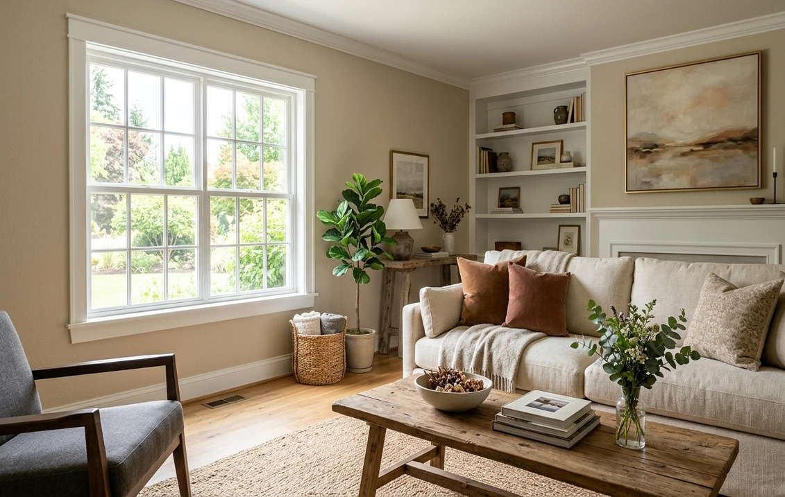

Sherwin-Williams Realist Beige (SW 6078) is the beige people reach for when "greige" has started to feel too gray and cool. It is a warm, grounded mid-beige with a soft taupe core, the kind of color that makes a room feel settled and lived-in rather than showroom-blank. It is not trendy in the way Accessible Beige is trendy, and that is exactly the point: Realist Beige is a quiet, honest neutral that reads as a real color while still letting your furniture and art do the talking.
This profile is for the homeowner deciding between Realist Beige and the half-dozen near-identical SW beiges next to it on the fan deck. We will cover its undertones, the real published LRV and hex, how it behaves room by room, the trim and decor that flatter it, and exactly how it differs from Accessible Beige, Balanced Beige, and Kilim Beige. It is one of the warm neutrals in our wider Sherwin-Williams interior paint colors guide, and you can see where it sits among the favorites in our best interior paint colors for 2026 roundup.
Upload one photo and preview SW Realist Beige under your room's actual light in about 30 seconds, free.
The numbers behind Realist Beige SW 6078
Start with the published data, because these figures predict the wall far better than a small fan-deck chip ever will. They come from the Sherwin-Williams color tools:
| Spec | Value |
|---|---|
| SW code | SW 6078 Realist Beige |
| HEX (screen approximation) | #C9BBA8 |
| RGB approximation | 201, 187, 168 |
| LRV (Light Reflectance Value) | 56 |
| Hue family | Warm mid-beige with a soft taupe core |
| SW color collection | Part of the SW neutral "beige" range, near Nuance and Familiar Beige |
| Closest SW cousins | Accessible Beige (SW 7036), Balanced Beige (SW 7037), Kilim Beige (SW 6106) |
Sources: Sherwin-Williams SW 6078 Realist Beige color data, retrieved 2026; The Spruce paint undertone references.
The LRV of 56 is the number to anchor on. That is a true mid-tone: dark enough to read as a definite warm beige with visible body, but still light enough to keep most rooms feeling open and reflective. It sits a notch below the very popular Accessible Beige (LRV 58) and well above a deeper greige like Balanced Beige (LRV 46.5). In practice, Realist Beige looks like a "color" on the wall, not a tinted white, which is one reason it photographs warmer and richer than the airier greiges most people default to. For a lighter, grayer alternative in the same family, our SW Accessible Beige profile shows how a higher-LRV greige reshapes the same rooms.
The undertones: warm taupe with a soft pink-gold pull
Realist Beige is fundamentally a warm beige, but the warmth is not a single flat note. There is a taupe spine running through it (the gray-brown that keeps it grounded), and beside that taupe sits a faint pink-to-gold cast that surfaces or recedes depending on the light. Understanding both is the difference between a beige that feels rich and one that feels dated.
- The taupe core. This is the steady part of Realist Beige and the reason it does not read as a flat tan. The gray-brown base keeps it from going overly yellow, so it stays current next to modern furniture rather than tipping into a 1990s "builder beige."
- The pink-peach whisper. Under warm incandescent or 2700K light, and against warm-toned wood floors, a soft rosy warmth can lift to the surface. It is subtle, not a true pink, but it is what gives Realist Beige its cozy, skin-flattering quality in a bedroom.
- The gold side. In strong direct sun, the same warmth can read more golden-tan than pink. This is the version that can feel a touch yellow if you pair it with very warm cream trim, so a cleaner white keeps it honest.
Because the undertones lean warm rather than balanced, Realist Beige moves less dramatically across the day than a color-shifting neutral, but the room's orientation still nudges which warm note dominates, as the interior color families guide explains. Typical behavior across the four Northern Hemisphere orientations:
| Room orientation | Daylight character | How Realist Beige reads |
|---|---|---|
| South-facing | Warm, abundant midday light | Richest and warmest, a glowing golden-taupe beige |
| West-facing | Cooler by day, very warm at sunset | Soft taupe by day, deep amber-beige in late-day sun |
| East-facing | Warm early sun, neutral later | Warm and rosy in the morning, settling to balanced taupe |
| North-facing | Cool, indirect, no direct sun | Calmest and most taupe-gray; warmth tones down without going cold |
Sources: American Institute of Architects daylight reference; Sherwin-Williams SW 6078 color data; designer field notes on warm neutrals.
The practical takeaway: Realist Beige is one of the better warm beiges for a north-facing room because its taupe core keeps it from going icy, while its built-in warmth fights the cool, flat light those rooms get. In a bright south room it can read quite warm and golden, so if you want to restrain that warmth, lean on a clean white trim rather than a cream. For a neutral that holds its read more uniformly across the whole house, our profile of SW Agreeable Gray is the cooler, more chameleon counterpoint.
The rooms Realist Beige was made for
Realist Beige is a workhorse warm neutral, the kind you can run through connected living spaces without it ever feeling like a statement. Its mid-tone depth and cozy warmth steer it toward a clear set of rooms:
- Living rooms and open-plan main floors: the signature use. At LRV 56 it has enough body to feel intentional and warm in a large room without darkening it, and it flows beautifully through an open floor plan where a too-light greige would look washed out.
- Bedrooms: the soft pink-gold warmth is genuinely flattering and restful. It layers easily under white, cream, ivory, and natural-linen bedding and loves warm wood furniture.
- Hallways and stairwells: its taupe core hides scuffs better than a pale neutral, and the warmth keeps these often light-starved transition spaces from feeling like a cold tunnel.
- Dining rooms and dens: the warmth reads as cozy and enveloping by lamplight, which makes it a strong pick for rooms used in the evening. For how it sits beside other warm neutrals, our Sherwin-Williams vs Benjamin Moore interior comparison covers how the two brands' beiges differ in formula and coverage.
Where to be careful: in a very bright, very warm south-facing room paired with golden oak floors and cream trim, Realist Beige can tip toward a yellow-tan that some people find dated, so balance it with a cooler white and cooler accents. In a windowless room under warm builder bulbs, its warmth can flatten, so a higher-Kelvin bulb keeps the taupe crisp. Our interior house painting cost guide covers what a whole-floor repaint in a color like this should run.
Free AI visualizer: test Realist Beige in a living room, bedroom, or hallway before you buy a sample.
Trim, ceiling, and decor that flatter it
Because Realist Beige carries real warmth, the white beside it decides whether it reads rich and current or yellow and tired. The right contrast keeps the taupe crisp:
- Best all-around trim: Sherwin-Williams Pure White (SW 7005, LRV 84). Bright and only faintly warm, it gives Realist Beige clean separation and stops the warmth from looking yellow. The safest designer pairing.
- For a soft, seamless scheme: SW Alabaster (SW 7008, LRV 82). A creamy white that lets Realist Beige feel warm and enveloping with low contrast, ideal in a bedroom or a cozy den.
- Avoid: a stark cool white like SW Extra White can make Realist Beige look dirty by contrast, exaggerating its yellow side. Stay within warm-leaning whites.
- Ceiling: a flat white (Pure White or a tinted-down version) keeps the room open. Realist Beige overhead in a low room can feel heavy.
- Deeper coordinating tones: for built-ins, a island, or an accent wall, SW Balanced Beige (SW 7037) steps down in the same family, and a soft black like SW Tricorn Black (SW 6258) gives sharp, modern contrast for hardware and doors.
- Decor and finishes: warm and white oak, walnut, rattan, brass, and aged bronze all flatter it. Soft sage greens and dusty blues make excellent accent partners. Very cool gray floors and chrome-heavy schemes can fight its warmth.
For a calm, cooler color to use in adjoining rooms (a bathroom or a bedroom that wants contrast), a soft blue-green flows naturally beside a warm beige; our SW Sea Salt profile is a popular companion for exactly that pairing.
Realist Beige vs the beiges people cross-shop
This is where most wrong samples happen. Realist Beige sits in a crowd of warm SW neutrals that look nearly identical on a chip but behave differently on a wall. Here is how it separates from its three closest rivals:
- vs SW Accessible Beige (SW 7036, LRV 58): the most common cross-shop. Accessible Beige is the lighter, grayer, more modern greige, a touch cooler and more "neutral." Realist Beige is warmer, slightly deeper, and reads more as a true beige than a greige. Choose Accessible Beige if you want a barely-there modern greige; choose Realist Beige if you want visible warmth and body. See our full Accessible Beige guide for that side by side.
- vs SW Balanced Beige (SW 7037, LRV 46.5): Balanced Beige is the deeper, browner, grayer sibling, noticeably darker on the wall with a stronger taupe-brown read. Realist Beige is lighter and a touch warmer-rosy. Choose Balanced Beige for a moodier, more enveloping space; choose Realist Beige for a lighter, more flexible warm neutral.
- vs SW Kilim Beige (SW 6106, LRV 57): Kilim Beige is the warmest of this group, with a clear pink-peach undertone that some love and others find too rosy. Realist Beige carries that pink only as a whisper and is grounded by more taupe-gray, so it stays more versatile and less overtly warm. Our Kilim Beige profile walks through that pink in detail.
The short version: among these four, Realist Beige is the "honest middle" warm beige. It is warmer and deeper than Accessible Beige, lighter and rosier than Balanced Beige, and more grounded and less pink than Kilim Beige. If the other three each lean too far in one direction for you, Realist Beige is usually the one that splits the difference.
How to test Realist Beige before you commit
Beige is the single most sample-sensitive color category, because four cans that look identical on the rack diverge completely on the wall. A 3-inch fan-deck chip viewed under store light near 4000K will not show you whether Realist Beige goes rosy or golden in your specific room. The reliable physical method is a large peel-and-stick sample (Sherwin-Williams sells one) taped to at least two walls and checked mid-morning, late afternoon, and after dark under your normal bulbs, so you see all three of its warm reads. The faster, no-paint first pass is a digital visualizer: upload a photo of the room and apply Realist Beige beside Accessible Beige (cooler) and Kilim Beige (warmer) to see which way your light pulls it, ruling out the beiges that were never going to work before you spend a cent on samples.
Preview Realist Beige beside a cooler and a warmer beige under your real light, free.
Frequently asked questions
What undertones does SW Realist Beige have?
Realist Beige (SW 6078) is a warm beige built on a taupe (gray-brown) core, with a faint pink-to-gold cast that shifts with the light. Under warm bulbs and against warm wood it leans softly rosy; in strong direct sun it can read more golden-tan; in cool north light it calms to a balanced taupe. The taupe spine is what keeps it from going overly yellow, so it stays more current than a plain tan.
What is the LRV of Realist Beige SW 6078?
Realist Beige has a Light Reflectance Value of 56, a true mid-tone. That is dark enough to read as a definite warm beige with visible body, but light enough to keep most rooms feeling open. It sits just below Accessible Beige (LRV 58) and well above the deeper Balanced Beige (LRV 46.5), which is why Realist Beige looks like a real color on the wall rather than a tinted white.
What is the difference between Realist Beige and Accessible Beige?
Accessible Beige (SW 7036) is lighter, grayer, and more of a modern greige, reading slightly cooler and more neutral. Realist Beige (SW 6078) is warmer, a touch deeper, and reads more as a true beige with a soft taupe-and-rose warmth. Choose Accessible Beige for a barely-there modern greige; choose Realist Beige when you want visible warmth and a more grounded, cozy feel.
What trim color goes with Realist Beige?
Sherwin-Williams Pure White (SW 7005, LRV 84) is the most reliable trim, giving clean separation that keeps Realist Beige's warmth from looking yellow. For a softer, low-contrast scheme, SW Alabaster (SW 7008) lets the beige feel warm and enveloping. Avoid a stark cool white like Extra White, which can make Realist Beige look dirty by contrast.
See SW Realist Beige under your real light, beside a cooler and a warmer beige, before you buy.
Disclaimer: Sherwin-Williams and SW 6078 Realist Beige are trademarks of The Sherwin-Williams Company. Benjamin Moore and Behr are trademarks of their respective owners. FacadeColorizer is an independent paint visualization service and is not affiliated with, endorsed by, or sponsored by Sherwin-Williams, Benjamin Moore, or Behr. Screen color approximates the manufacturer's sample; always confirm with a physical sample before purchase. Sources: Sherwin-Williams SW 6078 Realist Beige, SW 7036 Accessible Beige, SW 7037 Balanced Beige, SW 6106 Kilim Beige, SW 7005 Pure White, and SW 7008 Alabaster color data 2026, The Spruce paint undertone references, and designer field notes on warm neutrals.
Trademarks mentioned (Sherwin-Williams, Benjamin Moore, Behr, Caparol, Brillux, Sto, Alpina, Valspar, PPG, Glidden, Dulux, Crown Trade, Sandtex, Farrow & Ball, Johnstone's, Leyland) are property of their respective owners. FacadeColorizer is independent and not affiliated with any of them. Nominative fair use under Lanham Act §1125.


