
Sherwin-Williams Contented (SW 6191) is the kind of color you have to live with for a day before you trust it. Paint a swatch on the wall and it looks like a calm sage. Walk past at dusk and it has quietly slid toward gray. Catch it under a north window on an overcast afternoon and it can flirt with a cool celadon. That movement is exactly what makes Contented one of the most flattering gray-greens Sherwin-Williams makes, and exactly what makes shoppers second-guess their sample. It is a soft, dusty green with a substantial gray backbone, the sort of restful hue that reads as a neutral in most rooms while still bringing real color to the wall.
This profile is for the person who has already shortlisted Contented and wants to know what it actually does on the wall: how its undertones behave, the published LRV and hex, the rooms it suits, the trim and decor that keep it crisp, and how it separates from the three SW greens it gets cross-shopped against. It sits among the muted greens in our wider Sherwin-Williams interior paint colors guide, and you can see where soft greens rank in our best interior paint colors for 2026 roundup.
Upload one photo and preview SW Contented under your room's actual light in about 30 seconds, free.
The numbers behind Contented SW 6191
Before the chip, look at the published data. These figures predict the wall more reliably than a fan-deck swatch under store light. They come from the Sherwin-Williams color tools:
| Spec | Value |
|---|---|
| SW code | SW 6191 Contented |
| HEX (screen approximation) | #C5C9BB |
| RGB approximation | 197, 201, 187 |
| LRV (Light Reflectance Value) | 50 |
| Hue family | Soft gray-green, dusty sage with a cool gray base |
| Color collection | Part of the SW Quietude / muted green family |
| Closest SW cousins | Halcyon Green (SW 6213), Softened Green (SW 6177), Acacia Haze (SW 9132) |
Sources: Sherwin-Williams SW 6191 Contented color data, retrieved 2026; The Spruce paint undertone references.
The LRV of 50 is the number that defines this color's personality. Fifty sits squarely in the middle of the 0 to 100 scale, so Contented is neither a pale, airy wash nor a deep, enveloping green. It reflects about half the light that hits it, which means it brings noticeable depth to a wall without darkening the room the way a low-LRV sage would. Compare it to a true cozy green like SW Evergreen Fog at LRV 30, and you can feel the difference: our SW Evergreen Fog profile shows how dropping 20 LRV points turns an easy mid-green into a moody, dramatic one. Contented is the more livable, all-day green of the two.
The undertones: green on top, gray underneath
Contented is built from a soft green pigment laid over a cool gray base, with a faint blue whisper that only shows up in the coolest light. That gray underpinning is the secret to why it works as a near-neutral: it mutes the green just enough that the color never shouts, the way a saturated sage might. The trade-off is that the same gray can pull Contented toward a flat, dusty read if the light is wrong, so steering the undertones is the whole game.
- The sage read. Under warm light (direct sun, a 2700K incandescent-style bulb), the warmth lifts the green and Contented becomes a soft, restful sage. The version most people picture and the easiest to love.
- The celadon read. Under cool, indirect light (a north window, an overcast sky, a 4000K to 5000K daylight LED), the warm side recedes, the gray cools, and Contented edges toward a pale celadon with a faint blue lean. Crisper and a touch cooler than the sage read.
- The gray read. In low or balanced light (dawn, dusk, a windowless interior bath), the green nearly cancels against the gray base and Contented settles into a quiet gray-green that behaves almost like a warm-leaning greige.
None of these is a mistake; they are all the same gallon doing what it was formulated to do. Because the green and gray sit close in weight, room orientation moves Contented more than it moves a committed beige, a behavior our interior color families guide explains in depth. Typical reads across the four Northern Hemisphere orientations:
| Room orientation | Daylight character | How Contented reads |
|---|---|---|
| South-facing | Warm, abundant midday light | Warmest, greenest version, a soft inviting sage with real life |
| West-facing | Cool by day, very warm at sunset | Gray-green by day, glowing toward sage in late-afternoon sun |
| East-facing | Warm early sun, neutral later | Sage in the morning, settling to a calm gray-green by afternoon |
| North-facing | Cool, indirect, no direct sun | Coolest and grayest, can edge toward pale celadon with a blue whisper |
Sources: American Institute of Architects daylight reference; Sherwin-Williams SW 6191 color data; designer field notes on gray-green neutrals.
The practical takeaway: if you want the sage you fell for, put Contented in a south or east room and keep your bulbs warm at 2700K. If you want the cool, crisp celadon, a north room with 4000K daylight bulbs delivers it. The room where Contented disappoints most often is a dim, north-facing space lit by harsh cool builder bulbs, where it can flatten to a sad gray. For a color that holds far steadier across orientations, our SW Repose Gray profile is the predictable counterpoint.
The rooms Contented was made for
Contented earns its name in rooms where you want calm with a little character. The LRV 50 mid-tone is deep enough to feel cocooning yet light enough to keep a space from going dark, which makes it more versatile than the bathroom-only soft greens. The spaces where it shines:
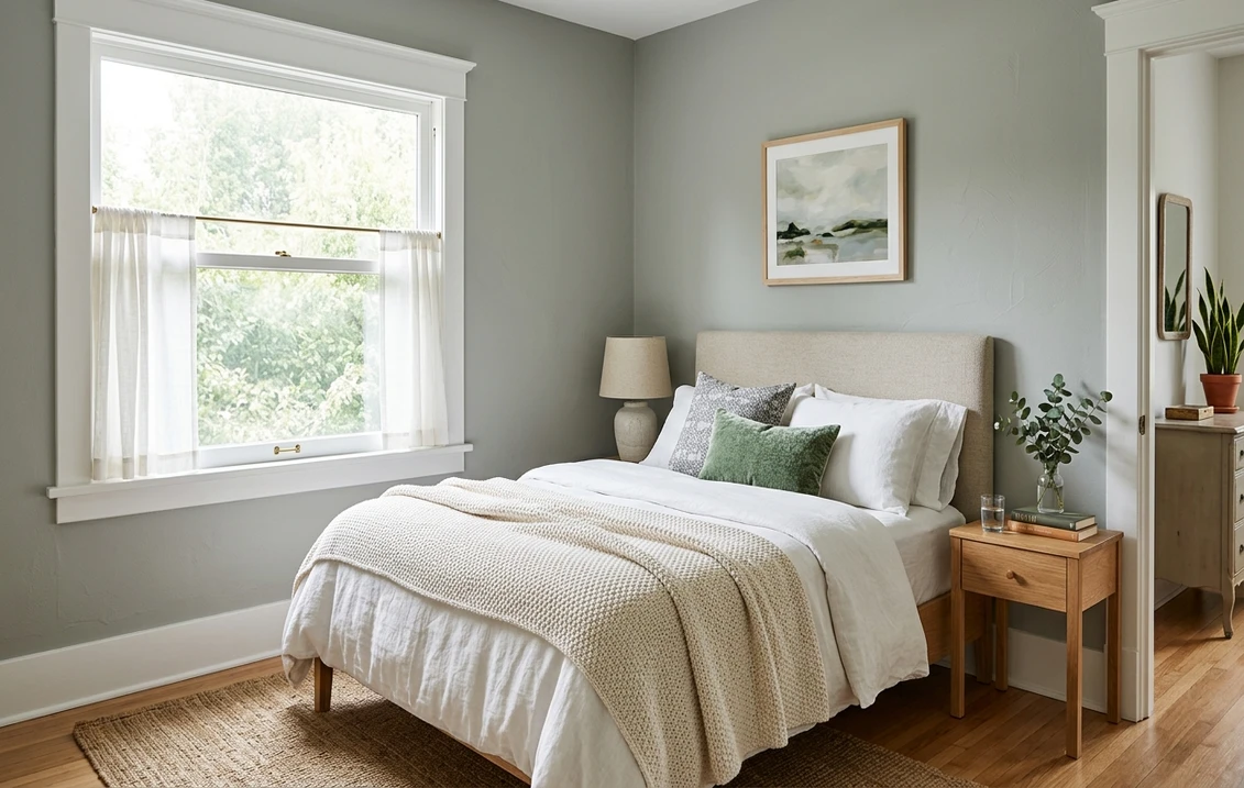
- Bedrooms: the standout use. The dusty, low-saturation green is genuinely restful and reads sophisticated rather than nursery-soft. It layers beautifully under white, oatmeal, and natural-linen bedding and loves warm wood nightstands.
- Living rooms and dens: with enough natural light, Contented works wall to wall as a warm, grounded backdrop. In a south or west room it gives a den that quiet, enveloping feel without the drama of a deep green.
- Home offices and studies: green is the classic focus-and-calm color, and Contented's muted version keeps a workspace soothing without putting you to sleep.
- Kitchens, on cabinets: increasingly popular on lower cabinets, an island, or a butler's pantry, where the gray-green reads custom and timeless against white uppers and warm brass hardware. For the cabinetry call, our Sherwin-Williams vs Benjamin Moore interior comparison covers how the two brands' finishes wear on doors and drawer fronts.
- Bathrooms and powder rooms: a spa-like choice against white tile and marble, though in a windowless bath you need warm, generous lighting to keep it from going gray.
Where to be careful: a dim, north-facing room with cool bulbs can drain Contented to a lifeless gray, and very small spaces with little daylight can feel heavier than the LRV suggests. If you love the color but the room is dark, either upgrade to warm 2700K bulbs or step to a lighter green. When you are ready to budget the repaint, our interior house painting cost guide covers what the job should run per square foot.
Free AI visualizer: test Contented in a bedroom, office, or on cabinets before you buy a sample.
Trim, ceiling, and decor that keep it crisp
Because Contented carries a gray base, the white beside it decides whether the green reads fresh or muddy. Soft, slightly warm whites generally flatter it better than a stark, icy white that would make the gray look dingy:
- Best all-around trim: Sherwin-Williams Alabaster (SW 7008, LRV 82). A soft, creamy white that warms Contented just enough to bring out its sage side without clashing. The most forgiving pairing in real rooms.
- For a crisper, cooler scheme: SW Pure White (SW 7005, LRV 84). Bright and only faintly warm, it sharpens the celadon read and works well in a north or daylight-bulb room where you want Contented to read cool and clean.
- Ceiling: a flat white keeps the room open. In a generously lit bedroom you can extend Contented to the ceiling for a soft cocooning effect, but avoid it overhead in a low or dim room.
- Deeper coordinating tones: for a built-in, an accent, or a vanity, a richer green like SW Evergreen Fog or a soft charcoal reads as a natural in-family step down. A warm brass or aged bronze metal finish flatters the green beautifully.
- Decor and finishes: warm woods (white oak, walnut), natural linen, jute, rattan, cream upholstery, and unlacquered brass all make Contented sing. Cool gray-washed floors and heavy slate grays drag it toward murky.
To ground a Contented scheme with a warm neutral in adjoining rooms, the greiges are the natural partners; our profiles of SW Accessible Beige and SW Agreeable Gray both flow comfortably beside a soft gray-green in an open floor plan.
Contented vs the SW greens people cross-shop
Contented lives in a crowded neighborhood of muted Sherwin-Williams greens, and three of them get held against it constantly. On a chip they can look like siblings; on the wall they part ways. Knowing the difference saves you a wrong gallon:
- vs SW Halcyon Green (SW 6213, LRV 51): the closest twin, almost identical in lightness. Halcyon Green carries a touch more obvious green and a hint more warmth, so it reads a little more clearly "green" and a little less gray. Contented is the more muted, neutral-leaning of the pair, the one that disappears into a greige scheme more easily. If you want people to register the green, lean Halcyon; if you want a quiet near-neutral, lean Contented.
- vs SW Softened Green (SW 6177, LRV 53): a hair lighter and slightly warmer in its gray base. Softened Green tilts a touch more toward a soft, warm sage, while Contented holds a cooler, crisper gray-green edge, most visible under north light. The two can look near-identical on a fan deck; sample both side by side if you are torn, and judge them on the actual wall in your worst light.
- vs SW Acacia Haze (SW 9132, LRV around 36): the deepest of the group and clearly the moodiest. Acacia Haze is a richer, grayer green with much lower reflectance, so it reads cozy and dramatic where Contented reads light and airy. Choose Acacia Haze for a den or accent you want to feel enveloping; choose Contented for an all-day, all-room green. Note that Benjamin Moore also sells a popular color called Acacia Haze (BM 1484); we cover the BM version in our Benjamin Moore Acacia Haze review, and the two are different colors despite the shared name.
The shortcut: among the four, Contented and Halcyon Green are the near-twins, Softened Green is the slightly warmer-lighter cousin, and Acacia Haze is the deep dramatic outlier. If you want a soft gray-green that behaves like a neutral, Contented is the safest of the set.
How to test Contented before you commit
Contented is a textbook color where a 3-inch fan-deck chip will mislead you. Under store light near 4000K, the chip often lands on a balanced gray-green that may be none of the reads you get at home. The reliable physical method is a large peel-and-stick sample (Sherwin-Williams sells one) taped to at least two walls and checked mid-morning, mid-afternoon, and after dark under your normal bulbs; the dim-light gray read is the version you actually live with at night. The faster, no-paint first pass is a digital visualizer: upload a photo of the room and apply Contented next to its near-twins, Halcyon Green and Softened Green, plus the deeper Acacia Haze, to see which way your light pulls each one and rule out the ones that were never going to work in your space.
Preview Contented beside Halcyon Green and Softened Green under your real light, free: 1 HD render plus 3 variations.
Frequently asked questions
Is SW Contented green or gray?
Both, depending on the light. Contented (SW 6191) is a soft green pigment laid over a cool gray base, so it shifts between the two. Warm light (direct sun or a 2700K bulb) lifts the green and gives you a restful sage. Cool, indirect light, like a north window, cools the gray and can push it toward a pale celadon. In dim or balanced light the green nearly cancels and it reads as a quiet gray-green, almost a greige. It is the same paint in every case; the light decides which side dominates.
What is the LRV of SW Contented?
Contented has a Light Reflectance Value of 50, which sits exactly in the middle of the scale. It reflects about half the light that hits it, so it brings real depth and color to a wall without darkening the room the way a low-LRV green would. That mid-tone is why Contented works in more rooms than a deep sage: it feels cocooning but never gloomy in a space with decent light.
What trim color goes with Contented?
Sherwin-Williams Alabaster (SW 7008, LRV 82) is the most forgiving pairing. Its soft, creamy warmth brings out Contented's sage side and keeps the gray base from looking dingy. For a crisper, cooler scheme, especially in a north-facing or daylight-bulb room, use SW Pure White (SW 7005), which sharpens Contented's celadon read. Keep the ceiling a flat white to hold the room open.
What is the difference between Contented and Halcyon Green?
They are near-twins with almost identical LRVs (Contented 50, Halcyon Green 51), but Halcyon Green (SW 6213) carries a touch more visible green and a hint more warmth, so it reads more clearly green and less gray. Contented is the more muted, neutral-leaning of the two and blends into a greige scheme more easily. Choose Halcyon if you want the green to register; choose Contented if you want a quiet, near-neutral gray-green.
See SW Contented under your real light, beside its closest SW twins, before you buy a gallon.
Disclaimer: Sherwin-Williams and SW 6191 Contented are trademarks of The Sherwin-Williams Company. Benjamin Moore and Behr are trademarks of their respective owners. FacadeColorizer is an independent paint visualization service and is not affiliated with, endorsed by, or sponsored by Sherwin-Williams, Benjamin Moore, or Behr. Screen color approximates the manufacturer's sample; always confirm with a physical sample before purchase. Sources: Sherwin-Williams SW 6191 Contented color data 2026, Sherwin-Williams Alabaster SW 7008 and Pure White SW 7005 color data, Sherwin-Williams Halcyon Green SW 6213, Softened Green SW 6177, and Acacia Haze SW 9132 color data, The Spruce paint undertone references, and designer field notes on muted gray-green neutrals.
Trademarks mentioned (Sherwin-Williams, Benjamin Moore, Behr, Caparol, Brillux, Sto, Alpina, Valspar, PPG, Glidden, Dulux, Crown Trade, Sandtex, Farrow & Ball, Johnstone's, Leyland) are property of their respective owners. FacadeColorizer is independent and not affiliated with any of them. Nominative fair use under Lanham Act §1125.


