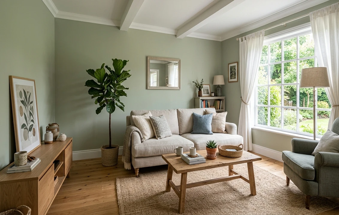

Sherwin-Williams Livable Green (SW 6176) is the kind of color people pick when they want green to act like a grown-up. It is a soft sage gray-green that lands right in the middle of the value scale: green enough to read as an actual color on the wall, muted enough that it never shouts. The name is the brief. This is a green you can live with all day, in a bedroom or a whole open floor, without it tiring you out, which is exactly why it shows up again and again on "calming sage" lists.
This profile is for the homeowner already circling Livable Green and wanting to be sure: how its undertones behave, the published LRV and hex, the rooms it flatters, and the trim and decor that keep it crisp instead of dusty. It is one of the soft sages in our wider Sherwin-Williams interior paint colors guide, and you can see where the whole green family sits in our green interior paint colors guide.
Upload one photo and preview SW Livable Green under your room's actual light in about 30 seconds, free.
The numbers behind Livable Green SW 6176
Start with the published data; these figures predict the wall far better than a fan-deck chip held under store light. They come from the Sherwin-Williams color tools:
| Spec | Value |
|---|---|
| SW code | SW 6176 Livable Green |
| HEX (screen approximation) | #ABAE96 |
| RGB approximation | 171, 174, 150 |
| LRV (Light Reflectance Value) | 42 |
| Hue family | Soft gray-green sage with a quiet warm-yellow core |
| Color strip neighbors | Softened Green (SW 6177), Coastal Plain (SW 6192) |
Sources: Sherwin-Williams SW 6176 Livable Green color data, retrieved 2026; The Spruce paint undertone references.
The LRV of 42 is the whole story of this color. That is a true mid-tone, almost dead center on the 0-to-100 reflectance scale. It is the dividing line between a sage that disappears into a tinted neutral and one that registers as color. Livable Green sits right on it, which is what makes it so versatile: in a bright room it behaves like a soft neutral green, and in a dimmer room it deepens into something with real sage presence. By comparison, SW Sea Salt sits at LRV 63 (much airier and bluer) and SW Evergreen Fog sits at LRV 30 (notably deeper and cozier). Livable Green is the calm middle of that trio.
Undertones: a warm sage, not a cool one
Sage greens split into two camps, and Livable Green sits firmly in the warmer one. Its base is a green-gray, but underneath that gray runs a soft yellow that keeps the whole color earthy and organic rather than cool or minty. That warm core is the reason it reads as restful and grounded rather than clinical, and it is also the reason it can drift if you put it next to the wrong things.
- The dominant note: a muted gray-green. This is what you see most of the time, the calm sage the color is known for.
- The warm whisper: a soft yellow-green hiding under the gray. In strong warm light it can edge toward a gentle olive or celadon; this is the undertone to watch.
- What it is not: there is no blue or mint in Livable Green. It will not turn spa-blue the way Sea Salt does. If you want the cooler, watery version, you want Sea Salt, not this color.
Because of that warm yellow core, Livable Green is happiest against warm-to-neutral whites and natural wood. Pair it with stark cool grays or blue-white trim and the contrast can make it look slightly dingy or yellow-cast. Our interior color families guide explains why a sage's undertone, not its name, decides which neutrals flatter it.
LRV and light: how the room's direction changes it
At LRV 42, Livable Green is sensitive to light without being volatile the way a finely balanced color-shifter is. It does not jump between three hues; it mostly gets greener and deeper in less light, and softer and grayer in more light. Orientation and bulb temperature do the steering. Here is the typical behavior across the four Northern Hemisphere orientations:
| Room orientation | Daylight character | How Livable Green reads |
|---|---|---|
| South-facing | Warm, abundant midday light | Softest and most neutral, the warm yellow core glows, reads as a gentle sage |
| West-facing | Cool by day, very warm at sunset | Grayer and quieter midday, turns warm and olive-tinged in late-afternoon sun |
| East-facing | Warm early sun, neutral later | Brightest green in the morning, settling to a calm gray-green by afternoon |
| North-facing | Cool, indirect, no direct sun | Deepest and grayest version, the gray steps forward and it can flatten if the room is dim |
Sources: American Institute of Architects daylight reference; Sherwin-Williams SW 6176 color data; designer field notes on sage greens.
Bulb color matters just as much as the windows. Under 2700K warm white bulbs Livable Green leans into its yellow core and feels cozy and slightly more olive at night. Under 4000K cool white bulbs the gray comes forward and the color reads crisper and more contemporary. North rooms and dim rooms are where Livable Green needs help: at LRV 42 it has enough body to go murky in low light, so pair it with warm 2700K lamps and plenty of light layers there. For a sage that holds airier in those same dim spaces, the lighter soft sage interior shades guide covers the higher-LRV alternatives.
The rooms Livable Green was made for
Livable Green is, true to its name, one of the most flexible sages for whole-room use. Because it sits at a comfortable mid-LRV and carries a warm, earthy undertone, it works as an all-over wall color where a deeper green would close a room in:
- Bedrooms: the headline use. The muted sage is genuinely restful and pairs effortlessly with white, cream, and natural-linen bedding. In a warm-light or south room it is soft and enveloping without being dark.
- Living and family rooms: at LRV 42 it grounds an open space as a calm color you can live with all day, especially with white oak floors and warm wood furniture. Best in rooms with decent natural light.
- Home offices and studies: green is the classic focus-and-calm color, and Livable Green delivers it without the drama of a deep forest. It reads composed and a little traditional.
- Kitchens, on cabinets: increasingly popular on lower cabinets or an island, where the warm sage reads custom and timeless against white uppers, warm-wood counters, and brass hardware. For the brand-finish call on cabinetry, our Sherwin-Williams vs Benjamin Moore comparison covers how the two wear.
- Dining rooms: a sage with this much warmth flatters food, candlelight, and wood furniture, which is why it suits traditional and transitional dining spaces.
Where to be careful: a north-facing or windowless room under cool builder bulbs can drain Livable Green to a flat, slightly muddy gray-green, so reserve it for spaces with warm light or commit to warm lamps there. And in a very small, dim bathroom the deeper sage can feel heavy, where the lighter Softened Green or Sea Salt would keep things airy. Our interior house painting cost guide covers what the repaint should run before you commit a whole floor to it.
Free AI visualizer: test Livable Green in a bedroom, living room, or on cabinets before you buy a sample.
Trim, ceiling, and decor that keep it crisp
Because Livable Green has a warm yellow core, the white you set beside it decides whether it reads fresh-sage or dusty. Warm and soft whites win; stark blue-whites fight it:
- Best all-around trim: Sherwin-Williams Alabaster (SW 7008, LRV 82). Its gentle creamy warmth echoes Livable Green's yellow core and frames it as soft and intentional rather than gray. The default designer pairing for warm sages.
- For a slightly crisper look: SW Pure White (SW 7005, LRV 84). A touch cooler and brighter than Alabaster, it sharpens the contrast without going icy. Use it when you want the green to feel more contemporary.
- Avoid: bright blue-white trims, which make Livable Green's warmth read as a yellow-gray cast and can dull the whole scheme.
- Ceiling: a flat warm white keeps the room open. Livable Green overhead in a low room can feel heavy at LRV 42.
- Deeper coordinating tones: for an accent, a built-in, or a door, a deeper green like SW Pewter Green (SW 6208) or a soft black like SW Iron Ore (SW 7069) reads as a natural step down. A warm greige flows beside it in adjoining rooms.
- Decor and finishes: white oak and warm woods, natural linen, rattan, aged brass, and unlacquered hardware all flatter it. Cool gray-washed floors and heavy cool grays drag it toward murky.
To ground a Livable Green scheme with a warm neutral in adjoining rooms, the obvious partners are the greiges: our profiles of SW Agreeable Gray and SW Accessible Beige both flow naturally beside a warm sage and keep a whole-home palette cohesive.
Livable Green vs the colors people cross-shop
Livable Green has a few near-twins shoppers line up against it, and the differences are small enough that the wrong sample is easy to buy. Here is how it separates from the three colors most often confused with it:
- vs SW Softened Green (SW 6177): the direct neighbor one step lighter on the same color strip. Softened Green is paler and airier with a higher LRV, so it stays soft and barely-there even in dim rooms. Livable Green is the more saturated, more grounded version of the same warm sage. Choose Softened Green if Livable Green tests too strong; choose Livable Green if Softened Green washes out and you want green to actually register.
- vs SW Cascade Green (SW 0066): a historic-collection green that runs cooler and more blue-leaning than Livable Green. Cascade Green reads as a soft blue-green sage closer to a celadon, where Livable Green stays warm and earthy with that yellow core. Pick Cascade Green for a cooler, more vintage feel and Livable Green for a warmer, more current sage.
- vs SW Coastal Plain (SW 6192): a deeper, more muted gray-green from the same general family. Coastal Plain is darker and heavier, a moodier sage for a feature wall or a cabinet, where Livable Green stays mid-tone and works as an all-over wall color. Choose Coastal Plain when you want depth and drama, Livable Green when you want easy, everyday calm.
If you are weighing Livable Green against the airier, bluer end of the sage spectrum, the cleanest comparison is our SW Sea Salt profile (LRV 63, blue-green-gray), and for the deeper, cozier end the SW Evergreen Fog profile (LRV 30). Together those three map almost the whole usable range of Sherwin-Williams sage. You can also see the full lineup ranked in our best interior paint colors for 2026 roundup.
How to test Livable Green before you commit
A 3-inch fan-deck chip is the worst way to judge a mid-LRV sage like Livable Green, because store light near 4000K flattens its warm core and the chip is too small to show how the color fills a wall. The reliable method is a large peel-and-stick sample (Sherwin-Williams sells one) taped to at least two walls and checked mid-morning, mid-afternoon, and after dark under your normal bulbs; in a north or dim room the after-dark check is the one that tells you whether it goes murky. The faster, no-paint first pass is a digital visualizer: upload a photo of the room and apply Livable Green beside Softened Green (lighter) and Sea Salt (cooler and bluer) to see which way your light pulls it, ruling out the shades that were never going to work for your space.
Preview Livable Green beside a lighter and a cooler alternative under your real light, free.
Frequently asked questions
What undertones does Livable Green SW 6176 have?
Livable Green is a warm sage. Its base is a muted gray-green, and underneath that gray runs a soft yellow that keeps it earthy and organic rather than cool or minty. That warm yellow core is what makes it read as restful and grounded, but it can edge toward a gentle olive under strong warm light. It has no blue or mint in it, so it will not turn spa-blue the way Sea Salt does.
What is the LRV of SW Livable Green?
Livable Green has a Light Reflectance Value of 42, a true mid-tone almost dead center on the scale. That is the line between a sage that reads as a tinted neutral and one that registers as real color. In a bright room it behaves like a soft neutral green; in a dimmer room it deepens into a sage with genuine presence. It is lighter than Evergreen Fog (LRV 30) and darker than Sea Salt (LRV 63).
What trim color goes with Livable Green?
Sherwin-Williams Alabaster (SW 7008, LRV 82) is the best all-around trim. Its creamy warmth echoes Livable Green's yellow core and frames it as a soft, intentional sage rather than a gray. For a slightly crisper, more contemporary look use Pure White (SW 7005). Avoid bright blue-white trims, which make Livable Green's warmth read as a yellow-gray cast and dull the scheme.
What is the difference between Livable Green and Softened Green?
They are neighbors on the same Sherwin-Williams color strip. Softened Green (SW 6177) is one step lighter, paler and airier with a higher LRV, so it stays soft even in dim rooms. Livable Green (SW 6176) is the more saturated, more grounded version of the same warm sage. Choose Softened Green if Livable Green tests too strong, and Livable Green if Softened Green washes out and you want green to actually register on the wall.
What rooms work best for Livable Green?
Bedrooms, living rooms, home offices, and dining rooms all suit it, especially spaces with decent natural light, because at LRV 42 it works as a calm all-over wall color you can live with all day. It is also popular on lower kitchen cabinets and islands. Be careful in north-facing or windowless rooms under cool bulbs, where it can flatten to a muddy gray-green; pair it with warm 2700K lamps there.
See SW Livable Green under your real light, beside a lighter and a cooler alternative, before you buy. One HD preview plus three variations, free.
Disclaimer: Sherwin-Williams and SW 6176 Livable Green are trademarks of The Sherwin-Williams Company. Benjamin Moore and Behr are trademarks of their respective owners. FacadeColorizer is an independent paint visualization service and is not affiliated with, endorsed by, or sponsored by Sherwin-Williams, Benjamin Moore, or Behr. Screen color approximates the manufacturer's sample; always confirm with a physical sample before purchase. Sources: Sherwin-Williams SW 6176 Livable Green color data 2026, Sherwin-Williams Alabaster SW 7008 and Pure White SW 7005 color data, Sherwin-Williams Softened Green SW 6177, Cascade Green SW 0066, and Coastal Plain SW 6192 color data, The Spruce paint undertone references, and designer field notes on sage greens.
Trademarks mentioned (Sherwin-Williams, Benjamin Moore, Behr, Caparol, Brillux, Sto, Alpina, Valspar, PPG, Glidden, Dulux, Crown Trade, Sandtex, Farrow & Ball, Johnstone's, Leyland) are property of their respective owners. FacadeColorizer is independent and not affiliated with any of them. Nominative fair use under Lanham Act §1125.


