Brush Pewter Green (SW 6208) onto a kitchen island and in the morning it reads as a deep, sophisticated forest sage; by dinner, under warm bulbs, the same doors go smoky and almost gray-brown with a whisper of olive. That chameleon swing is why it became one of the most-saved cabinet and front-door colors in the country, and why a fan-deck chip almost never tells you the truth about it.
This single-color profile covers the specifics before you commit cabinets, a study, or a powder room: the undertones, why an LRV this low changes everything, the best rooms, the light behavior, and the pairings that make it look custom. It is one of the deeper anchors in our wider Sherwin-Williams interior paint colors guide and our best interior paint colors for 2026 roundup.
Upload one photo and preview SW Pewter Green under your room's actual light in about 30 seconds, free.
Pewter Green SW 6208 at a glance
The published Sherwin-Williams color data predicts the wall far better than any small chip:
- SW code: 6208, part of the same color strip as Sea Salt and Ripe Olive, sitting at the deep, saturated bottom of that family.
- LRV (Light Reflectance Value): 12. Genuinely dark. It reflects very little light, which gives the color its drama and a tendency to deepen toward near-black in a dim room.
- Hue family: a deep gray-green. The green is unmistakable in good light, but a strong gray base keeps it muted and sophisticated, never minty or juvenile.
- HEX / RGB approximation: roughly #5E6259, about RGB 94, 98, 89. A screen reference for mood only, never a substitute for a real sample on a color this deep.
- Closest relatives: SW Rosemary (6187), the deeper SW Cast Iron (6202), and Benjamin Moore Vintage Vogue (462), all covered in the comparison section below.
That LRV of 12 is the headline. It puts Pewter Green firmly in statement-color territory: a confident, almost-black green that still shows its color in daylight. For where it sits relative to lighter greens and the greiges, our interior paint color families guide maps the green and neutral groups, and our profile of SW Sea Salt shows what the lightest member of this strip does in the same rooms.
The undertones: green you can see, gray that grounds it
Pewter Green is built from two pigment directions held in tension, plus a third that surfaces only at the edges of the day:
- The green is the dominant read and the reason people choose it: in daylight, especially direct or south light, it is clear and confident, somewhere between a deep sage and a muted forest.
- The gray base makes it look expensive rather than loud, muting the green and pulling it back from anything minty, so it reads as a grown-up designer green, not a saturated emerald.
- A faint blue-to-olive swing hides at the extremes: a cooler, bluer cast in overcast light, and a smoky olive under warm 2700K bulbs at night. Neither is strong, but on a color this deep the small shifts show.
So here is what actually matters when you plan. The LRV is so low that the thing to watch is brightness, not hue. The color barely changes color; it changes how dark it looks. In dim or cool light the gray takes over and the whole thing goes smokier, closer to a green-charcoal.
How light decides whether you see green or near-black
With a deep color, light direction and quantity matter even more than for a soft neutral. The table maps the typical read by orientation in the Northern Hemisphere:
| Room orientation | Daylight character | How Pewter Green reads |
|---|---|---|
| South-facing | Warm, abundant midday light | Greenest and most alive; the color shows its full sage-forest depth |
| East-facing | Warm early sun, neutral by afternoon | Clear green in the morning, settling to a deeper gray-green later in the day |
| West-facing | Cooler mornings, very warm late-day sun | Smoky and gray by day, glowing toward a warm olive-green at sunset |
| North-facing | Cool, indirect, no direct sun | Coolest and moodiest; can lean slightly blue-gray and flatten toward charcoal without added light |
Try it on your house
No photo? Try a sample
Where this comes from: the American Institute of Architects daylight reference and Sherwin-Williams SW 6208 color data, plus The Spruce paint undertone references and our own designer field notes on how deep gray-green behaves.
Bulb temperature is the second lever: cool 4000K to 5000K LEDs keep the green crisp, while warm 2700K bulbs pull out the olive and a cozy, library-like depth. But quantity matters more. A north-facing or windowless room needs generous layered lighting to keep the green visible after dark; if you wanted green at night, plan the lighting first.
Free AI paint visualizer. Upload your room photo to see whether Pewter Green reads green or near-black under your own windows before buying a sample.
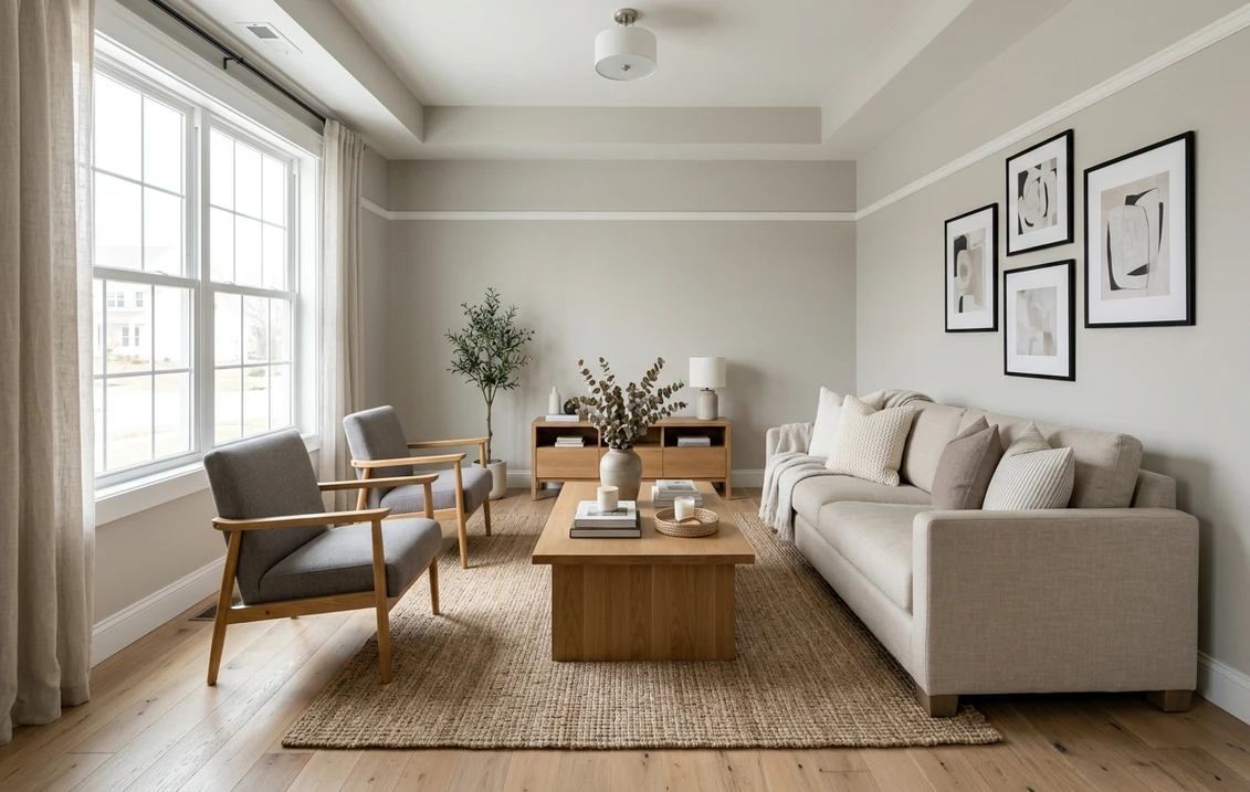
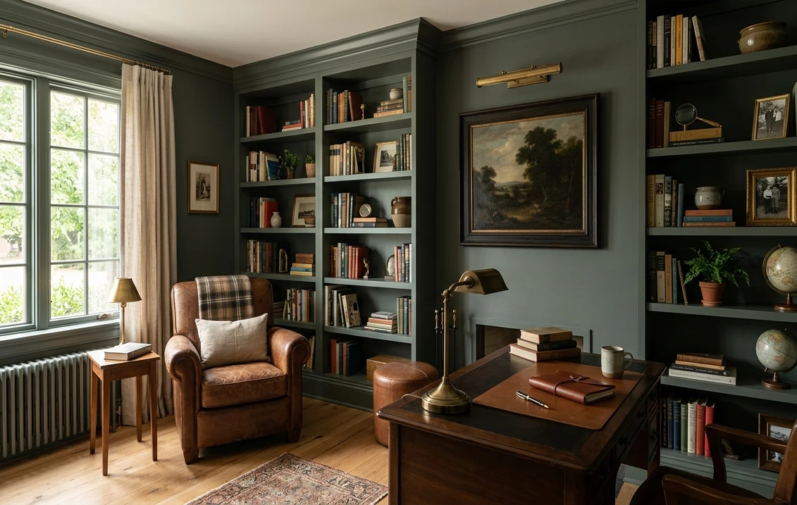
The rooms Pewter Green was made for
This is a specialist, not an everywhere color. Its low LRV and grounded, nature-derived green pay off in the rooms where you actually want depth and drama:
- Kitchen cabinetry and islands. Its signature use: on shaker cabinets or an island with brass hardware, white oak counters, and warm wood shelving, it reads as a high-end, organic alternative to white, navy, or gray.
- Studies, libraries, and home offices. At LRV 12, on walls plus built-in bookcases tone on tone, it gives a room a grounded, paneled feel that reads enveloping rather than heavy.
- Powder rooms and small baths. A windowless powder room is where the deepness becomes an asset. Drenched floor to ceiling with brass fixtures and a good vanity light, it turns a tiny room into a jewel box.
- Dining rooms and accent walls. A dining room carries the full depth beautifully under warm evening light, and if a whole room is too much, a single fireplace wall or a run of built-ins delivers the drama.
In a large, dim, north-facing room, commit to strong layered lighting or pick a lighter green. For what drenching a room in a deep color costs to execute well, our interior house painting cost guide breaks down labor and materials by room.
Trim, metal, and wood pairings
Pewter Green holds both green and gray, and it tips warm or cool with the light. That flexibility is why it sits happily next to almost anything natural. Here are the pairings designers keep coming back to:
- Trim and ceiling: a crisp-but-soft warm white gives the cleanest contrast. Pure White (SW 7005, LRV 84) frames the green sharply; Alabaster (SW 7008, LRV 82) softens the line for a warmer look, and our SW Alabaster guide covers how that warm white behaves beside a saturated color. The other strong move is tone on tone: trim and walls both in Pewter Green.
- Metals: brass and aged or unlacquered gold are the showstopper choice, making the green feel luxe and warm. Matte black grounds it, oil-rubbed bronze leans traditional, and chrome or bright nickel read coldest.
- Wood tones: warm and mid-tone woods are the magic pairing. White oak, walnut, and maple bring out the green; cool gray-washed floors fall flat.
- Companion wall colors: flow it beside Accessible Beige for an earthy transition, or against the cooler Repose Gray and Agreeable Gray for a calm green-and-gray scheme.
- Textiles and decor: cream linen, jute, rattan, and terracotta flatter it; blush, mustard, rust, or cognac leather adds contrast.
See Pewter Green with brass hardware and white oak in a single preview, free.
Pewter Green vs the greens people cross-shop
A few greens get held up against it again and again. On a chip the differences barely register. On a wall they are obvious:
- vs SW Rosemary (SW 6187): the closest comparison. Rosemary is a touch warmer, reads more clearly green, and is a hair brighter; Pewter Green is grayer and more muted, the moodier pick of the two.
- vs SW Cast Iron (SW 6202): the moodier, near-black sibling, reading almost charcoal with just a hint of green; Pewter Green keeps far more visible green. At the opposite end of the strip, the light, airy Sea Salt (6204, LRV 63) layers with it in a tonal palette.
- vs Benjamin Moore Vintage Vogue (462): the most common BM cross-shop. Vintage Vogue reads slightly warmer and more clearly green; Pewter Green holds a grayer, more muted character. For how the two brands handle deep greens in formula and coverage, see our Sherwin-Williams vs Benjamin Moore interior comparison.
How to test Pewter Green before you commit
Pewter Green is the textbook case where a 2-inch fan-deck chip will lie to you. A small chip under store light near 4000K lands on a balanced green that may be none of the reads you get at home, and it cannot show the brightness collapse an LRV of 12 brings. The reliable method is a large peel-and-stick sample (Sherwin-Williams sells one) taped to two walls, one near a window and one in the darker part of the room, checked mid-morning, mid-afternoon, and after dark under your normal bulbs. The after-dark read matters most, because the near-black version is the one you live with at night.
The faster, no-paint first pass is a digital visualizer: upload a real photo of the room and apply Pewter Green beside a warmer green like Rosemary and a lighter one to see which way your light pulls it, then confirm the finalist with a sample before you buy.
Preview Pewter Green beside a warmer and a lighter green under your real light, free.
Frequently asked questions
What undertones does Pewter Green have?
Pewter Green (SW 6208) is a deep gray-green. The green is the dominant read in good daylight, while a strong gray base mutes it and keeps it sophisticated rather than minty. At the edges of the day it shows a faint swing: slightly cooler and bluer in north or overcast light, slightly warmer and olive under warm 2700K bulbs at night. Because the color is so deep, the most noticeable shift is actually brightness, not hue.
What is the LRV of Pewter Green?
Pewter Green has a Light Reflectance Value of 12 on the Sherwin-Williams color data. That is genuinely dark; it reflects very little light, which gives it drama on cabinets and walls. The trade-off is that in a dim or north-facing room it can flatten toward charcoal, so generous layered lighting is important to keep the green visible after dark.
Is Pewter Green good for kitchen cabinets?
It is one of its best uses. On shaker cabinets or an island with brass or unlacquered-gold hardware and white oak or warm wood accents, Pewter Green reads as a high-end, organic alternative to white, navy, or gray cabinetry. The depth gives the kitchen a custom, grounded richness, and the green stays visible in daylight while reading almost-black and dramatic at night.
What trim color goes with Pewter Green?
A crisp-but-soft warm white gives the cleanest contrast. Sherwin-Williams Pure White (SW 7005, LRV 84) frames the green sharply, while Alabaster (SW 7008, LRV 82) softens the line for a warmer, more traditional look. The other popular choice is tone on tone: painting the trim and built-ins the same Pewter Green for a drenched, architectural effect that makes a study or powder room feel custom.
What is the difference between Pewter Green and Rosemary?
They are close, deep Sherwin-Williams greens that shoppers often compare. SW Rosemary (6187) runs a touch warmer, reads more clearly green, and is a hair brighter. Pewter Green (6208) is grayer, cooler, and more muted. Pick Pewter Green for a moodier, more sophisticated read, and Rosemary when you want the green to come forward a little more. Both look best with brass and warm wood.
See SW Pewter Green on your actual walls and cabinets before buying a single sample pot.
Disclaimer: Sherwin-Williams and SW 6208 Pewter Green are trademarks of The Sherwin-Williams Company. Benjamin Moore and Behr are trademarks of their respective owners. FacadeColorizer is an independent paint visualization service and is not affiliated with, endorsed by, or sponsored by Sherwin-Williams, Benjamin Moore, or Behr. Color reproduction on screens approximates the manufacturer's chip; always confirm with a physical sample before purchase, and especially with a low-LRV color like this one. Sources: Sherwin-Williams SW 6208 Pewter Green color data 2026, SW Pure White 7005, Alabaster 7008, Rosemary 6187, and Cast Iron 6202 color data, Benjamin Moore Vintage Vogue 462 data, American Institute of Architects daylight reference, The Spruce paint undertone references, and designer field notes on deep gray-green behavior.
Trademarks mentioned (Sherwin-Williams, Benjamin Moore, Behr, Caparol, Brillux, Sto, Alpina, Valspar, PPG, Glidden, Dulux, Crown Trade, Sandtex, Farrow & Ball, Johnstone's, Leyland) are property of their respective owners. FacadeColorizer is independent and not affiliated with any of them. Nominative fair use under Lanham Act §1125.