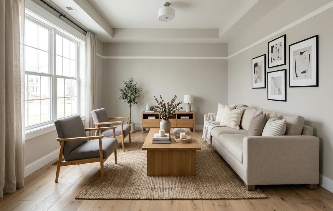
Ever notice how the walls in a newly staged open house all seem to be the same warm not-quite-beige? Across the United States, that color is usually Sherwin-Williams Accessible Beige (SW 7036). Builders, flippers, and stagers reach for it when they want "warm but neutral" without a true tan or a cold gray. The reason is its split personality. Accessible Beige is a greige, a beige and gray hybrid that leans warm in most light but carries just enough gray to keep it from going gold or peach. That balance is what makes it so popular, and what makes it behave differently from room to room.
This is a single-color profile, written for the homeowner who has already narrowed the search to Accessible Beige and now needs the specifics: what its undertones actually do, the published LRV, which rooms it flatters, how it shifts under different light, and the trim whites and decor that pair with it in real homes. It is one of the warm neutrals featured in our wider Sherwin-Williams interior paint colors guide, and our roundup of the best interior paint colors for 2026 sets it against the other contenders.
Preview SW Accessible Beige under your room's actual light in about 30 seconds, free.
The numbers behind Accessible Beige SW 7036
First, the hard numbers. These come straight from Sherwin-Williams technical data and color tools, and they tell you more about how the paint will read on a wall than any swatch can:
- SW code: 7036, in the Sherwin-Williams neutral color family.
- LRV (Light Reflectance Value): 58. That is squarely mid-tone. It is light enough to feel airy in a bright room but has enough depth to show as a real color, not an off-white, on a sunless wall.
- Hue family: warm greige, a beige base with a balanced gray-to-yellow undertone. The gray is what stops it drifting gold.
- HEX / RGB approximation: roughly #D4C8B0, about RGB 212, 200, 176. Useful as a screen reference, but never a substitute for a real sample.
- Closest cousins: SW Agreeable Gray (7029, LRV 60) sits a touch lighter and grayer; SW Repose Gray (7015, LRV 58) is the same brightness but reads clearly cooler and grayer. Accessible Beige is the warmest of the three.
An LRV of 58 matters more than people expect. Mid-50s to low-60s is forgiving: it does not glare back in a south-facing room, and it does not collapse into flat gray mud in a north-facing one the way a darker greige can. That mid-tone resilience is half the reason Accessible Beige is so widely used.
What the undertones actually do
Accessible Beige is often described as a "no-undertone neutral," which is not quite right. Every paint has an undertone; the trick with this one is that the warm (yellow-beige) and cool (gray) sides are close to balanced, so neither shouts. In practice you will see three behaviors depending on what is around it and how much light the room gets:
- In strong warm light, the beige base steps forward and Accessible Beige reads as a soft, creamy tan. This is the look stagers want in listing photos.
- In cool or dim light, the gray steps forward and it reads as a true greige, closer in feel to a warm gray than a beige. North-facing rooms and overcast days pull it this direction.
- Next to other colors, contrast decides the reaction. Beside a crisp white trim it looks unmistakably beige; beside a tan sofa or oak floor, the gray side surfaces and it can look almost gray by comparison.
One undertone to watch: in low light with cool LED bulbs, the gray base can pick up a faint green-gray cast. It is subtle and most people never notice, but if your room is north-facing and you run 5000K daylight bulbs, test first. The same balanced undertone makes this color dependable outdoors too; our Accessible Beige 7036 exterior guide covers how it behaves on siding and stucco. This page owns the color on interior walls and in rooms; that one owns it on the facade. They are companions, not duplicates.
How room orientation changes the read
Accessible Beige sits so close to balanced that the light in a room gets the deciding vote, nudging it warm or gray. Here is how it typically behaves across the four orientations in the Northern Hemisphere:
| Room orientation | Daylight character | How Accessible Beige reads |
|---|---|---|
| South-facing | Warm, abundant midday light | Soft creamy beige, warmest version, very inviting |
| West-facing | Cool mornings, very warm late-day sun | Greige by day, glowing warm tan at sunset |
| East-facing | Warm early sun, neutral by afternoon | Balanced greige, leans beige in the morning |
| North-facing | Cool, indirect, no direct sun | Reads as a true warm greige, grayer and quieter |
Try it on your house
No photo? Try a sample
Sources: Sherwin-Williams SW 7036 color data; The Spruce paint undertone references; designer field notes on greige behavior by orientation.
So if you fell for the warm "beige" version in a listing photo, you were almost certainly looking at a bright south or west room. Put that exact paint in a north-facing study and it shifts toward warm gray. Know which one your room will give you, and you skip a repaint. For a side-by-side look at how a cooler, grayer neutral behaves in the same rooms, compare our profile of SW Repose Gray, and for the popular warm-gray middle ground see SW Agreeable Gray.
Best rooms for Accessible Beige
Few colors are this easy to place. Being a forgiving mid-tone, Accessible Beige earns its keep almost anywhere, but a handful of rooms really let it shine:
- Open-concept living and dining: its biggest strength. The neutral greige flows wall to wall without fighting the kitchen or the furniture, which is why it is a whole-house favorite. See how it sits among other contenders in our top living room paint colors for 2026.
- Primary bedrooms: warm enough to feel restful, neutral enough to layer any bedding over it. It pairs especially well with white oak and warm woods. Our guide to calming primary bedroom colors explains why mid-tone greiges read as soothing.
- Hallways and stairwells: the LRV of 58 holds up in low-light transitions where a darker color goes murky and a white feels stark.
- Kitchens with white or wood cabinets: it bridges the two beautifully, reading warm against white cabinetry and neutral against stained wood. If cabinets are the bigger decision, start with our trending kitchen cabinet colors.
Where to be cautious: in a small, windowless north-facing bathroom it can read flat and dull, and against cool gray flooring or blue-gray tile it can look muddy. Sample those rooms before buying a gallon.
Free AI visualizer: test the color in any room before you buy a sample.
Trim whites and decor that pair best
The trim white is where Accessible Beige rooms succeed or fall flat. Because the wall is a warm mid-tone, a clean but not icy white gives the crispest contrast without making the walls look dingy:
- Best all-around trim: Sherwin-Williams Pure White (SW 7005, LRV 84). Bright and slightly warm, it keeps Accessible Beige reading clean and beige rather than gray. This is the default pairing in most stager and designer schemes.
- For a softer, low-contrast look: SW Alabaster (SW 7008, LRV 82). A warmer creamy white that lets the trim blend gently into the wall for a calm, cohesive feel rather than a sharp frame.
- Use with care: SW Extra White (SW 7006, LRV 86) or any bright cool white. The crisp contrast can make Accessible Beige look more gray and the white look slightly blue against it, especially in north light.
- Coordinating wall color (one step deeper): SW Anew Gray or a Urbane Bronze accent reads as a natural, in-family darker tone for an accent wall, built-ins, or a powder room.
- Decor and finishes: warm metals (brass, aged bronze), natural linen and jute, white oak and walnut, and black accents for definition. Cool chrome and gray-washed oak fight the warmth and pull the room muddy.
If you want the warmth of Accessible Beige but a hair more gray, Benjamin Moore Revere Pewter (HC-172) is the natural cross-brand comparison; our Revere Pewter review breaks down where each color wins. For the bigger picture of how greiges fit alongside warm grays, true grays, and off-whites, the interior color families guide is the place to start.
Accessible Beige vs the colors people confuse it with
Shoppers almost always cross-shop Accessible Beige against three colors:
- vs SW Agreeable Gray (7029): the lighter, grayer "greige that leans gray," where Accessible Beige is the "greige that leans beige." Warm furnishings favor Accessible Beige; cool furnishings favor Agreeable Gray. We call the winner room by room in our Agreeable Gray vs Accessible Beige duel.
- vs BM Revere Pewter (HC-172): a touch darker and greener-gray with more drama. Accessible Beige is warmer, reads more reliably beige in average light, and is the safer whole-house neutral. For the full cross-brand showdown, see Revere Pewter vs Accessible Beige: the side-by-side verdict.
- vs BM Manchester Tan (HC-81): a truer, more yellow tan with less gray. If Accessible Beige looks slightly gray to you and you want frank warmth, Manchester Tan delivers it, at some cost to versatility.
There is also a fourth, quieter rival from the same SW strip: Balanced Beige (SW 7037), one step darker on the card. We settle that matchup in Accessible Beige vs Balanced Beige: the full duel. And if the beiges you are weighing are warmer and more classic, two more matchups are worth a look: Accessible Beige vs Kilim Beige, compared wall to wall and Natural Linen vs Accessible Beige: which soft neutral wins.
Still torn between the big brands themselves? Our Sherwin-Williams vs Benjamin Moore interior comparison and the Behr vs Sherwin-Williams comparison dig into formula, coverage, and the price gaps that matter once the color is chosen.
How to test it before you commit
A fan-deck chip reads roughly 25 to 35 percent lighter than a rolled wall and cannot show the warm-versus-gray shift that defines this color. The reliable method is a large peel-and-stick sample (Sherwin-Williams sells one) on two walls, checked mid-morning, mid-afternoon, and after dark under your normal bulbs. How far it swings toward gray in the dimmest moment is the version you live with at night.
The faster, no-paint first pass is a digital visualizer: upload a room photo and apply Accessible Beige beside a grayer and a warmer alternative to see which way your light pulls it. Once the color is locked, our interior house painting cost guide covers what the repaint should run.
Preview Accessible Beige beside a warmer and a grayer alternative, free.
Frequently asked questions
Is Accessible Beige a warm or cool color?
Accessible Beige (SW 7036) is a warm greige: a beige base with a balanced gray undertone. In most light it reads warm and beige, but the gray side keeps it from going gold or peach. In cool or dim light, especially north-facing rooms, the gray surfaces and it reads more like a warm gray. Overall it is on the warm side of neutral, just not strongly so.
What is the LRV of SW Accessible Beige?
Accessible Beige has a Light Reflectance Value of 58, a true mid-tone. That brightness is light enough to feel open in a sunny room yet deep enough to read as a real color, not an off-white, on a sunless wall. The mid-50s LRV is a big part of why it is so forgiving across different rooms.
What trim color goes with Accessible Beige?
Sherwin-Williams Pure White (SW 7005, LRV 84) is the most reliable trim pairing. It is bright and slightly warm, so it keeps Accessible Beige reading clean and beige without looking icy. For a softer, blended look, use SW Alabaster (SW 7008). Avoid bright cool whites like Extra White (SW 7006) if you do not want the walls to look grayer by contrast.
What is the difference between Accessible Beige and Agreeable Gray?
Both are greiges, but they lean opposite ways. Accessible Beige (LRV 58) leans beige and warm; Agreeable Gray (LRV 60) is lighter and leans gray. If your furnishings, flooring, and light are warm, Accessible Beige holds its identity better. If they are cool or you want a more modern gray feel, Agreeable Gray is the safer pick.
See SW Accessible Beige under your real light, with warmer and grayer alternatives, before buying.
Disclaimer: Sherwin-Williams and SW 7036 Accessible Beige are trademarks of The Sherwin-Williams Company. Benjamin Moore and Behr are trademarks of their respective owners. FacadeColorizer is an independent paint visualization service and is not affiliated with, endorsed by, or sponsored by Sherwin-Williams, Benjamin Moore, or Behr. Screen color approximates the manufacturer's sample; always confirm with a physical sample before purchase. Sources: Sherwin-Williams SW 7036 Accessible Beige color data 2026, Sherwin-Williams Pure White SW 7005 and Alabaster SW 7008 color data, The Spruce paint undertone references, and designer field notes on greige behavior by orientation.
Trademarks mentioned (Sherwin-Williams, Benjamin Moore, Behr, Caparol, Brillux, Sto, Alpina, Valspar, PPG, Glidden, Dulux, Crown Trade, Sandtex, Farrow & Ball, Johnstone's, Leyland) are property of their respective owners. FacadeColorizer is independent and not affiliated with any of them. Nominative fair use under Lanham Act §1125.