Reach for a warm cream, watch the walls go buttery, return the gallon. The white you actually wanted was Pure White (SW 7005). Inside a house, Sherwin-Williams Pure White reads crisp, clean, and quietly cool, a true balanced white with just a whisper of gray that keeps walls and trim looking gallery-fresh instead of yellowed. At a Light Reflectance Value of 84 it is bright without the glare of a builder white, which is why it is a default architect specification for modern, transitional and Scandinavian-leaning interiors across the United States.
This is a deep profile of Pure White indoors: the specs, the undertone you will actually see, the rooms where it shines (and the one where it can turn cold), the trim and cabinet pairings, how it compares to Alabaster, Snowbound and the Benjamin Moore near-twins, and how to test it first. It is part of our Sherwin-Williams interior paint colors hub. If you are painting siding, the companion piece is our SW Pure White exterior guide; that page owns the facade, fascia and front-door story, while this one stays inside the walls.
Upload a photo of your room and see SW Pure White on the walls in about 30 seconds, free, no signup.
SW Pure White at a glance
Pure White sits in the cool-neutral zone of the Sherwin-Williams white matrix: not a creamy off-white like Alabaster, not a stark builder white at LRV 90 and above. It is the in-between value designers reach for when they want a clean result that still feels soft. The published numbers:
- SW code: 7005.
- LRV (Light Reflectance Value): 84. Two points brighter than Alabaster (LRV 82), two points darker than Extra White (LRV 86), the brighter cool sister covered in our SW Extra White 7006 undertones and best rooms profile. If you are new to the metric, our guide on what LRV (light reflective value) means for this color explains how that number drives how bright Pure White reads in your room.
- HEX approximation: #EDECE6, with an RGB read near 237, 236, 230.
- Undertone: cool-neutral. A balanced white carrying a faint gray base, no yellow or cream, and no blue chill either.
- Cross-brand near-twins: Benjamin Moore Decorator's White (CC-20, LRV 84) sits within a single LRV point with the same cool-neutral feel; BM Chantilly Lace (OC-65, LRV 90.04) is cleaner and brighter.
That faint gray base is the whole personality. It keeps Pure White reading as a true white under cool indoor light, where a warm cream would slide toward greige. The trade-off runs the other way: in a room with little natural light and warm bulbs, the same gray base can feel slightly clinical. Most of this guide is about steering that one variable. For where Pure White sits in the wider white-and-neutral landscape, our interior paint color families guide maps the spectrum.
Where Pure White lands on the SW white ladder
Whites only make sense next to their neighbors. Here is Pure White against the four Sherwin-Williams whites it is cross-shopped with most, plus the two Benjamin Moore references homeowners bring to the paint desk:
| Color | LRV | Undertone | Reads as |
|---|---|---|---|
| SW Pure White 7005 | 84 | Cool-neutral, whisper of gray | Clean true white, crisp not creamy |
| SW Alabaster 7008 | 82 | Warm yellow-cream | Soft, buttery, farmhouse-warm |
| SW Snowbound 7004 | 83 | Soft gray, touch of mauve | Cool white, warmer than Pure White |
| SW Extra White 7006 | 86 | Cool, slight blue lean | Bright, sharp, can read icy |
| BM Decorator's White CC-20 | 84 | Cool-neutral | Near-twin of Pure White |
| BM Chantilly Lace OC-65 | 90.04 | Clean, near-no undertone | Gallery-bright, brightest here |
Try it on your house
No photo? Try a sample
Sources: Sherwin-Williams technical data sheets (SW 7005, 7008, 7004, 7006); Benjamin Moore technical data sheets (CC-20, OC-65).
The useful read: Pure White is the crisp middle, cooler and brighter than Alabaster, warmer and softer than Extra White, and a functional twin of Decorator's White if your contractor stocks Benjamin Moore. If those two are the finalists on your desk, our Pure White versus Extra White head-to-head breaks down which one wins by room and light. Snowbound is the half-step for anyone who finds Pure White a touch too cool but does not want cream; Chantilly Lace is for maximum gallery brightness. The deciding factor between Pure White and Alabaster is your finishes: cool ones (marble, stainless, black metal) point to Pure White, warm ones leading the room (oak, brass, linen) point to Alabaster; our Alabaster vs Pure White side-by-side comparison settles that duel room by room. For the full brand picture indoors, see our Sherwin-Williams vs Benjamin Moore interior comparison.
Best rooms for Pure White
Want light, openness, and a clean backdrop that lets the furniture and art do the talking? That is where Pure White earns its keep. Here is how it plays out, space by space.
Kitchens and cabinetry
Pure White's strongest room. As a cabinet color it photographs clean and modern without the slightly aged look cream cabinets can take on, and it sits well next to stainless, marble and quartz that carry a cool base. On walls above white cabinets it keeps the whole kitchen bright. For the wider cabinet conversation, see our 2026 best interior paint colors guide.
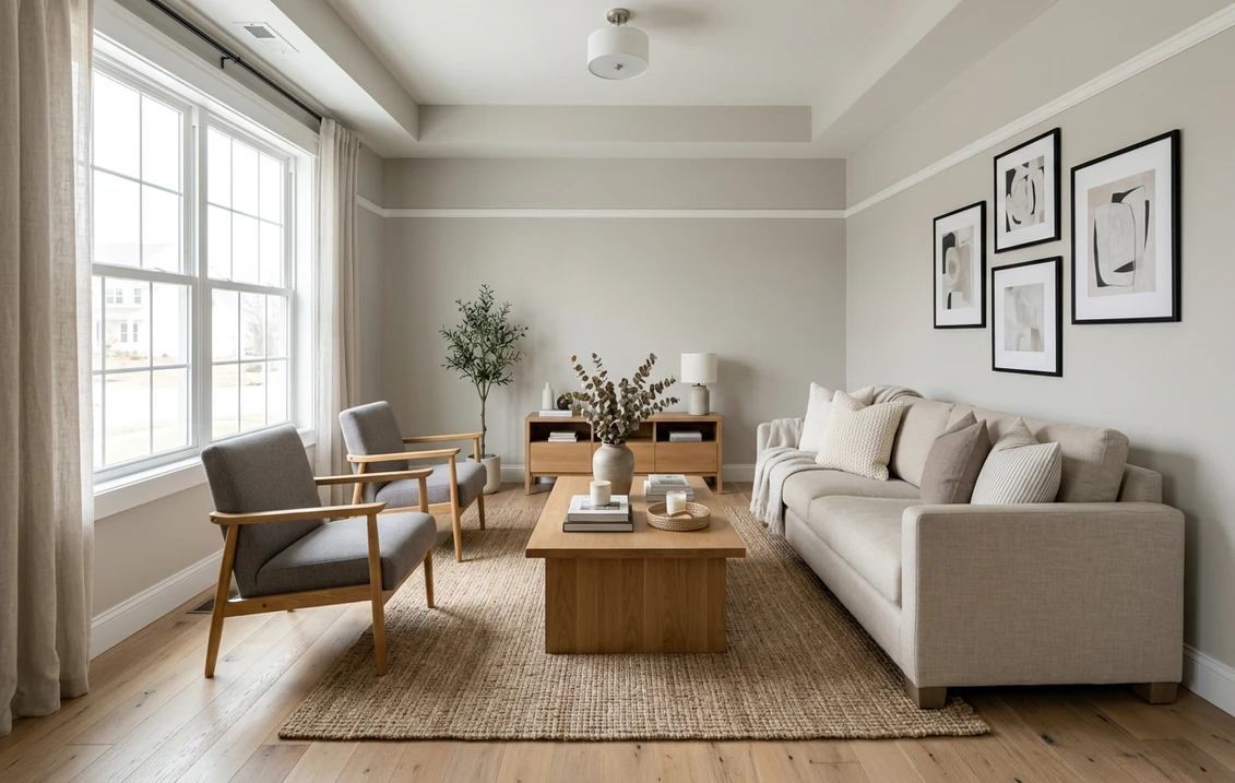
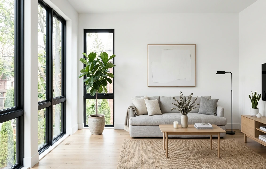
Living rooms and open-plan main floors
In a bright, window-rich living room Pure White is hard to beat. The cool base resists the yellowing warm whites suffer in strong daylight, so the wall holds its identity all day. It is the natural backdrop for the modern and Scandinavian look: light wood floors, linen upholstery, black-framed windows, a few green plants.
Bathrooms
Pure White reads spa-clean against white tile and chrome or matte-black fixtures. Because bathrooms often pair a window with cool LED vanity lighting, the cool base is an asset here: the room stays crisp instead of dingy.
Trim, doors and ceilings throughout
Even when the walls are a color, Pure White is a workhorse trim and ceiling white: crisp enough to frame a saturated wall, neutral enough not to fight it. Many designers run it on all the millwork and change only the wall color room to room.
The room to be careful with: a dim, north-facing space
A small north-facing room or windowless hallway lit only by warm bulbs is where Pure White can feel cold, with no warm daylight to balance its gray base. There, Snowbound (SW 7004) or a warmer white like Alabaster feels more inviting. If you love Pure White anyway, warm it from the floor up with honey-oak flooring, 2700K bulbs and brass accents. Our Alabaster north-facing undertones guide covers the physics of why light direction drives this.
See SW Pure White on your real walls under your own lighting before buying a sample pot. Free.
How Pure White shifts by light and orientation
Any white is just the manufacturer's pigment minus whatever wavelengths the room's light fails to supply. Pure White starts cool-neutral, not warm, and that calm starting point makes it easy to read across the day:
- South-facing rooms: warm midday daylight neutralizes the cool base, so Pure White reads as a clean true white. The easiest case.
- East and west rooms: a warm glow at sunrise or sunset that the cool base absorbs without going yellow, crisp neutral the rest of the day. Forgiving.
- North-facing rooms: cool, even, sunless light. Pure White stays white here where a warm cream would turn greige, but in a small north room it can edge cool or flat. The orientation to sample.
Artificial light matters just as much. The lever is simple: warm 2700K bulbs make Pure White warmer and softer; neutral or "daylight" LEDs at 3500K and up keep it at its crispest, which can feel cool after dark.
Trim, cabinet and decor pairings
Respect the cool base and the pairings fall into place. Lean on cool-to-neutral companions, then bring warm materials like wood and brass in as accents, not the dominant tone.
- Trim and ceiling: Pure White itself is the trim. On its own walls, keep trim and ceiling the same Pure White for a seamless modern envelope.
- Black accents: Tricorn Black (SW 6258) on window frames, hardware and fixtures gives the graphic Scandinavian-modern contrast Pure White was made for.
- Color companion wall: a greige such as Agreeable Gray pairs cleanly when you want one color wall against Pure White trim. See our Agreeable Gray undertones guide.
- Greige cabinets and furniture: a soft beige-gray like Accessible Beige reads warm-but-grounded next to Pure White without clashing. Our Accessible Beige undertones guide covers it.
- Floors and stone: white oak, light cool-toned wood, chrome, nickel and cool marble are natural matches; brass works as a deliberate accent.
One pairing to avoid indoors: heavy warm beiges and yellow-based creams as the dominant adjacent color. The cool-warm mismatch makes Pure White look dull or slightly blue, the opposite of crisp.
How to test Pure White before you commit
A 3-inch fan-deck chip is the biggest cause of white-paint regret: it reads 25 to 35 percent brighter than a rolled wall and cannot show how a room's light shifts the undertone. The reliable method is a peel-and-stick or sample-pot swatch at least 12 inches across, painted on two walls, looked at three times: midmorning, midafternoon, and after dark under your normal bulbs. Watch the north wall most closely, where any cool lean shows.
The fastest no-paint option is a digital preview: upload a real photo of your room and apply Pure White (plus Alabaster, Snowbound or Decorator's White) to the same space to compare them under your actual light before buying a sample. Want more options first? See our 2026 best interior paint colors guide. Budgeting the repaint? Our interior house painting cost guide covers per-room and whole-home pricing.
Toggle SW Pure White, Alabaster and Snowbound on your own room in 30 seconds. Free, no signup.
Frequently asked questions
Is SW Pure White warm or cool indoors?
Pure White (SW 7005) is a cool-neutral white: a balanced true white with a faint gray base and no yellow or cream, so it reads crisp rather than warm. In a bright or south-facing room the warm daylight neutralizes the cool base and it looks like a clean true white; in a dim room with warm bulbs the gray base can make it feel slightly cool. It is the cooler counterpart to SW Alabaster.
What is the LRV of SW Pure White?
Pure White has a Light Reflectance Value of 84 on the official Sherwin-Williams technical data sheet, two points brighter than SW Alabaster (LRV 82) and two points darker than SW Extra White (LRV 86). At LRV 84 it reads as a clean white in most light but avoids the glare of a builder white at LRV 90 and above, such as BM Chantilly Lace (LRV 90.04).
Which rooms is Pure White best for?
It is strongest in bright, window-rich spaces and on cabinetry: kitchens, open-plan living rooms and bathrooms, plus as an all-house trim and ceiling white. It suits modern, contemporary and Scandinavian interiors with cool finishes. Be careful in a small, dim, north-facing room lit only by warm bulbs, where it can feel cold; there, Snowbound or Alabaster usually fits better.
Pure White vs Alabaster: which should I use inside?
Pure White (cool-neutral, LRV 84) wins on modern, contemporary and Scandinavian interiors and in bright or cool-light rooms; pair it with white marble, stainless and black metal. Alabaster (warm cream, LRV 82) wins on traditional, transitional and modern-farmhouse spaces and in dim rooms; it sits more naturally with oak, brass and natural linen. Match the white to your dominant finishes and your light, then sample both.
See SW Pure White and its alternatives on your actual room before you buy a sample pot.
Disclaimer: SHERWIN-WILLIAMS, PURE WHITE, ALABASTER, SNOWBOUND, EXTRA WHITE, AGREEABLE GRAY, ACCESSIBLE BEIGE and TRICORN BLACK are trademarks of The Sherwin-Williams Company. BENJAMIN MOORE, DECORATOR'S WHITE and CHANTILLY LACE are trademarks of Benjamin Moore & Co. FacadeColorizer is an independent paint visualization service and is not affiliated with, endorsed by, or sponsored by Sherwin-Williams or Benjamin Moore. All product names, trademarks, color codes and specifications are used for identification, comparison and editorial commentary only. Color reproduction on screens approximates the manufacturer's chip; always confirm with a manufacturer sample before purchase. Sources: Sherwin-Williams SW 7005 Pure White technical data sheet 2026, Sherwin-Williams SW 7008 Alabaster technical data sheet 2026, Sherwin-Williams SW 7004 Snowbound and SW 7006 Extra White technical data sheets 2026, Benjamin Moore CC-20 Decorator's White and OC-65 Chantilly Lace technical data sheets 2026, The Spruce paint-undertone references 2025.
Trademarks mentioned (Sherwin-Williams, Benjamin Moore, Behr, Caparol, Brillux, Sto, Alpina, Valspar, PPG, Glidden, Dulux, Crown Trade, Sandtex, Farrow & Ball, Johnstone's, Leyland) are property of their respective owners. FacadeColorizer is independent and not affiliated with any of them. Nominative fair use under Lanham Act §1125.