Try it on your room

When a designer says a room needs to feel "clean," Sherwin-Williams Extra White (SW 7006) is often the color already in their head. It is the crisp, cool white that reads as simply white: no cream, no yellow, no beige creeping in. That is why it has become one of the most specified trim and ceiling whites in the country, and why it turns up on modern kitchen cabinets and bright bathroom walls everywhere. It is not a stark, clinical white either: a whisper of gray sits underneath, just enough to keep it from feeling sterile or turning blue.
This profile covers Extra White indoors: the published numbers, how its cool character behaves by light and orientation, the rooms and trim jobs it was made for, and how it differs from the softer white everyone cross-shops it against. It anchors the clean-white end of our wider Sherwin-Williams interior paint colors guide, and you can see where it lands among every neutral family in our best interior paint colors for 2026 roundup.
Upload one photo and preview SW Extra White under your room's actual light in about 30 seconds, free.
The numbers behind Extra White SW 7006
Start with the published data; with a white especially, these figures predict the wall better than any fan-deck chip, because whites are almost impossible to judge from a two-inch sample:
| Spec | Value |
|---|---|
| SW code | SW 7006 Extra White |
| HEX (screen approximation) | #EEEFEA |
| RGB approximation | 238, 239, 234 |
| LRV (Light Reflectance Value) | 86 |
| Hue family | Cool, clean white with a subtle gray undertone |
| Closest SW cousins | Pure White (SW 7005), Snowbound (SW 7004), High Reflective White (SW 7757) |
Try it on your house
No photo? Try a sample
Sources: Sherwin-Williams SW 7006 Extra White color data, retrieved 2026; The Spruce paint undertone references.
The LRV of 86 puts Extra White firmly in the bright, high-reflectance band, so it keeps a space feeling open and airy. It is not the brightest white Sherwin-Williams makes (High Reflective White reaches LRV 93 and reads starker), but it hits the sweet spot most people want: clearly white and clean, with enough softness that it does not glare. For the full method of reading numbers like these before you buy a sample, our guide on how to compare paint colors the right way walks through LRV, undertones, and side-by-side testing.
Undertones: a clean white that leans cool
Extra White has one job and does it well: it reads white. Underneath is a subtle cool gray, and that gray is the whole story of how it behaves. No warm cream or yellow, so it never goes ivory, yet just enough gray to avoid the icy blue tip pure bright whites can take. In practice that gives you three reads:
- The clean-white read (most of the time). In bright and average daylight, Extra White is exactly what the name promises: a crisp, neutral white with no obvious cast, the read that gets it specified so often.
- The cool gray read (dim or north light). In shadow, on a cloudy day, or in a north-facing room, the gray base steps forward and Extra White can feel slightly steely, and in the coolest light a faint green-gray or blue-gray whisper can appear, though never as an obvious color.
- The soft neutral read (warm light). Under warm 2700K bulbs most whites drift toward cream; Extra White resists, warming only slightly into a clean, comfortable neutral rather than going yellow.
That controlled coolness is why it is trusted for trim: it stays consistent from room to room instead of picking up whatever cast is nearby. Here is the typical behavior across the four Northern Hemisphere orientations:
| Room orientation | Daylight character | How Extra White reads |
|---|---|---|
| South-facing | Warm, abundant midday light | At its cleanest and brightest; a crisp neutral white that resists going cream |
| West-facing | Cool by day, very warm at sunset | Clean and cool through the day, a faint warm cast at sunset that never fully warms |
| East-facing | Warm early sun, neutral later | Softly warm at dawn, then crisp and cool-clean the rest of the day |
| North-facing | Cool, indirect, no direct sun | Coolest version; the gray undertone reads most and can feel slightly steely, so pair it with warm wood or brass |
Sources: American Institute of Architects daylight reference; Sherwin-Williams SW 7006 color data; designer notes on cool whites.
The rooms Extra White was made for
Extra White is a workhorse, not a mood color. Its clean brightness makes it the default wherever you want white to read as white and get out of the way:
- Trim and millwork: its signature use. As baseboards, casing, doors, and crown, Extra White gives a room crisp, modern edges and stays consistent against almost any wall color.
- Ceilings: its high reflectance bounces light down and keeps a ceiling feeling tall and airy, above both white and colored walls.
- Bathrooms: the cool cleanliness is tailor-made for white tile, marble-look counters, and chrome or nickel. It reads spa-fresh rather than builder-basic.
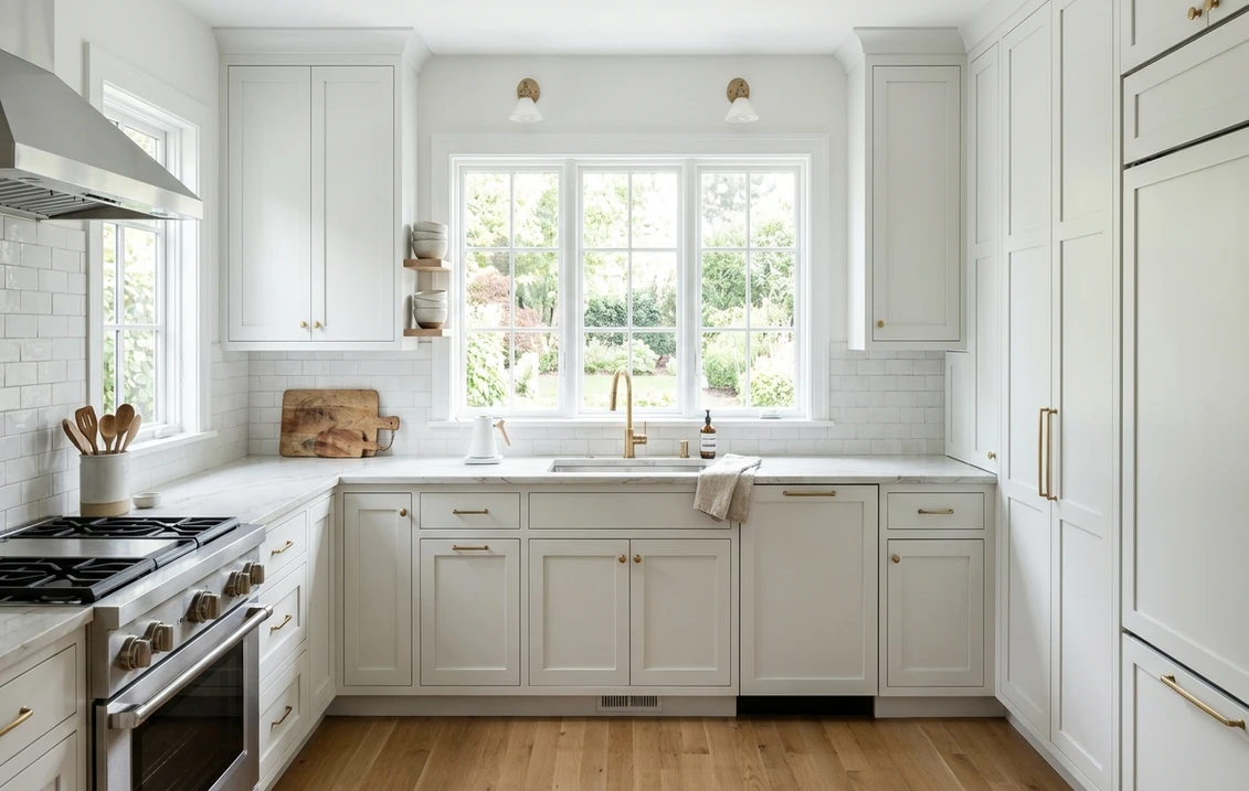
- Modern kitchens: on Shaker cabinets and walls together it delivers the bright, gallery-clean look that warm creamy whites cannot, especially with black hardware and stone counters.
- Contemporary whole-home schemes: as an all-over wall and trim white it creates a calm, cohesive envelope for art, plants, and furniture.
Where to be careful: in a windowless or deeply north-facing room, the cool gray base can tip Extra White toward flat and cold, so bring in warm wood, brass, or natural linen to balance it. And next to a warm cream white it looks noticeably colder, so commit to one temperature of white per sightline.
Free AI visualizer: test Extra White on cabinets, trim, or full walls before you buy a sample.
Trim, ceiling, and decor that keep it crisp
Extra White is so often the trim itself that pairing it is really about what goes beside it when it is on the walls. The goal is to protect its clean, cool character:
- Monochromatic trim: Extra White on both walls and trim, changing only the sheen, gives a seamless, architectural look that is hard to get wrong.
- For a brighter frame: to make trim pop against Extra White walls, step up to High Reflective White (SW 7757, LRV 93); the extra brightness reads as crisp and intentional rather than mismatched.
- Ceiling: a flat white overhead, or the same Extra White in a ceiling finish, keeps the room bright and cohesive. Avoid a warm cream ceiling, which makes the cool walls look gray.
- Deeper coordinating tones: Extra White loves contrast. Black or charcoal hardware, a deep navy accent wall, and cool mid-grays all sharpen it. For a softer companion white elsewhere in the home, SW Snowbound (SW 7004) steps down gently without clashing.
- Decor and finishes: marble, chrome, nickel, glass, and cool grays play to its clean side; white oak, walnut, and unlacquered brass add the warmth that keeps it from feeling clinical. Skip heavy yellow-beige tones, which fight its temperature.
Extra White vs the colors people cross-shop
Nobody samples a white in isolation, and Extra White has one rival it is almost always weighed against, plus a couple of others on the shortlist:
- vs SW Pure White (SW 7005): the great Sherwin-Williams white debate. Pure White is a touch softer and warmer, with a barely-there greige that makes it more forgiving; Extra White (LRV 86) is cooler, crisper, and cleaner than Pure White (LRV 84). Choose Pure White for an easygoing, warm-leaning white; choose Extra White for crisp and modern. See the softer sibling in our SW Pure White undertones and rooms guide, and the complete head-to-head in Pure White vs Extra White: the clean-white duel.
- vs SW High Reflective White (SW 7757): the brighter, starker option. At LRV 93 it is closer to a pure snow white with more glare; Extra White is softer and easier to live with over large areas. Pick High Reflective White for a true stark white, Extra White for clean without the clinical edge.
- vs BM Chantilly Lace (OC-65): the standard Benjamin Moore cross-shop. It sits in the same crisp, cool, clean territory and reads a touch brighter. In many rooms they land very close, and the deciding factors are usually your trim, existing whites, and which brand your painter prefers.
- vs Behr Ultra Pure White (PR-W15): the big-box benchmark, and on published figures the brightest name on this shortlist at LRV 94, a point above even High Reflective White. Its undertone is close to nil, so where Extra White still shows a faint gray cast across a full wall, Ultra Pure White stays flat and neutral. The room-by-room breakdown is in our Behr Ultra Pure White PR-W15 profile.
How to test Extra White before you commit
Whites are the hardest colors to judge, because they borrow the temperature of everything around them. The fan-deck chip is too small to show how Extra White reads across a whole wall, and store lighting near 4000K flatters it in a way your home may not. The reliable method: a large peel-and-stick sample on two walls, checked mid-morning, mid-afternoon, and after dark under your normal bulbs, always held against your existing trim and any warm-toned flooring, which decide whether Extra White looks clean or cold. The faster first pass is digital: upload a photo of your room and apply Extra White next to a warmer white (Pure White) and a starker one (High Reflective White). Seeing the three side by side under your own light settles in two minutes what sample pots settle in a week.
Preview Extra White beside a warmer and a starker white under your real light, free.
Frequently asked questions
Is Sherwin-Williams Extra White warm or cool?
Cool. Extra White (SW 7006) is a crisp, clean white with a subtle gray undertone and no warm cream or yellow, which is why it reads as simply white in most light. That cool base keeps it from going ivory under warm bulbs, but it can feel slightly steely in dim or north-facing rooms. It is one of the most popular cool whites Sherwin-Williams makes.
What is the LRV of SW Extra White?
Extra White has a Light Reflectance Value of 86, placing it in the bright, high-reflectance band. It bounces plenty of light back into a room and keeps a space feeling open and airy. It sits just below Sherwin-Williams High Reflective White (LRV 93), so it is clean and bright without the stark glare of a pure snow white.
What is the difference between Extra White and Pure White?
They are the two whites Sherwin-Williams shoppers most often compare. Pure White (SW 7005, LRV 84) is a touch softer and slightly warmer, with a barely-there greige that makes it forgiving and cozy. Extra White (SW 7006, LRV 86) is cooler, crisper, and cleaner. Choose Pure White for a warm-leaning, easygoing white; choose Extra White for a crisp, modern look.
Is Extra White a good trim and ceiling color?
Yes, it is one of the most specified trim and ceiling whites in the country. Its clean, cool character stays consistent against almost any wall color, giving a room crisp modern edges, and its LRV of 86 reflects light well overhead to keep ceilings feeling bright and tall. For walls painted in Extra White, you can run the same color on the trim for a seamless look, or step up to High Reflective White (SW 7757) for a brighter frame.
See SW Extra White under your real light, beside a warmer and a starker white, before you buy.
Disclaimer: Sherwin-Williams and SW 7006 Extra White are trademarks of The Sherwin-Williams Company. Benjamin Moore is a trademark of its respective owner. FacadeColorizer is an independent paint visualization service and is not affiliated with, endorsed by, or sponsored by Sherwin-Williams or Benjamin Moore. Screen color approximates the manufacturer's sample; always confirm with a physical sample before purchase. Sources: Sherwin-Williams SW 7006 Extra White color data 2026, Sherwin-Williams Pure White SW 7005, Snowbound SW 7004 and High Reflective White SW 7757 color data, Benjamin Moore Chantilly Lace OC-65 color data, The Spruce paint undertone references, and designer notes on cool whites.
Trademarks mentioned (Sherwin-Williams, Benjamin Moore, Behr, Caparol, Brillux, Sto, Alpina, Valspar, PPG, Glidden, Dulux, Crown Trade, Sandtex, Farrow & Ball, Johnstone's, Leyland) are property of their respective owners. FacadeColorizer is independent and not affiliated with any of them. Nominative fair use under Lanham Act §1125.