
You sample Sherwin-Williams Balanced Beige (SW 7037) on the hallway wall expecting a safe, do-nothing tan, and instead it warms the whole room like a cup of weak coffee with a splash of cream. That is the appeal: Balanced Beige is a true greige, a beige-gray hybrid, but unlike the cooler greiges everyone defaults to, it keeps a soft taupe-pink warmth that reads cozy instead of clinical. It is the color people reach for when Agreeable Gray feels too gray and a flat builder beige feels too yellow.
This profile is for the homeowner deciding whether Balanced Beige is the right warm neutral for an open main floor: how its undertones behave, the published LRV and hex, the rooms it suits, the trim and wood tones that flatter it, and how it differs from the three greiges shoppers always line it up against. It is one of the warm neutrals in our wider Sherwin-Williams interior paint colors guide, and you can see where it ranks in our best interior paint colors for 2026 roundup.
Upload one photo and preview SW Balanced Beige under your room's actual light in about 30 seconds, free.
The numbers behind Balanced Beige SW 7037
Start with the published data; these figures predict the wall better than any fan-deck chip. They come from the Sherwin-Williams color tools:
| Spec | Value |
|---|---|
| SW code | SW 7037 Balanced Beige |
| HEX (screen approximation) | #C3B3A1 |
| RGB approximation | 195, 179, 161 |
| LRV (Light Reflectance Value) | 37 |
| Hue family | Warm greige (beige-gray) with a taupe-pink base |
| Closest SW cousins | Accessible Beige (SW 7036), Realist Beige (SW 6078), Perfect Greige (SW 6073) |
Sources: Sherwin-Williams SW 7037 Balanced Beige color data, retrieved 2026; The Spruce paint undertone references.
The LRV of 37 is the part most people misjudge. That is a genuine mid-tone, well below the lighter neutrals it gets cross-shopped against. Balanced Beige reflects far less light than its own sibling Accessible Beige (LRV 58), which is why it reads noticeably deeper and cozier on the wall, and why it can feel heavy in a dim, north-facing room with little natural light. Think of it as a color with real body, not a pale greige that disappears. If you want that same family but lighter and airier, the SW Accessible Beige profile walks through the brighter end of the range.
The undertones: warm taupe with a quiet pink
Balanced Beige is a greige, which by definition means it sits between beige and gray. What sets SW 7037 apart from the cooler greiges is the direction it leans when light hits it. Three undertones do the work:
- The dominant taupe. The gray side keeps it grounded and modern, so it never tips into the dated golden-tan territory of 1990s builder beige. This is what makes it read as "greige" rather than "beige."
- The warm beige base. Underneath the gray is a real warmth, so even in cool light it holds onto a soft, inviting cast instead of going flat or cold. This is the trait that wins people over.
- The pink whisper. The undertone that catches some people off guard: in strong warm light, Balanced Beige can show a faint mauve or rosy taupe cast, especially next to a cool gray. It is subtle, but it is why this greige feels softer and a little pinker than a strictly gray-taupe neutral.
That pink whisper is the make-or-break trait. If you love a warm, soft envelope, it is exactly what you want. If you are after a crisp, cool gray-greige, Balanced Beige will read too rosy and you are better off one or two doors over. Because the warmth is built in, Balanced Beige holds its character across orientations more steadily than a finely balanced color like Sea Salt does, as the interior color families guide explains. Typical behavior across the four Northern Hemisphere orientations:
| Room orientation | Daylight character | How Balanced Beige reads |
|---|---|---|
| South-facing | Warm, abundant midday light | Warmest and most flattering, a rich taupe-greige; the pink can show late day |
| West-facing | Cool by day, very warm at sunset | Balanced greige by day, glowing and slightly rosy at golden hour |
| East-facing | Warm early sun, neutral later | Warm taupe in the morning, settling to a steady greige by afternoon |
| North-facing | Cool, indirect, no direct sun | Grayest and deepest version; warmth recedes, can feel a touch dim given LRV 37 |
Sources: American Institute of Architects daylight reference; Sherwin-Williams SW 7037 color data; designer field notes on greige undertones.
The practical takeaway: Balanced Beige is at its best in south, east, and west rooms with decent natural light, where the warmth has something to play off. In a true north room with limited windows, the mid LRV plus the receding warmth can make it feel darker and grayer than the chip promised; in those spaces a lighter greige is often the safer call. For a neutral that holds far steadier under cool light, the predictable counterpoint is our SW Repose Gray profile.
The rooms Balanced Beige was made for
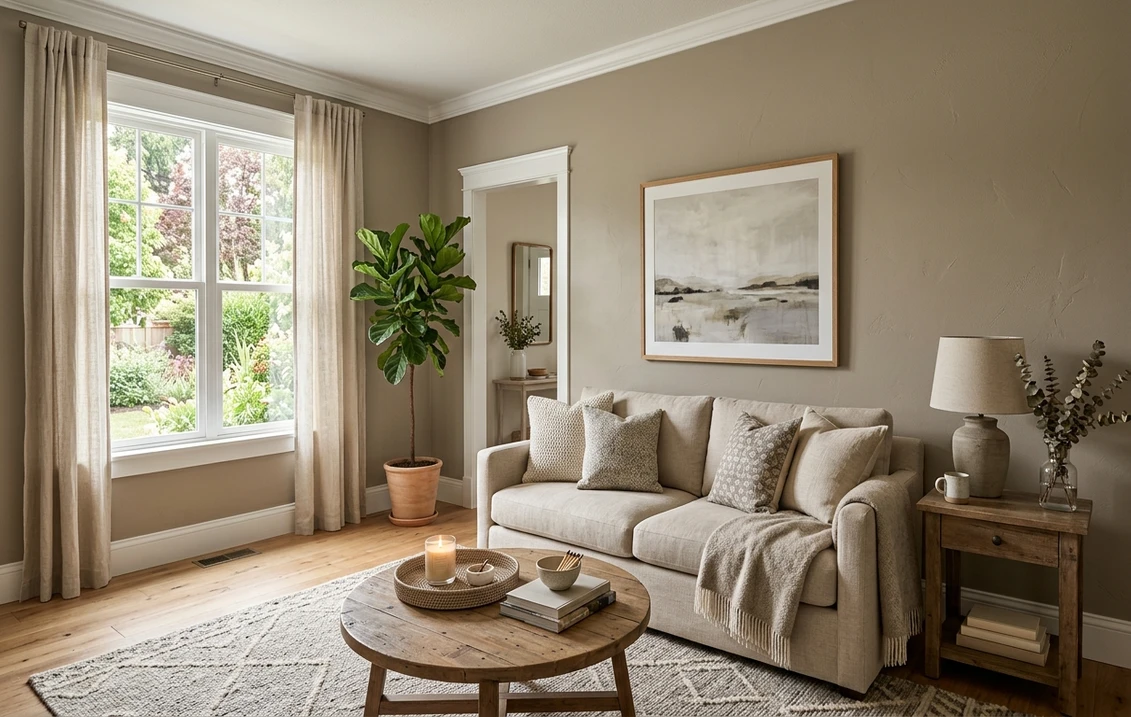
Balanced Beige is a whole-home warm neutral, and its mid-depth body makes it especially good in spaces where you want enveloping warmth rather than bright airiness:
- Living rooms and family rooms: the signature use. The warmth makes a large open space feel cozy and grounded, and it flatters warm wood furniture, leather, and natural fibers without fighting them.
- Open-plan main floors: its taupe-greige neutrality flows from room to room and pairs cleanly with both white and off-white trim, which is why it is a popular whole-floor pick. The mid LRV gives the connected spaces a settled, lived-in feel.
- Hallways and stairwells: a transitional zone benefits from a color with body. Balanced Beige hides scuffs better than a pale white and adds warmth to spaces that usually get none.
- Bedrooms: the soft warmth reads restful and cocooning, especially in a room with warm-light lamps and natural linens.
- Beige bathrooms: on a vanity wall or a powder room it gives a warm, spa-adjacent base; our beige bathroom paint ideas show how to keep it from going flat with the right tile and fixtures.
Where to be careful: a small, windowless room or a dark north-facing space can let the LRV 37 close in, so test before committing the whole room. And rooms loaded with cool-gray flooring or icy LED downlights can pull the warmth out and leave the greige looking muddy. Our interior house painting cost guide covers what a whole-floor repaint should run.
Free AI visualizer: test Balanced Beige in a living room, hallway, or bedroom before you buy a sample.
Trim, ceiling, and decor that flatter it
Because Balanced Beige is a mid-tone warm greige, the white beside it should be warm too. A stark, blue-white trim will make the wall look dingy and overemphasize the pink; a soft warm white frames it cleanly. The reliable Sherwin-Williams pairings:
- Best all-around trim: Sherwin-Williams Alabaster (SW 7008, LRV 82). A soft, creamy warm white that sits in the same temperature family, so it frames Balanced Beige without making it look gray or rosy. The default designer pairing for this color.
- For more contrast: SW Pure White (SW 7005, LRV 84). Brighter and only faintly warm, it gives a crisper trim line while still staying warm enough not to clash. Good when you want the woodwork to pop.
- Ceiling: a flat warm white (Alabaster at 25 percent, or a clean white) keeps the room feeling tall. Given the mid LRV, a bright ceiling helps the room stay open.
- Deeper coordinating tones: for an accent wall, island, or built-in, SW Urbane Bronze (SW 7048) or a soft black like SW Iron Ore (SW 7069) reads as a natural warm step down. A warm white-oak floor is the ideal companion.
- Decor and finishes: warm woods, leather, brass and aged bronze hardware, and natural fibers all flatter it. Cool chrome, icy gray flooring, and pure-white blue-based linens drag it toward muddy.
To layer Balanced Beige across a home, the easiest companions are its own family members and a warm gray; our profiles of SW Agreeable Gray and SW Accessible Beige both flow naturally beside it as a lighter open-concept partner.
Balanced Beige vs the greiges people cross-shop
Balanced Beige has three close greige relatives shoppers always line it up against, and the differences are subtle enough that the wrong sample costs a weekend. Here is how SW 7037 separates from each:
- vs SW Accessible Beige (SW 7036): the most common cross-shop, and the lighter sibling. Accessible Beige sits at LRV 58 against Balanced Beige's 37, so it reads noticeably lighter, airier, and a touch grayer. Balanced Beige is the deeper, warmer, cozier of the two. Choose Accessible Beige for a bright open floor; choose Balanced Beige when you want more enveloping warmth and depth.
- vs SW Realist Beige (SW 6078): the closest match in depth, also a mid-tone greige. Realist Beige runs a hair more gray and slightly cooler, with less of the pink whisper that Balanced Beige shows. If you want the same body but a more neutral, less rosy read, Realist Beige is the pick; if you want the extra warmth, stay with Balanced Beige.
- vs SW Perfect Greige (SW 6073): darker and more clearly purple-leaning. Perfect Greige (LRV around 35) is similar in depth but its violet undertone is stronger and shows up faster in cool light, where Balanced Beige's warmth stays more taupe. Perfect Greige is the moodier, more dramatic option; Balanced Beige is the friendlier, warmer everyday neutral.
The short version: Balanced Beige is the warmest and pinkest of the four, Accessible Beige the lightest, Realist Beige the most neutral at the same depth, and Perfect Greige the moodiest and most purple. If you are also weighing Sherwin-Williams against another brand for coverage and finish, the full Sherwin-Williams vs Benjamin Moore interior comparison covers how the two lines wear.
Indoors versus on the facade
Greiges in this family pull double duty as exterior colors, and the two projects are not the same. This page owns Balanced Beige indoors, on living-room and hallway walls, under your bulbs, framed by your trim. For the same warm-greige family on siding, stucco, and brick, with door colors and curb-appeal pairings, our sibling color Accessible Beige has a dedicated SW Accessible Beige exterior guide. Complementary, not duplicates: this one for the rooms, that one for the curb.
How to test Balanced Beige before you commit
Balanced Beige is a color where the pink whisper either delights you or bothers you, and a 3-inch fan-deck chip cannot tell you which. Under store light near 4000K the chip lands on a neutral taupe that may hide the warmth you will get at home. The reliable method is a large peel-and-stick sample (Sherwin-Williams sells one) taped to at least two walls and checked mid-morning, mid-afternoon, and after dark under your normal bulbs; the after-dark warm-light read is where the pink shows most, and the north-wall read is where the gray takes over. The faster, no-paint first pass is a digital visualizer: upload a photo of the room and apply Balanced Beige beside a lighter alternative (Accessible Beige) and a more neutral one (Realist Beige) to see which way your light pulls it, ruling out the colors that were never going to work.
Preview Balanced Beige beside a lighter and a more neutral greige under your real light, free.
Frequently asked questions
What undertones does SW Balanced Beige have?
Balanced Beige (SW 7037) is a warm greige built on a taupe base, with a real beige warmth underneath and a quiet pink or mauve whisper that can show in strong warm light. The gray side keeps it modern so it never reads as dated golden builder beige, while the warmth keeps it cozy rather than cold. That faint rosy cast is the trait to test for: it is subtle, but it is what makes Balanced Beige softer and warmer than a strictly gray-taupe neutral.
What is the LRV of SW Balanced Beige?
Balanced Beige has a Light Reflectance Value of about 37, a genuine mid-tone. That gives it real body on the wall, far deeper and cozier than its lighter sibling Accessible Beige (LRV 58). The mid LRV is why Balanced Beige feels enveloping in a sunny room, and why it can feel a touch dim in a dark north-facing space with limited natural light. Plan for a bright ceiling and warm bulbs to keep a low-light room open.
What trim color goes with Balanced Beige?
SW Alabaster (SW 7008, LRV 82) is the most reliable trim pairing. It is a soft creamy warm white in the same temperature family, so it frames Balanced Beige cleanly without making it look gray or overly pink. For crisper contrast use SW Pure White (SW 7005), which is brighter but still warm enough not to clash. Avoid a stark blue-white trim, which makes the greige look dingy and pushes the pink forward.
What is the difference between Balanced Beige and Accessible Beige?
They are siblings, but Accessible Beige (SW 7036) is the lighter, airier, slightly grayer one at LRV 58, while Balanced Beige (SW 7037) is deeper and warmer at LRV 37 with a faint pink whisper. Use Accessible Beige for a bright, open main floor; use Balanced Beige when you want more enveloping warmth and depth. They share a family, so they can be used together, with Accessible Beige as the lighter open-concept partner.
See SW Balanced Beige under your real light, beside a lighter and a more neutral greige, before you buy.
Disclaimer: Sherwin-Williams and SW 7037 Balanced Beige are trademarks of The Sherwin-Williams Company. Benjamin Moore and Behr are trademarks of their respective owners. FacadeColorizer is an independent paint visualization service and is not affiliated with, endorsed by, or sponsored by Sherwin-Williams, Benjamin Moore, or Behr. Screen color approximates the manufacturer's sample; always confirm with a physical sample before purchase. Sources: Sherwin-Williams SW 7037 Balanced Beige color data 2026, Sherwin-Williams Accessible Beige SW 7036, Realist Beige SW 6078, Perfect Greige SW 6073, Alabaster SW 7008 and Pure White SW 7005 color data, The Spruce paint undertone references, and designer field notes on greige undertones.
Trademarks mentioned (Sherwin-Williams, Benjamin Moore, Behr, Caparol, Brillux, Sto, Alpina, Valspar, PPG, Glidden, Dulux, Crown Trade, Sandtex, Farrow & Ball, Johnstone's, Leyland) are property of their respective owners. FacadeColorizer is independent and not affiliated with any of them. Nominative fair use under Lanham Act §1125.


