
Sherwin-Williams named Redend Point (SW 9081) its Color of the Year for 2023, and the reaction split the room. Half of people saw a sophisticated, earthy mauve. The other half saw "pink" and backed away. Both are looking at the same paint, and both are partly right: Redend Point is a muddy, grounded rose-mauve built on a sandy brown base, the kind of color that reads as a warm neutral in one room and as a soft blush in another. It is not the saccharine pink that name worried people about, and it is not a true beige either. It sits in the gap between the two, which is exactly why it works on a whole wall where a clearer pink never could.
This profile is for the homeowner deciding whether Redend Point belongs on their walls: how its mauve, brown, and gray undertones trade places, the published LRV, the rooms it flatters, and the trim and decor that keep it looking intentional instead of "did the nursery leak." It is one of the warm earth tones in our wider Sherwin-Williams interior paint colors guide, and you can see where it ranks against the year's other favorites in our best interior paint colors for 2026 roundup.
Upload one photo and preview SW Redend Point under your room's actual light in about 30 seconds, free.
The numbers behind Redend Point SW 9081
Start with the published data; these figures predict the wall far better than guessing from the name. They come from the Sherwin-Williams color tools:
| Spec | Value |
|---|---|
| SW code | SW 9081 Redend Point |
| HEX (screen approximation) | #B79A8E |
| RGB approximation | 183, 154, 142 |
| LRV (Light Reflectance Value) | 43 |
| Distinction | Sherwin-Williams Color of the Year 2023 |
| Hue family | Earthy mauve-rose on a sandy brown base, a warm muted neutral |
| Closest SW cousins | Roycroft Rose (SW 0027), Quartzite (SW 6250), Malted Milk (SW 6057) |
Sources: Sherwin-Williams SW 9081 Redend Point color data and 2023 Color of the Year announcement, retrieved 2026; The Spruce paint undertone references.
The LRV of 43 is the number that should reset your expectations. At 43, Redend Point is a true mid-tone: it is not a pale, barely-there blush you can drown a room in, and it is not a deep, dramatic accent either. It sits squarely in the middle of the scale, which means it has real presence on a wall but still bounces enough light to keep a room from going cave-like. For comparison, a soft greige like SW Accessible Beige reads much lighter and recedes; Redend Point steps forward and gives a room an enveloping, hand-built feel. That mid-LRV is the whole reason it can carry a dining room or a bedroom wall to wall without overwhelming it.
Three undertones taking turns
Redend Point is what designers call a "muddy" color, meaning it carries more than one pigment direction at once, which is why two people describe it so differently. There are three forces inside it, and the room's light decides which one leads:
- The mauve-rose read. Under warm light (direct sun or a 2700K bulb) the rose pigment lifts and Redend Point reads as a soft, dusty mauve. This is the "blush" version that surprises beige shoppers, but it stays grounded rather than sweet because the brown base mutes it.
- The brown-taupe read. In balanced or moderate light the sandy brown base takes the lead and Redend Point behaves like a warm clay or dusty taupe, closer to a true neutral than a color. This is the read that lets it work as a sophisticated whole-room wall.
- The gray-purple read. Under cool or indirect light (a north window, an overcast day, a 4000K-plus LED) the warmth drains and a cooler purple-gray surfaces, making Redend Point look grayer and dustier, almost like a smoky mauve-gray.
None of these is the "wrong" Redend Point; they are all the same paint behaving as designed. The skill is deciding which read you want to dominate, then steering the light toward it. Because the pigment load is muted rather than clean, Redend Point shifts noticeably with orientation, more than a committed beige but less wildly than a color-shifting green. The interior color families guide explains why muddy mid-tones behave this way. Typical behavior across the four Northern Hemisphere orientations:
| Room orientation | Daylight character | How Redend Point reads |
|---|---|---|
| South-facing | Warm, abundant midday light | Warmest and rosiest, a glowing dusty mauve-clay |
| West-facing | Cool by day, very warm at sunset | Brown-taupe by day, rich rose glow late afternoon |
| East-facing | Warm early sun, neutral later | Rosy in the morning, settling to warm taupe by afternoon |
| North-facing | Cool, indirect, no direct sun | Coolest and grayest, leans smoky mauve-gray, can look dusty |
Sources: American Institute of Architects daylight reference; Sherwin-Williams SW 9081 color data; designer field notes on muted earth tones.
Want the cozy, glowing version? Put Redend Point in a south, east, or west room and lean warm with your bulbs. A north-facing room is where it most often surprises people, the rose you expected goes quiet and a cooler gray-mauve takes over, which can be lovely and moody or can read flat if the bulbs are also cool. If you want the steadier, less shifty neutral beside it, the greiges hold their ground; our profile of SW Accessible Beige is the predictable warm counterpoint.
The rooms Redend Point was made for
Redend Point rewards rooms where you want warmth, intimacy, and a hand-crafted feel. Its mid LRV and earthy character steer it toward spaces meant to feel cocooning rather than bright:
- Dining rooms: the standout use. The enveloping mauve-clay flatters skin tones under candlelight and warm bulbs, makes wood furniture glow, and gives a formal room a modern, grounded warmth that a beige never delivers.
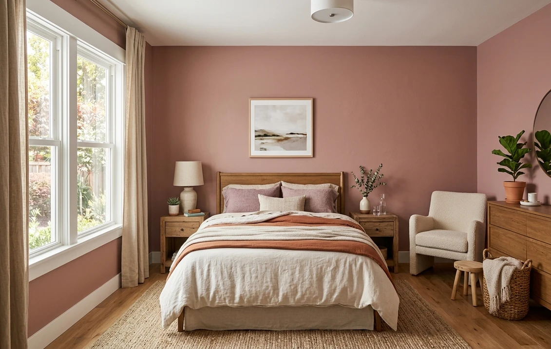
- Bedrooms: genuinely restful. The muted rose is soothing without being girly, and it layers beautifully under cream, oatmeal, and rust-toned bedding with light or medium wood.
- Powder rooms and small baths: a small windowless space is the perfect place to commit fully. The mid-tone wraps a powder room in warmth, and it looks expensive against brass or matte-black fixtures.
- Studies, libraries, and accent walls: as a single feature wall behind a bed or in an office, Redend Point adds depth without the heaviness of a true dark color. On built-ins or a fireplace surround it reads custom and collected. For the cabinetry and built-in finish call, our Sherwin-Williams vs Benjamin Moore interior comparison covers how the two brands' paints wear.
Where to be careful: a bright, north-lit kitchen or a kid's room can pull Redend Point toward its cooler, grayer side where some people read it as muddy or "Band-Aid" toned, so those are the rooms to sample hardest. And in a wide-open great room flooded with cool daylight, wall to wall can feel like a lot of warm color; many designers use it on one wall or below a chair rail there instead. Our interior house painting cost guide covers what the repaint should run before you commit a whole room.
Free AI visualizer: test Redend Point in a dining room, bedroom, or powder room before you buy a sample.
Trim, ceiling, and decor that keep it intentional
Because Redend Point is a warm, slightly dusty color, the white beside it decides whether it reads "designer earth tone" or "old pink." Warm and creamy whites win; stark cool whites can make the mauve look chalky:
- Best all-around trim: Sherwin-Williams Alabaster (SW 7008, LRV 82). Its soft, creamy warmth flatters Redend Point and keeps the rose looking rich rather than washed out. The default designer pairing for this color.
- For a crisper look: SW Greek Villa (SW 7551, LRV 84). Slightly brighter than Alabaster but still warm, it gives a little more contrast without going icy or making the mauve look chalky.
- Avoid: a stark blue-white trim. Cool whites fight the warm base and can pull Redend Point toward its grayest, dustiest read.
- Ceiling: a soft white keeps the room open. In a small powder room or cocoon-style bedroom, painting the ceiling the same Redend Point can look luxurious and enveloping.
- Deeper coordinating tones: for an accent, a built-in, or a moody pairing, SW Roycroft Rose (SW 0027) steps deeper in the same rose family, while a warm green like SW Pewter Green (SW 6208) or a soft black like SW Tricorn Black (SW 6258) makes a striking, grounded contrast.
- Decor and finishes: brass and warm gold, matte black, terracotta and rust, caramel leather, and warm woods (walnut, oak) all flatter it. Cool chrome, gray-washed floors, and heavy cool grays drag it toward dingy.
To ground a Redend Point scheme with a steadier neutral in adjoining rooms, the greiges flow best beside a warm mauve; our profiles of SW Accessible Beige and SW Agreeable Gray both transition cleanly out of a Redend Point room and keep the hallway or open-plan flow calm.
Redend Point vs the colors people cross-shop
Redend Point has a few near-twins shoppers line up against it, and knowing the difference saves a wrong sample:
- vs SW Roycroft Rose (SW 0027): the closest in family but clearly deeper and more saturated. Roycroft Rose, from the historic preservation palette, reads as a true dusty rose-brown with more pigment and a moodier, vintage feel. Redend Point is lighter (LRV 43 vs the deeper Roycroft Rose), more muted, and reads as a soft neutral where Roycroft Rose reads as a defined color. Choose Redend Point for a wall that whispers earth tone; choose Roycroft Rose when you want the rose to be unmistakable.
- vs SW Quartzite (SW 6250): often cross-shopped because both can read mauve-gray, but they lean opposite ways. Quartzite is a cooler, grayer purple-leaning neutral with far less warmth, so it stays in the gray-violet zone in almost any light. Redend Point carries a warm sandy brown base that gives it that rosy, clay glow. If your room runs cool and you want a quiet purple-gray, Quartzite holds steadier; if you want warmth and movement, Redend Point delivers it.
- vs SW Malted Milk (SW 6057): a useful contrast if you fear the pink. Malted Milk is a pinkish beige that stays much closer to a neutral tan and almost never reads as a color. Redend Point is a full step rosier and deeper. Sample Malted Milk if Redend Point feels like too much mauve, and Redend Point if Malted Milk feels too safe.
Worth flagging: because Redend Point was such a high-profile Color of the Year, many brands published "matches," and the closest Benjamin Moore cross-shop is usually a muted mauve like Cinnamon Slate (2113-40), which runs deeper and more purple. They are relatives, not duplicates; confirm the brand and code before sampling. We untangle the differences in formula, coverage, and finish in the full Sherwin-Williams vs Benjamin Moore interior comparison.
How to test Redend Point before you commit
Redend Point is the textbook color where a 3-inch fan-deck chip will mislead you, because the chip is too small to show whether the mauve, the brown, or the gray will win in your room. Viewed under store light near 4000K, the chip lands on a balanced taupe-mauve that may be none of the three reads you get at home. The reliable method is a large peel-and-stick sample (Sherwin-Williams sells one) taped to at least two walls and checked in the morning, mid-afternoon, and after dark under your normal bulbs; the night-time, warm-bulb read is the rosy version you will live with most evenings, and the daytime north-wall read is where the dusty gray-mauve shows up. The faster, no-paint first pass is a digital visualizer: upload a photo of the room and apply Redend Point beside a deeper alternative (Roycroft Rose) and a cooler one (Quartzite) to see which way your light pulls it, ruling out the colors that were never going to work before you spend a cent on samples.
Preview Redend Point beside a deeper and a cooler alternative under your real light, free.
Frequently asked questions
Is Redend Point pink, mauve, or brown?
It is a muted blend of all three, which is why people describe it so differently. Redend Point (SW 9081) is an earthy mauve-rose built on a sandy brown base. In warm light the rose-mauve lifts and it reads as a soft dusty blush; in balanced light the brown base leads and it behaves like a warm clay-taupe; in cool north light it goes grayer and reads as a smoky mauve-gray. The brown base keeps it from ever looking like a clean, sweet pink, which is why it works on a whole wall.
What is the LRV of SW Redend Point?
Redend Point has a Light Reflectance Value of 43, a true mid-tone. That is dark enough to give a room real warmth and an enveloping, cocooning feel, but light enough that it still bounces a fair amount of light and does not read as a deep or dramatic color. It is the LRV that lets Redend Point carry a dining room or bedroom wall to wall without the room going cave-like.
What trim color goes with Redend Point?
Sherwin-Williams Alabaster (SW 7008, LRV 82) is the most reliable trim pairing. Its soft, creamy warmth flatters the mauve and keeps Redend Point looking rich rather than chalky. For a slightly crisper, brighter frame that stays warm, use Greek Villa (SW 7551). Avoid a stark blue-white trim, which fights the warm base and can pull Redend Point toward its grayest, dustiest read.
What rooms look best in Redend Point?
Dining rooms, bedrooms, powder rooms, and studies are where Redend Point shines. Its mid LRV and earthy warmth create an intimate, hand-crafted feel that flatters skin tones under warm light and makes wood and brass glow. It is riskiest in bright, cool, north-lit rooms like some kitchens, where it can drift toward a muddy gray-mauve, so sample those spaces hardest before committing.
See SW Redend Point under your real light, beside a deeper and a cooler alternative, before you buy.
Disclaimer: Sherwin-Williams and SW 9081 Redend Point are trademarks of The Sherwin-Williams Company. Benjamin Moore and Behr are trademarks of their respective owners. FacadeColorizer is an independent paint visualization service and is not affiliated with, endorsed by, or sponsored by Sherwin-Williams, Benjamin Moore, or Behr. Screen color approximates the manufacturer's sample; always confirm with a physical sample before purchase. Sources: Sherwin-Williams SW 9081 Redend Point color data and 2023 Color of the Year announcement 2026, Sherwin-Williams Alabaster SW 7008 and Greek Villa SW 7551 color data, Roycroft Rose SW 0027 and Quartzite SW 6250 color data, The Spruce paint undertone references, and designer field notes on muted earth tones.
Trademarks mentioned (Sherwin-Williams, Benjamin Moore, Behr, Caparol, Brillux, Sto, Alpina, Valspar, PPG, Glidden, Dulux, Crown Trade, Sandtex, Farrow & Ball, Johnstone's, Leyland) are property of their respective owners. FacadeColorizer is independent and not affiliated with any of them. Nominative fair use under Lanham Act §1125.


