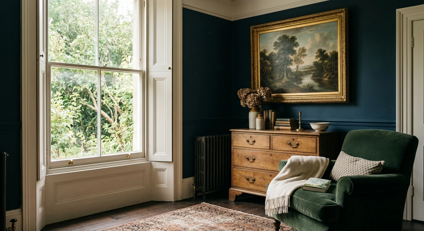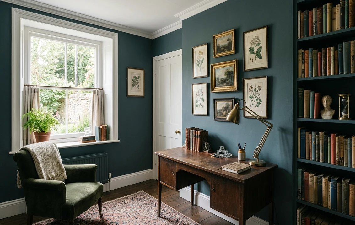

You paint a sample of Farrow & Ball Inchyra Blue (No.289) on the dining room wall at noon and see a smoky teal. You walk back in at dusk and it has gone almost black, with a quiet green-gray cast in the shadows. That is not a trick of memory. Inchyra Blue is one of the most chameleon-like deep colors Farrow & Ball makes, a blue that carries teal and gray in equal measure and swings dramatically with the light. It is the reason designers reach for it when they want a room that feels different in the morning than it does over dinner.
This profile is for the homeowner who already loves the idea of a deep, moody Inchyra Blue room: how its undertones trade places, the published Light Reflectance Value, the rooms it suits, and the trim and coordinating colors that keep it elegant instead of flat. It is one of the darks in our wider Farrow & Ball paint colors guide for 2026, and it shares a moody temperament with our profile of Benjamin Moore Aegean Teal.
Upload one photo and preview Inchyra Blue under your room's actual light in about 30 seconds, free.
The numbers behind Inchyra Blue No.289
Start with the published data; with a deep color like this, the LRV predicts how the room will feel better than any small sample card. These figures come from the Farrow & Ball color tools:
| Spec | Value |
|---|---|
| F&B name and number | Inchyra Blue No.289 |
| HEX (screen approximation) | #46545A |
| RGB approximation | 70, 84, 90 |
| LRV (Light Reflectance Value) | 17 |
| Hue family | Deep blue with strong teal and a soft gray base |
| Closest F&B relatives | Hague Blue (No.30), Stiffkey Blue (No.281), De Nimes (No.299) |
Sources: Farrow & Ball Inchyra Blue No.289 color data, retrieved 2026; designer field notes on deep blue-teal paints.
The LRV of 17 is the figure to respect. That is a genuinely dark color: it reflects only about 17 percent of the light that hits it, so it will eat light in a dim room and turn nearly black after sunset. That is the point of Inchyra Blue, not a flaw, but it means it asks for either generous daylight or a deliberate, candlelit-dinner kind of mood. For comparison, a deep navy like our SW Naval profile sits even lower at LRV 5, while a true mid-tone neutral lands near 50, which is why Inchyra Blue feels enveloping rather than airy.
Three undertones taking turns
What makes Inchyra Blue so beloved is that it is not a flat navy. It carries three pigment directions, a blue, a teal-green, and a soft gray, and which one dominates depends entirely on the light in the room at that moment.
- The teal read. In bright, direct daylight the green pigment surfaces and Inchyra Blue reads as a rich smoky teal, the dramatic, jewel-toned version most people fall for in photos.
- The blue read. Under cooler, indirect light the teal recedes and a deep ink-blue steps forward, closer to a classic navy but with more depth and softness than a primary navy.
- The near-black read. In low light, lamplight, or after dark, all the color drains down to the gray base and Inchyra Blue reads almost black, with only a faint blue-green glow in the highlights. This is the version you live with most evenings.
None of these is the "wrong" Inchyra Blue; they are all the same paint behaving as designed, which is exactly why it suits a room you use across the whole day. Because the undertones sit so close together, the direction a room faces moves Inchyra Blue more than it moves a flat navy. Typical behavior across the four Northern Hemisphere orientations:
| Room orientation | Daylight character | How Inchyra Blue reads |
|---|---|---|
| South-facing | Warm, abundant midday light | Brightest, tealest version; the smoky jewel-tone really shows |
| West-facing | Cool by day, very warm at sunset | Blue-gray by day, glowing warm teal in late-afternoon sun |
| East-facing | Warm early sun, neutral later | Teal in the morning, settling to deep blue-gray by afternoon |
| North-facing | Cool, indirect, no direct sun | Coolest and darkest; leans inky and near-black, very moody |
Sources: American Institute of Architects daylight reference; Farrow & Ball Inchyra Blue No.289 color data; designer field notes on color-shifting deep blues.
Want the teal you fell for? Put Inchyra Blue in a south or east room with strong daylight, and it will show its green side most. Want full drama? A north-facing study, dining room, or media room leans inky and near-black, which is where Inchyra Blue earns its reputation. Either way, plan your artificial light deliberately, because after dark the bulbs you choose decide whether the room glows warmly or goes cold and flat.
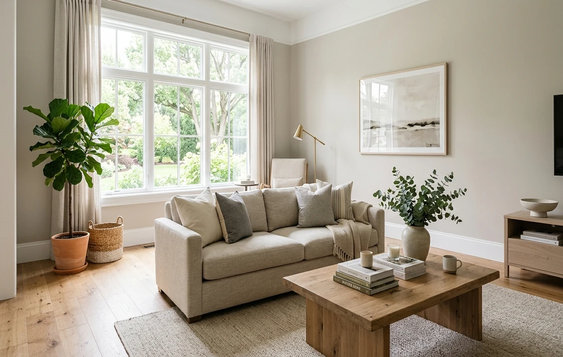
The rooms Inchyra Blue was made for
A color this deep is a statement, and it rewards rooms where atmosphere matters more than brightness. Its best uses:
- Dining rooms: the signature use. Inchyra Blue makes a dinner feel like an occasion, especially "color drenched" with walls, trim, and ceiling all the same shade, where it flatters candlelight, brass, and warm wood beautifully. See our elegant dining room paint colors guide for the drenched look.
- Studies, libraries, and home offices: the enveloping depth reads as focused and serious, and the teal side keeps it from feeling as severe as a pure navy or black.
- Bedrooms: for a cocooning, hotel-suite mood. Pairs with crisp white linens to balance the darkness, or go fully moody. Our dark moody bedroom ideas show how to keep it restful rather than heavy.
- Cabinetry and built-ins: stunning on kitchen islands, lower cabinets, a butler's pantry, or bookshelves, where the teal-blue reads custom and high-end against warm brass hardware and white uppers.
- Powder rooms: a small, low-light space is the perfect place to be bold; the near-black drama feels intentional rather than overwhelming in a room you pass through.
Where to be careful: a dim north-facing room with no good artificial light can let Inchyra Blue collapse into a flat, lifeless near-black, losing the teal entirely. And in a large, bright open-plan space it can feel like a great deal of dark color wall to wall, so many designers use it on a single feature wall, an island, or a built-in there. Test it under your evening bulbs, not just at noon.
Free AI visualizer: test Inchyra Blue in a dining room, study, or on cabinets before you buy a sample pot.
Trim, ceiling, and decor that keep it elegant
Because Inchyra Blue is so dark, the colors beside it decide whether the room reads sophisticated or stark. You have two clear directions: contrast it with crisp white, or drench the whole room in it.
- Crisp white trim: Farrow & Ball All White (No.2005) or a clean off-white gives sharp, traditional contrast that lets the teal-blue pop. The classic, lower-risk choice.
- Soft white trim: a warmer white such as F&B Wevet (No.273) or Strong White (No.2001) softens the contrast for a more relaxed, less graphic look.
- The drenched look: paint walls, trim, doors, and ceiling all in Inchyra Blue (often in different finishes) for a seamless, enveloping cocoon, currently the most fashionable way to use it in a dining room or study.
- Ceiling: a flat white opens the room; Inchyra Blue overhead deepens the drama but should be reserved for a room with real daylight or strong lighting.
- Decor and finishes: aged brass and antique gold, warm wood, natural rattan, and rich textiles in mustard, terracotta, blush, or warm cream all flatter it. Avoid pairing it only with cool chrome and cool grays, which can make it feel cold and dead.
For an accent or adjoining color that complements the teal side, warm earthy tones work hardest. If you want to build a fuller palette around the teal undertone, our guide to colors that go with teal covers the warm partners that keep a deep blue-teal feeling rich instead of chilly.
Inchyra Blue vs the colors people cross-shop
Inchyra Blue has two close Farrow & Ball relatives shoppers constantly line up against it, plus a popular American cross-shop. Knowing the difference saves a wasted sample pot:
- vs F&B Hague Blue (No.30): the most common mix-up. Hague Blue (LRV around 7) is a deeper, truer, more classic navy with very little teal in it. It reads as a rich dark blue all day and shifts far less. Choose Hague Blue for a deeper, more conventional navy that stays blue; choose Inchyra Blue for the teal-green movement and the slightly lighter, more atmospheric feel.
- vs F&B Stiffkey Blue (No.281): Stiffkey Blue (LRV around 11) is a deep blue with a violet-purple undertone, more of a true indigo. It leans warm-purple where Inchyra Blue leans cool teal-green. Side by side, Stiffkey looks distinctly more purple-navy and Inchyra distinctly more teal. Pick Stiffkey for a softer, ink-blue mood and Inchyra when you want that green-blue chameleon quality.
- vs Benjamin Moore Hale Navy (HC-154): the closest big-box American cross-shop. Hale Navy is a flatter, more straightforward dark navy that reads consistently and a little warmer; it shifts far less across the day than Inchyra Blue. Our Benjamin Moore Hale Navy profile covers it in full. Choose Hale Navy for a predictable, classic navy you can buy stateside; choose Inchyra Blue for the teal undertone and the dramatic light-driven shift.
The short version: Inchyra Blue is the teal-leaning chameleon of the deep blues. If a room mostly stays blue across the day, you wanted Hague Blue. If it leans purple, you wanted Stiffkey. If it never shifts at all, you wanted a flat navy like Hale Navy.
How to test Inchyra Blue before you commit
A deep color like Inchyra Blue is the textbook case where a small paper sample will mislead you, because dark colors look entirely different at scale and a 2-inch swatch cannot tell you how the whole room will feel. The reliable physical method is a large sample, ideally Farrow & Ball's peel-and-stick sample or a generous brushed patch, taped to at least two walls and checked at mid-morning, mid-afternoon, and after dark under your normal bulbs; the after-dark near-black is the version you live with most evenings. The faster, no-paint first pass is a digital visualizer: upload a photo of the room and apply Inchyra Blue beside a truer navy (Hague Blue) and a purpler one (Stiffkey Blue) to see which way your light pulls it, and to gut-check whether you really want a room this dark before you commit to several pots of paint.
Preview Inchyra Blue beside a truer navy and a purpler alternative under your real light, free.
Frequently asked questions
Is Farrow & Ball Inchyra Blue blue, teal, or black?
All three, depending on the light. Inchyra Blue (No.289) is a deep blue with strong teal-green and a soft gray base. In bright direct daylight the teal surfaces and it reads as a smoky teal; in cooler indirect light it reads as a deep ink-blue; and in low light or after dark it drains to near-black with only a faint blue-green glow. It is the same paint in every case, and the light decides which side you see.
What is the LRV of Inchyra Blue?
Inchyra Blue has a Light Reflectance Value of about 17, which makes it a genuinely dark color. It reflects only around 17 percent of the light that hits it, so it absorbs light and turns nearly black after sunset. That depth is its appeal, but it means the color wants either generous daylight or deliberate, well-planned artificial lighting; in a dim room with poor lighting it can collapse into a flat, lifeless near-black.
What is the difference between Inchyra Blue and Hague Blue?
Hague Blue (No.30) is deeper, around LRV 7, and a truer, more classic navy with very little teal, so it reads as a rich dark blue all day and shifts very little. Inchyra Blue (No.289, LRV about 17) is slightly lighter, carries a clear teal-green undertone, and changes dramatically with the light. Choose Hague Blue for a deeper conventional navy that stays blue; choose Inchyra Blue for the teal movement and the more atmospheric, chameleon quality.
What trim and decor colors go with Inchyra Blue?
For sharp contrast, pair Inchyra Blue with a crisp white trim such as Farrow & Ball All White; for a softer look, use a warmer off-white like Wevet or Strong White. The most fashionable approach is the drenched look, with walls, trim, and ceiling all in Inchyra Blue. For decor, aged brass, warm wood, rattan, and warm textiles in mustard, terracotta, blush, or cream flatter the teal side; avoid pairing it only with cool chrome and cool grays, which can make it feel cold.
See Inchyra Blue under your real light, beside a truer navy and a purpler alternative, before you buy.
Disclaimer: Farrow & Ball and Inchyra Blue No.289 are trademarks of Farrow & Ball Limited. Benjamin Moore is a trademark of its respective owner. FacadeColorizer is an independent paint visualization service and is not affiliated with, endorsed by, or sponsored by Farrow & Ball or Benjamin Moore. Screen color approximates the manufacturer's sample; always confirm with a physical sample before purchase. Sources: Farrow & Ball Inchyra Blue No.289, Hague Blue No.30, and Stiffkey Blue No.281 color data 2026, Benjamin Moore Hale Navy HC-154 color data, and designer field notes on deep blue-teal paints.
Trademarks mentioned (Sherwin-Williams, Benjamin Moore, Behr, Caparol, Brillux, Sto, Alpina, Valspar, PPG, Glidden, Dulux, Crown Trade, Sandtex, Farrow & Ball, Johnstone's, Leyland) are property of their respective owners. FacadeColorizer is independent and not affiliated with any of them. Nominative fair use under Lanham Act §1125.