
The first time you open a Farrow & Ball color card, the names throw you. Elephant's Breath, Dead Salmon, Mouse's Back. It feels like a joke until you brush a sample on the wall and watch it shift from gray to mauve to taupe across one afternoon. That depth is the whole point, and it is the reason a quart of British paint costs roughly twice what a Sherwin-Williams gallon does. This guide is for the US homeowner standing in front of that card, trying to figure out which Farrow & Ball paint colors are worth the money and which are hype.
Quick orientation. Farrow & Ball is a heritage British brand, founded in Dorset in 1946, now sold in the US through its own stores, a stockist network, and the website. The full palette is a tightly curated 132 colors (no thousand-chip fan deck here), each given a name and a number. The pigments are dense and the finishes are flat-leaning, which is exactly why these colors look so layered on a wall and so dull on a phone screen. If you are weighing premium paint against the big-box options, this hub pairs with our Lowe's paint colors store-brand guide and slots into the wider interior paint color families guide.
Upload a photo of your actual room and preview shades like Hague Blue and Pointing under your own light in about 30 seconds, free.
What makes Farrow & Ball different (and is it worth it)
Let me be blunt about the value question, because it is the one everyone actually asks. You are not paying for better coverage. A flat Farrow & Ball wall still needs a careful second coat, and the lower-sheen finishes scuff more easily than a scrubbable Sherwin-Williams matte. What you are paying for is pigment load and the way the brand layers undertones so a color shifts as the light moves. A cheap gray sits flat all day. Cornforth White goes greige at noon and almost lilac at dusk. If you care about that, the premium is justified. If you want a wipeable wall in a kid's playroom, it is not.
Two things to know before you commit. The finish naming is its own system (more on that below), and you genuinely cannot judge these colors from a chip or a website thumbnail. The same pigment depth that justifies the price is exactly what makes a screen lie to you.
The best Farrow & Ball colors for 2026, with real LRV
Here are the shades worth your attention, with the published Light Reflectance Value (LRV) so you know how dark or light each one truly is. These are the numbers you can take to a stockist:
| Color | Number | LRV | Reads as | Best use |
|---|---|---|---|---|
| Hague Blue | No. 30 | about 6 | Near-black navy, green-based | Study, accent wall, cabinetry |
| Railings | No. 31 | about 6 | Soft off-black, blue undertone | Front door, trim, dramatic walls |
| Pointing | No. 2003 | about 84 | Warm white, cream undertone | Trim, ceilings, whole-room white |
| Cornforth White | No. 228 | about 60 | Cool greige, modern neutral | Living room, bedroom (good light) |
| Elephant's Breath | No. 229 | about 47 | Warm greige, magenta lean | Cozy living spaces, hallways |
| Hardwick White | No. 5 | about 41 | Sage-leaning gray-green | Period rooms, kitchens |
Sources: Farrow & Ball published color and LRV data 2026; designer field reports compiled by FacadeColorizer. LRV values are approximate and rounded.
A note on the "White" names that are not white. Cornforth White is a gray. Hardwick White is a gray-green. Farrow & Ball uses "White" loosely for its lighter neutrals, which trips up a lot of first-time buyers. If you want an actual clean white for trim, Pointing is the safe bet. For a broader look at white selection logic, our best white paint for walls guide walks through undertone before brand.
Free AI visualizer. Test a deep navy on your real walls before paying premium prices for a sample pot.
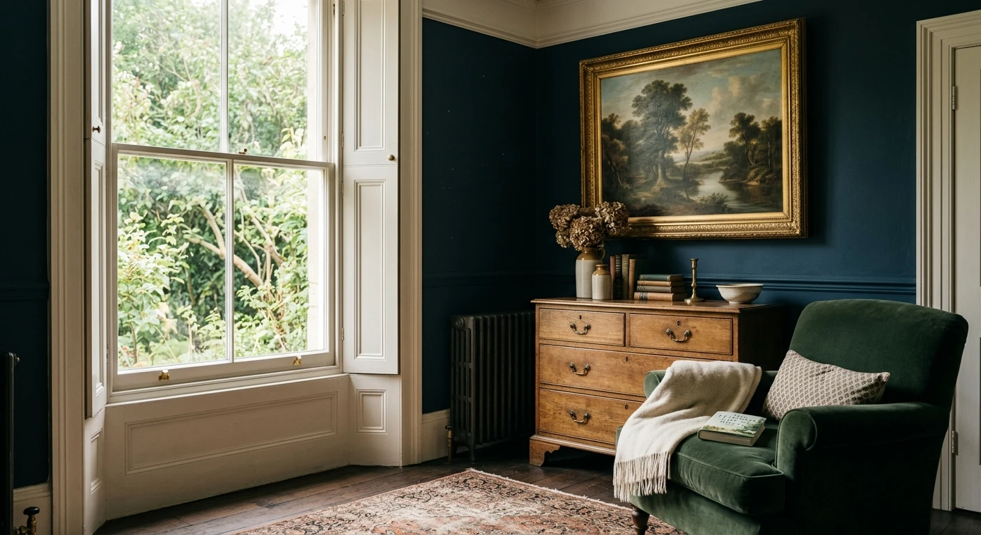
The standout darks: Hague Blue and Railings
If there is one Farrow & Ball color that earns its reputation, it is Hague Blue (No. 30). At LRV 6 it sits at the deep end of the palette, a near-black navy with a green base that keeps it from going flat and cold. On a study wall, a library of built-ins, or a set of kitchen island cabinets, it reads rich and a little moody in daylight, then drops to almost black under lamps. This is a color that rewards a dense pigment and is hard to fake with a cheap match. Cut in carefully; at this depth, lap marks and thin spots show.
Railings (No. 31) is the off-black sibling. Same LRV neighborhood, but where Hague Blue leans navy, Railings carries a blue-gray undertone that reads as a soft charcoal in good light and near-black at night. It is the British answer to a true black without the harsh, flat heaviness pure black brings. Classic on a front door, beautiful on interior trim, and increasingly used on whole feature walls behind a bed. If you are deciding between the two for cabinetry, Hague Blue feels warmer and more saturated; Railings feels more architectural and restrained. Both pair with a crisp white like Pointing and with unlacquered brass hardware. For more on navy as a whole-room direction, see our blue interior paint shades guide.
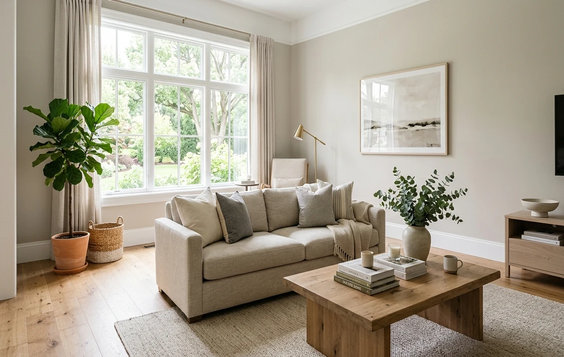
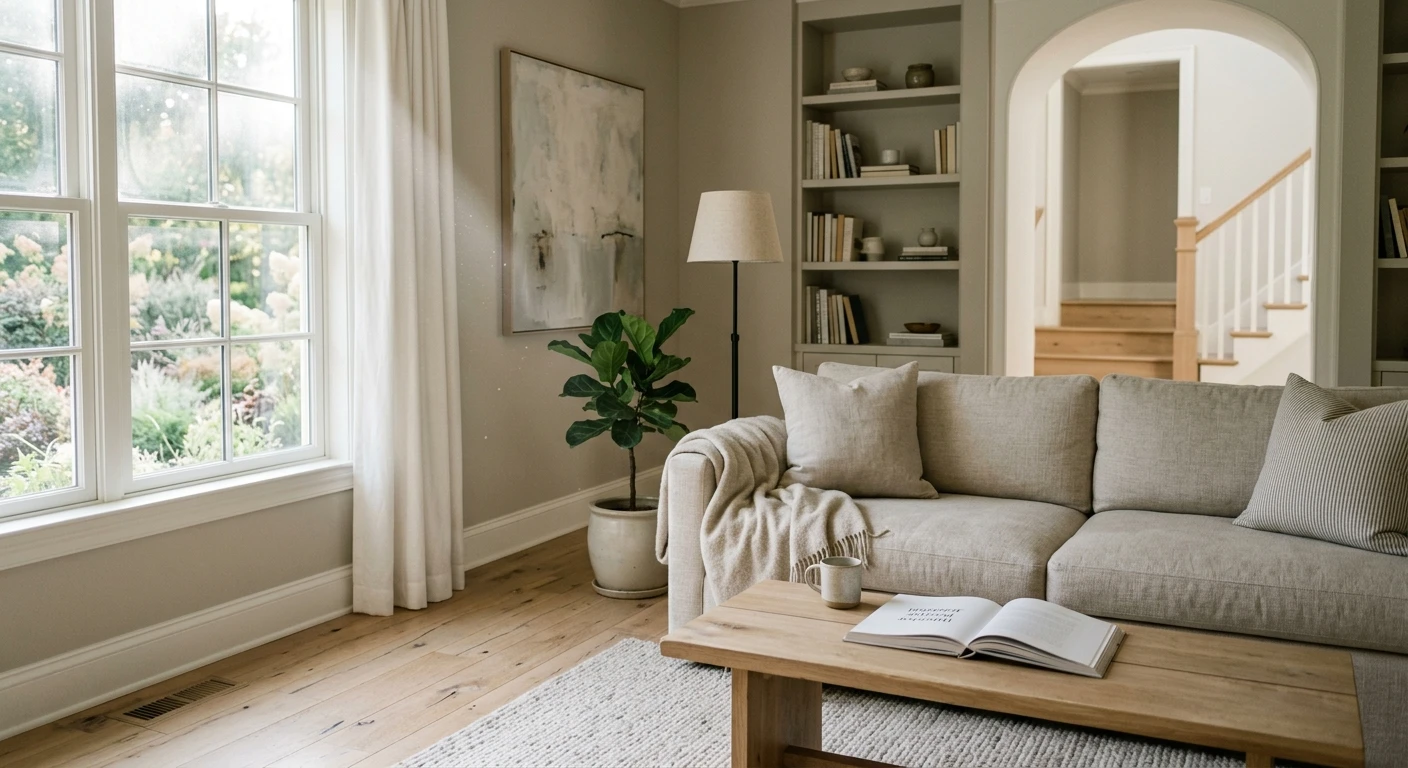
The everyday neutrals: Pointing, Cornforth White, Elephant's Breath
Most people do not paint a whole house Hague Blue. The colors that actually go on big wall planes are the neutrals, and Farrow & Ball has three that designers reach for constantly.
Pointing (No. 2003)
The brand's warm white workhorse. At LRV 84 it is bright but never sterile, carrying just enough cream to feel soft against natural wood and warm metals. It is the default trim and ceiling white, and it can carry a whole room when you want light without the clinical edge of a blue-white. If you only buy one Farrow & Ball white, buy this one.
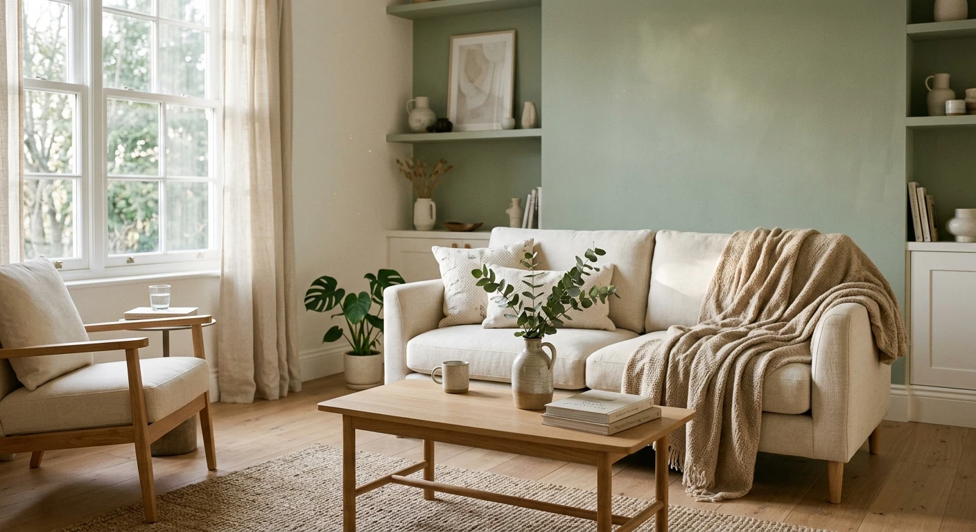
Cornforth White (No. 228)
A cool, modern greige at LRV 60. This is the color people mean when they say a Farrow & Ball room looks "expensive and calm." It shifts beautifully: a soft warm gray in bright light, a cooler, almost mauve-gray in shade. Here is the catch, and it is a real one. Cornforth White needs decent natural light. In a dim, north-facing room it can go cold and slightly dreary, the same trap that catches a lot of greiges. Test it in the actual room before you commit. For where it sits among other modern neutrals, our greige warm-neutral paint guide maps the field.
Elephant's Breath (No. 229)
The famous one. A warm greige at LRV 47 with a quiet magenta undertone that makes it read warmer and a touch pinker than Cornforth White. It is cozy, flattering, and works in hallways and living rooms where you want a neutral with some life in it. The magenta lean is exactly why some people love it and others find it goes too mauve under cool light, so a swatch is non-negotiable here.
See walls, trim, and floor together in one preview, free, before the cool light surprises you.
Understanding Farrow & Ball finishes
The finish names are their own learning curve. Picking the wrong one is the most common mistake US buyers make, so here is the short version:
- Estate Emulsion: the signature flat matte for walls and ceilings. Deepest color, lowest sheen, least scrubbable. Beautiful, but not for high-traffic or splash zones.
- Modern Emulsion: a more durable, washable matte for kitchens, baths, and family spaces. Slightly more sheen than Estate, much easier to wipe.
- Estate Eggshell: the low-sheen finish for interior wood and metal (trim, doors, cabinetry). This is what you use for Hague Blue on cabinets.
- Modern Eggshell: a tougher eggshell for high-traffic woodwork and floors.
- Dead Flat: the most matte of all, for a true period look on walls and woodwork. Delicate; treat it gently.
Rule of thumb: Estate Emulsion on formal walls, Modern Emulsion anywhere that gets touched, Estate Eggshell on trim and cabinets. Do not put Estate Emulsion in a mudroom and then act surprised when it marks.
Farrow & Ball vs the US brands: the honest price math
This is where most buyers make the real decision. Farrow & Ball is sold by the US quart and gallon and lands at a clear premium over the big domestic brands. Rough current positioning:
- Farrow & Ball: premium tier, sold per gallon at the high end of the market. Tight 132-color palette, deepest pigment, lower-sheen finishes.
- Sherwin-Williams and Benjamin Moore: upper-mainstream tier, typically well below Farrow & Ball per gallon, with huge palettes and very durable, scrubbable matte options.
- Behr, Valspar, store brands: value tier, the lowest cost per gallon, covered in our Behr interior paint colors guide and the Lowe's guide linked above.
My take after years of specifying both: use Farrow & Ball where the color does heavy lifting and the surface is small or low-traffic. A study in Hague Blue, a powder room in Railings, a dining room in Cornforth White. Use a mainstream brand for the whole-house neutral that covers a thousand square feet and has to survive kids and dogs. Many designers color-match the Farrow & Ball shade into a more durable base for the big walls and save the real paint for showcase trim and cabinets. You lose a little undertone magic and save real money. For schemes that mix premium and value brands well, see our interior color schemes guide.
How to test Farrow & Ball before you spend
At premium prices, a wrong sample pot stings, and these colors punish anyone who buys off a screen. Two ways to get it right:
- Use the real sample sheets: Farrow & Ball sells peel-and-stick color sheets painted in the actual paint. Put one on two different walls and check it mid-morning, mid-afternoon, and at night under your normal bulbs. Watch Cornforth White and Elephant's Breath especially for the cool-light shift.
- Preview it digitally first: upload a real photo of your room and apply the shade (plus a warmer and a cooler alternative) before you order a single pot, narrowing the field to one or two worth sampling. Repaint budget context is in our interior house painting cost guide.
Preview a Farrow & Ball shade against a warmer and a cooler option, side by side, free.
Frequently asked questions
Are Farrow & Ball paint colors worth the higher price?
It depends on the job. You are not paying for better coverage or durability; the flat finishes scuff more easily than a scrubbable US matte. You are paying for dense pigment and layered undertones that shift with the light, which a cheap paint cannot do. They are worth it on showcase walls, trim, and cabinetry where the color carries the room, and overkill on a high-traffic playroom that just needs a wipeable surface.
What is the most popular Farrow & Ball color?
Elephant's Breath (No. 229) is the brand's most famous neutral, a warm greige at LRV 47 with a faint magenta undertone. Cornforth White (No. 228) and Pointing (No. 2003) are the other constant best sellers for whole rooms, while Hague Blue (No. 30) and Railings (No. 31) lead the dramatic darks for studies and cabinetry.
What is the difference between Hague Blue and Railings?
Both sit around LRV 6 and read near-black at night. Hague Blue (No. 30) is a navy with a green base, so it looks warmer and more saturated, ideal on cabinetry and library walls. Railings (No. 31) is a soft off-black with a blue-gray undertone that reads as charcoal in daylight, more architectural and restrained, and classic on front doors and trim.
Which Farrow & Ball finish should I use for walls?
Estate Emulsion is the signature flat matte for low-traffic walls and ceilings, with the deepest color but the least scrubbable surface. Use Modern Emulsion in kitchens, baths, and family rooms where the wall gets touched, since it is washable. For trim and cabinets use Estate Eggshell. Matching the finish to the traffic is the most common mistake US buyers avoid.
Why does Cornforth White look gray and not white?
Farrow & Ball uses "White" loosely for its lighter neutrals, so Cornforth White (No. 228) is really a cool greige at LRV 60, not a true white. It reads as a soft warm gray in bright light and a cooler, almost mauve-gray in shade. In a dim, north-facing room it can go cold and dreary, so test it in the actual space before committing.
Preview shades like Hague Blue, Pointing, and Cornforth White on your actual walls under your own light before paying premium prices.
Disclaimer: Farrow & Ball and the color names Hague Blue (No. 30), Railings (No. 31), Pointing (No. 2003), Cornforth White (No. 228), Elephant's Breath (No. 229), and Hardwick White (No. 5) are trademarks of Farrow & Ball Limited. Sherwin-Williams, Benjamin Moore, Behr, and Valspar are trademarks of their respective owners. FacadeColorizer is an independent paint visualization service and is not affiliated with, endorsed by, or sponsored by Farrow & Ball or any other brand named here. LRV and color values are approximate, rounded, and based on the manufacturer's published data. Color reproduction on screens approximates the manufacturer's sample; always confirm with a manufacturer sample under your own light before purchase. Sources: Farrow & Ball published color and LRV data 2026, designer field reports compiled by FacadeColorizer.
Trademarks mentioned (Sherwin-Williams, Benjamin Moore, Behr, Caparol, Brillux, Sto, Alpina, Valspar, PPG, Glidden, Dulux, Crown Trade, Sandtex, Farrow & Ball, Johnstone's, Leyland) are property of their respective owners. FacadeColorizer is independent and not affiliated with any of them. Nominative fair use under Lanham Act §1125.