
You paint a board with Farrow & Ball Oval Room Blue (No.85), prop it in the living room, and spend the next day unable to name the color. Morning, a soft denim blue. Midday sun, a dusty teal that tips toward green. By lamplight, a deep smoky gray-blue that feels almost moody. That uncertainty is the whole point. Oval Room Blue is one of the most quietly chameleonic mid-tones Farrow & Ball makes: a blue-gray with a green heart, drawn from a historic distemper recipe, and it behaves less like a swatch and more like a mood that follows your light around the room.
This profile is for the person already half in love with Oval Room Blue: how its undertones trade places, the published LRV, the rooms it flatters, and the trim and decor that keep it elegant instead of murky. It is one of the deeper soft hues in our wider Farrow & Ball paint colors guide for 2026, and you can see how blue-greens like it behave across a room in our best interior blue paint shades roundup.
Upload one photo and preview Oval Room Blue No.85 under your room's actual light in about 30 seconds. Free: 1 HD render plus 3 variations.
The numbers behind Oval Room Blue No.85
Start with the published data. These figures predict the wall far better than a small painted card, and they come from the Farrow & Ball color references:
| Spec | Value |
|---|---|
| F&B name and number | Oval Room Blue No.85 |
| HEX (screen approximation) | #A0AEA5 |
| RGB approximation | 160, 174, 165 |
| LRV (Light Reflectance Value) | 30 |
| Hue family | Smoky mid-tone blue-gray with a green undertone |
| Closest F&B cousins | Light Blue No.22, French Gray No.18, De Nimes No.299 |
Sources: Farrow & Ball Oval Room Blue No.85 color data, retrieved 2026; The Spruce paint undertone references.
The LRV of 30 is the number to internalize. That is a genuine mid-tone, not a pastel: it absorbs more light than it reflects, which is why Oval Room Blue reads as enveloping and characterful rather than airy. In a bright south room it stays soft and dusty; in a dim or north room it deepens noticeably and can turn quite moody. If you wanted a paler, more relaxed blue instead, the lighter end of the spectrum lives in our piece on colors that go with light blue, which is a useful contrast for understanding what an LRV in the 50s or 60s feels like by comparison.
Three undertones taking turns
Oval Room Blue is not a clean primary blue. It is a layered, slightly muddied color built from blue, green, and gray pigment, which is exactly what gives it depth and a faintly historic feel. Which direction it leans is decided by your light:
- The blue read. Under cool, indirect light (an overcast sky, a north window, a daylight LED near 5000K), the green retreats and the color settles into a soft, smoky denim or petrol blue. The version most people picture from the name.
- The green read. Under warm light (direct sun or a 2700K bulb), the warmth lifts the green and the color tips toward a dusty teal or muted blue-green. The read that surprises people who expected a pure blue.
- The gray read. In low or balanced light (dusk, a dim hallway, a shaded corner), blue and green mute each other and the gray base takes over, deepening into an almost charcoal-blue. This is the moody, dramatic side.
None of these is the wrong Oval Room Blue. They are all the same paint behaving as the recipe intends. Because it is a balanced, slightly complex color, room direction moves it more than it would a flat commercial blue, a behavior we map across the spectrum in our interior color families guide. Typical behavior across the four Northern Hemisphere orientations:
| Room orientation | Daylight character | How Oval Room Blue reads |
|---|---|---|
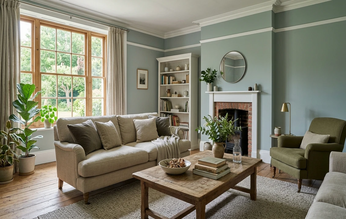
| South-facing | Warm, abundant midday light | Softest and dustiest, leans toward its teal-green side, very flattering |
| West-facing | Cool by day, very warm at sunset | Smoky blue-gray by day, glowing teal-green late afternoon |
| East-facing | Warm early sun, neutral later | Greener in the morning, settling to a balanced blue-gray by afternoon |
| North-facing | Cool, indirect, no direct sun | Bluest, coolest, and deepest, leans dramatic petrol-blue |
Sources: American Institute of Architects daylight reference; Farrow & Ball No.85 color data; designer field notes on muted blue-greens.
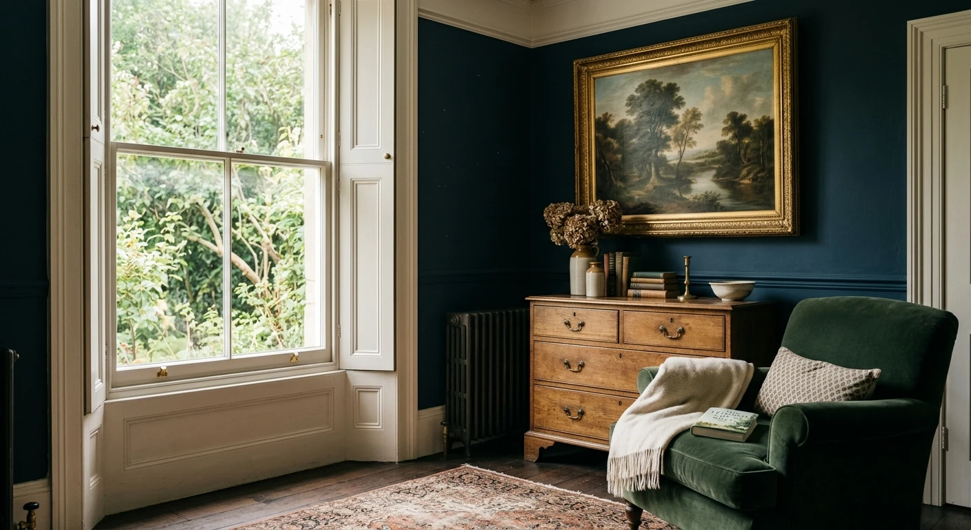
Want the soft, dusty version you fell for? Put Oval Room Blue in a south or east room and lean warm with your bulbs. Want the dramatic, enveloping side? A north-facing study, dining room, or powder room with cool daylight bulbs delivers a deep petrol-blue that feels jewel-box rich. The deeper the room and the cooler the light, the more this color commits to drama, which is why it shows up so often in moody dining rooms and bedrooms, as our blue bedroom paint ideas illustrate.
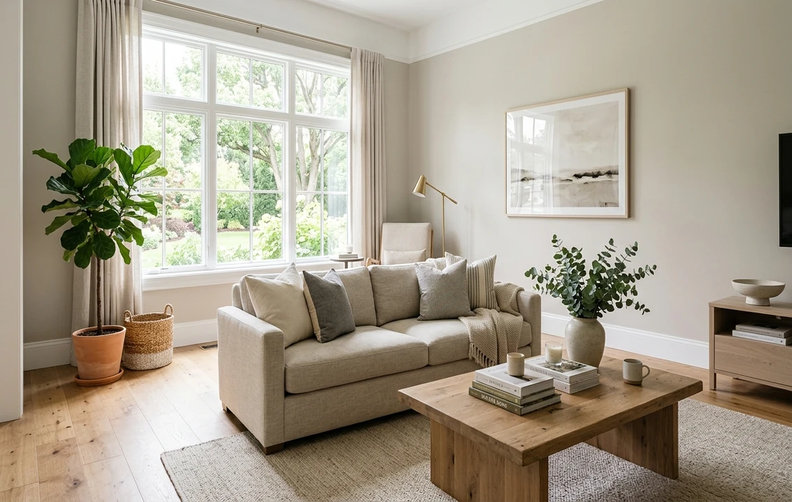
The rooms Oval Room Blue was made for
With an LRV of 30, Oval Room Blue is a color of atmosphere, not airiness. It rewards rooms where you want depth, calm, and a slightly traditional sense of enclosure:
- Dining rooms: a signature use. Its smoky depth flatters candlelight and warm bulbs, making the space feel intimate and grown-up after dark, while the green undertone keeps it from feeling cold.
- Studies, libraries, and home offices: the muted blue-green is focused and quietly serious without going to a hard navy. It pairs beautifully with brass, leather, and bookshelves.
- Bedrooms: the deeper read is restful and cocooning. It layers under white, cream, oatmeal, or warm taupe bedding and loves warm wood. See where it sits among other options in our blue bedroom paint ideas.
- Powder rooms and small baths: a windowless powder room is the rare place where a low LRV becomes an asset, turning a tiny space into a jewel box. The watery green-blue reads clean against white porcelain and brass or aged-nickel fixtures.
- Kitchen cabinetry: increasingly popular on lower cabinets or an island, where the soft blue-green reads custom and timeless against white uppers and warm wood counters.
Where to be careful: a large, dim, north-facing open-plan room painted wall to wall can feel heavy and gloomy, where the same color used on one accent wall, on joinery, or in a cozier closed room would feel rich instead of dark. And a bright, modern white kitchen can find it a touch traditional; it sits more naturally in homes with some warmth and character. To weigh it against other brands before you commit, our best interior paint brands ranked covers how Farrow & Ball's finishes and coverage compare.
Free AI visualizer: test it in a dining room, study, or on cabinets before you buy a sample pot.
Trim, ceiling, and decor that keep it elegant
Because Oval Room Blue is a soft, complex color rather than a clean bright one, the white beside it decides whether it reads refined or chalky. With a color this muted, a warm white usually wins over a stark one:
- Best all-around trim: a soft warm white such as Farrow & Ball Pointing or School House White. They frame Oval Room Blue without the harsh contrast a brilliant white creates, keeping the scheme calm and period-correct.
- For more drama: paint trim and walls the same Oval Room Blue (a tonal, color-drenched look). With a color this deep, dropping the contrast makes the room feel larger and more deliberate, not smaller.
- Ceiling: a soft white keeps a low room open; in a dining room or powder room you can take the color up onto the ceiling for full immersion.
- Deeper coordinating tones: for an accent or contrast, a warm off-white, a putty greige, or a deep inky blue like Hague Blue all step naturally up or down from it.
- Decor and finishes: warm wood, brass and aged-brass hardware, natural linen, rattan, and antique mirror all flatter it. Cool chrome and stark gray-washed floors can drag it toward a colder, flatter read.
For pairing it into a wider scheme, soft blues and blue-grays sit beside it effortlessly; our guide to colors that go with light blue works as a companion palette when you want a lighter blue in an adjoining room to balance Oval Room Blue's depth.
Oval Room Blue vs the colors people cross-shop
Oval Room Blue has two near-twins inside the Farrow & Ball range that shoppers constantly line up against it. Knowing the difference saves a wrong sample pot:
- vs Light Blue No.22: despite the name, Light Blue is itself a muted blue-gray-green, but it is paler, grayer, and more retiring. Light Blue (LRV 54) reads as a soft, quiet blue-gray that recedes; Oval Room Blue is noticeably deeper (LRV 30), greener, and far more present in a room. Choose Light Blue when you want subtle and calm, Oval Room Blue when you want depth and character.
- vs French Gray No.18: French Gray is a soft, sage-leaning gray-green, lighter and clearly more green than blue. Where French Gray is a gentle, pastoral green-gray that flatters bright rooms, Oval Room Blue is a deeper, bluer, moodier color built for atmosphere. If your samples keep looking green and that disappoints you, you may actually want the blue commitment of Oval Room Blue over French Gray.
- vs De Nimes No.299: a slightly more recent denim-blue, cleaner and more clearly blue with less green muddiness. De Nimes reads as a soft, honest denim; Oval Room Blue is smokier, greener, and more historic in feel.
The short version: Light Blue is the paler, grayer retreat; French Gray is the lighter green-leaning sibling; Oval Room Blue is the deepest and most atmospheric of the three, the one to pick when you want a room to feel enveloping rather than airy. To see how it stacks up against other brands' blues entirely, our best interior paint colors for 2026 roundup lets you place it in the wider field.
How to test Oval Room Blue before you commit
Oval Room Blue is the textbook color where a small painted card will mislead you. At an LRV of 30, the color changes dramatically with the size of the surface and the light around it: a 2-inch swatch in your hand looks far lighter and flatter than a whole wall will. The reliable method is a large painted sample (Farrow & Ball sells peel-and-stick samples and sample pots) applied to at least two walls and checked mid-morning, mid-afternoon, and after dark under your normal bulbs. The after-dark deep version is the one you will live with most evenings, and it is the read that surprises people. The faster, no-paint first pass is a digital visualizer: upload a photo of the room and apply Oval Room Blue beside a lighter alternative (Light Blue No.22) and a greener one (French Gray No.18) to see which way your light pulls it, ruling out the colors that were never going to work before you buy a single pot.
Preview it beside a lighter and a greener alternative under your real light. Free: 1 HD render plus 3 variations.
Frequently asked questions
Is Oval Room Blue actually blue or is it green?
Both, depending on the light. Oval Room Blue No.85 is a smoky mid-tone built from blue, green, and gray pigment. Under cool or north light it settles into a soft denim or petrol blue; under warm light or direct sun it tips toward a dusty teal-green; in low or balanced light the gray base takes over and it deepens. It is the same paint in every case, and the room's light decides which side you see.
What is the LRV of Farrow & Ball Oval Room Blue?
Oval Room Blue No.85 has a Light Reflectance Value of about 30, a true mid-tone. It absorbs more light than it reflects, which is why it reads as deep, enveloping, and atmospheric rather than airy. In bright south rooms it stays soft and dusty; in dim or north rooms it deepens noticeably and turns moodier, so factor your light in before committing wall to wall.
What trim color goes with Oval Room Blue?
A soft warm white such as Farrow & Ball Pointing or School House White frames Oval Room Blue without the harsh contrast a brilliant white creates, keeping the scheme calm and period-correct. For more drama, paint the trim the same Oval Room Blue as the walls for a color-drenched look that makes the room feel larger and more deliberate. Warm wood and brass hardware flatter it; cool chrome can flatten it.
How is Oval Room Blue different from Light Blue and French Gray?
All three are muted Farrow & Ball blue-grays, but they differ in depth and lean. Light Blue No.22 is paler, grayer, and more retiring. French Gray No.18 is lighter and clearly more green than blue, a soft sage-gray. Oval Room Blue No.85 is the deepest of the three (LRV 30), bluer, and the most atmospheric, the one to choose when you want a room to feel enveloping rather than airy.
See Oval Room Blue No.85 under your real light, beside a lighter and a greener alternative, before you buy.
Disclaimer: Farrow & Ball and Oval Room Blue No.85 are trademarks of Farrow & Ball Limited. Other brand and color names are trademarks of their respective owners. FacadeColorizer is an independent paint visualization service and is not affiliated with, endorsed by, or sponsored by Farrow & Ball. Screen color approximates the manufacturer's sample; always confirm with a physical sample before purchase. Sources: Farrow & Ball Oval Room Blue No.85 color data 2026, Farrow & Ball Light Blue No.22 and French Gray No.18 color data, The Spruce paint undertone references, and designer field notes on muted blue-greens.
Trademarks mentioned (Sherwin-Williams, Benjamin Moore, Behr, Caparol, Brillux, Sto, Alpina, Valspar, PPG, Glidden, Dulux, Crown Trade, Sandtex, Farrow & Ball, Johnstone's, Leyland) are property of their respective owners. FacadeColorizer is independent and not affiliated with any of them. Nominative fair use under Lanham Act §1125.