
Paint a wall in Farrow & Ball Studio Green No.93 and the first reaction is almost always the same: "That's black." Step closer, or wait for the sun to swing across it, and the color confesses what it really is, a deep, smoky forest green so dark it passes for charcoal in shadow. Studio Green is one of Farrow & Ball's most dramatic near-blacks, a color that hides in plain sight by day and turns velvety and architectural by lamplight. It is not a color you sample casually, and it is not one a 3-inch chip can ever explain.
This profile is for the homeowner already drawn to Studio Green: what undertones live inside that darkness, the published LRV and why it matters so much here, the rooms it transforms, how the light in your house changes it, and the trim, ceiling, and decor that keep it looking deliberate rather than dingy. It is one of the boldest entries in our wider Farrow & Ball paint colors guide for 2026, and you can see where deep greens sit overall in our best interior paint colors for 2026 roundup.
Upload one photo and preview Studio Green No.93 under your room's actual light in about 30 seconds, free.
The numbers behind Studio Green No.93
Start with the published data; with a color this dark, the figures predict the wall far better than any fan-deck chip can. These come from the Farrow & Ball color references:
| Spec | Value |
|---|---|
| F&B name and number | Studio Green No.93 |
| HEX (screen approximation) | #43473D |
| RGB approximation | 67, 71, 61 |
| LRV (Light Reflectance Value) | 8 |
| Hue family | Very dark, smoky forest green; near-black with a black base pigment |
| Closest F&B relatives | Inchyra Blue No.289, Studio Green's lighter cousin Green Smoke No.47, Pitch Black No.256 |
Sources: Farrow & Ball Studio Green No.93 color data, retrieved 2026; The Spruce and designer references on near-black paints.
The LRV of 8 is the single most important number on this page. Light Reflectance Value runs from 0 (absolute black) to 100 (pure white), and an 8 sits right at the bottom of the usable range. Studio Green reflects almost no light back into the room, which is exactly why it reads as black in any space that is not directly lit. That low LRV is the source of both its drama and its risk: in a bright, sunny room it becomes a rich, dimensional green; in a dim or north-facing room it can flatten into a heavy gray-black. For a near-black green that is read as a clear historic green rather than a charcoal, our Charleston Green guide covers a slightly warmer, more obviously green alternative.
The undertones hiding in the dark
A near-black is not simply "green plus black." Studio Green is built on a base of black pigment with a deep green sitting over it and a faint warm, almost olive-brown shadow underneath. Because so little light bounces off it, the undertone you actually see depends entirely on how much light reaches the surface.
- The forest-green read. In strong, direct light, the green pigment finally has enough energy to show. The wall reads as a deep, slightly warm forest or bottle green with real saturation. The version that sells people on Studio Green.
- The charcoal read. In ordinary indirect light or partial shade, the green recedes and the black base dominates. The wall reads as a soft, smoky charcoal with only a whisper of green, more architectural than colorful.
- The olive-shadow read. In warm artificial light or low evening sun, the faint brown undertone warms the green and it leans toward a deep olive or moss, cozy and enveloping rather than crisp.
None of these is the wrong Studio Green; they are the same paint reacting to the light it is given. The practical takeaway is that you are choosing a behavior, not a fixed swatch. If you want the unmistakable green, you need a room with generous light. If you are happy with a near-black that occasionally flashes green, almost any room will do. For the full vocabulary of how dark greens shift and what to pair with them, our guide to colors that go with dark green is the companion read.
How light by orientation changes Studio Green
Because Studio Green starts so dark, the direction a room faces decides whether you ever see its green at all. Typical behavior across the four Northern Hemisphere orientations:
| Room orientation | Daylight character | How Studio Green reads |
|---|---|---|
| South-facing | Warm, abundant midday light | Richest green: the warm sun unlocks the forest read and gives the wall dimension |
| West-facing | Cool by day, very warm at sunset | Charcoal-green by day, glowing deep olive at golden hour |
| East-facing | Warm early sun, cooler later | Green in the morning, settling to dark charcoal-green by afternoon |
| North-facing | Cool, indirect, no direct sun | Darkest and coolest: reads as a near-black charcoal, green almost vanishes |
Sources: American Institute of Architects daylight reference; Farrow & Ball Studio Green No.93 color data; designer field notes on low-LRV paints.
The lesson is counterintuitive. Most homeowners reach for a dark color to make a moody north room cozier, but a north-facing space gives Studio Green nothing to work with and you end up with flat black. Studio Green looks most alive in a bright south or west room, where light reveals the green and the depth becomes a feature rather than a void. In a dim room, lean into it on purpose with warm lamplight and accept the charcoal read, or choose a higher-LRV green instead. For how a deep green plays with the rest of a scheme, see our pairing playbook on colors that go with green indoors.
The rooms Studio Green was made for
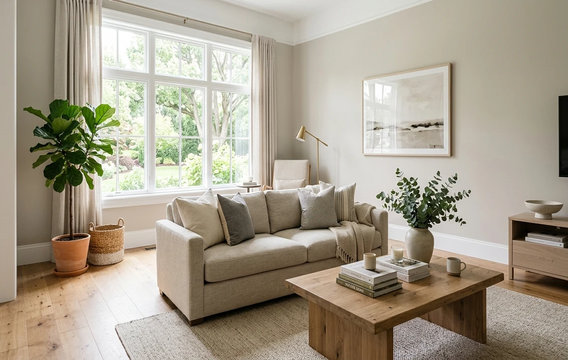
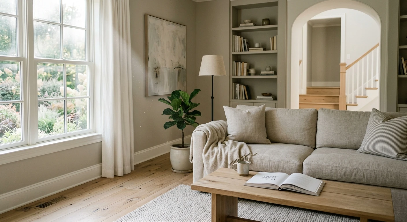
Studio Green is a statement color, and statement colors reward rooms where you want atmosphere over airiness. Its low LRV makes it a poor choice for spaces that need to feel open and bright, and a brilliant one for spaces meant to feel intimate, rich, and enclosing:
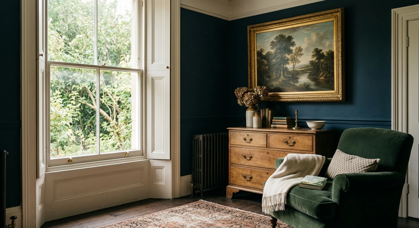
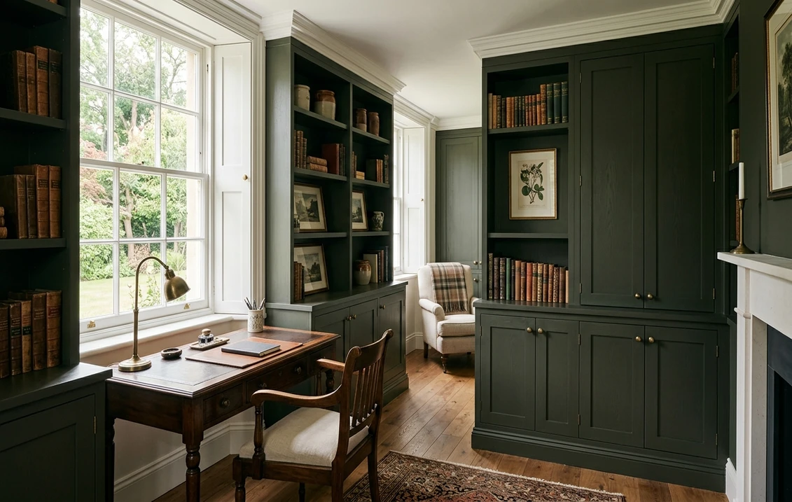
- Studies, libraries, and home offices: the signature use. The enveloping darkness reads as focused and serious, and the green keeps it from feeling as severe as a true black. Bookshelves painted out in the same color create a cocoon.
- Dining rooms: a dark dining room is a designer favorite because it comes alive at night. Studio Green by candlelight or warm pendant light becomes a deep, luxurious backdrop for the table.
- Powder rooms: small windowless rooms are the one place where a near-black actually flatters. There is no airiness to lose, so you get pure drama, especially with brass fixtures and a bold mirror.
- Front doors and millwork: on a paneled door, built-ins, or a kitchen island, Studio Green reads as sophisticated and timeless rather than overwhelming, because the area is contained. For the cabinetry direction specifically, our Farrow & Ball colors guide covers where the brand's deep tones earn their premium.
Where to be careful: a bright, sun-flooded living room painted wall to wall in Studio Green can feel like it lost its windows, and a north-facing bedroom can tip from cozy to cave. If you love the color but the room is dim, use it on a single feature wall, on the lower two-thirds below a picture rail, or on joinery only. Before committing the whole room, it helps to know what the repaint will run; our interior house painting cost guide covers the numbers, and dark colors often need an extra coat over a tinted primer.
Free AI visualizer: test Studio Green in a study, dining room, or on cabinets before you buy a sample.
Trim, ceiling, and decor that keep it from going flat
With a near-black, the surrounding colors decide whether the room reads intentional and rich or murky and unfinished. The contrast level is the whole game:
- High-contrast crisp trim: a clean white such as Farrow & Ball Wimborne White or All White frames Studio Green sharply and makes the green read as a deliberate color. The classic, gallery-like treatment.
- Low-contrast tonal trim: for a more modern, immersive look, paint trim, doors, and even the ceiling in the same Studio Green or a soft off-white very close to it. This "color-drenched" approach removes the visual edges and makes the room feel larger and more enveloping, not smaller.
- Ceiling: a warm soft white keeps a dark room from feeling top-heavy, but a tonal or matching ceiling deepens the cocoon. Avoid a bright stark white ceiling over Studio Green; the contrast can feel harsh.
- Metals and decor: brass, antique gold, and warm woods (walnut, oak) glow against Studio Green and warm it up. Aged brass hardware is the natural partner. Cool chrome and stark black accessories can make it feel cold.
- Textiles: natural linen, cream, terracotta, blush, and warm ochre all pop beautifully against the dark green and stop the room from feeling somber.
For adjoining rooms, Studio Green flows naturally beside warm neutrals, soft pinks, and muted golds, and it pairs especially well with mid-tone greens stepping up the scale. The deep green also reads as a near-relative to the historic dark greens used on traditional facades; for the exterior parallel, our broader green coverage in the best interior paint colors roundup shows where deep greens sit beside lighter sages.
Studio Green vs the near-twins people cross-shop
Studio Green sits in a small club of dark, dramatic colors, and shoppers routinely line it up against two in particular. Knowing the difference saves an expensive wrong sample:
- vs Benjamin Moore Essex Green: the most common cross-brand comparison, and the closest match in mood. Both are very dark, near-black greens, but Essex Green reads as a touch warmer and more clearly green more of the time, with a slightly higher LRV that lets its green show in more light conditions. Studio Green is moodier and tips to charcoal faster as light drops. Choose Essex Green if you want the green to stay visible; choose Studio Green for the more shape-shifting, almost-black drama. Note that Essex Green is a Benjamin Moore color, so cross-brand color matching is approximate, never exact.
- vs Farrow & Ball Inchyra Blue No.289: the in-house cousin people confuse with it. Inchyra Blue (LRV 17) is a dark, smoky teal-blue that leans green in some light and blue in others; Studio Green is unambiguously green-black with no blue side. Inchyra Blue is somewhat lighter and cooler, with more obvious color movement between blue and green. Studio Green is darker, more grounded, and stays in the green-to-charcoal lane. Pick Inchyra for a blue-green that surprises; pick Studio Green for a committed dark green.
- vs a true black: worth naming because the choice is often "black or dark green." A flat black is harder and more graphic; Studio Green carries warmth and softness from its green, so it reads as cozier and more livable in a room you spend real time in.
The headline difference comes down to LRV and undertone: Studio Green (LRV 8, green-black), Inchyra Blue (LRV 17, teal-blue with green movement), and Essex Green (similar darkness, warmer and more consistently green). They are not interchangeable, and the only way to know which one your light favors is to see all three in the actual room.
How to test Studio Green before you commit
Studio Green is the textbook color where a small chip will mislead you, and it misleads more than most because the difference between "rich forest green" and "flat black" depends entirely on light your store does not have. The reliable physical method is a large peel-and-stick or painted sample board taped to at least two walls and checked in direct morning sun, mid-afternoon, and after dark under your real bulbs; the dim-light charcoal is the version you live with most evenings, so judge that read honestly. The faster, no-paint first pass is a digital visualizer: upload a photo of the room and apply Studio Green beside Essex Green and Inchyra Blue to see which way your light pulls each one, ruling out the near-twins that were never going to work in your space.
Preview Studio Green beside Essex Green and Inchyra Blue under your real light, free.
Frequently asked questions
Is Studio Green No.93 a green or a black?
Both, depending on the light. Studio Green is a very dark forest green built over a black base, with an LRV of just 8. In strong direct light it reads as a rich, slightly warm forest green; in ordinary indirect or north light the black base dominates and it reads as a smoky charcoal with only a hint of green. The same paint can look green in a sunny room and near-black in a dim one.
What is the LRV of Farrow & Ball Studio Green?
Studio Green No.93 has a Light Reflectance Value of 8, near the very bottom of the scale (0 is black, 100 is white). That extremely low LRV means it reflects almost no light, which is why it reads as near-black in shade and reveals its green only where light is strong. It also means dark rooms will flatten it, so Studio Green looks best in bright, sunny spaces or in small rooms used for drama, such as powder rooms and studies.
What trim color goes with Studio Green?
Two directions work. For a crisp, framed look, pair Studio Green with a clean white trim such as Farrow & Ball Wimborne White or All White, which makes the green read as a deliberate color. For a modern, immersive look, color-drench the room by painting trim, doors, and even the ceiling in the same Studio Green or a soft near-tone, which removes the edges and makes the space feel larger. Brass hardware and warm woods flatter it in either scheme.
How is Studio Green different from Essex Green and Inchyra Blue?
All three are dark and dramatic, but they differ in undertone. Studio Green (LRV 8) is a green-black with no blue. Benjamin Moore Essex Green is a similarly dark green that runs a touch warmer and stays visibly green in more light. Farrow & Ball Inchyra Blue No.289 (LRV 17) is a smoky teal-blue that shifts between blue and green and is somewhat lighter and cooler. Choose Studio Green for committed dark green, Essex Green for a green that stays green, and Inchyra Blue for a blue-green that moves.
See Studio Green No.93 under your real light, beside Essex Green and Inchyra Blue, before you buy.
Disclaimer: Farrow & Ball, Studio Green No.93, and Inchyra Blue No.289 are trademarks of Farrow & Ball. Benjamin Moore and Essex Green are trademarks of Benjamin Moore & Co. FacadeColorizer is an independent paint visualization service and is not affiliated with, endorsed by, or sponsored by Farrow & Ball or Benjamin Moore. Cross-brand color matches are approximate, never exact. Screen color approximates the manufacturer's sample; always confirm with a physical sample before purchase. Sources: Farrow & Ball Studio Green No.93 and Inchyra Blue No.289 color data 2026, Benjamin Moore Essex Green color data, The Spruce and designer references on near-black paints, and the American Institute of Architects daylight reference.
Trademarks mentioned (Sherwin-Williams, Benjamin Moore, Behr, Caparol, Brillux, Sto, Alpina, Valspar, PPG, Glidden, Dulux, Crown Trade, Sandtex, Farrow & Ball, Johnstone's, Leyland) are property of their respective owners. FacadeColorizer is independent and not affiliated with any of them. Nominative fair use under Lanham Act §1125.