
You brush a sample of Farrow & Ball Stiffkey Blue (No.281) onto the powder-room wall in the morning and it looks like a clean, deep navy. Come back at dusk, switch on a warm lamp, and the same wall has turned almost slate, with a faint violet bruise running through it. That drift is the whole point of Stiffkey Blue. Named for the mud flats of a Norfolk beach at low tide, it is a deep, atmospheric navy that carries a soft gray-violet cast, and that cast is what separates it from the flatter, harder navies you find on a standard fan deck.
This profile is for the homeowner already circling Stiffkey Blue: how its undertone behaves, the published LRV, the rooms it was built for, and the trim and coordinating colors that keep it looking rich instead of cave-like. It is one of the deep hues we cover in the wider Farrow & Ball paint colors guide, and you can see where it sits among other deep blues in our navy paint colors roundup.
Upload one photo and preview Stiffkey Blue under your room's actual light in about 30 seconds, free.
The numbers behind Stiffkey Blue No.281
Start with the published data. For a color this dark, the LRV tells you more about how the room will feel than any chip ever could:
| Spec | Value |
|---|---|
| F&B name and number | Stiffkey Blue No.281 |
| HEX (screen approximation) | #45516A |
| RGB approximation | 69, 81, 106 |
| LRV (Light Reflectance Value) | 6 |
| Hue family | Deep navy with a gray-violet (slate) undertone |
| Closest F&B cousins | Hague Blue (No.30), Inchyra Blue (No.289), De Nimes (No.299) |
Sources: Farrow & Ball No.281 Stiffkey Blue color data, retrieved 2026; designer field notes on deep-blue interiors. Screen HEX approximates the manufacturer's chip.
The LRV of 6 is the number to respect. That is firmly in the darkest tier of interior paint, on a par with a true black. A color this low reflects almost no light back into the room, which means Stiffkey Blue will swallow a dim space and feel enveloping rather than open. That is not a flaw, it is the effect people chase, but it sets the rule for where it belongs. For a navy that holds slightly more body without going quite as black, our SW Naval profile (LRV 5) is a useful reference point on the same end of the scale.
The undertone: navy with a violet-slate shift
Most navies sit on a green or a clean blue base. Stiffkey Blue is different: under its deep blue surface runs a soft gray and a touch of violet. That violet is subtle in bright light and steps forward as the light dims, which is why the color seems to soften and warm toward dusk while a green-based navy stays cool and sharp.
- The navy read. In good daylight it reads as a confident, slightly muted deep blue, the version you see on the chip and the one most people expect.
- The slate-violet read. As light drops, the gray base and violet edge come forward together. The blue cools into a smoky slate with a faint plum cast, atmospheric and a little romantic.
- The near-black read. In a windowless room or after dark under warm bulbs, Stiffkey Blue drops close to a soft black-blue. It still reads as color up close but behaves like a dark neutral across the room.
Because the violet is light-dependent, the direction a room faces matters more here than it would for a flat navy, as the interior color families guide explains. Typical behavior across the four Northern Hemisphere orientations:
| Room orientation | Daylight character | How Stiffkey Blue reads |
|---|---|---|
| South-facing | Warm, abundant midday light | Richest, most readable navy; the violet stays quiet, the blue glows |
| West-facing | Cool by day, very warm at sunset | Clean navy by day, warming to a deep slate-violet in the evening light |
| East-facing | Warm early sun, neutral later | Bright navy in the morning, settling into a moodier slate by afternoon |
| North-facing | Cool, indirect, no direct sun | Coolest and grayest; the slate-violet dominates and the room reads very dark |
Sources: American Institute of Architects daylight reference; Farrow & Ball No.281 color data; designer field notes on deep-blue rooms.
The practical takeaway: a south or west room lets Stiffkey Blue show off its full navy richness and is the safest bet if you want the blue to stay legible. A north room leans hard into the gray-violet and goes very dark, which is glorious in a small jewel-box space and oppressive in a large one. Lean your bulbs warm (2700K) to coax out the cozy violet side; cool daylight bulbs flatten it toward a hard gray.
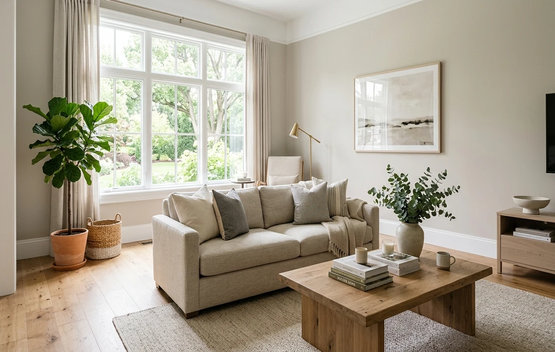
The rooms Stiffkey Blue was made for
With an LRV of 6, Stiffkey Blue is a commitment color. It rewards small, intentional spaces and rooms you use in the evening, where its depth reads as luxury rather than gloom:
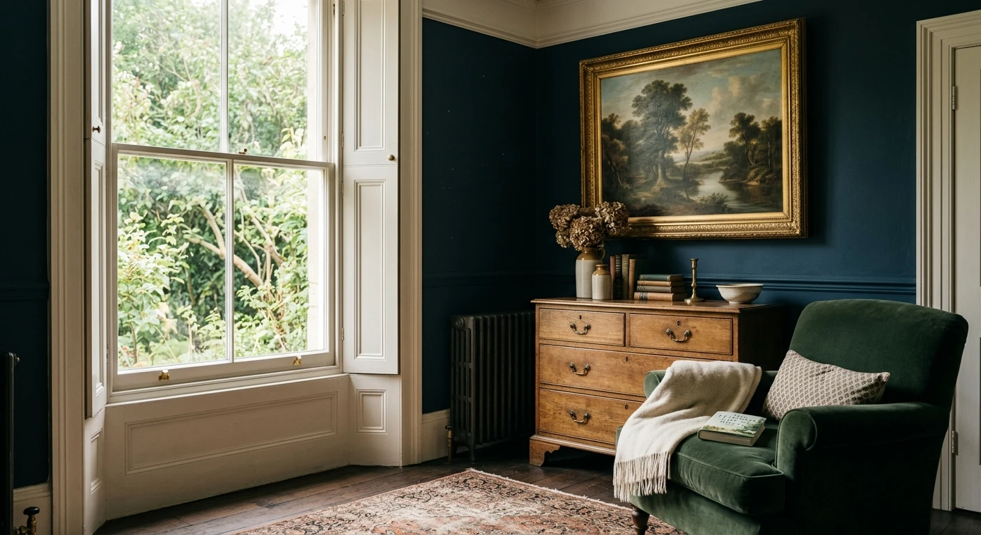
- Powder rooms: the textbook use. A small windowless space is the safest place to go this dark, and Stiffkey Blue turns a powder room into a jewel box. Add a gold mirror and brass tap and it looks expensive.
- Studies, libraries, and home offices: the enveloping depth makes a small work room feel like a retreat. Pairs beautifully with dark wood shelving and warm brass hardware.
- Dining rooms used at night: a moody dining room glows under candlelight and pendant lighting. The violet cast warms the space and flatters skin and food.
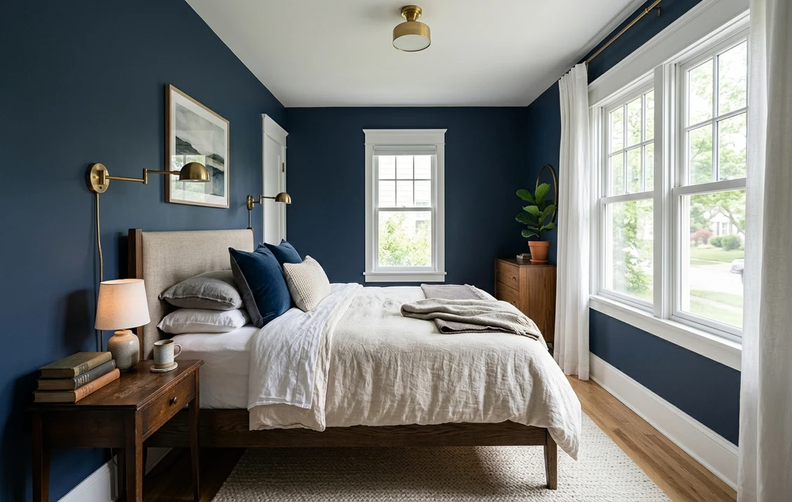
- Bedrooms for a cocooning feel: on all four walls it makes a restful, cave-like sleeping room. Best where you have at least one good window and warm bedside lamps.
- Cabinetry and built-ins: on kitchen lowers, an island, or a fireplace surround, Stiffkey Blue reads custom and architectural against pale walls and warm wood.
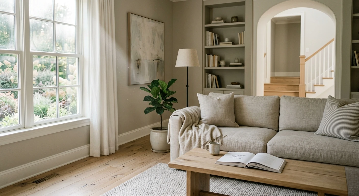
Where to be careful: a large, sun-flooded family room is the wrong home for it. The depth that looks rich by lamplight can read heavy and cave-like wall to wall in full daylight, and many designers reserve such rooms for an accent wall or the lower half of a two-tone scheme instead. Our interior painting cost guide covers what a deep-color repaint runs, and note that very dark colors often need an extra coat and a tinted primer for even coverage.
Free AI visualizer: test Stiffkey Blue in a powder room, study, or on cabinets before you buy a sample.
Trim, ceiling, and coordinating colors
A color this deep lives or dies by what frames it. The contrast you choose for trim sets the whole mood:
- For crisp, high contrast: a clean white trim such as F&B All White or Wimborne White makes Stiffkey Blue pop and reads classic and tailored. The safest, most timeless choice.
- For a softer, blended look: a warm off-white or pale gray trim lets the wall recede and the room feel more enveloping, ideal in a bedroom or library.
- For a dramatic, drenched room: paint the trim, doors, and even the ceiling in Stiffkey Blue too (color-drenching). It dissolves the edges and makes a small room feel like a continuous, intimate box.
- Ceiling: a clean white ceiling keeps a normal-height room from feeling closed in; reserve a Stiffkey-blue ceiling for the full-drench look in a small space.
- Coordinating accents: warm brass, antique gold, aged leather, walnut and dark oak, and warm whites all flatter it. Avoid cold chrome and stark gray-blue accents, which fight the violet undertone.
For an adjoining room, pair Stiffkey Blue with a warm neutral or a soft warm white rather than another saturated color, which keeps the navy as the clear star. If you want a navy that wears the same role with a touch more body and slightly less violet, the Benjamin Moore Hale Navy review is the most-used American alternative.
Stiffkey Blue vs the F&B navies people cross-shop
Farrow & Ball offers a small family of deep blues that shoppers constantly confuse, and the difference between them decides whether your room reads blue or something else entirely:
- vs F&B Hague Blue (No.30): the most common mix-up. Hague Blue (LRV around 6) is a deep blue with a clear green undertone, so it reads as a cooler, slightly teal-leaning navy. Stiffkey Blue swings the other way, toward gray and violet. Pick Hague Blue for a crisper green-navy, Stiffkey Blue for a softer, moodier, slightly purple navy.
- vs F&B Inchyra Blue (No.289): often cross-shopped but genuinely different. Inchyra Blue (LRV 17) is a blue-green that shifts to teal and even charcoal-green depending on light; it is lighter and greener than Stiffkey Blue and far more changeable. Stiffkey Blue stays anchored as a navy where Inchyra wanders toward green-gray. Choose Inchyra for a chameleon teal-blue, Stiffkey for a stable deep navy with a violet edge.
- vs F&B De Nimes (No.299): a denim-style mid blue at a much higher LRV. Far lighter and more casual than Stiffkey Blue, useful if you love the blue family but find No.281 too dark for the room.
Quick way to tell them apart on a sample card: hold them side by side in the actual room. Hague Blue leans green next to Stiffkey, and Inchyra leans noticeably lighter and teal. In isolation they all look like "navy," which is exactly how people end up with the wrong one. For the broader deep-blue field across American brands, our navy paint colors guide lines up the Sherwin-Williams and Benjamin Moore equivalents too.
How to test Stiffkey Blue before you commit
A dark color is the riskiest kind to judge from a chip, because a 2-inch sample on white card always looks lighter and bluer than a whole wall will. The reliable physical method is a large Farrow & Ball sample pot or a peel-and-stick sample painted in two coats over a primed white card, taped to at least two walls, and checked mid-morning, late afternoon, and after dark under your normal bulbs. The after-dark view is the one that matters most, because that is when Stiffkey Blue does its slate-violet trick and when you will use a powder room or dining room anyway. The faster, no-paint first pass is a digital visualizer: upload a photo of the room and apply Stiffkey Blue beside Hague Blue and Inchyra Blue to see which way your light pulls each one, ruling out the two that were never going to be right.
Preview Stiffkey Blue beside Hague Blue and Inchyra Blue under your real light, free: 1 HD preview plus 3 variations.
Frequently asked questions
What undertone does Stiffkey Blue have?
Stiffkey Blue (No.281) is a deep navy with a gray-violet, slate undertone. In bright daylight it reads as a confident muted navy, but as the light drops the gray base and a faint violet edge come forward, softening it into a smoky slate with a slight plum cast. That violet shift is what separates it from green-based navies like Hague Blue and from clean, hard navies on a standard fan deck.
What is the LRV of Farrow & Ball Stiffkey Blue?
Stiffkey Blue has a Light Reflectance Value of about 6, placing it in the darkest tier of interior paint, close to a true black. It reflects very little light, so it makes a room feel enveloping rather than open. That makes it ideal for small, intentional spaces such as powder rooms, studies, and dining rooms used at night, and risky in a large, sun-flooded room where it can read heavy.
What is the difference between Stiffkey Blue and Hague Blue?
Both are deep Farrow & Ball blues at a similar LRV, but their undertones differ. Hague Blue (No.30) carries a green undertone, so it reads as a cooler, slightly teal-leaning navy. Stiffkey Blue (No.281) leans the other way, toward gray and violet, giving a softer, moodier, faintly purple navy. Held side by side in the same room, Hague Blue looks greener and Stiffkey looks more slate and plum.
What trim color goes with Stiffkey Blue?
A clean white trim such as Farrow & Ball All White or Wimborne White gives crisp, classic contrast and is the safest choice. For a softer, more enveloping look, use a warm off-white or pale gray trim so the wall recedes. For maximum drama in a small room, color-drench by painting the trim, doors, and ceiling in Stiffkey Blue too. Warm metals like brass and antique gold flatter it; avoid cold chrome.
See Stiffkey Blue under your real light, beside Hague Blue and Inchyra Blue, before you buy.
Disclaimer: Farrow & Ball, Stiffkey Blue (No.281), Hague Blue (No.30), Inchyra Blue (No.289), De Nimes (No.299), All White, and Wimborne White are trademarks of Farrow & Ball Limited. Benjamin Moore and Hale Navy (HC-154) are trademarks of Benjamin Moore & Co. Sherwin-Williams and Naval (SW 6244) are trademarks of The Sherwin-Williams Company. FacadeColorizer is an independent paint visualization service and is not affiliated with, endorsed by, or sponsored by Farrow & Ball, Benjamin Moore, or Sherwin-Williams. Screen color approximates the manufacturer's sample; always confirm with a physical sample under your own light before purchase. Sources: Farrow & Ball No.281 Stiffkey Blue color data 2026, Farrow & Ball Hague Blue No.30 and Inchyra Blue No.289 color data, and designer field notes on deep-blue interiors compiled by FacadeColorizer.
Trademarks mentioned (Sherwin-Williams, Benjamin Moore, Behr, Caparol, Brillux, Sto, Alpina, Valspar, PPG, Glidden, Dulux, Crown Trade, Sandtex, Farrow & Ball, Johnstone's, Leyland) are property of their respective owners. FacadeColorizer is independent and not affiliated with any of them. Nominative fair use under Lanham Act §1125.