
If you have ever scrolled a furniture-flip video and watched someone brush color straight onto a glossy thrift-store dresser with zero sanding, there is a good chance the can said Heirloom Traditions. The brand built its reputation on one promise: an All-In-One mineral paint that bonds to almost anything without primer, stripping, or a topcoat. That promise is exactly why people search Heirloom Traditions paint colors before they search the price. This guide walks through the best shades for 2026, the undertones that trip people up, where each color actually works, and an honest read on how the paint performs once the video ends.
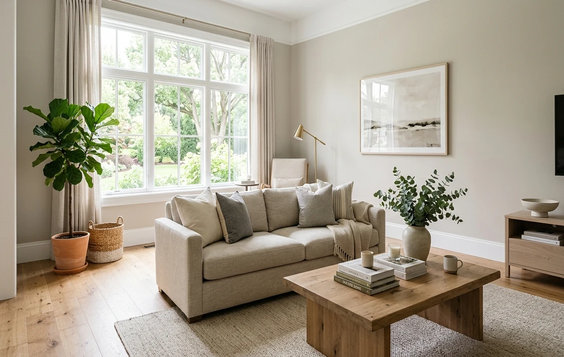
Quick orientation. Heirloom Traditions is a US direct-to-consumer brand best known for its All-In-One (ATO) paint, a self-priming, self-sealing acrylic-mineral hybrid aimed at furniture, cabinets, trim, and accent pieces rather than whole-house wall jobs. It is sold online and through a stockist network, not stacked on a big-box shelf, so it sits in a different lane than the store brands in our Lowe's paint colors store-brand guide. If you are weighing a heritage premium paint instead, our Farrow & Ball paint colors guide covers that end of the market.
Upload a photo of your dresser, cabinets, or room and preview a shade under your own light in about 30 seconds, free.
What All-In-One paint actually is (and is not)
Let me set expectations before we talk color, because the format drives every decision you will make. All-In-One is marketed as a no-prep, no-primer, no-topcoat finish. In practice that is true on clean, dull, sound surfaces. On a slick, glossy, or greasy piece (a laminate kitchen cabinet, a varnished antique, a previously oil-painted door) you still want to scuff and degloss, and a bonding primer is cheap insurance. The "no sanding ever" claim is the part that over-promises, and skipping prep on the wrong surface is the single most common reason a flip peels two months later.
What you genuinely get is a thick, self-leveling, low-VOC paint that dries to a soft matte-to-satin sheen, builds opaque coverage in two coats, and seals itself well enough for low-touch furniture without a separate topcoat. For high-wear surfaces (a tabletop, a kitchen cabinet door, a stair rail) the brand still sells a clear sealer, and on those jobs you should use it. Treat All-In-One as a furniture and accent paint that happens to be very forgiving, not as a magic wall paint, and you will be happy.
The best Heirloom Traditions paint colors for 2026
The palette leans heritage: chalky neutrals, muted greens, soft blues, and a handful of moody darks that flippers reach for constantly. Below are the shades worth your attention, with the undertone you should expect and where each one earns its keep. Read the undertone column carefully, because that is where a screen lies to you the most.
| Color | Family | Undertone | Reads as | Best use |
|---|---|---|---|---|
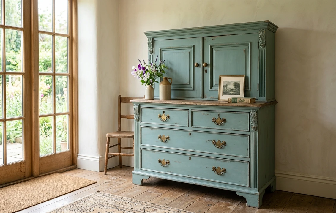
| Vintage Duck Egg | Blue-green | Soft green-blue | Faded heritage teal | Dressers, hutches, accent cabinets |
| Crinoline | White / cream | Warm cream | Soft antique white | Farmhouse trim, light furniture |
| Liberty Blue | Blue | Deep, slightly green navy | Rich classic navy | Island cabinets, statement dressers |
| Bayberry | Green | Muted gray-green | Sage with a gray base | Kitchen cabinets, bookcases |
| Java | Brown / black | Warm near-black brown | Espresso, soft black | Bold furniture, contrast bases |
| Linen | Greige | Warm taupe-gray | Soft natural greige | Neutral furniture, calm rooms |
| Magnolia | Off-white | Faint warm yellow | Creamy soft white | Trim, cabinets, brightening pieces |
Sources: Heirloom Traditions published color information 2026; furniture-painter field reports compiled by FacadeColorizer. Color names are illustrative of the brand's heritage palette; undertones are approximate and shift with light and substrate.
A note on naming. Heirloom Traditions, like most heritage furniture brands, leans on evocative names rather than a numeric code system, so two greiges or two creams can look almost identical on a screen and behave very differently on a piece. The undertone is the real signal. When you cannot decide between two creams, you are really deciding between warm and warmer, and that is exactly the kind of call a digital preview on your own piece settles fast.
Free AI visualizer. Test a heritage shade on your real piece before ordering a single jar.
The crowd favorites: Vintage Duck Egg, Bayberry, and Liberty Blue
If there is one shade that built the brand's fan base, it is Vintage Duck Egg. It is the soft, faded green-blue that reads like a teal someone left in the sun for forty years, and it is forgiving on almost any wood tone. On a dresser with brass pulls it looks heritage and collected; on a hutch with the doors removed it looks fresh without being trendy. Because it carries both green and blue, it shifts: cooler and bluer in north light, softer and greener under a warm bulb. That shift is a feature, but it is also why people who buy it off a phone screen sometimes feel surprised in person.
Bayberry is the muted gray-green that has taken over kitchen-cabinet flips. It is sage with a gray base, which keeps it grown-up rather than minty, and it pairs beautifully with unlacquered brass, butcher block, and warm whites. If you are deciding between Bayberry and a brighter sage, Bayberry is the safer whole-kitchen choice because the gray base keeps it from reading dated. For where it sits among other greens and how to keep a green from going olive, our green interior paint shades guide maps the field.
Liberty Blue is the navy for people who find pure navy a touch flat. It carries a faint green lean that gives it depth, reading rich and classic on island cabinets and statement dressers, and it drops to near-black under lamplight. It is the kind of color that needs opaque, even coverage to look its best, so two thin coats beat one thick one. For navy as a whole-room direction rather than a furniture accent, see our blue interior paint shades guide.
The neutrals that do the quiet work: Crinoline, Linen, Magnolia
Most people do not paint a whole house in heritage teal. The colors that quietly carry the most pieces are the neutrals, and Heirloom Traditions has three that show up again and again.
Crinoline
A warm, soft antique white with just enough cream to feel old without feeling yellow. It is the go-to for farmhouse trim and light furniture where a stark white would look too new. Against natural wood and warm metals it reads soft and collected. If you want a clean white instead, this is not it; Crinoline is deliberately warm.
Linen
The brand's greige workhorse, a warm taupe-gray that sits between beige and gray without committing to either. It is the safe choice for a neutral dresser or a calm bedroom piece, and it plays well next to both warm woods and cool stone. Here is the catch that catches every greige: in a dim, cool-light room it can drift gray and lose its warmth, so check it where the piece will actually live. For how greige behaves across rooms, our greige warm-neutral paint guide walks through the trap in detail.
Magnolia
A creamy off-white with a faint warm-yellow undertone, brighter than Crinoline but still soft. It is the one to reach for when you want to lighten a heavy piece or freshen trim without going clinical. Under warm bulbs the yellow lean can read a touch buttery, so if you want it to stay crisp, balance it with cooler hardware and a true-white wall behind it.
See two warm neutrals on your real piece, in your light, free, before you guess.
Color combinations that work
Furniture and cabinet projects almost always pair two or three of these colors, so here are combinations that hold up rather than fight each other:
- Bayberry cabinets + Magnolia walls + brass: the classic warm heritage kitchen. The gray-green grounds the room, the creamy off-white lifts it, and brass ties them together. This is the safest crowd-pleaser of the bunch.
- Liberty Blue island + Crinoline perimeter: a two-tone kitchen where the navy island anchors and the soft antique white keeps it from feeling heavy. Add black hardware for contrast.
- Vintage Duck Egg dresser + Linen walls: the teal becomes the star and the warm greige behind it stays quiet, so the piece reads collected, not loud.
- Java base + Crinoline drawers: a high-contrast furniture flip, espresso body with soft-white fronts, that looks expensive on a thrift piece and photographs well for resale.
The rule underneath all of these: pick one color to lead and let the others support. Two bold colors fighting for attention is the fastest way to make a heritage piece look busy. For broader room-level pairing logic, our interior color schemes guide covers how to build a palette around a lead color.
Heirloom Traditions for kitchen cabinets: the honest read
This is the highest-stakes use, so let me be direct. All-In-One can make a beautiful cabinet, but cabinets are the surface where the no-prep marketing gets people in trouble. Kitchen cabinets are usually slick, often factory-coated, and they live in a grease-and-touch environment. On that surface you want to clean thoroughly with a degreaser, scuff-sand the sheen, and on factory laminate add a bonding primer. Then two thin coats of color, and a clear sealer on the doors and any high-touch edges. Skip those steps and the paint can chip at the handles within months.
Done with prep, the matte heritage finish on cabinets is genuinely lovely and far cheaper than a refacing. If you want the full step-by-step on prep, primer choice, and coat order for cabinets specifically, our how to paint kitchen cabinets step-by-step guide applies directly to All-In-One and is the one to read before you open the jar.
How to test before you commit
Heirloom Traditions is sold mostly online, so you cannot grab a chip off a shelf and hold it against your piece in the store. That makes testing more important, not less. Two ways to get it right:
- Order a real sample first: the brand sells small sample sizes and color cards. Brush the actual paint on a hidden section of the piece or a scrap board, and check it in morning, afternoon, and lamp light. Watch Vintage Duck Egg and Linen especially, since both shift the most.
- Preview it digitally first: upload a photo of your dresser, cabinets, or room and apply the shade, plus a warmer and a cooler alternative, before you order anything. That narrows six maybes down to the one or two worth a real sample. Budget context for a full repaint is in our interior house painting cost guide.
Preview a heritage shade against a warmer and a cooler option, side by side, free. One HD render plus three variations.
Frequently asked questions
Do you really not need to sand or prime with Heirloom Traditions?
On clean, dull, sound surfaces, the All-In-One paint bonds well without sanding or primer. But on slick, glossy, or greasy pieces such as laminate cabinets, varnished antiques, or oil-painted doors, you should still degloss and use a bonding primer. The "no sanding ever" claim over-promises on those surfaces, and skipping prep there is the main reason a finish peels later.
What is the most popular Heirloom Traditions paint color?
Vintage Duck Egg, a soft faded green-blue, is the signature crowd favorite for dressers and hutches. Bayberry, a muted gray-green, has become the go-to for kitchen-cabinet flips, and Liberty Blue, a deep navy with a faint green lean, leads the bold statement pieces. For neutrals, Crinoline and Linen are the constant best sellers.
Can I use Heirloom Traditions on kitchen cabinets?
Yes, and it can look great, but cabinets need real prep. Clean with a degreaser, scuff-sand the sheen, add a bonding primer on factory laminate, apply two thin color coats, and seal the doors and high-touch edges with the clear topcoat. Cabinets are slick and high-contact, so the no-prep marketing is exactly where people get into trouble on this surface.
Does All-In-One paint need a topcoat?
For low-touch furniture and accent pieces, the paint seals itself well enough to skip a topcoat. For high-wear surfaces such as tabletops, kitchen cabinet doors, and stair rails, you should add the brand's clear sealer for durability. Match the level of protection to how much the surface gets touched.
Is Heirloom Traditions a wall paint?
It is designed as a furniture, cabinet, trim, and accent paint rather than a whole-house wall paint. The thick, self-leveling formula and soft matte sheen shine on furniture and millwork, but for large wall areas a dedicated interior wall paint is more economical and more scrubbable. Treat it as a furniture and accent specialist.
Preview shades like Vintage Duck Egg, Bayberry, and Liberty Blue on your actual furniture or cabinets under your own light before you order. One HD render plus three variations.
Disclaimer: Heirloom Traditions, All-In-One, and the color names referenced here are trademarks of their respective owner. Farrow & Ball, Sherwin-Williams, Benjamin Moore, Behr, and Valspar are trademarks of their respective owners. FacadeColorizer is an independent paint visualization service and is not affiliated with, endorsed by, or sponsored by Heirloom Traditions or any other brand named here. Color and undertone descriptions are approximate, rounded, and based on the manufacturer's published information plus field reports. Color reproduction on screens approximates the manufacturer's sample; always confirm with a manufacturer sample under your own light and on your own surface before purchase.
Trademarks mentioned (Sherwin-Williams, Benjamin Moore, Behr, Caparol, Brillux, Sto, Alpina, Valspar, PPG, Glidden, Dulux, Crown Trade, Sandtex, Farrow & Ball, Johnstone's, Leyland) are property of their respective owners. FacadeColorizer is independent and not affiliated with any of them. Nominative fair use under Lanham Act §1125.