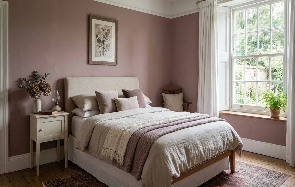

Farrow & Ball Sulking Room Pink (No. 295) is the pink for people who insist they hate pink. There is nothing sweet about it: it is a muted, dusty mauve with brown and gray pulled through it, the color of a faded velvet curtain or a dried rose petal. The name comes from the French boudoir, a private room for retreating, and that is exactly the mood it casts. It does not brighten a room so much as wrap it.
This profile is for the homeowner already circling Sulking Room Pink: how its mauve, brown, and gray undertones behave, the published LRV, the rooms it suits, the trim that keeps it from turning muddy, and how it differs from the cleaner pinks people cross-shop. It is one of the standout deep tones in our wider Farrow & Ball paint colors guide, and you can see where it sits among the softer options in our soft blush pink picks for interiors.
Upload one photo and preview F&B No. 295 under your room's actual light in about 30 seconds, free.
The numbers behind Sulking Room Pink No. 295
Start with the published data; these figures predict the wall far better than the foil chip in the fan deck. They come from the Farrow & Ball color tools:
| Spec | Value |
|---|---|
| F&B code | No. 295 Sulking Room Pink |
| HEX (screen approximation) | #B89B98 |
| RGB approximation | 184, 155, 152 |
| LRV (Light Reflectance Value) | 29 |
| Hue family | Muted mauve-pink, brown and gray base, cool-leaning rose |
| Closest cross-shops | Setting Plaster (F&B No. 231, lighter), BM Tissue Pink (1191), SW Redend Point (9081) |
Sources: Farrow & Ball No. 295 Sulking Room Pink color data, retrieved 2026; designer references on muted pinks.
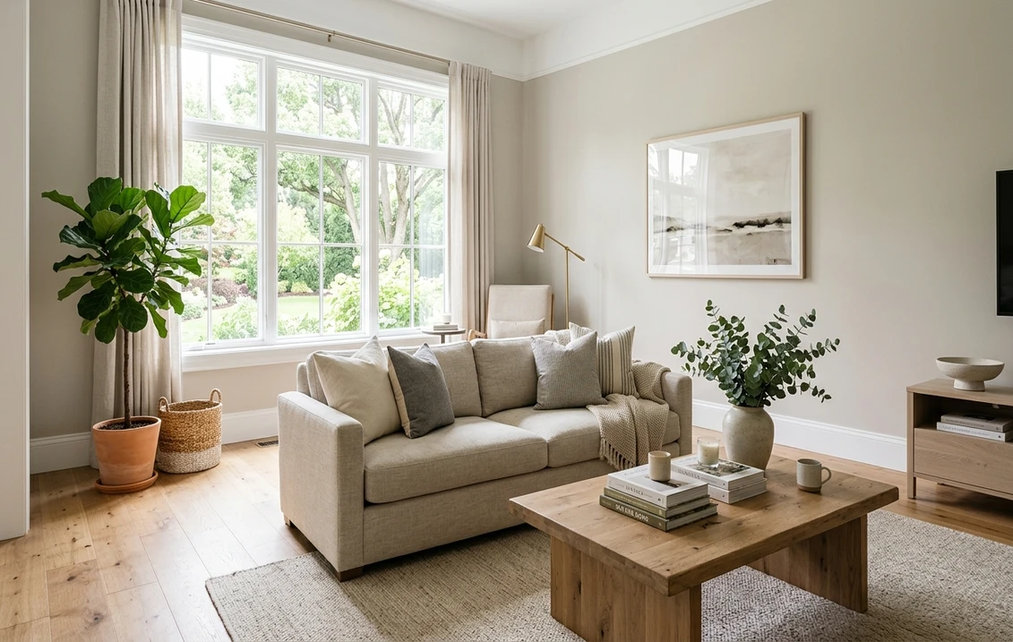
The LRV of 29 is the headline figure. That is a genuinely deep, saturated mid-tone, not a soft blush you can ignore. A wall this low reflects only a little light, so Sulking Room Pink reads as a real, committed color that envelops a room rather than tinting it. For comparison, a plaster pink like Setting Plaster sits up near LRV 56, almost twice as reflective, which is why the two behave like completely different colors despite both being "pink." If you want airy rather than enveloping, you want the lighter end of our soft blush pink roundup, not this one.
The undertones: mauve, brown, and gray
What makes Sulking Room Pink read as grown-up rather than girlish is what is mixed into the rose. There is no clean, high-chroma pink here. Three quieter directions do the work:
- The mauve read. This is the dominant character: a purple-tinged rose that leans cool. In balanced daylight, the mauve is what you notice first, and it is what separates this from a warm peachy pink.
- The brown read. A dusty brown sits underneath, and it is the part that strips out any sweetness. Under warm light, the brown comes forward and the color reads earthier, almost a faded terracotta-rose.
- The gray read. In low or cool light, the gray base surfaces and Sulking Room Pink turns moodier and more muted, closer to a smoky heather than a pink. This is the version that makes it work in dim, cocooning rooms.
Because the rose is so heavily grayed and browned, this color almost never reads as candy, even in a child's room. But the same muting means it can tip toward muddy in the wrong light, so the room's orientation matters. Our interior color families guide explains why grayed mid-tones swing more than people expect. Typical behavior across the four Northern Hemisphere orientations:
| Room orientation | Daylight character | How Sulking Room Pink reads |
|---|---|---|
| South-facing | Warm, abundant midday light | Warmest and rosiest; the brown softens and it glows as a dusty rose |
| West-facing | Cool by day, very warm at sunset | Muted heather by day, deep terracotta-rose in the late golden hour |
| East-facing | Warm early sun, neutral later | Rosy in the morning, settling to a grayed mauve by afternoon |
| North-facing | Cool, indirect, no direct sun | Coolest and moodiest; the gray and mauve dominate, smoky and enveloping |
Sources: American Institute of Architects daylight reference; Farrow & Ball No. 295 color data; designer field notes on muted mauves.
Counterintuitively, north-facing rooms are where Sulking Room Pink earns its keep. Cool indirect light, which flattens a brighter pink into something insipid, instead lets the cool mauve and gray go full and moody. Warm 2700K bulbs at night put the rose back without losing the depth. A south room, by contrast, can push it warm and almost terracotta, which some people love and others find heavier than they expected.
The rooms Sulking Room Pink was made for
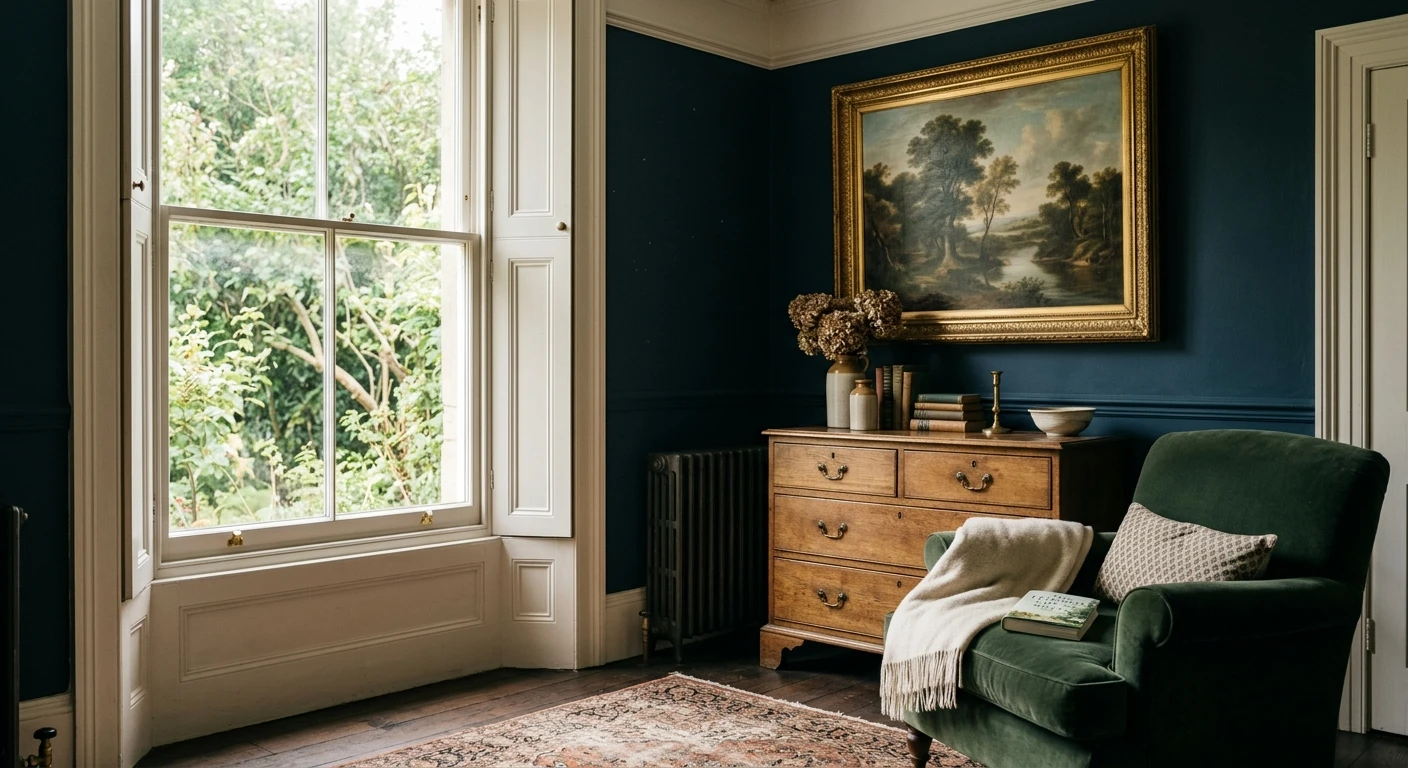
At LRV 29, this is a color for embracing darkness, not fighting it. It rewards small, intentional rooms where drama is the point:
- Powder rooms and dressing rooms: the signature use. A small windowless powder room is the ideal canvas for a saturated mauve; there is no risk of overwhelming the house, and the jewel-box effect is exactly what you want.
- Bedrooms: done full-coverage on all four walls, it makes a deeply cocooning, restful bedroom. Pair it with warm bedding and lamplight rather than overhead light to keep it soft.
- Studies, libraries, and dining rooms: rooms used mostly in the evening play to its strengths, since lamplight pulls the rose and brown forward and the mauve goes warm and rich.
- Accent and feature walls: if you are not ready to commit all four walls, a chimney breast or alcove in Sulking Room Pink reads as considered rather than timid. For the budget math on a single feature wall versus a full room, our interior painting cost guide covers what to expect.
Where to be careful: a bright, sunny family room flooded with light can wash the muted mauve thin and flat during the day, and a large open-plan space can be a lot of dusty pink to live with wall to wall. In big bright rooms, many designers reserve it for a moody zone or pair it with deeper neutrals. If a pink bath is the goal but LRV 29 feels too dark, our pink bathroom paint ideas walk through lighter options.
Free AI visualizer: test No. 295 in a powder room or bedroom before you buy a sample.
Trim, ceiling, and decor that keep it rich
A deep, grayed mauve is unforgiving about the wrong white. A stark, blue-cool white beside it makes the pink look dirty by contrast, so the goal is warmth and softness, not brightness:
- Best all-around trim: a soft warm white such as Farrow & Ball Pointing (No. 2003) or School House White (No. 291). Both have enough warmth to flatter the rose without going stark, and they keep the scheme feeling tonal rather than high-contrast.
- For a tone-on-tone look: paint the trim in a lighter related pink like Setting Plaster (No. 231), or even the same Sulking Room Pink in a different finish, for a soft, modern, enveloping effect.
- Ceiling: a warm white keeps a low-LRV room from feeling like a cave; for full drama in a powder room, carrying the pink onto the ceiling makes the jewel-box complete.
- Deeper coordinating tones: green is its natural partner. A muted sage, olive, or a deep forest green calms the rose and reads sophisticated. A warm charcoal or a soft taupe grounds it for a tailored scheme.
- Decor and finishes: unlacquered brass, antique gold, warm oak, and natural linen all flatter the warm side. Chrome and cool blue-grays fight it. Velvet and other matte textures read beautifully against its depth.
For a softer, lighter pink to run in an adjoining room or on the trim, Setting Plaster is the obvious in-family partner, and the broader Farrow & Ball guide covers the warm whites and greens that flow beside it.
Sulking Room Pink vs the colors people cross-shop
Sulking Room Pink gets lined up against a few muted pinks across brands, and they are genuinely different paints. Knowing the difference saves a wrong sample pot:
- vs F&B Setting Plaster (No. 231): the in-family comparison most people make. Setting Plaster (LRV around 56) is a light, airy plaster pink with far more sweetness and almost no mauve. Sulking Room Pink (LRV 29) is its deep, grayed, grown-up cousin. Choose Setting Plaster for a soft, sunlit room, Sulking Room Pink for a saturated, moody one. They are not interchangeable.
- vs BM Tissue Pink (1191): the most common Benjamin Moore cross-shop, and the clearest contrast. Tissue Pink is a cleaner, brighter, lighter pink with much less brown and gray pulled through it, so it reads younger and more straightforwardly pink. Sulking Room Pink has far more depth and a cool mauve cast; it never reads as "just pink." Pick Tissue Pink if you actually want the room to look pink, Sulking Room Pink if you want it to look like a faded antique.
- vs SW Redend Point (SW 9081): the Sherwin-Williams cross-shop and a frequent mix-up, but they part ways on temperature. Redend Point (LRV around 35) is a warm rosy-beige that leans clay and pink-brown, a softer, lighter, warmer color. Sulking Room Pink is cooler, deeper, and more clearly mauve. If your room runs cool and you want depth, go Sulking Room Pink; if you want a warm, lighter, more neutral pink-beige, Redend Point is the safer call.
None of these three is a true match for Sulking Room Pink, which is the point: its specific cool mauve depth at LRV 29 is hard to reproduce in another brand. If you have seen it specced and want the exact effect, sample No. 295 itself rather than a "close" substitute.
How to test Sulking Room Pink before you commit
A deep, color-shifting mauve like this one is exactly where a tiny chip lies to you. The foil swatch viewed under store light gives no sense of how the gray and brown will take over in a north room or how warm it glows under lamplight. The reliable physical method is a large painted sample, a peel-and-stick swatch or a sample-pot board, taped to at least two walls and checked in the morning, mid-afternoon, and after dark under your real bulbs; the lamplight version is the one you will live with most. The faster, no-paint first pass is a digital visualizer: upload a photo of the actual room and apply Sulking Room Pink beside a lighter pink (Setting Plaster) and a warmer one (Redend Point) to see which way your light pulls it, ruling out the directions that were never going to work.
Preview No. 295 beside a lighter and a warmer alternative under your real light, free.
Frequently asked questions
What undertones does Sulking Room Pink have?
Sulking Room Pink (F&B No. 295) is a muted mauve-pink built on a brown and gray base. The mauve is what you notice first, a cool, purple-tinged rose, while the brown strips out any sweetness and the gray makes it moodier in low light. Warm light pulls the rose and brown forward so it reads as a dusty rose; cool or north light brings the gray and mauve up so it reads as a smoky heather. It almost never reads as a sweet candy pink because of how heavily it is grayed.
What is the LRV of Sulking Room Pink?
Sulking Room Pink has a Light Reflectance Value of 29, a deep, saturated mid-tone. That is genuinely dark for a pink: it reflects relatively little light, so it envelops a room rather than tinting it. For comparison, the lighter plaster pink Setting Plaster sits near LRV 56, almost twice as reflective, which is why the two look like completely different colors. The low LRV is what makes No. 295 ideal for cocooning powder rooms and bedrooms and risky in big, bright open spaces.
What trim color goes with Sulking Room Pink?
Use a soft, warm white rather than a stark cool one, which would make the mauve look dirty by contrast. Farrow & Ball Pointing (No. 2003) or School House White (No. 291) are reliable warm-white trims that flatter the rose and keep the scheme tonal. For a modern enveloping look, paint the trim in a lighter related pink like Setting Plaster, or in the same color in a different finish. Green, taupe, and warm charcoal make strong coordinating accent colors.
Does Sulking Room Pink work in a north-facing room?
Yes, and it is arguably its best orientation. North light is cool and indirect, which flattens a bright pink into something insipid but instead lets the cool mauve and gray in Sulking Room Pink go full and moody. The result is a smoky, enveloping color rather than a washed-out one. Add 2700K warm bulbs at night to bring the rose back without losing the depth. Sunny south rooms can push it warmer toward terracotta and, in very bright spaces, slightly flat during the day.
Is Sulking Room Pink the same as Redend Point or Tissue Pink?
No. Sherwin-Williams Redend Point (SW 9081, LRV around 35) is a warmer, lighter rosy-beige that leans clay and pink-brown, so it reads softer and more neutral. Benjamin Moore Tissue Pink (1191) is a cleaner, brighter, lighter pink with much less brown and gray, so it reads more straightforwardly pink. Sulking Room Pink is cooler, deeper, and more clearly mauve than either. None is an exact match; if you want its specific cool mauve depth, sample F&B No. 295 itself.
See F&B No. 295 under your real light, beside a lighter and a warmer alternative, before you buy.
Disclaimer: Farrow & Ball, Sulking Room Pink (No. 295), Setting Plaster (No. 231), Pointing (No. 2003), and School House White (No. 291) are trademarks of Farrow & Ball Limited. Benjamin Moore and Tissue Pink (1191) are trademarks of Benjamin Moore & Co. Sherwin-Williams and Redend Point (SW 9081) are trademarks of The Sherwin-Williams Company. FacadeColorizer is an independent paint visualization service and is not affiliated with, endorsed by, or sponsored by Farrow & Ball, Benjamin Moore, or Sherwin-Williams. Screen color approximates the manufacturer's sample; always confirm with a physical sample under your own light before purchase. LRV and color figures are manufacturer values, rounded. Sources: Farrow & Ball No. 295 Sulking Room Pink and No. 231 Setting Plaster color data 2026, Benjamin Moore Tissue Pink 1191 color data, Sherwin-Williams Redend Point SW 9081 color data, and designer field notes on muted mauves.
Trademarks mentioned (Sherwin-Williams, Benjamin Moore, Behr, Caparol, Brillux, Sto, Alpina, Valspar, PPG, Glidden, Dulux, Crown Trade, Sandtex, Farrow & Ball, Johnstone's, Leyland) are property of their respective owners. FacadeColorizer is independent and not affiliated with any of them. Nominative fair use under Lanham Act §1125.