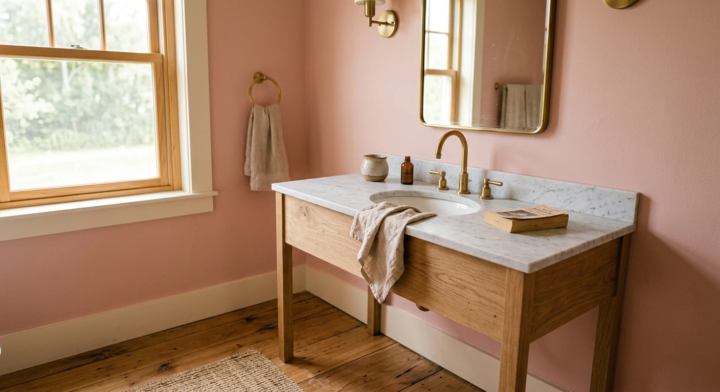

The first pink bathroom I ever cut in was a 1954 powder room with original tile the homeowner swore she hated. We rolled a warm blush above the chair rail, swapped the chrome for unlacquered brass, and she went quiet in the doorway. That is the thing about a pink bathroom: it sounds like a gamble until the light hits it, then it reads less "Pepto" and more "old French hotel." Pink is the most flattering color you can stand in front of a mirror, since it bounces a warm cast onto skin the way no gray will. The trick is the right pink: the gap between a blush that looks expensive and one that looks like a birthday cake comes down to undertone and LRV. Here are 12 looks that work.
This guide stays on pink in the bathroom: how it behaves near tile, under vanity lights, and beside the fixtures you own. For the broader gallery, this page sits inside our room paint color ideas by room guide. For blush, rose, and dusty pinks as a family (with codes and LRVs), see our pink and blush interior paint colors roundup: that one is the color library, this one is the room.
Upload a photo of your actual bathroom and preview any blush under your own light in about 30 seconds, free.
Why pink works so well in a bathroom
Bathrooms are usually small, often windowless, and lit by cool ceiling cans plus warmer vanity bulbs, a combination that flattens most colors. Pink is the exception: a warm blush absorbs the harshness of overhead light and throws a soft, complimentary glow back at your face. It is why so many heritage hotels read rosy.
Three rules carry every good pink bathroom. Mind the undertone: a peachy or beige-based pink reads sophisticated, while a blue-based or fluorescent pink reads juvenile fast. Watch the LRV (Light Reflectance Value): a high-LRV blush (75 plus) keeps a tiny bath open, while a deep rose (under 40) wants real square footage. And let the fixtures and tile do half the talking: pink with brass, white marble, and warm wood reads luxe; the same pink with builder chrome and gray tile falls flat.
12 pink bathroom ideas, by shade and look
Organized roughly light to deep. Each notes the pink direction, where it shines, and what to pair it with.
1. Barely-there blush on every wall
The easiest entry point. A near-white pink at LRV 80 plus reads as a warm off-white in most light and only whispers pink when the sun moves through. Perfect for a primary bath when you want the glow without committing to color. Crisp white trim, white subway tile.
2. Mid-tone blush, full-room
A true blush with a warm beige base (a soft rosy greige) is the safest committed pink: enough body to read as color, still grown-up. The workhorse for a guest bath. Brass fixtures, oak vanity.
3. Dusty rose half-wall over wainscot
For period homes, run a muted dusty rose above white beadboard or a chair rail. The white lower third keeps the room clean while the rose carries the character. This is the classic that rescued my 1954 powder room.
4. Clay rose with brass everything
A terracotta-leaning rose earths the pink so it reads warm and architectural instead of sweet. It loves unlacquered brass, walnut, and honed marble. Easily the most current pink bathroom look for 2026.
5. Pink ceiling, white walls (the "fifth wall")
If full pink bathroom walls feel like too much, paint only the ceiling blush and keep the walls white. The pink reflects down softly all day and surprises everyone who looks up. Low risk, high payoff in a small bath.
6. Color-drench: walls, trim, and ceiling in one blush
The drama move. One mid blush on every surface (matte walls, satin trim, flat ceiling) erases the edges and makes a tiny powder room feel like a jewel box. Pick a clean warm undertone so it does not muddy on the trim.
7. Blush walls with deep green vanity
Pink and green are a designer staple. A soft blush wall over a forest or olive vanity reads botanical. Our bathroom color schemes for 2026 breaks down which secondaries carry pink best.
8. Pink and navy powder room
A blush above a navy lower wall or vanity is bold and timeless. The navy grounds the pink so it never reads babyish, and the contrast photographs beautifully. Brass ties the two together.
9. Mauve pink for a moody ensuite
Add gray to pink and you get mauve: a dusky, almost purple-pink that turns a windowless primary bath into a spa cocoon. Keep lighting warm (2700K) or it tips cold.
10. Peachy pink in a north-facing bath
North light steals warmth, so a peach-leaning pink with a real orange undertone holds its glow where a cool blush goes flat. The right pink for a dim, north-facing room. Crisp white tile keeps it fresh.
11. Blush accent wall behind the tub or vanity
Not ready to drench? Paint one wall, behind a freestanding tub or the vanity mirror, in a deeper rose and leave the rest soft white. The color hit lands exactly where the eye does.
12. Pink with terracotta or zellige tile
Let the tile lead. A blush wall with handmade pink-clay or glossy zellige tile creates a tonal, layered look. The variation in handmade tile keeps the whole room from reading flat.
Free AI visualizer. Test blush, dusty rose, and clay on your real bathroom walls before buying a sample pot.
Pink bathroom shades compared: undertone, LRV, and best use
Most pink bathroom walls disappoint for one reason: the wrong undertone for the room's light. Use this as a quick map from the look you want to the pink that delivers it. LRV ranges are typical for each family, not a single product spec:
| Pink direction | Undertone | Typical LRV | Best bathroom use |
|---|---|---|---|
| Barely-there blush | Warm white / faint peach | 78 to 85 | Small or windowless bath; pink by day, neutral at night |
| Mid blush (rosy greige) | Warm beige | 62 to 74 | All-wall guest bath; the safe committed pink |
| Dusty rose | Muted gray-rose | 45 to 58 | Half-wall over wainscot; period powder rooms |
| Clay rose / terracotta pink | Warm orange-brown | 35 to 50 | Color-drench with brass; the 2026 statement bath |
| Mauve pink | Gray-violet | 30 to 45 | Moody ensuite; needs warm 2700K light |
| Peachy pink | Clear orange | 60 to 72 | North-facing rooms that drain cooler blushes |
Sources: manufacturer color data for blush and rose families 2026; The Spruce and Apartment Therapy bathroom-color coverage; designer field reports compiled by FacadeColorizer. LRV ranges are typical, not a single product value.
How pink reads under bathroom light
Lighting is the variable that makes or breaks a pink. The same swatch can look like soft rose by the window and cold lilac under a cheap LED puck. Three things to watch:
- Bulb temperature: warm 2700K bulbs deepen and flatter every pink, especially dusty rose and mauve. Cool 4000K bulbs drain a blush toward gray and surface a blue undertone. For pink, warm bulbs win.
- Tile reflections: cool white or gray tile throws cool light onto your paint and chills a warm blush. Warm-white, cream, or pink-clay tile reinforces the warmth instead.
- Steam and sheen: bathrooms need a scrubbable finish, and a satin or semi-gloss sheen reflects more light, so a pink reads slightly lighter and shinier than in matte. Sample in the finish you will use.
One painter note worth its weight: cut in your sample around the mirror, not a random corner, because that is where you judge the color every morning. And lay your second coat before you decide, since one thin coat of any blush reads patchy and cooler than the finished wall.
See walls, tile, and fixtures together in one preview, free.
Fixtures, tile, and trim that flatter a pink bathroom
A pink wall is only half the room. What sits against it decides whether the whole thing reads heritage-luxe or dated:
- Metals: brass and unlacquered brass are the gold standard with pink; aged or champagne bronze also sings. Chrome reads cooler against blush, and polished nickel is a safe neutral middle.
- Tile: white marble, honed Carrara, cream zellige, and pink-clay tile reinforce warmth. Cool gray porcelain and stark blue-white tile fight a warm blush; with those, lean to a peachy pink.
- Trim and ceiling: a clean warm white keeps a blush bath fresh and avoids the chalky contrast a stark blue-white creates. In a color-drench, paint the trim the same blush in satin.
- Wood and counters: white oak and walnut vanities flatter pink; warm terrazzo and creamy quartz pick up the rosy cast. Cool gray-washed wood leaves the room flat.
- Pair with another color: green, navy, and warm white carry pink furthest. Our best bathroom picks guide shows where blush ranks against other top directions.
If your bath is genuinely tiny, the rules tighten: a windowless powder room rewards a higher-LRV blush and lighter fixtures. Our small bathroom paint colors for 2026 covers keeping a compact room open, and if a painted vanity is in the plan, our bathroom vanity paint colors guide pairs cabinet tones to wall pinks.
How to test a pink bathroom color before you commit
A fan-deck chip is the number-one reason pink bathroom paint disappoints: too small to show the undertone, and it reads lighter and cooler than a rolled, second-coated wall. Two better methods:
- Paint a large swatch by the mirror: roll a 12-by-12-inch sample (two coats) on the mirror wall and one other, then check it in daylight, under vanity bulbs at night, and right after a hot shower. Pinks shift more across a day than almost any other color.
- Preview it digitally first: upload a photo of your bathroom and apply a blush, a dusty rose, and a clay rose before buying any samples, narrowing three contenders to one worth painting. Budget context is in our interior house painting cost guide for 2026.
Preview a blush against a dusty rose and a clay tone, side by side, free.
Frequently asked questions
What is the best pink for a small bathroom?
In a small or windowless bath, a high-LRV barely-there blush (roughly LRV 78 to 85) is the safest pink because it keeps the room feeling open and reads as a warm off-white at night, only showing color in daylight. If you want more presence without closing the room in, a mid-tone rosy greige works on every wall. Save deep dusty rose, clay, and mauve for rooms with real square footage or a window.
Does a pink bathroom look dated?
Not when the undertone is right. The dated reputation comes from 1980s blue-based and fluorescent pinks. A warm, beige-based blush, a muted dusty rose, or a clay-leaning terracotta pink reads heritage and current, especially paired with brass fixtures, white marble, and warm wood. Skip cool, candy, and blue-pink undertones and the room looks intentional rather than retro.
What colors go with pink bathroom walls?
Green, navy, and warm white are the three secondaries that carry pink furthest. A deep green or olive vanity reads botanical, a navy lower wall grounds the pink and keeps it grown-up, and warm white trim keeps a blush bath fresh. For metals, brass and aged bronze flatter pink most, while chrome reads cooler.
What sheen should I use for a pink bathroom?
Use a satin or semi-gloss in a bathroom so the walls resist moisture and wipe clean. Be aware that a higher sheen reflects more light, so the same pink reads slightly lighter and shinier than it would in matte. Always sample in the exact finish you plan to use, and judge it after a second coat, since one thin coat looks patchy and cooler than the finished wall.
Will pink make a bathroom look smaller?
Only a deep pink will. A light, high-LRV blush actually keeps a small bath feeling open while adding warmth, and a color-drench in a soft blush can make a tiny powder room feel like a jewel box rather than a cramped box. Deep dusty rose, clay, and mauve absorb more light, so they suit larger or window-lit bathrooms.
Preview a blush, a dusty rose, and a clay tone on your actual walls under your own light before buying a single sample.
Disclaimer: Color names in this guide (blush, dusty rose, clay rose, mauve, peachy pink) describe pink families rather than single proprietary products; LRV ranges are typical, not a substitute for a manufacturer's published value. FacadeColorizer is an independent paint visualization service and is not affiliated with, endorsed by, or sponsored by any paint manufacturer. Color reproduction on screens approximates a real painted surface; always confirm your final choice with a manufacturer sample, in your chosen sheen and under your own bathroom light, before purchase. Sources: manufacturer blush and rose color data 2026, The Spruce and Apartment Therapy bathroom-color coverage, designer field reports compiled by FacadeColorizer.