
My sister repainted her builder-beige kitchen one slate blue over a long weekend, and the first thing she said when I walked in was that it finally felt like a room someone chose. That is the quiet power of a blue kitchen: it reads calm and considered in a space we usually treat as pure utility. Blue is the rare color that flatters white counters, warm oak, brass, and stainless all at once, which is why it has quietly become the most-requested wall color for kitchens that want personality without going loud. Below are 14 blue kitchen ideas, each with a real shade, an honest LRV, the pairings that make it sing, and how it actually reads once the second coat dries.
One thing up front: a blue kitchen lives or dies on the depth you pick and the light you have. A pale sky blue in a north-facing galley can drift gray and cold by afternoon, while a deep navy in a bright south room can feel like a jewel box. This guide is part of our wider room-by-room paint color ideas series, and it pairs naturally with our interior blue paint shades guide if you want to see how each tone behaves across the whole house, not just at the stove.
Upload a photo of your actual kitchen and preview any of these blues under your own light in about 30 seconds, free.
How blue reads in a kitchen (before you pick a shade)
Kitchens are a hard room for blue because of three things working at once: bright task lighting, large reflective surfaces (counters, backsplash, appliances), and a lot of warm wood or white. Blue is a cool color, so it can either balance all that warmth beautifully or, picked wrong, fight it. The trick is matching depth to function.
- Pale blues (LRV 60 plus): sky, powder, and blue-green-grays keep a small kitchen feeling open and airy. They read coastal and fresh, but in cool north light they can slip toward gray, so you want a warm bulb to hold them.
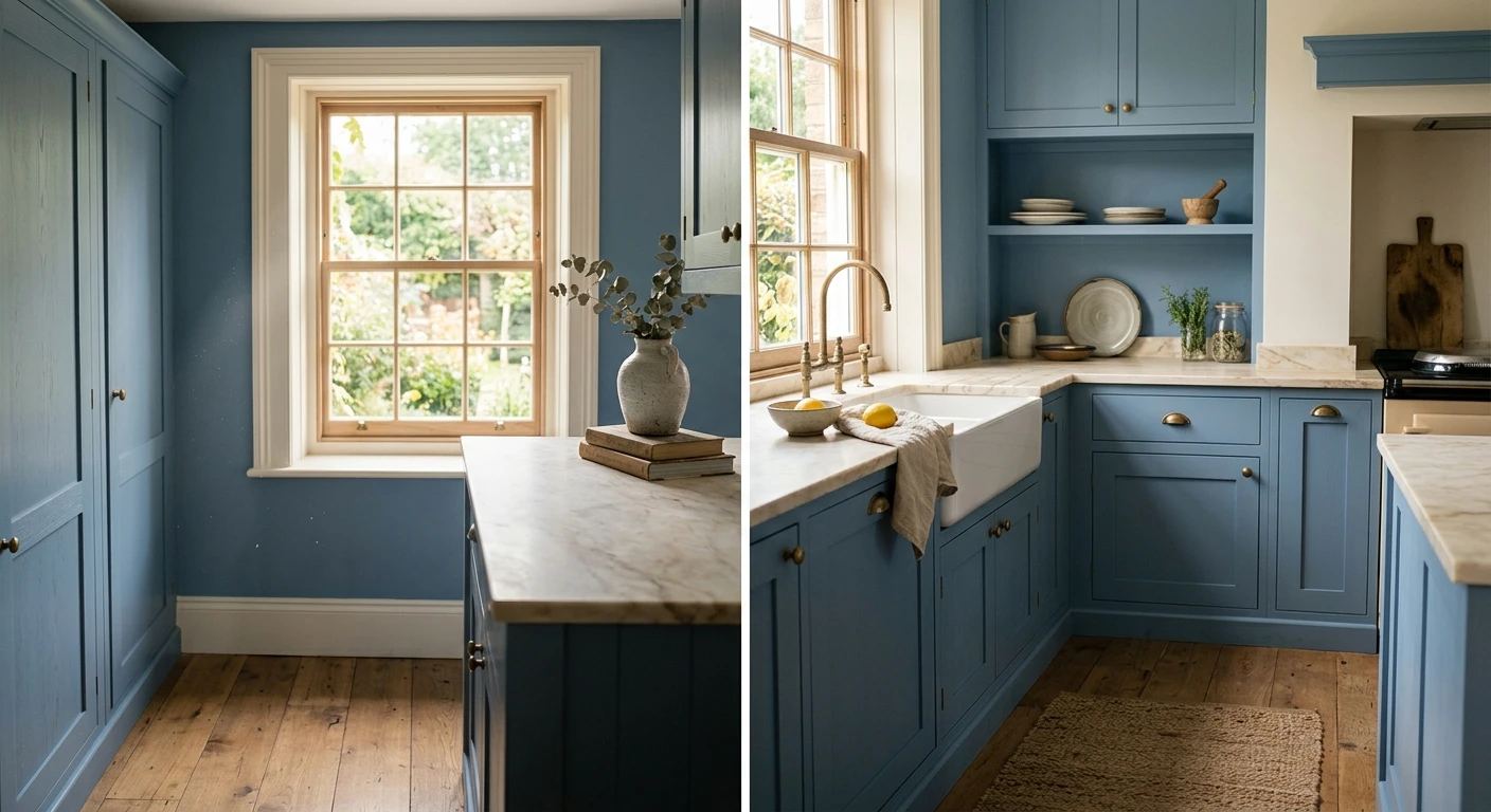
- Mid blues (LRV 15 to 35): slate, denim, and chambray are the all-day workhorses. Saturated enough to feel intentional, light enough not to swallow the room. This is the safest blue kitchen zone.
- Deep blues (LRV under 12): navy and ink make a dramatic statement, especially on a lower section or a single feature wall. They demand good light and warm metallics (brass, gold) to stay from feeling heavy.
A painter's note on finish: kitchens get splattered, so I push clients toward eggshell or satin on blue kitchen walls. Flat will not wipe clean behind a coffee station, and a deep navy in flat can chalk-rub when you scrub it. Cut in your edges first, then roll, and plan on a true second coat: saturated blues are notorious for patchy first-coat coverage over a light primer.
14 blue kitchen paint ideas, by depth
Here is the working list. I have grouped these blue kitchen ideas from lightest to deepest so you can scan straight to the saturation you are after. LRV (Light Reflectance Value) tells you how much light bounces back: higher is airier, lower is moodier.
| Color | Brand / code | LRV | How it reads in a kitchen |
|---|---|---|---|
| Sea Salt | SW 6204 | 63 | Soft blue-green-gray, coastal and airy; perfect for a small or dim kitchen |
| Palladian Blue | BM HC-144 | 61 | Spa-like aqua-gray; reads green in warm light, blue in cool light |
| Rainwashed | SW 6211 | 59 | Watery seafoam blue; relaxed cottage feel with white cabinets |
| Quietude | SW 6212 | 42 | Muted teal-gray; grounded, mature, easy with brass hardware |
| Wythe Blue | BM HC-143 | 41 | Historic gray-green-blue; vintage farmhouse warmth |
| Smoky Blue | SW 7604 | 26 | Dusty slate blue; cozy and current, great on a banquette wall |
| Stratton Blue | BM HC-142 | 36 | Soft chambray; gentle mid blue that flatters warm wood floors |
| Denim | BM 2128-30 | 22 | True washed-denim mid blue; casual, friendly, hides scuffs well |
| Van Deusen Blue | BM HC-156 | 17 | Classic slate blue; traditional, livable all day, ages gracefully |
| Mount Etna | SW 7625 | 12 | Deep blue-gray; sophisticated, moody without going full navy |
| Newburyport Blue | BM HC-155 | 9 | Rich classic navy; crisp with white counters and brass |
| Hale Navy | BM HC-154 | 6 | The benchmark navy; deep but soft, never quite black |
| Naval | SW 6244 | 4 | Saturated jewel navy; dramatic on a two-wall or full feature kitchen |
| Indigo Batik | SW 7602 | 8 | Ink blue with a violet whisper; rich and a touch unexpected |
Sources: Sherwin-Williams and Benjamin Moore published color data 2026; designer field reports compiled by FacadeColorizer.
Free AI visualizer. Test any shade above on your real kitchen before buying a sample pot.
Soft and airy blue kitchen ideas
If your kitchen is small, north-facing, or you just want light, start at the top of the list. Sea Salt (SW 6204) is the most forgiving blue kitchen wall color I know: at LRV 63 it bounces plenty of light, and its blue-green-gray base reads soft rather than icy. It loves white or off-white cabinets and warm wood floors. Palladian Blue (BM HC-144) is the spa cousin, with more green in warm light, while Rainwashed (SW 6211) leans the most seafoam and cottage-y.
The honest caution with pale blues: in a dim or strongly north-lit kitchen they can drift toward plain gray and lose their charm by mid-afternoon. A 2700K to 3000K warm bulb pulls the warmth back and keeps them reading as soft blue. If you are debating which undertone wins in your room, our blue-gray undertones guide walks through how these light blues shift across a day.
Mid-tone slate and denim blue kitchen walls
This is the sweet spot for most homes. Smoky Blue (SW 7604) and Stratton Blue (BM HC-142) are dusty, gentle mid blues that feel current without being trendy, and they hide everyday kitchen scuffs far better than a pale wall. Denim (BM 2128-30) is exactly what it sounds like, a friendly washed-jeans blue, and Van Deusen Blue (BM HC-156) is the traditional slate that has been quietly flattering kitchens for decades. These blue kitchen walls pair effortlessly with warm wood, brass pulls, and white counters.
What makes mid blues so easy is that they read as a true color, not a maybe. A slate blue commits in a way a pale blue does not, so the room looks designed even with simple cabinets. For full wall-plus-trim-plus-counter combinations built around these tones, see our colors that go with blue guide, which maps the whites, woods, and metals that flatter each depth.
Deep navy blue kitchen ideas
For drama, go deep. Hale Navy (BM HC-154) is the benchmark for a reason: at LRV 6 it is rich and enveloping but stays soft instead of flattening to black. Newburyport Blue (BM HC-155) is its slightly brighter classic-navy sibling, crisp against white counters. Naval (SW 6244) is the most saturated jewel tone of the three and looks spectacular on a two-wall pantry nook. And Indigo Batik (SW 7602) brings a faint violet whisper for something less expected.
A few real-world rules for navy in a kitchen. First, it needs light: a windowless galley in navy can feel like a cave. Second, warm metallics save it, so brass, unlacquered bronze, or gold hardware keep a deep navy from going cold. Third, a navy lower zone with lighter upper walls is often the smartest move in a small kitchen, you get the richness without losing the brightness. If navy is your direction, our Hale Navy HC-154 review covers exactly how the most popular navy behaves under different light.
See deep blue on your real walls before committing to a single gallon, free.
What to pair with a blue kitchen
A blue wall is only half the room. Here is what reliably flatters each depth without me having to see your space:
- Whites and trim: a soft warm white (think SW Alabaster or BM White Dove) keeps blue from feeling cold. Skip a stark blue-white trim next to navy, it can make the wall look dull by contrast.
- Counters: white quartz and warm white marble are the easy win against any blue. Butcher block adds cottage warmth to mid and pale blues especially.
- Wood: white oak, walnut, and natural rattan bounce warmth back onto cool blue walls and stop the room from tipping clinical.
- Metals: brass and gold are the navy whisperers; brushed nickel and matte black suit slate and denim blues; chrome reads crispest with pale coastal blues.
- Backsplash: white subway, zellige in cream, or a warm terracotta accent all play nicely. A blue-on-blue backsplash works only if you vary the depth clearly.
If you would rather see complete done-for-you palettes that include a blue kitchen wall, our kitchen color scheme guide packages walls, trim, counters, and metals into ready combinations. And if you are weighing painted cabinetry in the same project, the complete kitchen cabinet color guide covers how a blue wall sits next to white, wood, or two-tone cabinet fronts.
How to test a blue kitchen before you commit
Blue is the single most light-sensitive wall color there is, which means a fan-deck chip will lie to you in a kitchen. A 2-inch swatch under cabinet lighting tells you almost nothing about how a navy will read across a full wall at 8 a.m. versus 8 p.m. Two better methods:
- Paint a large swatch: roll a 12-by-12-inch sample (or peel-and-stick swatch) on two walls, one near the window and one in a darker corner. Check it morning, afternoon, and at night under your real bulbs. Watch the pale blues for the gray drift and the navies for how dark they truly go.
- Preview it digitally first: upload a real photo of your kitchen and apply a pale, a mid, and a deep blue before you buy any samples, then narrow three contenders to one worth painting. If you are budgeting the repaint, our interior house painting cost guide sets realistic numbers per room.
Preview a pale, a mid, and a deep blue side by side on your real kitchen, free.
Frequently asked questions
What is the best blue for a kitchen?
For most homes a mid-tone slate blue like Van Deusen Blue (BM HC-156, LRV 17) or Smoky Blue (SW 7604, LRV 26) is the safest, most livable choice: saturated enough to look intentional, light enough not to swallow the room. For a small or dim kitchen, go pale with Sea Salt (SW 6204). For drama in a bright kitchen, go deep with Hale Navy (BM HC-154).
Does a blue kitchen make the room look smaller?
Only the deep navies will, and even then mostly in poor light. Pale blues above LRV 60, such as Sea Salt or Palladian Blue, actually keep a small kitchen feeling open and airy. If you love navy in a small space, paint only a lower zone or one feature wall and keep the rest light, so you get the richness without the cave effect.
What colors go with blue kitchen walls?
Warm whites (SW Alabaster, BM White Dove) for trim, white quartz or marble counters, white oak or walnut wood, and brass or gold metals for navies. Brushed nickel and matte black suit mid slate and denim blues. The goal is to add warmth back, since blue is cool and can read clinical without warm wood and metal to balance it.
What sheen should I use on blue kitchen walls?
Eggshell or satin. Kitchens get splattered, and both finishes wipe clean while hiding more wall flaws than a high gloss. Flat looks elegant but will not scrub clean behind a coffee station, and deep navies in flat can chalk-rub when you wash them, so satin is the smarter pick for a navy kitchen.
Will a blue kitchen feel cold in north light?
Pale and aqua blues can drift gray and cool in north or dim light, especially by afternoon. A warm 2700K to 3000K bulb pulls the warmth back and keeps them reading blue. Mid-tone slate and denim blues hold their color better, and warm wood floors plus brass hardware further offset any chill in a north-facing kitchen.
Preview any blue above on your actual kitchen walls under your own light before buying a single sample.
Disclaimer: Sherwin-Williams, Sea Salt (SW 6204), Rainwashed (SW 6211), Quietude (SW 6212), Smoky Blue (SW 7604), Mount Etna (SW 7625), Naval (SW 6244), and Indigo Batik (SW 7602) are trademarks of The Sherwin-Williams Company. Benjamin Moore, Palladian Blue (HC-144), Wythe Blue (HC-143), Stratton Blue (HC-142), Denim (2128-30), Van Deusen Blue (HC-156), Newburyport Blue (HC-155), Hale Navy (HC-154), White Dove, and Alabaster are trademarks of their respective owners. FacadeColorizer is an independent paint visualization service and is not affiliated with, endorsed by, or sponsored by Sherwin-Williams or Benjamin Moore. Color reproduction on screens approximates the manufacturer's chip; always confirm with a manufacturer sample under your own light before purchase. Sources: Sherwin-Williams and Benjamin Moore published color data 2026, designer field reports compiled by FacadeColorizer.
Trademarks mentioned (Sherwin-Williams, Benjamin Moore, Behr, Caparol, Brillux, Sto, Alpina, Valspar, PPG, Glidden, Dulux, Crown Trade, Sandtex, Farrow & Ball, Johnstone's, Leyland) are property of their respective owners. FacadeColorizer is independent and not affiliated with any of them. Nominative fair use under Lanham Act §1125.