
The kitchen is where a color decision gets the most scrutiny and the least mercy. You stand in it every morning under bad light, you watch it change from gray dawn to warm 2700K dinner glow, and unlike a guest bedroom, you cannot just close the door on a choice you regret. That is why kitchen color schemes are harder than picking a single wall color: you are juggling cabinets, walls, an island, the backsplash, the countertop, and the trim, and they all have to agree. This guide gives you 14 schemes that hold up in real homes, with the undertone and LRV notes a painter actually uses, plus the combinations I tell clients to skip.
A quick frame before the palettes. Think in layers, not in single colors. The cabinets are your largest commitment and the hardest to redo, so they anchor everything. The walls are cheap to change, so let them flex. The island is your one free swing at contrast or color. Trim and ceiling keep the whole thing from floating. Get that hierarchy right and almost any color reads intentional. This page is part of our broader interior color schemes guide for 2026, and it pairs with the deeper kitchen cabinet colors complete guide when you want to go single-color on the boxes themselves.
Upload a photo of your actual kitchen and preview cabinets, walls, and island together in about 30 seconds, free.
How to build a kitchen palette that holds up
Before the 14 schemes, the rules that keep them from going wrong. None of these are optional in a room you live in daily:
- Match the undertone to the fixed elements first. Your countertop, backsplash, and floor are already chosen. A cool gray quartz fights a warm beige cabinet; a creamy marble fights a stark blue-white. Pick the cabinet undertone that agrees with what is staying.
- Use the 60-30-10 split. Roughly 60 percent dominant (cabinets or walls), 30 percent secondary (the other of those two), 10 percent accent (island, bar stools, hardware). It is an old rule because it works.
- Mind the LRV gap. When you go two-tone, keep at least 15 to 20 LRV points between the two cabinet colors or the contrast looks accidental rather than deliberate.
- Test under your real bulbs. Kitchens often run cooler 3500K to 4000K task lighting, which grays out warm colors. A scheme that sang in the showroom can go flat over your sink.
- Resist the all-trend palette. If every element is the color of the moment, the kitchen ages all at once. Anchor with a neutral, then date-stamp with the cheap-to-swap accent.
The 14 kitchen color schemes at a glance
Here are the combinations, organized from safest to boldest, with the cabinet, wall, island, and a counter that flatters each. LRV is for the cabinet color so you can gauge how light or moody the room will feel.
| Scheme | Cabinets (LRV) | Walls | Island / accent | Best counter |
|---|---|---|---|---|
| 1. Warm white classic | Alabaster SW 7008 (82) | Greige, soft | White oak island | Warm marble look |
| 2. Crisp white modern | Pure White SW 7005 (84) | Cool light gray | Matte-black hardware | White quartz, gray vein |
| 3. Greige all-over | Accessible Beige SW 7036 (58) | Creamy white | Brass pulls | Tan-toned granite |
| 4. Two-tone white + greige | White + AB island (82 / 58) | Warm white | Greige island | Soft white quartz |
| 5. Soft sage + cream | Evergreen Fog SW 9130 (30) | Cream / off-white | Aged-brass pulls | Honed white marble |
| 6. Sage island + white | White + sage island (84 / 30) | Warm white | Sage green island | White quartz |
| 7. Navy + white | Hale Navy HC-154 (6) | White Dove OC-17 | Polished nickel | White marble or quartz |
| 8. Navy island, white perimeter | White Dove + navy (84 / 6) | Pale blue-gray | Navy island | White quartz |
| 9. Blue-gray calm | Blue-gray, mid (35) | Soft white | Chrome or nickel | Light gray quartz |
| 10. Mid-gray + wood | Mid greige-gray (45) | Warm white | Walnut open shelves | Honed black or charcoal |
| 11. Black + warm white | Tricorn Black SW 6258 (3) | Warm white | Brass or wood hood | White marble, bold vein |
| 12. Earthy clay + cream | Terracotta-beige (40) | Cream | Natural wood island | Warm tan granite |
| 13. Olive + black accents | Olive green, muted (25) | Warm white | Matte-black faucet | Soapstone look |
| 14. Wood + white minimal | White oak slab + white (84) | Bright white | Integrated handles | White quartz, no vein |
Sources: Sherwin-Williams and Benjamin Moore color data 2026; LRV values from manufacturer color libraries; designer field reports compiled by FacadeColorizer.
Free AI visualizer. Test an island color against your perimeter cabinets before buying a sample.
The safe neutrals: schemes 1 through 4
If you plan to sell within a few years, or you just do not want to think about your kitchen again, start here. These four are the backbone of resale-friendly design, and they earn that reputation honestly.
Warm white + oak (scheme 1)
Alabaster cabinets with a white-oak island is the combination I reach for most. The cream bias in Alabaster keeps the room from going hospital-cold, and the natural oak grain adds the warmth that an all-white kitchen badly needs. This is the safe whole-kitchen pick that still looks custom. For the full breakdown of white cabinet tones and how oak changes them, see our white kitchen cabinets with oak guide.
Crisp white modern (scheme 2)
Pure White with matte-black hardware and cool gray walls is the cleaner, more contemporary cousin. It photographs beautifully and suits a black-window home. One honest caveat: in a north-facing kitchen with cool task lighting, Pure White can tip slightly clinical. Warm up the bulbs to 2700K or it reads like a dental office.
Greige all-over and two-tone (schemes 3 and 4)
Accessible Beige across all the cabinets gives you warmth without committing to a real color, and it flatters tan-toned granite that white can clash with. The two-tone version, white perimeter with a greige island, is the easiest way to add depth: low risk, high payoff. For more island-perimeter combinations and how to keep the contrast deliberate, our two-tone kitchen cabinets color combinations piece maps the good pairings.
The color schemes worth the nerve: 5 through 14
This is where a kitchen gets personality. Color on cabinets is no longer a gamble the way it was a decade ago, but the undertone discipline matters more, not less.
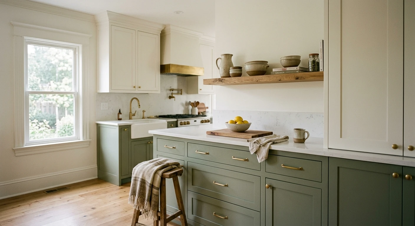
Green schemes (5 and 6)
Soft sage on cabinets, cream on the walls, aged brass pulls: this is my favorite low-risk color move in a kitchen right now. Evergreen Fog at LRV 30 is muted enough to act almost like a neutral, and it makes white marble look expensive. The sage-island-plus-white version (scheme 6) is the gentler entry point. Greens earn their place because they borrow from nature and read calm rather than loud. Our sage green kitchen cabinets color guide covers the best specific sages and where each one lands.
Blue and navy schemes (7, 8, 9)
Hale Navy with White Dove is the high-contrast classic for a reason: navy reads dressed-up and timeless, and White Dove's warm cream keeps the pairing from going corporate. For most people the island-only version (scheme 8) is smarter than a full navy kitchen, which can swallow light in a small room. A softer blue-gray (scheme 9) gives you the calm of blue without the drama. For the full navy story and which whites flatter it, read our Benjamin Moore Hale Navy HC-154 review.
Gray and black schemes (10 and 11)
A mid greige-gray with walnut open shelving (scheme 10) stays warm and grounded where a cool gray would feel dated. Black cabinets (scheme 11) are not for the timid, but Tricorn Black against a warm white wall and a brass hood is genuinely striking in a kitchen with good natural light. Skip full black in a windowless galley; it absorbs the little light you have. See our gray kitchen cabinets color guide for the warm-versus-cool gray decision.
Earthy and wood schemes (12, 13, 14)
Terracotta-beige with cream (scheme 12) and muted olive with black accents (scheme 13) lean into the warm, organic direction that has quietly taken over from cool gray. The wood-plus-white minimal scheme (14) pairs a white-oak slab base with bright white uppers for a Scandinavian feel. When you are ready to commit to finish and durability on the boxes, our best paint for kitchen cabinets guide covers the products that survive a working kitchen.
See bold cabinet color on your real walls before you buy a single sample pot, free.
Wall and cabinet combinations to avoid
Good kitchen wall and cabinet combinations are mostly about not fighting yourself. A few pairings come up again and again that simply do not work:
- Cool gray cabinets next to a warm beige countertop. The undertones cancel and both elements look muddy. Match temperature or change one.
- Stark blue-white cabinets with a creamy marble. The white will look dirty against the cream. Use a warm white like Alabaster or White Dove instead.
- Two cabinet colors at nearly the same LRV. A 5-point gap reads like a mistake, not a design choice. Go bigger or go single-color.
- An all-trend palette with no neutral anchor. Sage cabinets, green tile, green walls, and the kitchen dates in one cycle. Let one element be the color, keep the rest quiet.
- Heavy cool-white ceiling over a warm scheme. It pulls the whole room cold from above. A warm white or the trim color overhead keeps things consistent.
How to test a kitchen color scheme before you commit
A fan-deck chip cannot show you how cabinets, walls, and an island read together, and repainting cabinets twice is the most expensive mistake in this room. Two better methods:
- Sample the cabinet color large. Roll a peel-and-stick or a 12-by-12-inch swatch on an actual cabinet door and a wall, then check it at breakfast, mid-afternoon, and under your evening task lights. Watch for that cool-light gray-out over the sink.
- Preview the whole scheme digitally first. Upload a real photo of your kitchen and apply the cabinet, wall, and island colors together before you buy a single sample, narrowing three palettes to one worth painting. For the wider palette logic across the home, our interior color schemes guide for 2026 shows how the kitchen should relate to the rooms around it.
Preview cabinets, walls, and island side by side under your own light, free.
Frequently asked questions
What is the most popular kitchen color scheme in 2026?
Warm white cabinets with a natural-wood or greige island remains the most-requested kitchen color scheme, because it reads timeless and resale-friendly. The fastest-growing alternatives are soft sage green cabinets with cream walls and navy islands under a white perimeter. Cool all-gray kitchens have cooled off in favor of warmer, more organic palettes.
How do I choose a kitchen color palette that will not date?
Anchor the kitchen with a neutral on the largest surfaces (cabinets or walls), then add the trend color only where it is cheap to change, like bar stools, hardware, or an island. Use a 60-30-10 split, match the cabinet undertone to your fixed countertop and floor, and keep at least 15 to 20 LRV points between two-tone cabinet colors so the contrast looks deliberate.
Should kitchen walls be lighter or darker than the cabinets?
In most kitchens the walls should be lighter or roughly equal to the cabinets, especially with mid or dark cabinet colors, so the room keeps its sense of light. With white or very light cabinets you have freedom to go darker or add color on the walls. The exception is a deliberately moody kitchen, where dark cabinets and a dark wall can read intentional in a room with strong natural light.
What wall and cabinet combinations should I avoid?
Avoid cool gray cabinets next to a warm beige countertop, stark blue-white cabinets with creamy marble, and two cabinet colors at nearly the same LRV. Each of those makes the kitchen look muddy or accidental. Also avoid a fully trend-driven palette with no neutral anchor, since it ages all at once instead of letting one element carry the color.
Is a two-tone kitchen still a good idea?
Yes. A two-tone kitchen (white perimeter with a greige, navy, or sage island) is one of the safest ways to add depth without committing the whole room to a color. The key is keeping a clear LRV gap between the two and choosing an island color that agrees with the countertop. It also lets you repaint just the island later if you want to refresh the look.
Preview cabinets, walls, and island together on your actual kitchen before buying a single sample.
Disclaimer: Sherwin-Williams, Alabaster (SW 7008), Pure White (SW 7005), Accessible Beige (SW 7036), Evergreen Fog (SW 9130), and Tricorn Black (SW 6258) are trademarks of The Sherwin-Williams Company. Benjamin Moore, Hale Navy (HC-154), and White Dove (OC-17) are trademarks of Benjamin Moore & Co. FacadeColorizer is an independent paint visualization service and is not affiliated with, endorsed by, or sponsored by Sherwin-Williams or Benjamin Moore. LRV values are approximate and drawn from manufacturer color libraries; color reproduction on screens approximates the manufacturer's chip, so always confirm with a manufacturer sample under your own light before purchase. Sources: Sherwin-Williams and Benjamin Moore color data 2026, designer field reports compiled by FacadeColorizer.
Trademarks mentioned (Sherwin-Williams, Benjamin Moore, Behr, Caparol, Brillux, Sto, Alpina, Valspar, PPG, Glidden, Dulux, Crown Trade, Sandtex, Farrow & Ball, Johnstone's, Leyland) are property of their respective owners. FacadeColorizer is independent and not affiliated with any of them. Nominative fair use under Lanham Act §1125.


