
A black and white interior color scheme is the easiest palette to admire on a screen and the easiest one to get wrong in a real room. The pictures that sell it (a crisp white wall, a single inky door, a graphic rug) hide the part nobody photographs: the wrong black goes flat and cheap, the wrong white goes blue and clinical, and a 50-50 split can read like a checkerboard instead of a designed space. This guide walks the palette by room, gives you specific shade pairings with undertones, and fixes the two mistakes that turn high contrast into a cold, sterile box.
The short version of black and white interior design: it is never actually black and white. It is a near-black with a chosen undertone, a white with a matching undertone, and usually a third quiet tone (wood, brass, or a warm gray) doing the softening. Get those three right and the room looks expensive. This piece sits inside our interior color schemes guide, which covers the broader logic of pairing any two paint colors.
Upload a photo of your actual room and preview black, charcoal, and white pairings under your own light in about 30 seconds, free.
The two mistakes that ruin a black and white room
Before any color names, fix these two things, because they sink more black and white rooms than any wrong shade.
Mistake one: mismatched undertones. A blue-black wall next to a cream-white trim looks like two different projects collided. Black and white both carry undertones (blue, green, warm brown on the black side; cream, gray, blue on the white side). The trick is to keep them in the same family. Warm-black plus warm-white reads cozy and grounded. Cool-black plus cool-white reads sharp and modern. Cross them and the room feels off in a way most people cannot name.
Mistake two: an even split. Equal black and white feels like a referee shirt. The rooms that work use a ratio, not a balance. A common rule is roughly 70 percent of one color, 20 percent of the other, and 10 percent of a softening accent (wood, metal, a muted gray-green). White-dominant rooms feel airy and gallery-like; black-dominant rooms feel intimate and dramatic. Pick a side.
The best black and white paint pairings, by undertone
Here are field-tested pairings, grouped by the feeling they create. The "black" in most good schemes is actually a soft off-black or charcoal, which keeps the room from looking like a void. Approximate LRV is shown so you know how dark each near-black truly reads.
| Dark shade (code) | White partner (code) | Undertone | Approx. LRV (dark) | Best use |
|---|---|---|---|---|
| Tricorn Black (SW 6258) | Pure White (SW 7005) | Neutral, near-true | about 3 | Modern, graphic spaces, trim contrast |
| Iron Ore (SW 7069) | Alabaster (SW 7008) | Warm, soft | about 6 | Cozy living rooms, accent walls |
| Black Magic (SW 6991) | Extra White (SW 7006) | Cool, slightly blue | about 4 | Contemporary kitchens, baths |
| Onyx (BM 2133-10) | Chantilly Lace (BM OC-65) | Cool, crisp | about 4 | Gallery walls, high-contrast trim |
| Soot (BM 2129-20) | White Dove (BM OC-17) | Warm charcoal | about 8 | Bedrooms, studies, soft contrast |
| Cracked Pepper (Behr PPU18-01) | Polar Bear (Behr 75) | Neutral, value-tier | about 5 | Budget refreshes, rentals, laundry |
Sources: Sherwin-Williams, Benjamin Moore, and Behr published color and LRV data 2026; designer field reports compiled by FacadeColorizer. LRV values are approximate and rounded. SW = Sherwin-Williams, BM = Benjamin Moore.
Notice the pattern: the warm pairings (Iron Ore plus Alabaster, Soot plus White Dove) match a soft black to a creamy white. The cool pairings (Black Magic plus Extra White, Onyx plus Chantilly Lace) match a blue-leaning black to a clean blue-white. Stay inside one column and the scheme holds together. For the full logic on how undertones decide which colors live happily together, see our interior paint color families guide.
Free AI visualizer. Compare Iron Ore and Tricorn Black in your room before you buy a single sample.
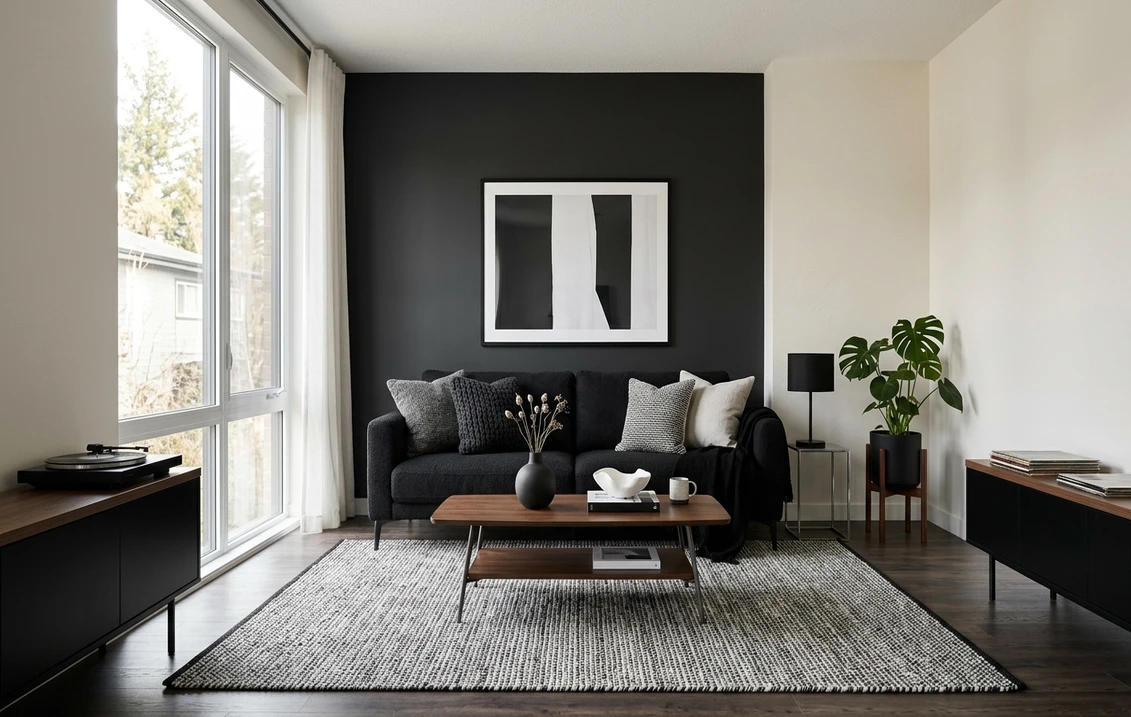
Black and white living room
The living room is where most people overdo the contrast. Go white-dominant: warm white on the big walls (Alabaster or White Dove), and let black show up in deliberate doses, a fireplace surround, window frames, a single bookcase, the legs of a coffee table. That keeps the room bright and lets the black read as intentional punctuation rather than gloom.
If you want one bold gesture, paint a single wall in a soft black like Iron Ore behind the sofa or the TV. That is the textbook accent-wall move, and the room stays warm because the rest stays light. Add the mandatory third element here: a wood coffee table, oak floors, or brass lighting. Without it, even a warm black and white living room can tip cold. Our accent wall color strategy covers exactly which wall to choose and how dark to push it.
Black and white kitchen
The kitchen is the one room where a near-even split works, because the architecture does the dividing for you. The classic move: white uppers, black or charcoal lowers. Tricorn Black or Black Magic on the base cabinets, a clean white (Pure White or Extra White) on the uppers and walls, and a white or marble-look counter to bridge them. The eye reads the horizontal band of counter as the breathing space, so the contrast never feels harsh.
A black island in an otherwise white kitchen is the lower-commitment version, and it photographs beautifully. Whatever you choose, pick the finish carefully: black cabinets show every fingerprint and dust mote in a high-gloss sheen, so a satin or matte eggshell on the cabinetry is far more forgiving day to day.
Black and white bedroom
Bedrooms want softness, so this is where the warm charcoals earn their place. Skip true black on the walls; it can feel cave-like over a full night. Instead, try Soot or Iron Ore on the wall behind the headboard with warm white (White Dove) everywhere else. The result is moody and restful rather than stark.
Layer in texture to keep it from feeling graphic: a linen headboard, a chunky knit throw, wood nightstands. In a black and white bedroom, texture is what stops the palette from reading like a magazine set and starts reading like a place you actually sleep. If you want a touch of color to break the duo without abandoning it, a single muted green or warm tan pillow set does the job.
Black and white bathroom
Bathrooms are small, so high contrast lands cleanly here and the classic black and white tile look never dates. For a small bath, keep walls white (this is the one room where a cooler, cleaner white like Chantilly Lace or Extra White works well, since tile and chrome read crisp) and let black show up in the floor tile, the window frame, the vanity, or the hardware.
A black vanity under a white counter with black faucets is a low-risk, high-payoff combination that reads custom. In a powder room, where you have permission to be dramatic, flip it: paint the whole space a soft black like Iron Ore with white trim and a big mirror. Small dark rooms feel like a jewel box, not a cave, precisely because you are in them briefly.
See the whole space dark with white trim, free, before you paint over a perfectly fine wall.
How to keep black and white from feeling cold
This is the question every black and white room comes down to. Five reliable warm-ups:
- Choose warm versions of both. A creamy white (White Dove, Alabaster) plus a soft, brown-leaning black (Iron Ore, Soot) is automatically warmer than a blue-white plus a blue-black.
- Add wood. Oak floors, walnut furniture, or a single wood beam does more to warm a black and white room than any amount of "warm white."
- Use brass or warm metal. Brass hardware, a brushed-gold lamp, or aged bronze fixtures inject warmth that chrome and nickel cannot.
- Introduce one quiet third color. A muted sage, a warm tan, or a dusty terracotta in textiles keeps the palette from feeling clinical without breaking the scheme.
- Lean on texture. Linen, wool, rattan, and matte finishes absorb light and soften the contrast that high-gloss surfaces sharpen.
The single biggest lever is the first one. Warm whites and soft blacks read cozy out of the box; cool whites and true blacks need more help from wood and textiles to avoid feeling like a showroom.
Getting the ratio right
Decide your dominant color before you buy paint. A quick way to plan it:
- White-dominant (70 white / 20 black / 10 accent): bright, airy, gallery-like. Best for living rooms, small spaces, and anyone nervous about going dark. Black appears in trim, frames, and one feature.
- Black-dominant (70 black / 20 white / 10 accent): intimate, dramatic, enveloping. Best for studies, powder rooms, and dining rooms used mostly at night. White appears in trim and ceiling to keep edges crisp.
- Balanced (50 / 50): reserve this for kitchens and baths, where built-in architecture (counters, tile lines) naturally separates the two and a counter or backsplash acts as the buffer.
Whatever ratio you pick, the 10 percent accent is not optional. A pure two-color room is the one that consistently reads cold. The third tone, even just in throw pillows and a rug, is what makes it look designed.
Test the contrast before you paint a wall black
Black is the one color where a wrong call costs the most, since covering it again takes primer and several coats. Two ways to get it right before you open a can:
- Sample both shades together. Paint a large swatch of your chosen black next to your chosen white on the actual wall, and check it in morning light, afternoon light, and under your night bulbs. Watch whether the black goes brown, blue, or stays neutral as the light shifts.
- Preview the whole scheme digitally first. Upload a real photo of your room and apply the black and white pairing (plus a warmer and a cooler alternative) to see the contrast and ratio in your own space before you commit a single sample pot.
Free AI visualizer: 1 HD preview plus 3 variations, so you can compare warm and cool pairings side by side.
Frequently asked questions
How do I keep a black and white interior from looking cold?
Choose warm versions of both colors (a creamy white like White Dove plus a soft brown-leaning black like Iron Ore), then add a third warm element: wood floors or furniture, brass hardware, and natural textures like linen and wool. One quiet accent color in textiles, such as a muted sage or warm tan, breaks the starkness without abandoning the scheme. Warm versions plus wood is the single most reliable fix.
What is the best ratio of black to white in a room?
Avoid an even 50-50 split in most rooms, which reads like a checkerboard. Use roughly 70 percent of one color, 20 percent of the other, and 10 percent of a softening accent. White-dominant feels airy and works for living rooms and small spaces; black-dominant feels intimate and suits studies and powder rooms. A true balanced split works only in kitchens and baths, where counters and tile naturally divide the two.
Should I use true black or a soft off-black on walls?
For most rooms, a soft off-black or charcoal (such as Iron Ore at LRV 6 or Soot) reads richer and less flat than a true black, and it keeps the room from looking like a void. Reserve a true black like Tricorn Black or Onyx for trim, frames, and graphic accents where you want maximum crispness. Powder rooms are the exception, where an enveloping near-black on every wall creates a jewel-box effect.
Do the black and the white need matching undertones?
Yes, this is the detail that makes or breaks the scheme. Pair a warm, brown-leaning black with a creamy white, or a cool, blue-leaning black with a clean blue-white. Crossing them (a blue-black against a cream-white) makes the room feel subtly off in a way most people cannot name. Staying inside one undertone family is what keeps a black and white scheme looking cohesive and expensive.
Preview warm and cool black-and-white pairings on your actual walls under your own light before you commit a single can.
Disclaimer: Sherwin-Williams, Benjamin Moore, Behr, and the color names referenced here (including Tricorn Black, Iron Ore, Black Magic, Pure White, Alabaster, Extra White, Onyx, Chantilly Lace, Soot, White Dove, Cracked Pepper, and Polar Bear) are trademarks of their respective owners. FacadeColorizer is an independent paint visualization service and is not affiliated with, endorsed by, or sponsored by any brand named here. LRV and color values are approximate, rounded, and based on each manufacturer's published data. Color reproduction on screens approximates the manufacturer's sample; always confirm with a manufacturer sample under your own light before purchase. Sources: Sherwin-Williams, Benjamin Moore, and Behr published color and LRV data 2026, designer field reports compiled by FacadeColorizer.
Trademarks mentioned (Sherwin-Williams, Benjamin Moore, Behr, Caparol, Brillux, Sto, Alpina, Valspar, PPG, Glidden, Dulux, Crown Trade, Sandtex, Farrow & Ball, Johnstone's, Leyland) are property of their respective owners. FacadeColorizer is independent and not affiliated with any of them. Nominative fair use under Lanham Act §1125.


