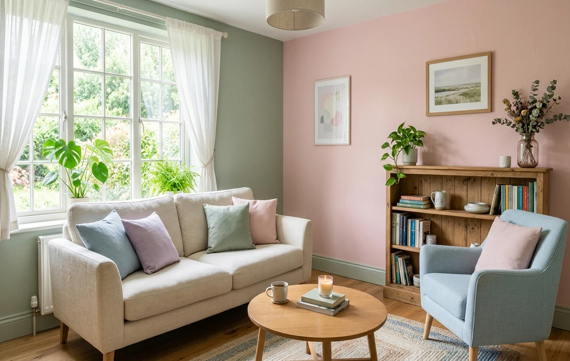

Pastels have a reputation problem. Say "pastel interior paint colors" and a lot of people picture a 1950s bathroom or a baby's room frozen in mint and powder blue. The 2026 version is nothing like that. Today's soft palette leans chalky, muted, and grounded, the kind of barely-there color that reads as a sophisticated neutral until you stand a true white next to it and realize the wall has been quietly pink, or green, or blue all along. This roundup covers the pastel interior paint colors worth painting now, organized by hue, with real undertones and the rooms each one actually flatters.
A quick definition, because it matters. A pastel is a high-value, low-saturation color: lots of white mixed in, just a whisper of the parent hue. That makes pastels behave differently from saturated colors. They pick up the light and the surrounding materials hard, they shift dramatically between a north-facing and a south-facing room, and they can curdle into something chalky or sickly if the undertone fights the light. So this is not a "grab any soft chip" list. It is a guide to which pastels hold up. For the wider framework, this piece sits under our interior color schemes guide and pairs with the interior paint color families guide.
Upload a photo of your actual room and preview soft shades like blush, sage, and powder blue under your own light in about 30 seconds. Free.
The 12 best pastel interior paint colors for 2026
Here is the working list, grouped by hue family, with the published Light Reflectance Value (LRV) range so you know how light each shade truly is, the dominant undertone, and where it earns its keep. Pastels run high on LRV by definition (most sit between 60 and 85), so the undertone column is the one that decides whether two soft colors will live together or clash.
| Pastel (name + family) | Undertone | LRV range | Best use |
|---|---|---|---|
| Powder blue (blue) | Clean, slightly gray | 68 to 78 | Bedrooms, bathrooms, south-facing rooms |
| Sky / cloud blue (blue) | Cool, airy | 70 to 80 | Ceilings, sunrooms, kids' rooms |
| Blush / petal pink (pink) | Warm, slightly peach | 68 to 78 | Bedrooms, dressing rooms, dining |
| Dusty rose (pink) | Muted, grayed mauve | 55 to 65 | Living rooms, accent walls, studies |
| Soft sage (green) | Gray-green, balanced | 55 to 68 | Kitchens, living rooms, whole-house |
| Mint / celadon (green) | Cool, fresh | 70 to 80 | Bathrooms, laundry, sunrooms |
| Lilac / soft lavender (purple) | Cool, blue-violet | 62 to 72 | Bedrooms, powder rooms (good light) |
| Greige-lilac (purple) | Warm, grayed violet | 58 to 68 | Living rooms, hallways, north rooms |
| Butter yellow (yellow) | Warm, creamy | 72 to 82 | Kitchens, breakfast nooks, hallways |
| Pale straw (yellow) | Soft, slightly green-gold | 70 to 80 | Studies, north-facing rooms |
| Peach / soft apricot (orange) | Warm, pink-gold | 65 to 76 | Bedrooms, dining, dressing areas |
| Greige (warm neutral base) | Soft taupe-gray | 58 to 70 | Whole-home backdrop for any pastel accent |
LRV ranges are approximate and represent typical pastel families across major US paint lines, rounded. Always confirm the exact value of a specific manufacturer shade. Compiled by FacadeColorizer.
Notice that greige sits on this list as a base, not a pastel. That is deliberate. The single most useful move with a soft palette is to pick one true pastel for the room you want to feel something in, and let a warm neutral carry the rest of the house. More on that in the pairing section below.
Free AI visualizer. See how a soft shade shifts on your real walls before you buy a sample.
Soft blues: the safest pastel to start with
If you have never lived with a colored wall, a pastel blue is the gentlest on-ramp. Powder blue and sky blue read calm and clean, and unlike warmer pastels they almost never go "babyish" when you keep the saturation low and the undertone slightly gray. The one rule: blue pulls cooler in north light. In a north-facing bedroom, a crisp powder blue can tip icy and a little sad by late afternoon. Push toward a grayer, softer blue (think the color of a faded denim shirt) and it stays serene instead of clinical.
The classic ceiling trick still works: a barely-there cloud blue overhead reads as a soft sky and makes a room feel taller and airier without ever competing with the walls. Pastel blue also pairs beautifully with crisp white trim and natural wood, which keeps it from feeling sterile. For the deeper end of the family, our bedroom color schemes guide shows where soft blue fits into a full restful palette.
Soft pinks: blush and dusty rose, not bubblegum
This is the family that has changed most. The 2026 pink is not a saturated rose; it is blush so muted it can pass for a warm off-white until the light hits it, or a grayed dusty rose with real depth. Blush (LRV in the low-to-mid 70s) is the most flattering wall color in a bedroom because it throws a faint warm glow that softens skin tones, which is why it shows up so often in dressing rooms and bathrooms. Watch the peach lean, though. A blush with too much yellow in it can go salmon under warm bulbs, so test it under your actual lighting.
Dusty rose is the grown-up cousin. At a lower LRV (mid-50s to mid-60s) it has enough gray and depth to anchor a living room or a study, and it pairs unexpectedly well with deep green, brass, and walnut. If a pure pink feels like too much, dusty rose gives you the warmth without the sweetness. For a full breakdown of soft pink options and their undertones, see our dedicated soft blush paint colors guide.
See a soft pink against a warmer and a cooler option, side by side, free, before the peach lean surprises you.
Soft greens: sage and mint do the heavy lifting
Soft green is the most versatile pastel on this list, and soft sage is the reason. A grayed, balanced sage reads almost like a neutral, which is why it works as a whole-house color in a way that no pink or blue can. It flatters wood, looks expensive next to brass and black hardware, and stays calm in nearly any light. It is the pastel you can commit to for a kitchen or a main living space without second-guessing. Our sage green interior shades and pairings guide goes deep on the specific shades.
Mint and celadon are the fresher, cooler end. These are higher-LRV, cleaner greens that feel crisp in a bathroom, a laundry, or a sunroom, the spaces where you want a wakeful, garden-fresh quality rather than a moody calm. Mint is more demanding than sage because its cool freshness can tip cold in a dim room, so it rewards bright natural light. If you love the color of the inside of a celery stalk, this is your pastel.
Soft purples: lilac is back, with a catch
Lavender and lilac are the comeback story of 2026, but they are also the riskiest pastel to get right. A clean, blue-violet lilac is gorgeous in a south-facing bedroom and turns gray and dingy in a north-facing one, where the cool light strips the warmth out of it. The fix designers reach for is a greige-lilac: a grayed, warmed-down violet that holds its color in poor light and reads as a sophisticated mauve-gray rather than a sweet purple. If you want lilac somewhere dim, go warm and grayed, not clean and bright. Lilac pairs best with off-white, soft gray, and a single deep accent (a plum or a charcoal) to keep it from floating.
Soft yellows and peach: warmth without going gold
Butter yellow is having a real moment, and it deserves it. A creamy, low-saturation yellow brings genuine warmth to a kitchen, a breakfast nook, or a dim hallway without the dated, saturated gold of decades past. The trick is restraint: keep it pale and slightly grayed and it glows; push the saturation and it goes "school cafeteria" fast. Pale straw is the even-quieter version, a soft green-gold that works in a study or a north-facing room that needs warming up without committing to obvious color.
Peach and soft apricot sit between pink and yellow, and they are the most flattering warm pastels for a bedroom or dressing area because they cast a healthy glow. As with blush, the danger is the shade going too orange under warm bulbs, so test it at night. Done right, a soft peach feels like morning light bottled into a wall.
How to pair pastels without going bland
The number-one failure of a pastel scheme is not clashing; it is washing out into something weak and forgettable. Here is how to keep a soft palette from going flat:
- Anchor with contrast. A pastel needs a darker partner to read as intentional. Pair powder blue with charcoal trim, blush with walnut, sage with black hardware. The contrast is what makes the soft color look designed rather than diluted.
- Match the temperature, not just the lightness. Two pastels at the same LRV will still clash if one is warm and one is cool. A warm blush and a cool mint fight. A warm blush and a warm butter yellow sing. Use the undertone column in the table above.
- Let one pastel lead. Pick a single hero pastel per room and support it with a warm neutral (greige) and a white. Three soft colors competing in one room is where "bland" turns into "muddy."
- Add a texture or a material, not a fourth color. Natural wood, linen, brass, and woven fiber give a pastel room depth without adding another paint color to balance.
- Test the white. The trim white can make or break a pastel. A blue-white trim sharpens a cool pastel and chills a warm one. Choose your white deliberately, using our best white paint for walls guide.
Free preview. See a hero pastel with its trim and neutral together before you commit to a scheme.
Pastels by room: a quick cheat sheet
Not every pastel suits every room. Light direction, traffic, and what the space is for all narrow the field:
- Bedroom: blush, soft blue, lilac, peach. The restful, flattering pastels. Keep the trim warm and the contrast soft.
- Bathroom: mint, powder blue, soft sage. Fresh, clean shades that feel right with tile and water. Use a washable finish.
- Kitchen: soft sage, butter yellow. The two pastels with enough body to anchor a busy room and flatter wood cabinets.
- Living room: dusty rose, greige-lilac, soft sage. Lower-LRV pastels with depth so the main space does not read thin.
- North-facing rooms: warm, grayed pastels only (greige-lilac, soft sage, pale straw). Avoid clean blue and mint, which go cold.
- South-facing rooms: you can run cooler and cleaner (powder blue, mint, clean lilac) because the warm light balances them.
If you are pricing a repaint to go with one of these schemes, our interior painting cost guide has current per-square-foot numbers and a calculator.
The one mistake to avoid with pastels
Buying off a chip or a phone screen. Pastels are the single hardest category of paint to judge from a small sample, because the white in them magnifies every quirk of your light. A blush that looks like a warm off-white on the chip can read distinctly pink on a big south wall at 4 p.m. A clean lilac that charms you in the store can go gray and sad in your north bedroom. The color is doing exactly what it should; the chip just could not show you. Always get the shade onto a real wall, in your real light, at three times of day before you commit a gallon.
Preview a pastel against a warmer and a cooler option, side by side, free, before you buy a single sample.
Frequently asked questions
Are pastel interior paint colors still in style for 2026?
Yes, but the 2026 version is muted and grounded rather than sweet. The shades trending now are chalky and grayed-down: soft sage, blush that reads almost neutral, butter yellow, greige-lilac, and dusty rose. They behave like sophisticated neutrals with a hint of color, not the saturated mint-and-bubblegum pastels of decades past.
Which pastel paint color is the most versatile?
Soft sage. A grayed, balanced sage reads almost like a neutral, flatters wood and brass, and holds its color in nearly any light, which makes it the only pastel safe to use as a whole-house color. Greige is the best neutral base to pair with any pastel accent.
How do I keep a pastel room from looking washed out?
Anchor the pastel with contrast. A soft color needs a darker partner to read as intentional: pair powder blue with charcoal trim, blush with walnut, or sage with black hardware. Let one pastel lead per room, support it with a warm neutral and a deliberately chosen white, and add depth with natural materials rather than a fourth color.
Do pastels work in a north-facing room?
Some do, if you choose warm, grayed shades. North light is cool and will chill a pastel, so clean blues, clean lilac, and mint can go gray and dreary. Stick to greige-lilac, soft sage, blush, or pale straw in north-facing rooms, and save the cooler, cleaner pastels for south-facing spaces where warm light balances them.
Can I judge a pastel from the paint chip?
No, pastels are the hardest category to judge from a chip because the white in them magnifies every quirk of your light. A blush can look like a warm off-white on the chip and read clearly pink on a big sunny wall. Always preview the shade on your real wall, in your real light, at several times of day before committing.
Preview soft shades like blush, sage, powder blue, and butter yellow on your actual walls under your own light. One HD render plus three variations, free.
Disclaimer: FacadeColorizer is an independent paint visualization service and is not affiliated with, endorsed by, or sponsored by any paint manufacturer. The pastel families described here (powder blue, blush, dusty rose, soft sage, mint, lilac, butter yellow, peach, and greige) are generic color descriptions, not specific branded products. LRV and undertone values are approximate, rounded, and representative of typical pastel families across major paint lines; always confirm the exact figures of a specific manufacturer shade. Color reproduction on screens approximates real paint; always confirm with a manufacturer sample under your own light before purchase. Compiled by FacadeColorizer.


