
The first time a paint color actually slowed my pulse, it was a north-facing bedroom in a rental I almost did not take. The previous tenant had rolled the walls a soft green-gray, the light came in flat and gray through a single window, and somehow the room felt like a long exhale. That is the whole trick of a calming color palette. It is not one magic swatch. It is a small family of low-contrast, low-saturation tones that let your eye rest instead of working. This guide breaks 12 serene schemes down by mood, with the LRV numbers and pairings that make them work on a real wall, not just a mood board.
Quick orientation before the schemes. A genuinely restful palette almost always shares three traits: medium-to-high LRV so the room stays soft and open, muted saturation (no pure, screaming hues), and undertones that agree with each other instead of fighting. Greens, blues, warm whites, soft greige, and quiet earth tones do this best. This page is part of our wider interior color schemes guide for 2026, and it pairs naturally with our deeper dive on calming master bedroom paint colors. Think of this one as the palette-by-mood map; those pages go room by room.
Upload a photo of your actual room and preview serene colors under your own light in about 30 seconds, free.
What actually makes a color palette feel calm
Before the schemes, the rules. A serene paint palette is built on restraint, and three numbers do most of the work:
- Saturation: keep it low. The more gray or earth mixed into a hue, the calmer it reads. A muted sage soothes; a pure kelly green energizes.
- LRV (Light Reflectance Value): for the main walls, aim higher (55 to 75) so light bounces softly. Save your lowest-LRV colors for accents, not whole rooms, unless you genuinely want a cocoon.
- Contrast: low. Calming wall colors live in a tight tonal band. Big jumps between wall, trim, and ceiling create tension, which is the opposite of what you want.
- Undertone harmony: a warm wall wants a warm white, not an icy one. Mixing a cool blue-gray wall with a stark blue-white trim can read clinical instead of calm.
- Temperature: warm palettes (cream, greige, soft terracotta) feel cozy and grounding; cool palettes (sea glass, blue-gray, soft lavender) feel spacious and airy. Both can be serene; pick by the feeling you want.
One honest caveat before we go further. Calm does not mean beige-everything. A flat, all-greige room with zero variation does not read serene, it reads unfinished. The schemes below all carry a little tonal movement, a deeper accent or a natural texture, because true quiet still needs depth.
12 calming color palettes, sorted by mood
Here are the 12 schemes I keep coming back to, grouped by the feeling they create. Wall LRV is the headline number; the accent and trim are what make each one a palette rather than a single color.
| Palette (mood) | Main wall | Wall LRV | Accent + trim |
|---|---|---|---|
| Spa retreat (airy) | Sea Salt (SW 6204) | 63 | Soft white oak + warm white trim |
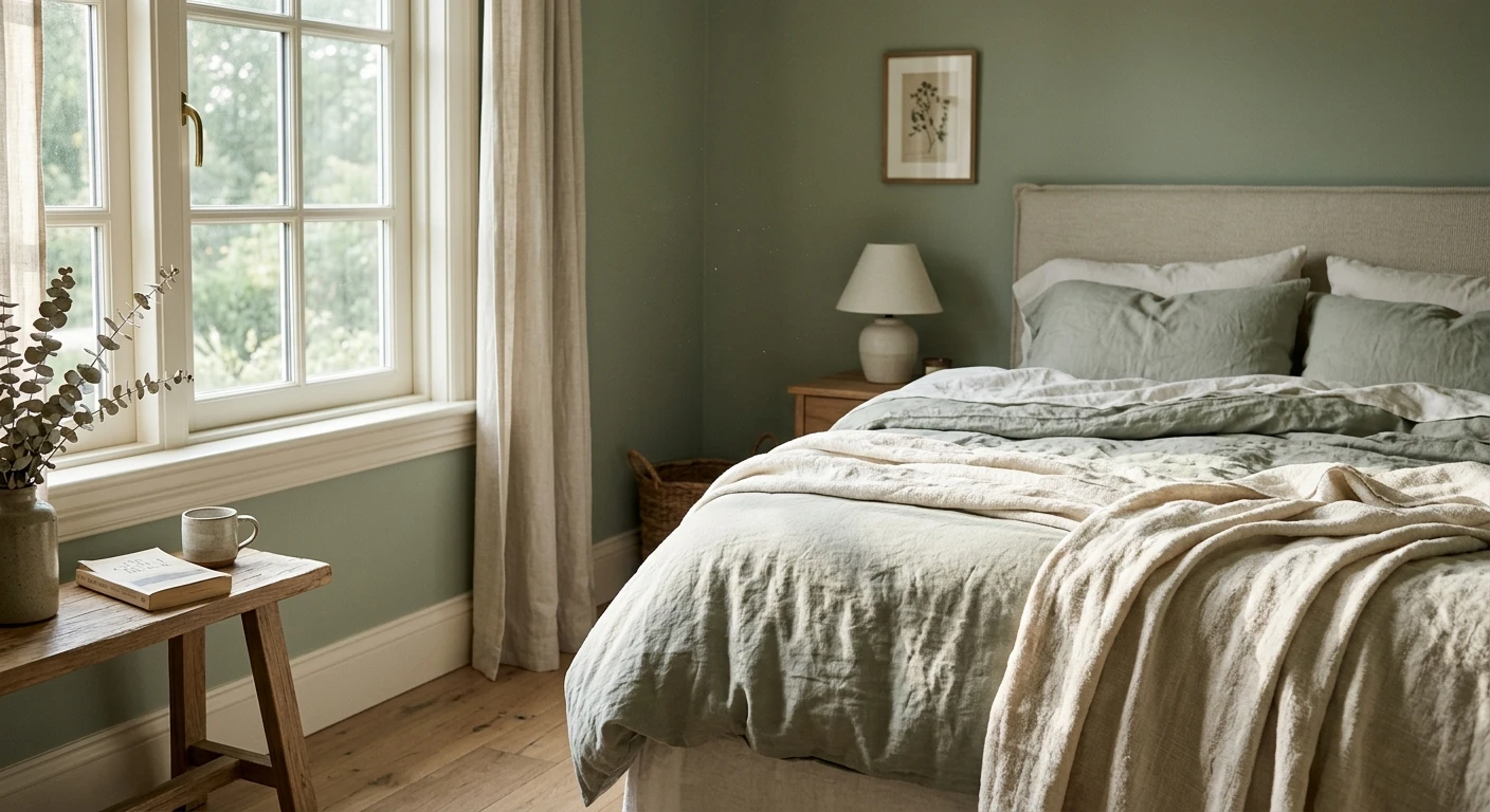
| Quiet sage (grounded) | Soft sage green | ~50 | Cream walls + natural linen |
| Foggy forest (cocoon) | Evergreen Fog (SW 9130) | 30 | Brass + creamy white trim |
| Coastal calm (breezy) | Soft blue-gray | ~55 | White trim + pale sand floor |
| Warm minimal (cozy) | Warm off-white | ~74 | Greige + oak + jute |
| Greige sanctuary (neutral) | Warm greige | ~58 | Soft white trim + walnut |
| Soft clay (earthy) | Muted terracotta blush | ~52 | Cream + warm wood |
| Pale lavender (restful) | Gray-lavender | ~62 | Cool white + soft gray |
| Sea glass (fresh) | Pale green-blue | ~66 | Crisp white + light oak |
| Mushroom taupe (moody calm) | Soft taupe | ~48 | Off-white + bronze |
| Misty blue (serene) | Powder blue-gray | ~60 | Warm white + pale wood |
| Oatmeal + olive (organic) | Oatmeal cream | ~70 | Olive accent + rattan |
LRV values for named Sherwin-Williams colors are from the manufacturer's data; generic-tone LRVs are typical ranges compiled by FacadeColorizer. Sources: Sherwin-Williams color library 2026; The Spruce and Better Homes & Gardens calming-color coverage; designer field reports.
Free AI visualizer. Test a calming palette on your real walls before buying a single sample pot.
The airy palettes: soft greens and sea-glass blues
If you want a room that feels like a slow morning, start here. These are the lightest, most spacious calming wall colors, the ones designers reach for in spa color palette work.
Spa retreat: Sea Salt SW 6204
Sea Salt is the closest thing to a foolproof serene neutral. At LRV 63 it is a soft green-blue that shifts gently with the light, reading more green in warm rooms and more blue-gray in cool ones. Pair it with a warm white trim and pale oak, and you get the bathroom-as-spa look without a single bold move. It is the anchor of almost every spa color palette I build.
Sea glass and misty blue
For something breezier, a pale green-blue (sea glass) or a powder blue-gray reads coastal and clean. Keep the trim crisp white and the floors light, and resist the urge to add a high-contrast accent. These cool palettes lean spacious, so they shine in smaller rooms that need to feel bigger. For more cool-toned schemes, our blue-gray paint colors and undertones guide walks through how these read room by room.
Quiet sage and oatmeal + olive
Soft sage green is the calm color of the moment, and for good reason: it borrows the restfulness of nature without the boldness of a true green. Run it on the walls with cream and linen, or flip it and use cream walls with a sage accent. For the full range of sage pairings and how to keep it from going minty, see our sage green interior paint shades and pairings. The oatmeal-and-olive scheme is its warmer cousin: an oatmeal cream body at LRV 70 with a single olive accent and rattan textures reads organic and grounded.
The cozy palettes: warm whites, greige, and soft clay
Cool calm feels like air; warm calm feels like a held breath by a fire. These palettes lean into comfort and work beautifully in rooms with limited natural light, where a cool scheme would just read cold.
Warm minimal and greige sanctuary
A warm off-white body (around LRV 74) with greige, oak, and jute is the quietest scheme on this list, and the most flexible. Add a warm greige in an adjoining space for a sanctuary feel that never tips cold. The non-negotiable here is the white: it has to be warm. A blue-white trim in a warm palette is the single most common way people accidentally make a cozy room feel clinical. Our warm white paint colors and undertones guide covers exactly how to pick one that stays soft.
Soft clay and mushroom taupe
For a little more soul, a muted terracotta blush or a soft mushroom taupe brings earthy warmth without going dark or heavy. These read best with cream trim, warm wood, and bronze or brass hardware. Mushroom taupe at LRV 48 is the moodiest pick here, so use it where you want a den or reading nook to feel enveloping rather than open. To see how taupe shifts across light, our taupe paint colors and undertones guide is the one to read first.
See walls, trim, and floor together in one preview, free.
The grounded palettes: deep green and soft lavender
Not every calm room is pale. A deeper, lower-LRV palette can feel just as serene when the color stays muted, it simply wraps the room instead of opening it up.
Evergreen Fog (SW 9130) is the standout. At LRV 30 it is a muted sage-gray that reads grounded and quiet, the kind of color that makes a small study or a bedroom feel like a retreat. Pair it with brass and a creamy white trim so the room has a glow rather than a gloom. The mistake to avoid: do not pair a low-LRV calming green with a stark cool-white ceiling, the contrast cracks the cocoon. A gray-lavender is the soft surprise of the bunch, restful and slightly romantic, best kept muted and paired with cool white and gray so it never tips into purple. For more tones that sit happily beside green, our earthy warm interior paint colors guide is a good companion, and our bedroom palette schemes for 2026 shows how these grounded tones behave in a sleeping space.
How to build your own calming palette in 4 steps
You do not have to copy a scheme exactly. The framework is simple:
- Pick one anchor. Choose a single muted wall color you love (a soft green, a sea-glass blue, a warm off-white). Note its LRV and undertone.
- Add a harmonious trim. Warm wall, warm white. Cool wall, soft cool white. Keep the trim only a few steps lighter, not a stark jump.
- Choose one quiet accent. A deeper version of your anchor, or a natural material (oak, linen, rattan, brass). One accent, not five.
- Add texture, not more color. Calm rooms get their depth from material (boucle, wood, stone), not from extra hues. This is where most "boring" neutral rooms actually went wrong.
The fastest way to know if a scheme reads serene or sterile in your actual light is to see it on your own walls before you commit. A fan-deck chip cannot show how a low-saturation color shifts across a day, and the wrong undertone is what turns "calm" into "cold." Preview it digitally first, then buy one sample of the finalist.
Preview a serene color against a warmer and a cooler option, side by side, free.
Frequently asked questions
What colors make the most calming palette?
Soft greens (sage, sea glass), muted blues (blue-gray, powder blue), warm whites, gentle greige, and quiet earth tones like soft clay and mushroom taupe make the most calming palettes. The common thread is low saturation and low contrast: muted hues that let the eye rest, paired with undertones that agree with each other rather than clash.
What is a good spa color palette for a bathroom?
A reliable spa color palette pairs a soft green-blue wall such as Sea Salt (SW 6204, LRV 63) with a warm white trim and pale oak or natural-stone accents. Keep contrast low and add texture through towels, wood, and matte tile rather than extra colors. The goal is a soft, light-reflecting, low-saturation scheme that feels restful instead of clinical.
Are dark colors ever calming, or do they need to be light?
Dark colors can absolutely be calming as long as they stay muted. A low-LRV but soft color like Evergreen Fog (SW 9130, LRV 30) wraps a room and feels grounded and serene rather than energetic. The key is to avoid high contrast: pair a deep calming green with a creamy white and warm metals, not a stark cool-white ceiling.
Should a calming palette be warm or cool?
Both can be serene; choose by the feeling and the light. Cool palettes (sea glass, blue-gray, soft lavender) read airy and spacious and suit bright or small rooms. Warm palettes (cream, greige, soft clay) read cozy and grounding and rescue rooms with little natural light, where a cool scheme would read cold. Match your trim temperature to the walls either way.
How many colors should a serene paint palette have?
Keep it to three: one main wall color, one harmonious trim, and one quiet accent (often a deeper version of the wall or a natural material like oak or brass). Calm comes from restraint and from adding depth through texture rather than extra hues. More than three colors usually introduces the contrast and visual busyness that make a room feel anything but calm.
Preview serene paint colors on your actual walls under your own light before buying a single sample.
Disclaimer: Sherwin-Williams, Sea Salt (SW 6204), and Evergreen Fog (SW 9130) are trademarks of The Sherwin-Williams Company. FacadeColorizer is an independent paint visualization service and is not affiliated with, endorsed by, or sponsored by Sherwin-Williams. Color reproduction on screens approximates the manufacturer's chip; always confirm with a manufacturer sample under your own light before purchase. LRV values for generic tones are typical ranges, not exact manufacturer figures. Sources: Sherwin-Williams color library 2026, The Spruce and Better Homes & Gardens calming-color coverage, designer field reports compiled by FacadeColorizer.
Trademarks mentioned (Sherwin-Williams, Benjamin Moore, Behr, Caparol, Brillux, Sto, Alpina, Valspar, PPG, Glidden, Dulux, Crown Trade, Sandtex, Farrow & Ball, Johnstone's, Leyland) are property of their respective owners. FacadeColorizer is independent and not affiliated with any of them. Nominative fair use under Lanham Act §1125.


