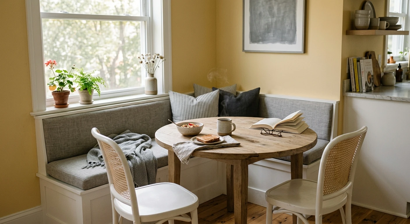

A client once handed me a fan deck open to a bright lemon and said, "I love it, but my husband thinks the whole house will look like a daycare." Fair worry. Yellow is the friendliest color on the wheel and also the easiest to overdo. The fix is almost never a softer yellow. It is the color that goes well with yellow sitting next to it: the right partner turns a cheerful wall into a grown-up, collected room. This guide walks the best yellow color combinations, what goes with yellow when you want calm versus energy, and the pairings I quietly steer people away from.
One thing first, because it changes every recommendation below. Not all yellows behave the same. A buttery, muted yellow (think weathered farmhouse) takes warm partners. A clean, saturated yellow takes cool ones to stay balanced. And a greenish chartreuse is almost a different color and pairs more like a green. So treat the pairings here as a map, then test against your actual yellow. This article sits inside our wider interior color schemes guide, which covers how to build a full palette around any starting hue.
Upload a photo of your actual room and preview a yellow plus its partner colors under your own light in about 30 seconds, free.
Why yellow needs a partner in the first place
Yellow is the highest-LRV chromatic color we paint with. It throws light, it advances toward you, and it carries a lot of visual energy. On its own across four walls that energy has nowhere to land, so the room can read busy or, worse, cheap. The job of a pairing color is to give the eye somewhere quiet to rest. That is why the strongest yellow schemes almost always lean on a neutral or a deep cool to do the heavy lifting, with yellow as the spark rather than the whole fire.
A useful rule from the color wheel: yellow's direct complement is purple, and its split-complements are blue-violet and red-violet. Complements create the most contrast and energy. The neighbors on the wheel (orange, green) create calmer, more harmonious blends. You do not need a degree to use this; you just need to decide whether you want the room to feel lively or restful, then pick the partner accordingly.
The best colors that go with yellow, ranked
Here is my working order of go-to partners, from the most foolproof to the most adventurous. Every one of these works; they just set a different mood.
1. Navy and deep blue (the tailored pick)
If you only try one pairing, make it this. Navy is yellow's near-complement, so the contrast is high, but navy is so deep and grounded that it reads sophisticated rather than circus-like. A buttery yellow with navy cabinets or a navy accent wall is the combination I reach for most in kitchens and studies. The yellow stays cheerful, the navy keeps it adult. Benjamin Moore Hale Navy is the workhorse here; see our Hale Navy HC-154 review for how it behaves indoors.
2. Warm greige and soft beige (the easy backdrop)
When yellow is the accent (a sofa, art, a single piece of cabinetry), a warm greige on the walls is the most forgiving choice in this whole list. It shares yellow's warmth, so nothing clashes, and it lets the yellow pop without competing. This is the safe route for anyone nervous about commitment. Our guide to warm greige neutrals covers the shades that flatter a sunny accent best.
3. Gray, warm and cool (the modern balance)
Gray is the cool counterweight that keeps a clean, saturated yellow from getting too sweet. A warm gray softens the effect; a cool gray sharpens it and reads more contemporary. The pairing that fails is a cold, blue-based gray next to a muted antique yellow, which can leave the yellow looking slightly dirty. Match temperatures: warm yellow wants warm-to-mid gray. For the undertone details, see our colors that go with gray breakdown and our light gray paint colors guide.
4. Warm white and cream (the brightener)
For trim, ceilings, and breathing room, a soft warm white is the answer. It frames yellow cleanly and bounces light without chilling the room. The mistake here is reaching for a stark blue-white, which fights yellow's warmth and can make both colors look slightly off. A creamy white like Benjamin Moore White Dove keeps everything in the same warm family; details in our White Dove OC-17 review.
5. Charcoal and near-black (the high-drama option)
Charcoal does what navy does but with more edge and less color. Yellow against a charcoal feature wall, black window frames, or dark soapstone counters is graphic and confident. It is not a beginner move (too much black with too much yellow can feel like a hazard sign), so keep yellow as the minority and let charcoal anchor.
6. Sage and muted green (the unexpected one)
Green sits beside yellow on the wheel, so a muted sage or olive creates a calm, organic, slightly vintage harmony rather than contrast. This is my favorite pairing for a relaxed cottage or a reading nook. It works best with the softer, earthier yellows; a neon yellow plus green can read a little too spring-meadow.
Free AI visualizer. See walls, trim, and an accent in one preview before buying a single sample pot.
Yellow color combinations at a glance
Here is the quick-reference table I keep coming back to. "Best with" assumes you have matched the yellow's temperature to the partner.
| Partner color | Mood it creates | Best with which yellow | Best room |
|---|---|---|---|
| Navy / deep blue | Tailored, high contrast, confident | Buttery or saturated | Kitchen, study, entry |
| Warm greige / beige | Easy, harmonious, forgiving | Any (as the accent) | Living room, hallway |
| Gray (warm to cool) | Modern, balanced | Clean saturated yellow | Living room, office |
| Warm white / cream | Bright, fresh, classic | Any | Trim, ceilings, kitchens |
| Charcoal / near-black | Graphic, dramatic | Saturated (as minority) | Feature wall, powder room |
| Sage / muted green | Calm, organic, vintage | Earthy mustard yellow | Bedroom, reading nook |
Sources: color-wheel harmony principles; The Spruce and House Beautiful color-pairing coverage; designer field reports compiled by FacadeColorizer.
What goes with yellow by undertone
This is where most yellow rooms go right or wrong. Match the partner to the undertone of your specific yellow, not to the word "yellow."
- Buttery / golden yellow (warm): loves warm partners. Greige, cream, warm gray, soft black, and navy all sing. Keep cool blue-whites away from it.
- Lemon / clean bright yellow (neutral to cool): needs a cool counterweight to stay crisp. Pair with gray, charcoal, crisp white, and navy. Adding more warmth can push it toward looking sugary.
- Mustard / ochre (earthy, slightly brown): the most flexible. Sage green, terracotta, deep teal, walnut wood, and warm white all flatter it. This is the easiest yellow to live with on a larger wall.
- Chartreuse (yellow-green): pair it like a green, not a yellow. It wants gray, charcoal, and clean white to be tamed, and it overwhelms most rooms unless kept small.
A painter's note on application: yellow is notorious for poor coverage. It is a transparent pigment family, so plan on a tinted gray primer and at least two finish coats. Cut in carefully, because yellow shows roller lap marks and patchiness more than almost any other color once the light rakes across the wall.
Yellow pairings I steer people away from
Not every combination earns a spot. A few that look fine on a screen but disappoint on a wall:
- Yellow plus stark blue-white trim: the cool white fights yellow's warmth and can make the trim look slightly gray and the yellow look slightly dirty. Use a warm white instead.
- Bright yellow plus bright red: high energy, low livability. It reads fast-food, not home. If you want warm contrast, drop the red to a muted terracotta.
- Saturated yellow plus saturated purple: they are true complements, so on paper it is "correct," but two strong colors at full strength vibrate and exhaust the eye. Keep one of them muted or as a small accent.
- Mustard plus cold gray: a blue-based gray drains the life out of an earthy yellow and leaves it looking muddy. Choose a warm or greige-leaning gray.
For full schemes built around these ideas, our living room color schemes and dining room paint colors guides show yellow working as both an accent and a confident main color.
Preview your yellow against navy, gray, and warm white side by side on your real walls, free.
How to test a yellow pairing before you commit
Yellow shifts more between the chip and the wall than any neutral, and a pairing that looks balanced in a magazine can fall apart in your specific light. Two reliable methods:
- Paint real swatches together: roll a foot-square sample of the yellow next to a sample of each partner color on the same wall, and look at them mid-morning, mid-afternoon, and at night under your bulbs. Yellow reads very different under warm 2700K versus cool 4000K light.
- Preview it digitally first: upload a photo of your actual room and apply the yellow with two or three partner colors before you buy any sample pots. It is the fastest way to narrow six tempting combinations down to the one worth painting.
Frequently asked questions
What color goes best with yellow?
Navy is the most reliable partner for yellow. It is yellow's near-complement, so the contrast is high, but navy is so deep that it reads tailored and grown-up rather than loud. If you want a calmer, more forgiving option, a warm greige lets a yellow accent pop without any clash. Match the partner's temperature to your specific yellow for the best result.
Does gray go with yellow?
Yes, gray is one of the best counterweights to yellow because it cools the room and keeps a bright yellow from looking too sweet. The key is temperature: a warm or mid gray flatters a buttery yellow, while a cool gray sharpens a clean lemon. Avoid a cold blue-gray next to an earthy mustard, which can leave the yellow looking muddy.
What goes with yellow walls in a small room?
In a small room, keep the yellow as the body color but pair it with a warm white trim and ceiling to bounce light and prevent the space from feeling closed in. Add one grounding accent (navy or charcoal on a single element) rather than a second bright color, so the eye has somewhere to rest and the room reads calm instead of busy.
What colors should you avoid with yellow?
Avoid stark blue-white trim, which fights yellow's warmth and can make both look off. Skip bright-red-plus-bright-yellow, which reads fast-food rather than home. And avoid two fully saturated complements, like strong yellow with strong purple, because at full strength they vibrate and tire the eye. Mute one color or keep it as a small accent.
What white trim works best with yellow?
A soft, warm white such as Benjamin Moore White Dove (OC-17) is the safest trim with yellow because it stays in the same warm family and brightens without chilling the room. A creamy white frames yellow cleanly, while a stark blue-white can make the yellow read slightly dirty by contrast. Keep the trim warm to match the wall.
Preview your yellow with navy, gray, and warm white on your actual walls under your own light before buying a single sample.
Disclaimer: Benjamin Moore, Hale Navy (HC-154), and White Dove (OC-17) are trademarks of Benjamin Moore & Co. FacadeColorizer is an independent paint visualization service and is not affiliated with, endorsed by, or sponsored by Benjamin Moore or any paint manufacturer. Color names and pairings are provided for guidance only; on-screen color reproduction approximates a manufacturer's chip, so always confirm with a manufacturer sample under your own light before purchase. Sources: color-wheel harmony principles, The Spruce and House Beautiful color-pairing coverage, designer field reports compiled by FacadeColorizer.
Trademarks mentioned (Sherwin-Williams, Benjamin Moore, Behr, Caparol, Brillux, Sto, Alpina, Valspar, PPG, Glidden, Dulux, Crown Trade, Sandtex, Farrow & Ball, Johnstone's, Leyland) are property of their respective owners. FacadeColorizer is independent and not affiliated with any of them. Nominative fair use under Lanham Act §1125.


