
You can stand in the paint aisle for forty minutes, pull eight chips, and still walk out with nothing decided. The problem is rarely the wall color by itself. It is that a living room is a scheme: walls, trim, ceiling, and one or two accents that have to agree with the sofa and floor you already own. Get the relationships right and a cheap room looks considered; get them wrong and a $6,000 sectional looks like a mistake. Below are 14 color schemes for living rooms I actually specify, each a full recipe with real paint names, undertone notes, and the trim that finishes it.
How to read these: each palette lists a body (the main wall color), a trim, and an accent, plus the published LRV where it matters, because LRV decides whether a room reads bright or moody. This guide sits inside our wider interior color schemes guide and pairs with our best living room paint for 2026 roundup: that page ranks single colors, this one hands you finished combinations.
Upload a photo of your room and preview a full palette under your own light in about 30 seconds, free.
How a living room color scheme is actually built
Before the 14, the rule of thumb that keeps a scheme from going sideways. Decorators call it the 60-30-10 split, less a law than a sanity check:
- 60 percent, the body: your wall color (and usually the largest furniture). This is the mood of the room. Keep it the most neutral or the most committed element, but pick one lane.
- 30 percent, the support: trim, a secondary upholstery, a rug, drapery. This contrasts gently with the body and gives the eye somewhere to rest.
- 10 percent, the accent: an accent wall, pillows, art, a lamp. This is where you spend your boldness budget. Ten percent of saturated navy reads as taste; sixty percent reads as a decision you regret by July.
Two more things separate a scheme that works from one that nags at you. First, undertone agreement: warm grays fight cool blue-whites, and a green-based greige sours next to a pink-beige sofa. Second, light direction: a north-facing room drains warmth, so a scheme that looks great on Pinterest (shot in a sunny west room) can read cold in yours. Every palette below notes which way it leans. For the full theory on pairing neutrals, our notes on colors that go with gray and colors that go with beige go deeper.
14 living room color schemes, by mood
I have grouped these by the feeling they create, because that is how people choose. Pick the mood, then steal the recipe.
Warm neutral schemes (the safe, forgiving ones)
1. Greige and warm white. Body: SW Agreeable Gray (SW 7029, LRV 60). Trim: SW Alabaster (SW 7008). Accent: woven natural textures and walnut. The default for a reason: the cream undertone keeps it from going cold, and almost any sofa works against it. If you do nothing else, do this one. Full undertone breakdown in our Agreeable Gray guide.
2. Soft beige and bronze. Body: a warm beige around LRV 60. Trim: a creamy off-white. Accent: SW Urbane Bronze (SW 7048) on a built-in or fireplace surround. The bronze grounds the beige so the room reads layered, not flat. Best in south or west rooms where the warmth has light to work with.
3. Mushroom taupe and cream. Body: a taupe with a faint mauve base. Trim: cream. Accent: aged brass and a charcoal pillow. The quietly expensive look. It needs decent natural light or the taupe goes muddy.
Cool and crisp schemes (modern, gallery-clean)
4. Repose Gray and crisp white. Body: SW Repose Gray (SW 7015, LRV 58). Trim: SW Pure White (SW 7005). Accent: matte black hardware and a leather chair. A cool, current scheme for a room with black-framed windows. Where Agreeable Gray reads warm, this stays gray. See the Repose Gray undertone guide first.
5. Soft white on white. Body and trim: SW Pure White or BM White Dove (OC-17), walls in eggshell, trim in satin. Accent: a single saturated art piece and warm wood. A white room is harder than it looks (the undertone has to be right), but done well it is the most flexible base there is. Our White Dove review covers why it flatters trim.
6. Cool blue-gray and white. Body: a light blue-gray. Trim: bright white. Accent: navy and nickel. This reads coastal without the literal seashells. Watch the light: a north room can push a blue-gray toward icy, so test before you buy the gallon.
Bold and grounded schemes (high contrast, high drama)
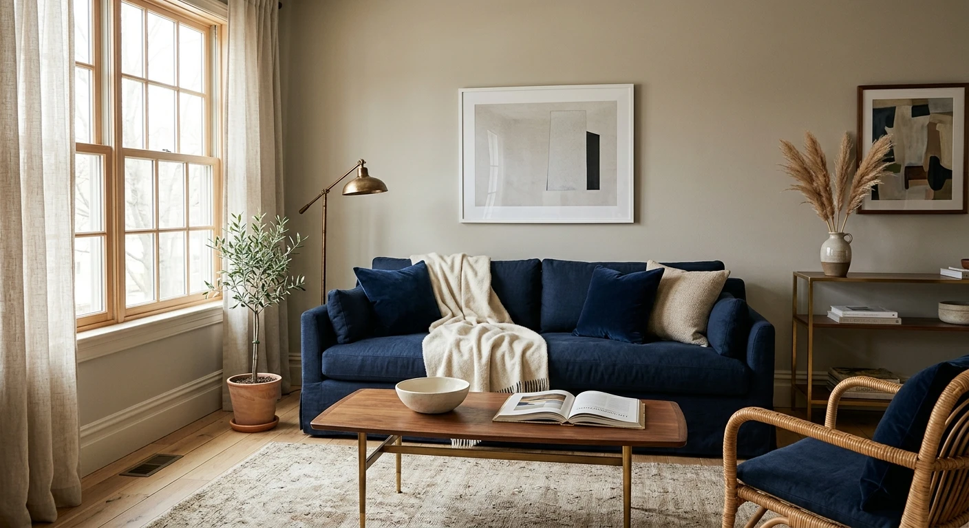
7. Navy accent and soft white. Body: BM White Dove (OC-17). Accent wall: BM Hale Navy (HC-154). Trim: White Dove. The classic. One navy wall behind the sofa does ninety percent of the design work in a builder-grade room. Get it right with our accent wall how-to and read the color in our Hale Navy review.
8. Charcoal and warm white. Body: warm white. Accent: SW Tricorn Black (SW 7069) or a true charcoal on a fireplace wall. Trim and ceiling: the white, kept bright to balance the weight. Moody on purpose. Keep the dark element to one plane or the room shrinks. Strategy in our accent wall color strategy.
9. Deep green and brass. Body: a forest or hunter green on all four walls. Trim: the same green or a soft cream. Accent: unlacquered brass and cognac leather. An enveloping green library-living-room is the most requested bold scheme I get. It demands lamp light, not overheads.
Earthy and organic schemes (warm, lived-in, current)
10. Sage green and greige. Body: SW Evergreen Fog (SW 6477) or a softer sage. Pair: SW Agreeable Gray on adjoining walls. Accent: terracotta and oak. Muted green is a neutral that happens to have a pulse. Shades and pairings in our sage green guide, and the specific color in our Evergreen Fog guide.
11. Terracotta and cream. Body: a muted clay or terracotta. Trim: cream. Accent: olive green and rattan. Warm, Mediterranean, and easier to live with than people expect because the clay is dusty, not orange. Reserve it for rooms with good afternoon sun.
12. Greige with a sea-salt accent. Body: greige. Accent: SW Sea Salt (SW 6204), a green-blue that softens the whole room. Trim: warm white. The gentlest of the green schemes, good for an open-plan space that flows into a kitchen. More on the color in our Sea Salt guide.
Color-forward schemes (for the brave)
13. Blush and warm gray. Body: a barely-there blush or warm pink at high LRV. Trim: warm white. Accent: olive, cognac, and brass. Done right this reads sophisticated, not little-girl pink. The trick is keeping the pink desaturated and grounding it with brown-based accents.
14. Slate blue and camel. Body: a muted slate blue. Trim: cream. Accent: camel leather and black metal. A handsome scheme that photographs beautifully and hides life with kids. The blue must be muted and gray-based, not primary, or it tips toward a teen's bedroom.
Free AI visualizer. Test a full palette on your real room before buying a single sample pot.
The 14 schemes at a glance
The whole set in one table so you can compare body, accent, and the light each scheme prefers. These are the values to take to a paint counter:
| Scheme | Body color | Accent | Best light |
|---|---|---|---|
| Greige + warm white | Agreeable Gray (SW 7029) | Walnut, woven texture | Any |
| Soft beige + bronze | Warm beige, LRV 60 | Urbane Bronze (SW 7048) | South / west |
| Mushroom taupe + cream | Mauve-based taupe | Aged brass, charcoal | Good natural light |
| Repose Gray + white | Repose Gray (SW 7015) | Matte black, leather | Any with black windows |
| Soft white on white | White Dove (OC-17) | One bold art piece | Any |
| Cool blue-gray + white | Light blue-gray | Navy, nickel | South / east (not north) |
| Navy accent + soft white | White Dove (OC-17) | Hale Navy wall (HC-154) | Any |
| Charcoal + warm white | Warm white | Tricorn Black wall (SW 7069) | Any (one wall only) |
| Deep green + brass | Forest / hunter green | Unlacquered brass, cognac | Lamp light |
| Sage + greige | Evergreen Fog (SW 6477) | Terracotta, oak | Any |
| Terracotta + cream | Muted clay | Olive, rattan | Afternoon sun |
| Greige + sea-salt accent | Greige | Sea Salt (SW 6204) | Any |
| Blush + warm gray | Desaturated blush | Olive, cognac, brass | Any with warm light |
| Slate blue + camel | Muted slate blue | Camel leather, black metal | Any |
Sources: Sherwin-Williams and Benjamin Moore color data 2026; designer field reports compiled by FacadeColorizer. LRV values are manufacturer-published; verify at a paint counter.
Building your own living room color palette from scratch
If none of the 14 fits your sofa exactly, build your own. Start with the thing you cannot repaint, usually the largest furniture or the floor, and pull your scheme from it:
- Anchor to the floor. Warm oak wants warm walls (greige, beige, sage); cool gray-washed floors want cooler walls (true gray, blue-gray, crisp white). Fighting the floor is the most common scheme mistake I see.
- Match the undertone, not the color. A gray sofa with a blue base needs a wall with a blue or violet base, not a green-gray. Hold the cushion against the chip in your own light; if one looks dirty, the undertones disagree.
- Pick one to commit, the rest to recede. Either the walls are the bold move or the accent is, never both. A neutral body lets a bold accent sing; a bold body needs everything else quiet.
- Trim is a decision, not a default. Builder white is rarely the right white. A warm wall wants a warm or soft white; a cool wall can take a crisp bright white. Mismatched whites are why a fresh room can still look off.
- Cut in a real test patch. Roll a two-foot square on two walls, cut in next to the trim, and live with it two days. The only honest preview is your own wall under your own bulbs.
One practical note before you buy: paint is the cheap part, but a full repaint adds up once you factor ceilings, trim, and a second coat. If you are budgeting the project, our interior house painting cost guide breaks down what a room actually costs.
See walls, trim, and accent together in one preview, free.
Frequently asked questions
What is the most popular color scheme for a living room?
The most requested scheme is a warm greige body (such as Agreeable Gray, SW 7029) with a soft white trim (Alabaster, SW 7008) and natural-wood accents. It is popular because the cream undertone keeps it from reading cold, it flatters almost any sofa, and it works in north and south rooms alike. If you want one safe scheme that is hard to get wrong, that is it.
How many colors should be in a living room color scheme?
Three to four is the sweet spot: a body color, a trim color, and one or two accents, roughly in a 60-30-10 split. Fewer than three can feel flat, and more than four starts to look busy unless the extra colors are tightly related neutrals. Count the wall, trim, and the loudest accent first; everything else should support those.
How do I choose a living room color palette to match my sofa?
Start from the sofa and identify its undertone, not just its color: a gray sofa can lean blue, green, or purple, and your walls should share that base. Pull the wall color a few steps lighter or darker than the sofa so they relate without matching exactly, then choose accents from a second tone in the room (a rug, art, or the wood floor). Always confirm the pairing on your own wall, since light changes both.
Should living room walls be lighter or darker than the furniture?
There is no rule, only contrast. Light walls with darker furniture feel open and airy; dark walls with lighter furniture feel cozy and enveloping. What you want to avoid is walls and a large sofa at nearly the same value and undertone, which reads muddy and washes the room out. Aim for a clear step of contrast in one direction.
What color scheme makes a small living room look bigger?
Light, low-contrast schemes open a small room: a high-LRV body color (off-white, soft greige, pale blue-gray) with trim a close shade rather than a sharp contrast, so the eye does not stop at every corner. Keep the ceiling bright and use a single accent rather than several. A dark accent wall can still work, but keep it to one plane and pair it with light everything-else.
Preview a full palette on your actual walls, under your own light, before buying a single sample.
Disclaimer: Sherwin-Williams, Agreeable Gray (SW 7029), Repose Gray (SW 7015), Alabaster (SW 7008), Pure White (SW 7005), Urbane Bronze (SW 7048), Evergreen Fog (SW 6477), Sea Salt (SW 6204), and Tricorn Black (SW 7069) are trademarks of The Sherwin-Williams Company. Benjamin Moore, White Dove (OC-17), and Hale Navy (HC-154) are trademarks of Benjamin Moore & Co. FacadeColorizer is an independent paint visualization service and is not affiliated with, endorsed by, or sponsored by Sherwin-Williams or Benjamin Moore. Screen reproduction approximates the manufacturer's chip; always confirm with a manufacturer sample under your own light before purchase.
Trademarks mentioned (Sherwin-Williams, Benjamin Moore, Behr, Caparol, Brillux, Sto, Alpina, Valspar, PPG, Glidden, Dulux, Crown Trade, Sandtex, Farrow & Ball, Johnstone's, Leyland) are property of their respective owners. FacadeColorizer is independent and not affiliated with any of them. Nominative fair use under Lanham Act §1125.


