Light gray has been the single most-searched interior neutral in the United States for nearly a decade, and it is also the one homeowners repaint most often. The reason is not the color. It is the undertone. A light gray that looks calm and clean on the store chip can turn cold blue, dingy green, or faintly purple once it is on a real wall in real light. Pick the undertone correctly and light gray is the most flexible backdrop in the house; pick it blind and the room feels like a parking garage.
This is a working profile of the light gray family, not a single can of paint: the shades designers reach for, the three undertones hiding inside almost every light gray, the LRV range that keeps a room bright, and the rooms and pairings where each shade performs. Use it alongside our broader interior paint color families guide when choosing which neutral family fits your home.
Upload a room photo and preview real light gray shades under your actual light in 30 seconds, free.
What counts as a "light gray," and why LRV decides the mood
Light gray is loosely defined as a low-saturation neutral between roughly LRV 50 and LRV 70. LRV (Light Reflectance Value) is the percentage of light a color bounces back, from 0 (black) to 100 (pure white), and it is the most useful single number on any paint chip: it predicts how bright a color will feel on a wall.
- Below LRV 50: you are leaving "light" gray for mid-tone or charcoal territory; the room reads cozy or dramatic, not airy.
- LRV 55 to 65: the sweet spot for most US light grays. Bright enough to keep a room open, dark enough that the gray still reads as gray.
- Above LRV 68: the gray behaves like a tinted white. Lovely in a dim, north-facing room; can look washed out in strong sun.
A practical rule from the field: a 3-inch fan-deck chip reads 25 to 35% lighter than the same paint rolled onto a wall, because the wall has corners, shadow, and far more surface throwing color back at itself. A light gray from a chip alone almost always comes out darker than you pictured, so choose a few LRV points brighter.
The light gray shades designers actually use
Here are the workhorses. Each one lists its published LRV next to the undertone it is most widely documented to show in US homes.
| Shade | Code | LRV | Dominant undertone | Reads as |
|---|---|---|---|---|
| Repose Gray | SW 7015 | 58 | Warm, faint purple-violet flag | Soft greige-gray |
| Agreeable Gray | SW 7029 | 60 | Warm, light beige (true greige) | Warm gray-beige |
| Stonington Gray | BM HC-170 | 59.5 | Cool, subtle blue | Clean true gray |
| Gray Owl | BM OC-52 | 65 | Cool, slight green-blue | Airy light gray |
| Light French Gray | SW 0055 | 53 | Cool, balanced | Crisp mid-light gray |
Try it on your house
No photo? Try a sample
Sources: Sherwin-Williams and Benjamin Moore technical data sheets 2026; The Spruce and Benjamin Moore Color Lab undertone documentation.
The two most-painted "light grays" in America, Repose Gray and Agreeable Gray, are really greiges, warm gray-beige hybrids. That is on purpose: a perfectly neutral gray can feel clinical, so the market drifted toward warm grays that play nicely with wood, brass, and cream. For a truly cool, no-beige gray, Stonington Gray and Light French Gray are the reliable picks; our greige paint colors guide goes deeper on these warm hybrids.
The three undertones hiding in light gray
Almost every light gray is built on a faint pigment you cannot see in flat showroom light. On a wall, the room's light and surroundings either neutralize that pigment or amplify it. There are three to watch for.
Blue (the cold trap)
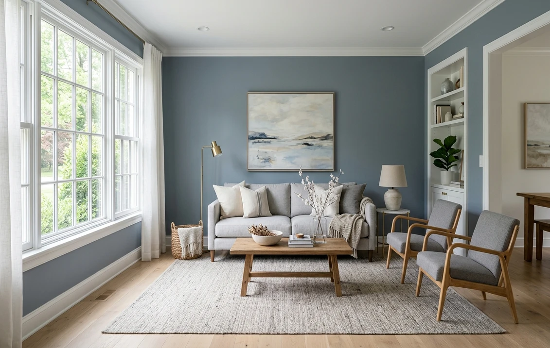
The most common reason a light gray feels cold. A blue-based gray under north light or 5000K LEDs can tip toward "hospital" or "gray steel." Stonington Gray carries a controlled blue that reads crisp in well-lit rooms but goes chilly in a dim north-facing space. If a room already feels cool, avoid the bluest grays or warm them with wood, brass, and 2700K bulbs.
Green (the dingy trap)
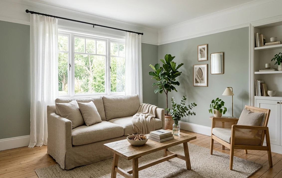
Some light grays carry a hint of green that, near foliage outside a window or under warm incandescent light, makes walls read drab or "sage-adjacent." Gray Owl shows a touch of this in greenery-heavy rooms, which can be a feature if you lean into it; our sage green interior paint guide covers grays that bridge into soft green on purpose.
Purple / violet (the surprise trap)
The sneakiest of the three: warm grays often hide a faint violet base. Repose Gray is the textbook case, soft in good light but able to flash a mauve cast in a dim room, at dusk, or next to the wrong cool-white trim. The fix is rarely a different gray; it is warmer trim and bulbs, and no stark blue-white ceiling overhead.
No light gray acts the same in every room. The winner is just the one whose hidden undertone your light and finishes cancel out instead of amplify.
Preview Repose Gray, Stonington Gray, and Gray Owl on your actual wall to see which stays neutral in your light, free.
How light gray behaves room by room
Light gray goes nearly everywhere. What changes from room to room is which shade you reach for:
- Living rooms, open-plan spaces, and bedrooms: a warm greige (Repose Gray, Agreeable Gray) keeps a large, sunlit space calm rather than cold and bridges wood floors and white trim. In bedrooms, a slightly deeper gray around LRV 55 feels restful; lean warm facing north.
- Kitchens, bathrooms, and hallways: a cool, clean gray (Stonington Gray, Light French Gray) reads crisp against white cabinets, while a warm greige softens an all-white kitchen. In small, windowless rooms lit with cool LEDs, a warm gray plus 3000K bulbs avoids a clinical feel; dark hallways should skip the bluest grays.
Light gray under different light: orientation matters more than the chip
The same light gray can look like three colors in three rooms of one house, because daylight is not neutral: its temperature swings with orientation.
| Room orientation | Daylight character | Effect on light gray |
|---|---|---|
| North-facing | Cool, blue, no direct sun | Pushes gray cooler and grayer; blue and purple undertones show most |
| South-facing | Bright, warm, lots of sun | Lifts and warms the gray; very forgiving, undertones stay balanced |
| East-facing | Warm early, cool by afternoon | Color shifts through the day; warm grays stay safest |
| West-facing | Cool morning, warm golden evening | Can flash warm or even pink at sunset; watch purple-based grays |
Latitude amplifies this: the shift is strongest above the 40th parallel (Boston, Chicago, Seattle) and in winter.
If your samples keep tipping cold, a cooler blue-leaning gray may suit the room better; see our blue gray paint colors guide.
Trim, ceiling, and decor pairings
Light gray walls live or die by what surrounds them; the wrong white trim is the fastest way to expose an unwanted undertone:
- Trim: a soft warm white (Benjamin Moore White Dove OC-17, or Sherwin-Williams Pure White SW 7005) flatters warm grays without going stark. Reserve a bright cool white like SW Extra White for genuinely cool grays.
- Ceiling: a warm or neutral white keeps light gray grounded, while a blue-white ceiling drags the walls cooler. Tinting the ceiling to 25 to 50% of the wall gray is elegant in bedrooms.
- Floors: warm wood (white oak, honey, walnut) bounces warm light onto the walls, the easiest way to stop a cool gray feeling cold. Cool gray-washed floors can flatten a room.
- Metals and decor: brass, aged bronze, and rattan warm a gray room; chrome and black hardware keep it cool and modern. A single deeper accent (navy, forest, terracotta) makes the gray read intentional, not builder-grade.
- Pairing with off-whites: light gray and a warm off-white in one open plan is a designer move; just keep the off-white clearly warmer than the gray. Our off-white paint colors guide helps you match the two.
Warm gray vs cool gray: which side should you pick?
This decision matters more than the specific brand, so let the room's fixed elements be the tiebreaker. Go warm (greige, Repose Gray or Agreeable Gray) with wood tones, cream fixtures, brass metals, or north-facing light. Go cool (Stonington Gray or Light French Gray) with white cabinetry, black or chrome hardware, cool stone, or abundant south light.
Torn between the Sherwin-Williams and Benjamin Moore versions? The differences are real but small, down to base tint and coverage. Our Sherwin-Williams vs Benjamin Moore comparison weighs coverage, durability, and price so you can pick the line, then the shade.
How to test a light gray before you commit
Skip the test step and light gray will punish you for it. Two methods that hold up:
- Peel-and-stick or rolled sample: paint a 12-inch swatch (two coats) on at least two walls, including the dimmest, and never judge it against bare drywall, which biases the eye warm. Look at it morning, afternoon, and after dark under your real bulbs.
- Digital preview first: before buying three sample pots, narrow the field by uploading a real photo of your room and applying candidate grays virtually. It will not replace a physical sample for the final pick, but it clears the obvious misses.
For a wider shortlist of the year's best neutrals, see our best interior paint colors of 2026 guide, and our interior house painting cost guide covers the project by room and square foot.
Preview several light grays on your real room photo, then sample only the finalists, free.
Frequently asked questions
What is the most popular light gray paint color?
In US homes, Sherwin-Williams Repose Gray (SW 7015, LRV 58) and Agreeable Gray (SW 7029, LRV 60) are the two most-painted light grays, and both are technically warm greiges. On the Benjamin Moore side, Stonington Gray (HC-170) and Gray Owl (OC-52) are the favorites for a cooler, cleaner gray. There is no universal best; the right one depends on your light and your fixed finishes.
Why does my light gray paint look blue or purple on the wall?
Light grays are built on a faint pigment. Cool grays hide a blue base that shows under north light or 5000K LEDs; warm grays hide a violet base that flashes purple in dim light, at dusk, or next to icy-white trim. The fix is usually warmer light (2700K to 3000K bulbs), warmer trim, and warm wood or brass nearby, not a different gray.
Is a warm or cool light gray better?
Match it to the room. Choose a warm light gray (greige) when you have wood tones, cream fixtures, brass metals, or north-facing light, for a calm feel. Choose a cool light gray when you have white cabinetry, black or chrome hardware, cool stone, or bright south light, for a crisp, modern look. Let the fixed elements you cannot change pick the temperature.
What LRV should a light gray be so the room does not feel dark?
For most rooms, an LRV between 55 and 65 keeps a light gray feeling open while still reading as gray rather than washing out to off-white. Below 50 the color shifts into mid-tone or charcoal territory and the room feels darker. Because a light gray comes out noticeably deeper on a full wall than on the chip, plan a few points brighter than the swatch you love.
See warm and cool light grays on your actual walls before you buy a single sample pot.
Disclaimer: Sherwin-Williams, Repose Gray, Agreeable Gray, and Light French Gray are trademarks of The Sherwin-Williams Company. Benjamin Moore, Stonington Gray, Gray Owl, and White Dove are trademarks of Benjamin Moore and Co. Behr is a trademark of Behr Process Corporation. FacadeColorizer is an independent paint visualization service, not affiliated with, endorsed by, or sponsored by Sherwin-Williams, Benjamin Moore, or Behr. LRV and undertone values are drawn from the manufacturers' published technical data sheets; screen color approximates the manufacturer's chip, so always confirm with a physical sample before purchase. Sources: Sherwin-Williams and Benjamin Moore technical data sheets 2026, Benjamin Moore Color Lab undertone documentation, The Spruce neutral-paint references.
Trademarks mentioned (Sherwin-Williams, Benjamin Moore, Behr, Caparol, Brillux, Sto, Alpina, Valspar, PPG, Glidden, Dulux, Crown Trade, Sandtex, Farrow & Ball, Johnstone's, Leyland) are property of their respective owners. FacadeColorizer is independent and not affiliated with any of them. Nominative fair use under Lanham Act §1125.