Walk the paint aisle and you will count more than 150 chips that all say "white" on them. Don't be fooled: those shades of white are not interchangeable. One reads crisp and icy. The next looks like vanilla ice cream. A third turns faintly pink the moment it goes up on a north wall. The difference is invisible on a fan deck and glaring on a finished wall, which is why "I painted the room white and it looks wrong" is one of the most common repaint complaints in American homes.
White paint splits into three groups: warm whites with a yellow, cream, or beige base; cool whites with a blue, gray, or green lean; and the rare true whites that hold almost no undertone. This guide decodes 15 of the most-specified US whites by their published LRV and undertone, then tells you which rooms, trim, and light each was built for. White is the anchor of the whole neutral spectrum. Before you commit, it pays to see where it sits among everything else in the full interior paint color families guide.
Upload a room photo and preview any of these 15 whites under your actual light in 30 seconds, free.
What LRV tells you about a white
LRV (Light Reflectance Value) is a 0 to 100 scale of how much light a color bounces back, and for whites it is the most useful number on the data sheet. Most usable whites land between 80 and 93. Above roughly 90 is true builder-white territory, bright and high-contrast; between 82 and 89 you get soft whites that read clearly white but feel warmer. Drop below 80 and the chip stops behaving like a white and reads as a pale greige.
The catch is that LRV only measures brightness, not undertone. Two whites can share an LRV of 84 and look nothing alike, one leaning yellow and the other blue. So the table below lists both: LRV for how light the wall feels, undertone for which way it drifts.
The 15 best shades of white, decoded
The 15 below are the whites US designers specify most, pulled from Sherwin-Williams, Benjamin Moore, and Behr. Codes and LRV values come straight from each manufacturer's current technical data sheet. The undertone column is different: that is what actually shows up once the paint is on a real wall.
| White | Code | LRV | Undertone | Reads as |
|---|---|---|---|---|
| Chantilly Lace | BM OC-65 | 90 | Near-neutral, faint cool | Crisp true white |
| Extra White | SW 7006 | 86 | Cool, slight blue-gray | Clean modern white |
| High Reflective White | SW 7757 | 93 | Neutral, brightest | Stark gallery white |
| Pure White | SW 7005 | 84 | Very soft warm | Balanced everyday white |
| White Dove | BM OC-17 | 85 | Soft warm, yellow-gray | Creamy soft white |
| Alabaster | SW 7008 | 82 | Warm, yellow with green-gray | Cozy off-white |
| Simply White | BM OC-117 | 89 | Warm, soft yellow | Bright warm white |
| Swiss Coffee | Behr / BM OC-45 | 82 | Warm, creamy yellow-beige | Soft vintage cream |
| Cloud White | BM OC-130 | 85 | Warm, subtle yellow | Gentle warm white |
| Snowbound | SW 7004 | 83 | Soft, slight gray-pink | Neutral cool-leaning white |
| Greek Villa | SW 7551 | 84 | Warm, peachy-yellow | Soft warm white |
| Decorator's White | BM CC-20 | 83 | Cool, slight blue | Architectural trim white |
| Polar Bear | Behr 75 | 82 | Soft, near-neutral | Easygoing soft white |
| Ultra Pure White | Behr PR-W15 | 93 | Neutral, very bright | Stock builder white |
| Shoji White | SW 7042 | 74 | Warm greige edge | Warm off-white / pale greige |
Try it on your house
No photo? Try a sample
Sources: Sherwin-Williams, Benjamin Moore, and Behr current technical data sheets (2026); The Spruce white paint guides. LRV values are manufacturer-published and rounded.
A few of these anchor entire palettes. Chantilly Lace (BM OC-65) is the reference "pure" white designers reach for when they want zero cream, and it doubles as wall and trim. White Dove (BM OC-17) is the most-sold off-white in the country because it stays creamy without going yellow across almost any orientation. Alabaster (SW 7008) is the cozy warm pick, beautiful in sunlight but prone to drifting gray-green in cold north rooms. Shoji White (SW 7042) is the outlier: at LRV 74 it has crossed out of the white family into greige, which is why it works as a soft, lived-in wall but never as a bright trim.
Warm vs cool vs true white
Picking a white is really picking a temperature. Once you decide which way you want the room to lean, the shortlist shrinks fast.
Warm whites (yellow, cream, beige base)
Soft and forgiving, these whites read cozy rather than clinical, and they pair naturally with wood, brass, and linen. White Dove, Alabaster, Swiss Coffee, Simply White, Cloud White, and Greek Villa all live here. The risk: under strong west sun or warm LEDs they can tip toward yellow or "old paint" cream, so they are happiest where cool or neutral daylight balances the warmth.
Cool whites (blue, gray, green lean)
Crisp and contemporary, this is the white of modern kitchens and minimalist baths. Extra White, Decorator's White, and Snowbound sit here. They sparkle in bright south and east light but can slide toward cold blue-gray in a dim north room, so choose them deliberately. Our light gray paint colors guide walks through the same undertone math one step darker.
True whites (near-zero undertone)
No real cast at all. Chantilly Lace, High Reflective White, and Ultra Pure White are the cleanest, brightest whites you can buy, and the safest bet for trim, ceilings, and gallery walls. Across a large wall expanse, though, they can feel stark unless warm furnishings step in to soften them.
Preview a warm white and a cool white on the same room photo before buying a sample pot, free.
How light direction changes every white
The most important factor is not the can, it is the window. The same white looks like two different colors in a north room and a south room, because daylight carries a color temperature the wall reflects back.
- North-facing rooms get cool, indirect, blue-leaning light all day. Warm whites rescue them; a cool white often reads gray and flat.
- South-facing rooms get the most light, warm and abundant. They carry a cool or true white beautifully and tame warm whites so they read clean.
- East-facing rooms are golden in the morning, cooler by afternoon. Neutral and soft warm whites (White Dove, Pure White) hold up best across the swing.
- West-facing rooms turn intensely warm at sunset, when a warm white can glow orange, so a neutral pick often balances better.
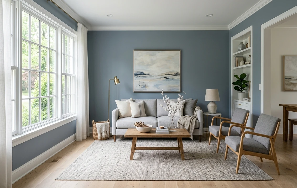
Latitude matters too. Above the 40th parallel (Boston, Chicago, Seattle) cool light is stronger and warm whites earn their keep, while in the South even north rooms hold enough ambient warmth for cool whites. It is the same mechanism that makes blue-leaning neutrals tricky in low light, covered in our blue gray paint colors guide.
Best white by room
Forget the idea of one perfect white. What you really want is the right white for the job in front of you:
- Living room and bedroom: White Dove (OC-17) or Alabaster (SW 7008) for warmth and ease. They photograph well and feel restful rather than bright.
- Kitchen: Pure White (SW 7005) for a clean backdrop that flatters white and stained cabinets alike, or Simply White (OC-117) for extra brightness.
- Bathroom: Chantilly Lace (OC-65) or Extra White (SW 7006) for a crisp, spa-clean feel against tile and chrome.
- Whole-house / open plan: White Dove or Simply White flow across rooms with different light without reading inconsistent.
- Trim and ceilings: Chantilly Lace, High Reflective White, or Decorator's White. A pure or cool trim makes warm walls read clean.
If white is part of a larger 2026 scheme, cross-check it against the broader shortlist in our best interior paint colors for 2026 roundup, where white sits alongside the warm neutrals and muted greens it usually shares a home with.
Trim, ceiling, and decor pairings
White-on-white works only when the two whites differ enough to register. A few rules keep the scheme from looking muddy:
- Trim should read crisper than the wall. Pair a soft warm wall (White Dove, Alabaster) with a cleaner trim (Chantilly Lace, Pure White) so the molding pops. The reverse looks like a mistake.
- Keep wall and trim in the same temperature family. A warm wall with a sharply cool trim reads dirty. Warm with warm, cool with cool, just at different brightness levels.
- Ceilings: a true white or the trim color keeps the overhead plane from competing. Over a warm wall in a north room, a soft white ceiling beats pure white.
- Decor: warm whites love wood, rattan, brass, and oatmeal linen. Cool and true whites pair cleanly with black hardware, chrome, and marble.
- Greige and green companions: warm whites sit beautifully next to a soft greige or muted sage, a pairing detailed in our greige paint colors guide and our sage green interior paint guide.
How to test a white before you commit
White is the hardest color to judge from a chip, because a 2-inch sample surrounded by other colors reads brighter and more neutral than a rolled wall. Two methods actually work:
- Paint a large sample. Use a 12 by 12 inch peel-and-stick swatch or two coats on poster board, then move it around the room. Check it morning, midday, and night under your normal bulbs; a white that looks perfect at noon can turn cream at 8 p.m. under warm LEDs.
- Preview it digitally first. A visualizer lets you apply several whites to a photo of your actual room before you spend on samples, the fastest way to rule out the obvious misses. Upload your room into our interior paint visualizer and compare White Dove, Alabaster, and Chantilly Lace in one sitting.
Test against the things that stay in the room: floor, countertop, largest piece of furniture. White reflects everything near it, so a white that looks great on bare drywall can shift once warm oak floors or a cool quartz counter are in frame. If you are weighing brands, the practical differences are in our Sherwin-Williams vs Benjamin Moore interior comparison, and repaint pricing in our interior house painting cost guide.
See your shortlist of whites on your real walls and lighting before buying a sample, free.
Frequently asked questions
What is the most popular white paint color?
Benjamin Moore White Dove (OC-17) and Sherwin-Williams Alabaster (SW 7008) are consistently the two best-selling interior whites in the US. White Dove (LRV 85) is a soft, creamy white that stays neutral across most light, while Alabaster (LRV 82) is a warmer, cozier off-white. For a crisp true white, Chantilly Lace (OC-65, LRV 90) is the designer default.
What is the best white for a north-facing room?
Choose a warm white. North light is cool and blue-leaning, so it drains warmth from the wall. White Dove, Alabaster, Cloud White, and Greek Villa all carry enough yellow or cream to stay inviting in cool light. Avoid cool whites like Extra White or Decorator's White in a north room, where they can read flat and gray.
How do I know if a white is warm or cool?
Check the undertone, not the chip. A warm white has a yellow, cream, or beige base; a cool white leans blue, gray, or green. The easiest test is to place the white next to a true white like Chantilly Lace: a warm white will suddenly look cream, and a cool white will look slightly gray or blue. LRV tells you how bright it is, not which way it leans.
Should walls and trim be the same white?
They can be, but usually the trim should read a touch crisper than the wall. A common approach is a soft warm white on the walls (White Dove or Alabaster) with a cleaner white trim (Chantilly Lace or Pure White) so molding stands out. Keep both in the same temperature family; a warm wall with a sharply cool trim can make the wall look dingy.
See any of these 15 whites on your actual room and lighting before buying a sample pot.
Disclaimer: Color names and codes referenced here (including Chantilly Lace, White Dove, Simply White, Cloud White, Decorator's White, Alabaster, Pure White, Extra White, High Reflective White, Snowbound, Greek Villa, Shoji White, Polar Bear, Swiss Coffee, and Ultra Pure White) are trademarks of Sherwin-Williams, Benjamin Moore, and Behr respectively. FacadeColorizer is an independent paint visualization service and is not affiliated with, endorsed by, or sponsored by Sherwin-Williams, Benjamin Moore, or Behr. Color reproduction on screens approximates the manufacturer's chip; always confirm with a manufacturer sample before purchase. Sources: Sherwin-Williams, Benjamin Moore, and Behr current technical data sheets (2026); The Spruce white paint guides.
Trademarks mentioned (Sherwin-Williams, Benjamin Moore, Behr, Caparol, Brillux, Sto, Alpina, Valspar, PPG, Glidden, Dulux, Crown Trade, Sandtex, Farrow & Ball, Johnstone's, Leyland) are property of their respective owners. FacadeColorizer is independent and not affiliated with any of them. Nominative fair use under Lanham Act §1125.