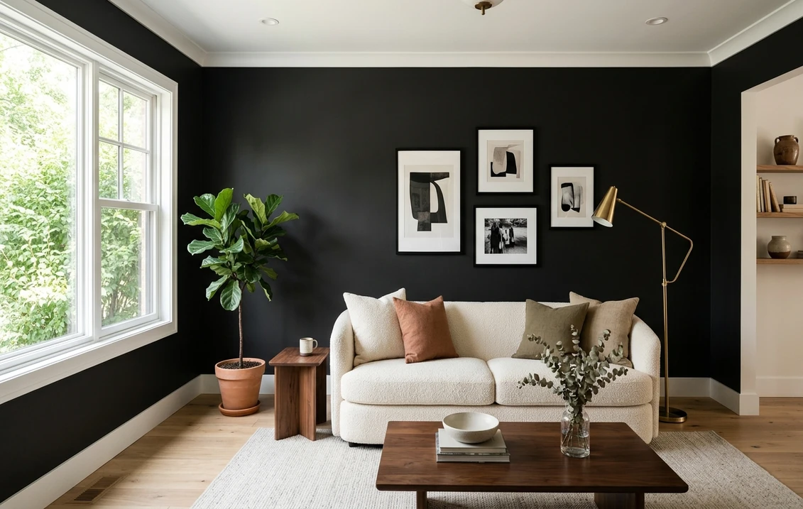
Of all the wall colors that scare people off before the lid is even pried open, black tops the list, usually on the fear that a true black like Tricorn Black (SW 6258, LRV 3) will swallow the room into a cave. That fear is usually misplaced. Walk through the homes where black walls look expensive and the ones where they look like a mistake, and the paint can is rarely the difference. Three things are. The exact depth of the black, meaning its LRV. The undertone hiding inside it. And how much light and white the room hands back. A near-black like Sherwin-Williams Iron Ore behaves nothing like a true black like Tricorn Black, which is why one "black wall" reads soft and architectural while the next reads flat and heavy.
This is a deep profile of black as an interior wall color: true black versus soft black, the surprising undertones in popular shades, how each behaves by light and room, and the trim, ceiling, and decor that keep a black wall looking intentional rather than gloomy. For where black sits in the wider palette, start with our interior paint color families guide.
Upload a photo and preview real black and near-black shades under your actual light, free.
True black vs. soft black: the distinction that decides everything
"Black paint" is not one thing. It splits into two camps, and picking the wrong one is the most common black-wall regret.
- True blacks sit at an LRV of roughly 3 or lower and read as a clean, graphic, almost ink-like black with crisp edges, the gallery-wall and dramatic-powder-room look. Sherwin-Williams Tricorn Black (SW 6258) is the reference point.
- Soft blacks (also called near-blacks) sit around LRV 5 to 9. They still read black across a room, but in raked light they reveal a charcoal softness that feels warmer and more livable. Sherwin-Williams Iron Ore (SW 7069) and Behr Cracked Pepper (PPU18-01) live in this range.
Here is what it means in practice. True blacks photograph beautifully. They also flaunt every speck of dust and every dent in the drywall. Soft blacks forgive both, age more gracefully, and rarely feel oppressive. For a first black wall in a room you actually live in, a soft black is usually the safer commitment.
LRV, undertones, and the shades worth knowing by name
LRV (Light Reflectance Value) runs from 0 to 100; no architectural black actually hits 0, and the deepest you will buy lands around 3. The number that matters more for blacks is the undertone, because once the room dims, that tiny secondary hue is what your eye latches onto. A brown base warms up; a blue or purple base can read cold or even faintly aubergine after dark.
| Shade | Code | LRV | Reads as / undertone |
|---|---|---|---|
| SW Tricorn Black | SW 6258 | 3 | True black, clean and neutral, minimal undertone |
| SW Black Magic | SW 6991 | 3 | True black with a warm brown base |
| SW Caviar | SW 6990 | 3 | True black, faint cool blue or purple whisper |
| SW Iron Ore | SW 7069 | 6 | Soft black, slightly warm charcoal |
| BM Wrought Iron | 2124-10 | 6 | Soft black, cool-leaning with a touch of warm gray |
| BM Soot | 2129-20 | 4 | Soft black, warm gray, gentle on big walls |
| Behr Cracked Pepper | PPU18-01 | 8 | Charcoal-black, a few points shy of true black |
Try it on your house
No photo? Try a sample
LRV and undertone references from Sherwin-Williams, Benjamin Moore, and Behr technical color data, 2026, plus published designer reviews. Behr Cracked Pepper was Behr's 2024 Color of the Year. Codes are manufacturer references; always confirm on a sample.
As a quick decision tree: Tricorn Black for a crisp graphic look, Black Magic or a soft black like Iron Ore for warmth in a lived-in room, and Caviar for barely-there moody depth (its cool or purple whisper can surface under warm bulbs). The same undertone physics drives the deep end of the blue-gray family, which we map shade by shade in our blue gray paint colors guide.
How light changes a black wall
You might assume a color this dark shrugs off the light-direction shifts that torment whites and grays. It does the reverse. Black soaks up nearly every photon that lands on it, so the sliver it bounces back belongs almost entirely to the room's light source. That exaggerates the undertone instead of hiding it.
- North-facing rooms: cool, indirect sky light (roughly 7,500 to 10,000 K) leans a black cooler and pulls out any blue or purple base, so a warm-based black like Black Magic or Iron Ore keeps a north room from feeling icy.
- South and west rooms: warm afternoon sun softens black to a rich espresso and shows off its depth, so true blacks look most "expensive" here.
- East-facing rooms: bright cool morning, neutral by afternoon; a soft black holds its charcoal character all day.
- Evening, warm LED: 2700K bulbs flatter warm-based blacks, while cooler 3500K to 4000K bulbs keep a true black reading crisp rather than brown.
A black wall is most flattering where something gives it scale: a window, a white ceiling, light flooring, or pale furniture. Strip all of that away in a small, low-light room and even a soft black can collapse into a void.
Free AI paint visualizer. Test Tricorn Black, Iron Ore, and a soft charcoal on your real room before buying a sample.
Where black walls actually work, room by room
Powder rooms and small bathrooms
The lowest-risk, highest-reward black-wall project there is. A windowless powder room has no daylight to "lose," so a true black like Tricorn Black turns a forgettable closet into a jewel box. Add a gold mirror, brass fixtures, and warm sconce lighting, and the small footprint becomes a feature.
Home offices, studies, and libraries
Black walls read as focused and bookish. A soft black such as Iron Ore or Wrought Iron grounds a study without sealing it shut; pair it with warm wood shelving and brass accents so the room feels like a den, not a bunker.
Accent walls in bedrooms and living rooms
A single black wall behind a bed or a fireplace adds depth without committing the whole room. A soft black is more restful behind a bed, while in a living room black works best on the wall opposite the largest window. For how black slots into a balanced palette, see our best interior paint colors of 2026 guide.
Where to be cautious
Avoid wrapping a small, north-facing, low-window bedroom in true black unless you want a cocoon and will light it well. Kitchens with black on every wall can feel heavy; black reads better on lower cabinets, an island, or a single wall with bright uppers. When a room mostly needs to feel warmer and more open, black is fighting you. Reach for a warm neutral instead; our greige paint colors guide walks through the shades that do that job.
Trim, ceiling, sheen, and decor: the supporting cast
Black is only half the decision. Everything framing it, the trim, the ceiling, the sheen, the floor, carries just as much weight.
- Trim, for contrast: crisp white trim (Sherwin-Williams Pure White SW 7005 or Benjamin Moore White Dove OC-17) frames a black wall and keeps it architectural.
- Trim, for drama: painting trim the same black as the wall (a "color drench") erases the lines and makes a small moody room feel larger.
- Sheen matters more with black: flat or matte hides imperfections and reads soft and velvety, the usual choice for big walls. Satin and semi-gloss look striking but telegraph every roller mark, so reserve gloss for smooth millwork or a feature wall.
- Ceiling: a white ceiling lifts a black room; drenching the ceiling in the same black is a bold cocoon for rooms you want intimate.
- Warmth is mandatory: white oak and walnut floors, brass and aged-bronze hardware, leather, and rattan stop a black room from going cold and clinical.
- Greens and black: deep green-and-black is one of the strongest 2026 pairings; soft sage walls with black trim feel organic and current. See our sage green interior shades and pairings guide for the green side of that combination.
Black vs. its near neighbors
- Black vs. charcoal: a charcoal is a black lifted a few LRV points so it reads as a very dark gray. If a black wall feels like too much, charcoal delivers most of the drama with more daylight.
- Black vs. deep navy or slate: a near-black navy or slate gives the moody, enveloping effect with a sliver of color and often feels softer in a bedroom. Our light gray paint colors guide covers the lighter end of the same cool family if you want to dial the drama down.
Sherwin-Williams and Benjamin Moore both make excellent blacks, and the line you choose subtly changes the undertone and how the paint covers. Our Sherwin-Williams vs Benjamin Moore interior comparison breaks down coverage, durability, and how each brand handles deep colors.
How to test a black before you commit
Getting black wrong is expensive. It wants a tinted primer and two coats, so painting over a bad pick is real work, and a thumbnail chip tells you almost nothing because depth and undertone only show up at scale. Test it properly instead:
- Paint a large swatch, at least 2 by 2 feet (peel-and-stick samples work), on the wall you are considering.
- Look at it morning, midday, and after dark under your own bulbs; a black that looks neutral at noon can warm to brown or cool to slate by night.
- Hold a true-white card beside it; against pure white, the undertone (brown, blue, or purple) jumps out.
- Sample one true black next to one soft black so you feel the LRV gap in your own light, not from a chip.
The fastest no-paint shortcut is a digital preview: upload a photo and apply several blacks to see which stays graphic and which softens to charcoal. Once chosen, plan the job with our interior house painting cost guide, which breaks pricing down by room and square foot.
See which black stays graphic and which softens to charcoal in your room, before buying samples.
Frequently asked questions
Will black walls make my room look smaller or like a cave?
Not by themselves. Black recedes, which can make a room feel larger and more enveloping. The "cave" effect comes from a black room with no contrast: dark floors, dark furniture, and little light. Give a black wall a white ceiling or trim, light flooring or pale furniture, and warm lighting, and it reads as dramatic rather than cramped.
What is the best black paint for interior walls?
For a crisp, graphic true black, Sherwin-Williams Tricorn Black (SW 6258, LRV 3) is the most popular and most neutral. For a warmer, more livable soft black, SW Iron Ore (SW 7069, LRV 6), Benjamin Moore Wrought Iron (2124-10), or Behr Cracked Pepper (PPU18-01, LRV 8) feel cozier on a big wall and hide imperfections, while SW Black Magic (SW 6991) bakes in a brown undertone.
Do black paint colors really have undertones?
Yes, and they matter more than people expect. Because black reflects so little light, the little it does reflect is dominated by its undertone, which gets exaggerated rather than hidden. Tricorn Black is close to neutral; Black Magic leans warm brown; Caviar carries a faint cool blue or purple whisper that can surface under warm bulbs.
What sheen should I use for black walls?
Flat or matte is the usual choice for full walls because it reads soft and velvety and hides surface imperfections, which black exaggerates. Save satin and semi-gloss for trim, millwork, or a single smooth feature wall, since higher sheen on black telegraphs every roller mark under direct light.
What trim color goes with black walls?
Two looks both work. For high contrast and a graphic, architectural feel, pair black walls with crisp white trim like Sherwin-Williams Pure White (SW 7005) or Benjamin Moore White Dove (OC-17). For a moody, enveloping room, drench the trim in the same black as the wall to erase the lines, which makes a small powder room or study feel larger. Either way, add warm wood and brass so the room does not go cold.
Upload your room photo and compare true and soft blacks side by side under your own light before committing.
Disclaimer: Sherwin-Williams, Benjamin Moore, Behr, and the color names and codes referenced throughout are trademarks of their respective owners. FacadeColorizer is an independent paint visualization service and is not affiliated with, endorsed by, or sponsored by Sherwin-Williams, Benjamin Moore, or Behr. Color reproduction on screens approximates the manufacturer's chip; always confirm with a manufacturer sample under your own lighting before purchase. Sources: Sherwin-Williams, Benjamin Moore, and Behr technical color data sheets 2026, The Spruce paint color references, and published designer undertone guidance.
Trademarks mentioned (Sherwin-Williams, Benjamin Moore, Behr, Caparol, Brillux, Sto, Alpina, Valspar, PPG, Glidden, Dulux, Crown Trade, Sandtex, Farrow & Ball, Johnstone's, Leyland) are property of their respective owners. FacadeColorizer is independent and not affiliated with any of them. Nominative fair use under Lanham Act §1125.