
I painted a client's library in a deep forest green two winters ago, and the room sat half-finished for three weeks because she could not decide on the trim. She kept holding a bright builder white against the wall, hating it, and blaming the green. The green was not the problem. A stark blue-white next to a moody green reads like a hospital corridor, all contrast and no warmth. The day we swapped in a soft cream white, the whole room exhaled. That is the lesson dark green teaches over and over: the shade on the wall matters far less than what you set beside it. Dark green is a near-neutral, almost as forgiving as charcoal, but it has a strong opinion about its company.
This guide is about partners, not the green itself. If you are still weighing the lighter sages and olives instead of the moody end, our broader guide to colors that go with green sorts those out. Here we stay in the moody end: forest, hunter, emerald, and bottle green, the kind of dark green combinations that anchor a dining room, a study, or kitchen cabinets. It all sits under our wider interior color schemes guide.
Upload a photo of your actual room and preview a deep green with different partner colors under your own light in about 30 seconds, free.
Why dark green is so easy to pair (and where it bites back)
Green sits in the middle of the color wheel, which is why it plays nicely with so much. A deep green pulls from both warm and cool ends, so it can flatter brass and oak on one side and navy and slate on the other. At low LRV (most true dark greens land somewhere between 6 and 14) it behaves like a soft neutral that happens to have a pulse. You can treat it the way you would treat charcoal or a warm black: as a grounding anchor that lets other materials sing.
The catch is undertone. Dark greens split into two camps. Warm greens lean yellow or olive (think hunter and bottle green) and want warm partners: cream, brass, terracotta, walnut. Cool greens lean blue or gray (a true forest green) and take crisper company: bright white, chrome, slate, navy. Pair across the line carelessly, set a warm olive next to a cold blue-white, and the green looks muddy while the white looks dirty. When in doubt, hold a warm white and a cool white chip to the wall in daylight and watch which one makes the green look richer.
Whites and creams: the partner you get wrong first
Most people reach for white trim on instinct, then pick the wrong white. Here is the honest ranking for dark green.
- Warm white (the safe default): a soft cream-leaning white like Benjamin Moore White Dove (OC-17) is the most reliable trim for any deep green. It softens the contrast so the green reads cozy and collected, not jarring. This is what I reach for nine times out of ten on warm and neutral greens. Full breakdown in our Benjamin Moore White Dove OC-17 review.
- Crisp white (only for cool greens): a clean bright white sharpens a true cool forest green and gives it a tailored, modern edge. It works beautifully when the green itself leans blue. Put that same crisp white next to a warm olive-green and the room can look stark and a little cold.
- Avoid: a stark blue-white on a warm green, and a heavy yellow-cream on a cool green. Both create a clash where one color flatters the room and the other fights it.
One more note on creams. A full cream or antique-white wall above dark green wainscoting is a classic, traditional move that never dates. It is warmer and softer than white trim and reads more English-library than modern-farmhouse. If your green is on the lower third of the wall, cream above it is hard to beat.
| Partner color | Best with which dark green | Mood it creates |
|---|---|---|
| Warm white / cream | Any, especially warm hunter and bottle green | Calm, traditional, collected (the safe pick) |
| Crisp bright white | Cool, blue-leaning forest green only | Tailored, modern, fresh |
| Brass / unlacquered gold | Warm and neutral deep greens | Warm, luxe, layered |
| Navy | Cool and neutral deep greens | Moody, tonal, expensive-looking |
| Blush / dusty pink | Any deep green (it is the complement) | Soft, unexpected, sophisticated |
| Walnut / warm wood | Warm and neutral deep greens | Grounded, organic, lived-in |
| Terracotta / rust | Warm olive and hunter green | Earthy, autumnal, warm |
| Warm near-black | Any deep green, on trim and doors | Dramatic, sharp, high-contrast |
Sources: color-wheel complementary theory; designer field reports compiled by FacadeColorizer; manufacturer LRV data for common deep greens 2026.
Free AI visualizer. See warm white and crisp white against your green before buying a sample pot.
Metals: brass is the headline, and chrome has a job too
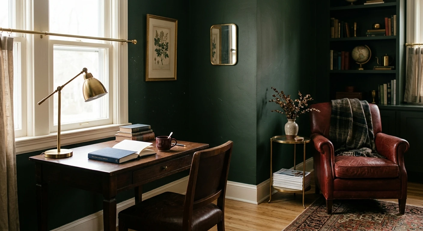
If you do one thing to make dark green look expensive, add brass. Warm gold and unlacquered brass against a deep green is the pairing every designer leans on: the warm metal lifts the green's depth and reads instantly luxe. Cabinet pulls, a picture light over art, a vintage lamp, sconces flanking a fireplace. It works on warm and neutral greens without fail.
Chrome and polished nickel are the cooler counter-move. On a true cool forest green, brushed nickel or chrome keeps things crisp and contemporary rather than traditional. I would not mix the two metals heavily in one room: pick brass for warmth or nickel for a cleaner look, and commit. Mixing in equal measure usually just looks indecisive.
The deeper colors: navy, black, and tonal layering
Dark green plays surprisingly well with other dark colors, which is where the moody, enveloping rooms come from. Two partners are worth singling out.
Navy
Navy and dark green sounds risky and looks fantastic, as long as both lean the same temperature. Pair a cool forest green with a classic navy like Hale Navy and you get a deep, tonal, layered scheme: green walls, navy velvet, brass and cream to break it up. It reads like a club room. Avoid putting a warm olive next to a cold navy, though, that is the one navy-green combination that can feel slightly off. See how navy behaves in our Benjamin Moore Hale Navy HC-154 review, and our guide to colors that go with blue covers the reverse pairing.
Warm black on the details
A warm near-black on interior doors, window sashes, or built-in shelving sharpens dark green without the chill a true cold black brings. Black picture frames, a black iron fireplace surround, matte-black hardware: all of it reads sophisticated against deep green. Keep the black warm, not blue-black, so it stays in the same family as the green.
See dark green walls with navy and warm-black details on your real photo, free.
The unexpected partners: blush, terracotta, and warm wood
Pink is green's complement, sitting directly across the wheel, and a soft dusty blush proves it. Blush against deep green is the pairing that surprises people: muted, grown-up, never sweet. A blush velvet chair or pale-pink art keeps a dark green room from feeling heavy or masculine. Skip the bright bubblegum pinks, they fight the depth. Stay dusty and muted and it sings.
On the warm side, terracotta and rust are the earthy answer, especially for olive and hunter greens. Think clay pots, a rust throw, a burnt-orange rug. It is the autumnal, organic version of a green room and it feels grounded rather than designed. For more on those warm earthy neutrals as a partner family, our guide to colors that go with beige is a useful companion.
And do not overlook the wood already in the room. Warm walnut, white oak, and natural rattan are some of the best partners dark green has, because wood carries its own warmth and texture. A green room with no wood can feel flat and cold. One warm wood floor or a single walnut piece is often all the warmth a deep green needs.
Where dark green and its partners work best
Deep green rewards rooms you want to feel enveloping. It is at its best in:
- Dining rooms and studies: the low LRV makes these rooms feel intimate and considered. Warm white trim, brass lighting, and a wood table is the formula.
- Kitchen cabinets: dark green lower cabinets with brass hardware and a warm-white or marble-look counter read timeless rather than trendy. It is one of the most-requested cabinet colors right now.
- Powder rooms: a small, windowless room is the one place you can go fully dark green on every wall and trim. With brass fixtures and a warm bulb it feels like a jewel box.
- Bedrooms (as an accent or full wrap): green is restful. A dark green behind the bed with cream bedding and warm wood nightstands is calm without being boring.
Before you commit a whole room, two things will save you money. Cost context for the full repaint is in our interior house painting cost guide for 2026, and dark colors almost always need a tinted primer plus a careful second coat to cut in cleanly and avoid patchy coverage, so budget the extra gallon.
How to test your dark green combinations before you commit
A 3-inch chip cannot show you a partnership. Dark green shifts hard between daylight and lamp light, and a tiny chip exaggerates contrast with whatever it touches. Two better methods:
- Paint a large swatch with the partner beside it: roll a 12-by-12-inch sample and tape your candidate trim white right next to it. Look at it mid-morning and again at night under your normal bulbs. The relationship between the two colors is what you are judging, not the green alone.
- Preview it digitally first: upload a real photo of your room and apply a deep green, then swap the trim and accent colors. It is the fastest way to see whether warm white or crisp white, brass or chrome, navy or blush is the right partner before you buy a single sample pot.
Preview dark green against warm white, brass, navy, and blush, side by side, free.
Frequently asked questions
What colors go with dark green?
Dark green pairs best with warm white or cream trim, brass and gold metals, warm woods like walnut and oak, dusty blush, terracotta, navy, and a warm near-black on details. The safest, most reliable partner is a soft warm white. The most luxe is brass. Match the temperature: warm greens want warm partners, cool greens can take crisper, cooler company.
What white trim looks best with dark green?
A soft warm white such as Benjamin Moore White Dove (OC-17) is the most reliable trim for almost any deep green, because it softens the contrast and keeps the room cozy. Reserve a crisp bright white for cool, blue-leaning forest greens only. Avoid a stark blue-white on a warm olive green, which can make the wall look muddy and the trim look dirty.
Does navy go with dark green?
Yes, navy and dark green make a moody, tonal pairing that looks expensive, as long as both lean the same temperature. A cool forest green next to a classic navy reads like a club room when you break it up with brass and cream. The one combination to avoid is a warm olive green beside a cold navy, which can feel slightly off.
What metal goes with dark green walls?
Brass and unlacquered gold are the headline metals for dark green: warm gold lifts the green's depth and reads instantly luxe on hardware, lighting, and frames. Chrome and polished nickel are the cooler option for a true cool forest green and a more contemporary look. Pick one metal and commit rather than mixing two in equal measure.
Is pink really a good match for dark green?
A dusty, muted blush is one of the best partners for dark green because pink is green's complement on the color wheel. It keeps a deep green room from feeling heavy or too masculine and reads grown-up rather than sweet. Stay with muted, dusty pinks; bright bubblegum pinks fight the depth and look out of place.
Preview a deep green with your chosen trim, metal, and accent colors on your actual walls before buying a single sample.
Disclaimer: Benjamin Moore, White Dove (OC-17), and Hale Navy (HC-154) are trademarks of Benjamin Moore & Co. Other color names referenced are trademarks of their respective manufacturers. FacadeColorizer is an independent paint visualization service and is not affiliated with, endorsed by, or sponsored by any paint manufacturer. Color reproduction on screens approximates the manufacturer's chip; always confirm with a manufacturer sample under your own light before purchase. Sources: color-wheel complementary theory, manufacturer LRV data for common deep greens 2026, designer field reports compiled by FacadeColorizer.
Trademarks mentioned (Sherwin-Williams, Benjamin Moore, Behr, Caparol, Brillux, Sto, Alpina, Valspar, PPG, Glidden, Dulux, Crown Trade, Sandtex, Farrow & Ball, Johnstone's, Leyland) are property of their respective owners. FacadeColorizer is independent and not affiliated with any of them. Nominative fair use under Lanham Act §1125.


