
The first coastal room I ever got wrong was a rental two blocks from the water in Cape May. I painted it a bright sailor blue with crisp white trim, hung a rope mirror, and the whole thing looked like a themed seafood restaurant. The owner was kind about it. Then she pointed at the dunes through the window: pale sand, silver driftwood, gray-green beach grass, a sky that was barely blue most mornings. A real coastal color palette is muted, not loud. It borrows from weathered things, not from a flag. Get that one idea right and the rest of this falls into place.
This guide walks through 14 beachy paint schemes, each built around a small set of named colors with LRV and undertone notes, so you can take the swatches straight to a paint counter. Some are airy and bright, some are deeper and moodier, a few lean modern. This is one branch of our larger interior color schemes guide, focused entirely on the coastal end. If your heart is set on the blue specifically, our blue rooms paint ideas goes deeper on that one color.
Upload a photo of your actual room and preview these beachy schemes under your own light in about 30 seconds, free.
What actually makes a palette read coastal
Before the schemes, the rules. A beachy color paint palette is not just "blue and white." Three things separate the coastal look from a generic blue room:
- Muted, dusty saturation. Every color is a little grayed-down, like it has been sitting in salt air. A pure, vivid blue breaks the spell instantly. Think sea glass, not pool-tile.
- Warm sand as the anchor. The neutral is almost never a cool gray. It is a warm off-white or a soft greige that mimics dry sand and reflects warm light, which keeps the cool blues from turning the room cold.
- A natural-texture undertone. The whites lean creamy (driftwood, shell), the greens lean gray (beach grass), the blues lean green or gray (water under cloud). Nothing reads primary.
Honest opinion: the single most common coastal mistake is over-using navy. Navy is gorgeous as an accent (one wall, a door, a bench), but a whole navy-and-white room reads preppy nautical, not soft coastal. Use it like a seasoning. If you want the full range of navy pairings, our guide to colors that go with blue interiors covers what plays nice with it.
14 coastal paint schemes, by mood
Here are the schemes. Each lists a wall color, a trim or secondary, and an accent, with the paint brand and code so you can pull samples. Brands: SW (Sherwin-Williams), BM (Benjamin Moore), F&B (Farrow & Ball). Treat the LRV column as a brightness guide: higher means lighter and more reflective.
| Scheme | Wall color | Accent | Wall LRV | Mood |
|---|---|---|---|---|
| 1. Sea Glass | Sea Salt (SW 6204) | Warm white trim | 63 | Airy, soft |
| 2. Dry Sand | Accessible Beige (SW 7036) | Sea Salt green-blue | 58 | Warm, grounded |
| 3. Washed Denim | Soft Chambray (SW 9139) | Creamy white | 52 | Calm, bedroom |
| 4. Shell White | White Dove (BM OC-17) | Pale blue ceiling | 85 | Bright, classic |
| 5. Driftwood Greige | Agreeable Gray (SW 7029) | Soft teal | 60 | Neutral, flexible |
| 6. Harbor Navy | Warm white walls | Hale Navy (BM HC-154) | 84 | Crisp, nautical |
| 7. Foggy Morning | Rainwashed (SW 6211) | Driftwood gray | 59 | Misty, quiet |
| 8. Beach Grass | Sea Salt (SW 6204) | Sandy taupe | 63 | Organic, soft |
| 9. Coastal Modern | Repose Gray (SW 7015) | Inky blue door | 58 | Clean, current |
| 10. Deep Water | Creamy white walls | Coastal Blue (BM 794) | 81 | Bold accent |
| 11. Hamptons White | Chantilly Lace (BM OC-65) | Pale gray-blue | 92 | Crisp, breezy |
| 12. Salt Air Green | Evergreen Fog (SW 9130) | Warm white | 30 | Moody, deep |
| 13. Sand & Sky | Natural Linen (BM 966) | Soft sky blue | 71 | Light, easy |
| 14. Stormy Coast | Stiffkey Blue (F&B 281) | Driftwood white | 10 | Dark, dramatic |
LRV values from Sherwin-Williams, Benjamin Moore and Farrow & Ball published color data 2026. Pairings compiled by FacadeColorizer from designer field reports.
Free AI visualizer. Test sand, sea glass, and navy on your real room before buying a single sample pot.
The three colors that anchor almost every coastal palette
You can build all 14 schemes above from a short shopping list. If you only sample three colors, sample these.
Sea Salt (SW 6204): the soft green-blue
Sea Salt is the color that launched a thousand coastal bathrooms, and for good reason. At LRV 63 it is a hushed green-blue with a gray undertone that almost never reads as a strong color. Here is the catch worth knowing before you commit: Sea Salt is a chameleon. In a bright south room it leans green; in a north room or under cool LEDs it leans more blue-gray, sometimes almost spa-gray. That is its charm and its trap. We break down exactly how it shifts in our Sea Salt undertones and best rooms guide. It does not work in a windowless room with one weak bulb, where it just turns flat and gray.
A warm sand neutral: Accessible Beige or Agreeable Gray
Sand is the part people skip, then wonder why the room feels cold. A warm greige on the main walls (Accessible Beige SW 7036 for cozier, Agreeable Gray SW 7029 for more neutral) does the heavy lifting. It reflects warm light back into the space so the blues and greens read calm instead of chilly. Use the sand color on the bulk of the walls and save the blue-green for a smaller plane.
A deep blue for the accent only: Hale Navy or Coastal Blue
This is your seasoning. Hale Navy (BM HC-154) on a front door, a kitchen island, or a single bedroom wall delivers the nautical note without taking over. For a brighter, more water-like accent, Benjamin Moore Coastal Blue (794) is excellent on a powder-room wall. Keep it to one surface. The moment navy covers two or more walls, the soft coastal mood tips into yacht-club, and that is a different look entirely.
Coastal paint schemes by room
The same palette behaves differently depending on the room's light and use. A quick room-by-room read:
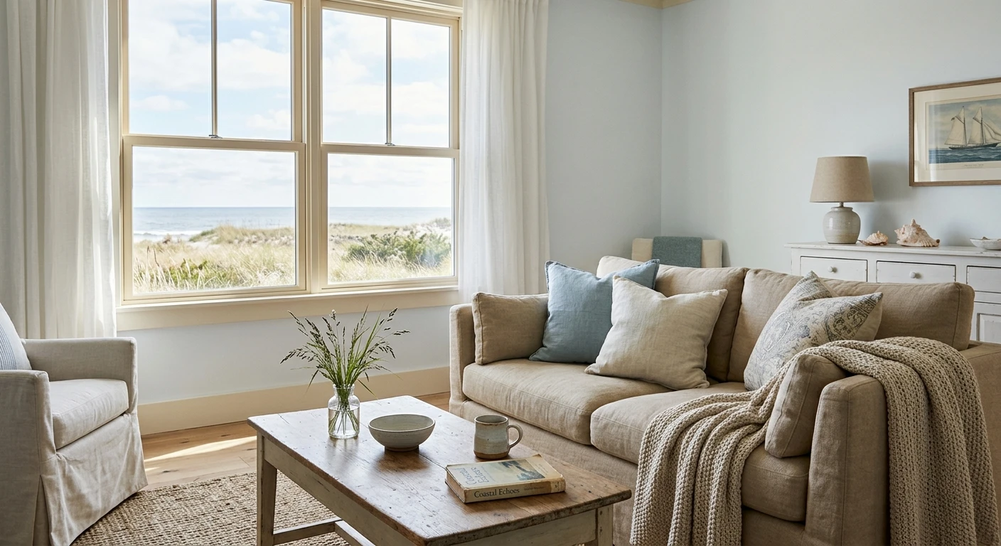
- Living room: warm sand walls (Agreeable Gray or Accessible Beige), Sea Salt on a built-in or alcove, navy in the throw pillows and one chair. Bright and open without theme-park props.
- Bedroom: Soft Chambray (SW 9139) or Rainwashed on the walls reads like washed denim and sleeps beautifully. Keep trim a creamy white, not a stark blue-white.
- Bathroom: this is Sea Salt's natural habitat. The steam and the typical cool tile both flatter it. Pair with white subway tile and warm brass.
- Kitchen: creamy white or warm greige cabinets, a navy or deep teal island, sandy backsplash. The island is where your one bold blue lives.
- Entry and powder room: a small space is the safest place to go dark. Stiffkey Blue or Evergreen Fog turns a powder room into a jewel box and the low light does not hurt a deep color the way it kills a pale one.
See walls, trim, and accent together in one preview, free.
Trim, ceiling, and finish notes for a coastal look
A coastal palette lives or dies on the supporting details. A few hard-won pointers:
- Trim: go creamy white, not blue-white. SW Alabaster (SW 7008) or BM White Dove (OC-17) keep the warmth. A stark, cool white like a bright contractor white can make the blues read cold and the sand read dingy.
- Ceiling: a pale blue ("porch ceiling blue") is a true coastal classic and reads like a soft sky overhead. Keep it very light, around LRV 70 plus, or it will lower the room.
- Finish: matte or eggshell on walls reads more weathered and coastal than a shiny satin, which looks too slick for the dusty palette. Save semi-gloss for trim and doors.
- The second coat matters: grayed-down coastal colors are notorious for looking patchy and uneven after one thin coat. Cut in clean, then give it a full, even second coat so the muted color reads as intentional, not blotchy.
For a wider look at how blues, greens, and warm neutrals relate as families before you lock a scheme, our interior color schemes guide is the map, and our blue rooms paint ideas drills into the moody end if you want to go darker.
How to test a coastal palette before you buy gallons
Coastal colors are exactly the ones that fool you on a fan-deck chip, because the dusty, low-saturation tones shift hard with light. Two reliable methods:
- Paint a large swatch: roll a 12-by-12-inch sample (or a peel-and-stick swatch) on two walls and check it mid-morning, mid-afternoon, and at night under your normal bulbs. Watch Sea Salt especially: it can read green by day and gray by lamp light in the same room.
- Preview it digitally first: upload a real photo of your room and try the whole scheme (sand walls, sea-glass accent, navy door) before you buy a single sample, narrowing several contenders to the one worth painting.
Preview sand, sea glass, and navy side by side on your actual walls, free.
Frequently asked questions
What colors are in a coastal color palette?
A coastal color palette centers on a warm sand neutral (a soft greige or creamy white), one or two muted blue-greens like Sea Salt or Rainwashed, and a single deeper blue such as Hale Navy used only as an accent. The whole palette is grayed-down and dusty, like sea glass and driftwood, never bright primary blue. Warm white trim ties it together.
What is the best blue for a beachy color palette?
For walls, a soft washed blue like Soft Chambray (SW 9139) or Rainwashed (SW 6211) reads beachy without being loud. For an accent surface only, Hale Navy (BM HC-154) or Benjamin Moore Coastal Blue (794) adds the nautical note. The key is keeping any saturated blue to one wall, door, or island so the palette stays soft rather than preppy.
Is Sea Salt a good coastal color?
Yes, Sea Salt (SW 6204) is one of the most popular coastal paint colors because its muted green-blue (LRV 63) mimics sea glass. It shifts with light, leaning green in warm south light and more blue-gray in cool north light, so test a large swatch first. It is least reliable in a windowless room with weak light, where it can read flat and drab.
What white trim works with coastal paint schemes?
Use a warm, creamy white like SW Alabaster (SW 7008) or BM White Dove (OC-17). A stark blue-white can make coastal blues read cold and the sandy neutrals look dingy by contrast. For a brighter Hamptons feel, Chantilly Lace (BM OC-65) works, but pair it with warm-toned floors and decor to keep the room from feeling clinical.
Can a coastal palette work in a room with no ocean view?
Absolutely. A coastal palette is about muted, light-reflective color, not location. The same sand, sea-glass, and navy scheme reads calm and airy in a city apartment or an inland home. Lean on the warm sand neutral to keep the room cozy, and add a little natural texture (rattan, linen, light wood) so the look feels organic rather than literal.
Preview sand, sea glass, and navy on your actual walls under your own light before buying a single sample.
Disclaimer: Sherwin-Williams, Sea Salt (SW 6204), Rainwashed (SW 6211), Soft Chambray (SW 9139), Accessible Beige (SW 7036), Agreeable Gray (SW 7029), Repose Gray (SW 7015), Evergreen Fog (SW 9130), and Alabaster (SW 7008) are trademarks of The Sherwin-Williams Company. Benjamin Moore, White Dove (OC-17), Hale Navy (HC-154), Chantilly Lace (OC-65), Coastal Blue (794), and Natural Linen (966) are trademarks of Benjamin Moore & Co. Farrow & Ball and Stiffkey Blue (No. 281) are trademarks of Farrow & Ball Limited. FacadeColorizer is an independent paint visualization service and is not affiliated with, endorsed by, or sponsored by any of these manufacturers. Color reproduction on screens approximates the manufacturer's chip; always confirm with a manufacturer sample under your own light before purchase. Sources: Sherwin-Williams, Benjamin Moore, and Farrow & Ball published color data 2026, plus designer field reports compiled by FacadeColorizer.
Trademarks mentioned (Sherwin-Williams, Benjamin Moore, Behr, Caparol, Brillux, Sto, Alpina, Valspar, PPG, Glidden, Dulux, Crown Trade, Sandtex, Farrow & Ball, Johnstone's, Leyland) are property of their respective owners. FacadeColorizer is independent and not affiliated with any of them. Nominative fair use under Lanham Act §1125.


