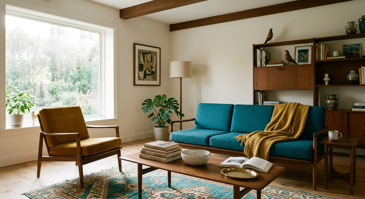

The first time I cut in around a teak credenza, I learned what makes a mid-century modern color palette actually click. The wall behind it was a flat builder white, and the credenza looked stranded, like a museum piece nobody wanted. We rolled a warm putty over that wall, dropped one mustard accent on the niche beside it, and the whole corner finally read like 1962 on purpose. That is the lesson: MCM is not a single paint chip. It is a small, disciplined family of warm neutrals, earthy saturated colors, and wood tones that agree with each other. Get the ratio right and the room feels collected. Get it wrong and it reads like a thrift store.
This guide lays out 12 working schemes you can take to a paint counter, with the why behind each one. If you want the broader logic of how any two paint colors relate, start with our interior color schemes guide, then come back here for the style-specific palette. The short version of MCM: roughly 70 percent warm neutral on the big walls, 20 percent in wood and one earthy mid-tone, and 10 percent in a single punchy accent. Skip the ratio and you get chaos.
Upload a photo of your actual room and preview a full MCM scheme under your own light in about 30 seconds, free.
What makes a color palette mid century modern
Mid-century color was a reaction against fussy postwar pastels. Designers wanted optimism, warmth, and a nod to nature, so the palette leaned earthy and a little bold. Five traits separate a real MCM scheme from a generic neutral room:
- Warm, never cool. The base neutrals lean putty, oatmeal, and warm white. A blue-gray builder beige is the wrong starting point and will fight the wood.
- Earthy saturation. The colors that pop are grounded: terracotta, mustard, olive, teal, walnut. Not primary, not candy. Think of a color dialed back by about 20 percent so it has a little gray or brown mixed in.
- Wood is a color. Teak, walnut, and oak count as part of the scheme. You paint around them, not over them.
- Contrast, but limited. One bold accent per zone. MCM uses restraint; it is not a rainbow.
- Matte and eggshell finishes. Period rooms read flat and chalky. A high-gloss wall breaks the spell fast.
If your house already has warm wood floors or trim, you are halfway there. For the warm-neutral foundation specifically, our roundup of earthy warm interior paint colors is the closest starting bank of swatches.
The 12 mid-century modern palettes
Here is the working table. Each row is a tested scheme: a base wall, an earthy mid-tone, and one accent. LRV (light reflectance value) is listed so you can judge how bright the room will stay. Codes are Sherwin-Williams and Benjamin Moore as a starting reference; match to your brand at the counter.
| Scheme | Base wall (LRV) | Earthy mid-tone | Accent | Best room |
|---|---|---|---|---|
| 1. Palm Springs | Warm white (LRV 80) | Teak wood tone | Marigold mustard | Living room |
| 2. Eames Office | Putty greige (LRV 58) | Walnut bronze | Tomato red door | Study / office |
| 3. Desert Ranch | Oatmeal (LRV 65) | Terracotta | Charcoal black | Open plan |
| 4. Atomic Avocado | Soft cream (LRV 75) | Muted olive green | Burnt orange | Kitchen / dining |
| 5. Scandi MCM | Bright warm white (LRV 84) | Light oak | Pale sage | Bedroom |
| 6. Peacock Lounge | Greige (LRV 55) | Walnut | Deep teal wall | Den / TV room |
| 7. Saarinen White | Soft white (LRV 82) | Camel tan | Black accent trim | Entry / hall |
| 8. Mustard Field | Warm taupe (LRV 50) | Mustard wall | Cream trim | Dining room |
| 9. Clay & Olive | Bone white (LRV 78) | Olive green | Rust clay | Living / reading nook |
| 10. Walnut Moody | Warm greige (LRV 48) | Bronze brown wall | Gold hardware | Powder room |
| 11. Citrus Pop | Creamy white (LRV 80) | Walnut wood | Citron / chartreuse | Kitchen |
| 12. Slate & Tangerine | Warm white (LRV 80) | Slate blue-gray | Tangerine orange | Family room |
Sources: Sherwin-Williams and Benjamin Moore color data 2026; Architectural Digest and Apartment Therapy mid-century color coverage; designer field reports compiled by FacadeColorizer.
Free AI visualizer. Try an MCM palette on your real walls before buying a single sample pot.
The warm neutral base: do not skip this
Every scheme above lives or dies on the base wall. This is the 70 percent, and it has to be warm. A putty, oatmeal, or warm white reflects light back with a golden cast that flatters wood and makes the accents glow. The classic mistake is reaching for a cool gray because it feels modern. It does not work here. Cool gray drains the warmth out of teak and makes a mustard accent look dirty rather than rich.
Practical picks for the base: a warm white around LRV 80 for bright rooms, a putty greige around LRV 55 to 60 for spaces that can take a little moodiness. If you want the room to feel like a 1960s ranch, go slightly deeper on the walls than instinct tells you, because period rooms were not stark white. They were warm and a touch enveloping.
The earthy mid-tones: terracotta, olive, teal, walnut
This is the heart of the mcm interior palette, the 20 percent that makes the room read mid-century rather than generic. Four families do the heavy lifting:
- Terracotta and burnt orange: the signature MCM warm. A clay-orange on a feature wall or a credenza area instantly dates the room (in a good way). It pairs with cream, walnut, and a touch of teal. For the full range of warm earth tones, our roundup of earthy warm interior paint colors covers the burnt and clay end you want here.
- Muted olive and avocado: the 70s color, dialed back. Modern MCM uses a grayed olive, not the loud avocado of an old fridge. It reads sophisticated next to oak and cream.
- Deep teal and peacock: the boldest base move. A whole teal wall behind a low walnut sideboard is peak lounge energy. Use it in a den, not a small bedroom.
- Walnut and bronze browns: these stand in for wood when you want a painted version. A bronze-brown wall in a powder room reads like a paneled study without the millwork.
Brown is the connective tissue of the whole style, so if you are building a scheme from scratch, our interior color schemes guide maps out which accents sit cleanly against walnut and teak tones. That pairing logic is the backbone of MCM.
See walls, wood, and accent together in one preview, free.
The accent: 10 percent, one color, used with nerve
The accent is where people either nail MCM or wreck it. The rule is brutal and simple: one saturated accent per zone, and commit to it. A timid mustard the size of a placemat looks like a mistake. The same mustard on a full niche, a door, or a credenza wall looks deliberate. Marigold, tomato red, tangerine, and citron are the period-correct options.
Where it goes wrong: spreading three accents around one room, or choosing an accent that is too pure. A fire-engine red reads like a kid's room. Pull it toward tomato or rust and it reads vintage. When you are cutting in the accent, take your time on the second coat: saturated colors show roller lap marks far more than a pale neutral, so keep a wet edge and do not stretch the paint.
For a deeper look at how to plan a single feature wall (placement, tape lines, the prep that keeps the edge crisp), our accent wall color strategy applies cleanly to MCM. And if you want a wood-tone feature instead of paint, the look in our wood accent wall ideas shows how walnut paneling reads against warm neutrals.
Room-by-room: where each MCM scheme lands best
Living room and great room
This is MCM's home turf. A warm white base, walnut furniture, and one mustard or terracotta accent (scheme 1 or 3) gives you the airy Palm Springs look. Keep the big walls calm and let the credenza and a single accent carry the period feel.
Kitchen and dining
Olive green or mustard works beautifully here (schemes 4 and 8), especially on a banquette wall or against wood cabinets. A muted olive on lower cabinets with cream walls is a very current MCM revival move that does not look costume-y.
Bedroom
Go quieter. The Scandi MCM scheme (5), warm white with light oak and a pale sage accent, keeps a bedroom restful while still reading mid-century. Save the teal and tomato for living spaces; they are too active over a bed.
Where to think twice
Small, north-facing rooms with cool light are tough for a full saturated MCM scheme. The earthy colors can go muddy and the warm base can read drab. There, lean on a warm-white base with just wood tones and a small accent, and warm the bulbs to 2700K. A deep teal or olive in a windowless box will feel like a cave, not a lounge.
Preview a warm-white base with an earthy accent, side by side, free.
How to test a mid-century modern palette before you commit
A fan-deck chip lies about saturated color worse than about any neutral. Mustard and terracotta look one way at 3 inches and completely different across a full wall in your own light. Two reliable methods:
- Paint a large swatch: roll a 12-by-12-inch sample of the base and the accent on the same wall, and check them mid-morning, mid-afternoon, and at night under your normal bulbs. Watch whether the olive goes too gray or the orange too brown in your light.
- Preview it digitally first: upload a real photo of your room and apply a full base-plus-accent scheme before buying any samples, narrowing 12 schemes to the one worth painting. Budget context for the full repaint is in our interior house painting cost guide.
Frequently asked questions
What colors make up a mid-century modern color palette?
A mid-century modern palette is built on warm neutrals (putty, oatmeal, warm white) for the big walls, earthy saturated mid-tones (terracotta, mustard, muted olive, deep teal, walnut bronze) for character, and one bold accent per zone such as marigold or tomato red. Wood tones like teak and walnut count as part of the scheme, so you paint around them rather than over them.
What is the 70-20-10 rule for an MCM room?
Use about 70 percent warm neutral on the main walls, 20 percent in wood tones and one earthy mid-tone (olive, terracotta, or teal), and 10 percent in a single saturated accent. Keeping that ratio is what makes a mid-century room read collected instead of chaotic. Spreading several accents around one space is the most common way the look falls apart.
Does gray work in a mid-century modern palette?
Cool gray generally fights the style because it drains warmth from wood and makes earthy accents look dirty. If you want a gray, choose a warm greige around LRV 55 to 60 as the base, or use a grayed slate blue as a deliberate accent (scheme 12). A blue-cool builder gray on the main walls is the wrong starting point for MCM.
What are the best accent colors for mid-century modern?
Marigold mustard, terracotta, burnt orange, tomato red, deep teal, and citron chartreuse are the period-correct accents. The key is to pull them slightly off pure: a tomato red reads vintage while a fire-engine red reads like a kid's room. Commit to one accent per zone and use it on a full surface like a niche, door, or feature wall.
What paint finish suits a mid-century modern room?
Matte and eggshell finishes suit MCM best because period rooms read flat and a little chalky. A high-gloss wall breaks the vintage feel quickly. Use eggshell on main walls for durability, flat or matte on ceilings, and reserve satin for trim or a single lacquered accent if you want a touch of sheen.
Preview a warm base, wood tone, and earthy accent on your actual walls under your own light before buying a single sample.
Disclaimer: Sherwin-Williams, Urbane Bronze (SW 7048), and the SW color references above are trademarks of The Sherwin-Williams Company. Benjamin Moore color references are trademarks of Benjamin Moore & Co. Color names such as terracotta, mustard, marigold, olive, and teal describe color families, not specific products. FacadeColorizer is an independent paint visualization service and is not affiliated with, endorsed by, or sponsored by Sherwin-Williams or Benjamin Moore. Color reproduction on screens approximates the manufacturer's chip; always confirm with a manufacturer sample under your own light before purchase. Sources: Sherwin-Williams and Benjamin Moore color data 2026, Architectural Digest and Apartment Therapy mid-century color coverage, designer field reports compiled by FacadeColorizer.
Trademarks mentioned (Sherwin-Williams, Benjamin Moore, Behr, Caparol, Brillux, Sto, Alpina, Valspar, PPG, Glidden, Dulux, Crown Trade, Sandtex, Farrow & Ball, Johnstone's, Leyland) are property of their respective owners. FacadeColorizer is independent and not affiliated with any of them. Nominative fair use under Lanham Act §1125.


