You finished the wood accent wall. The slats are up, the stain is dry, and now the three walls around it look wrong in every paint color you hold against them. This is the most common stall point in a wood feature-wall project, and it is rarely the wood that is off. Wood is not a neutral: white oak leans gold, walnut leans cool brown-violet, and knotty pine and cedar lean orange-red, so each undertone pushes a paint color a different way once the two surfaces share a room.
Below are the 12 paint colors US designers reach for most often beside a wood accent wall in 2026, grouped by the wood tone they flatter, each with its Sherwin-Williams or Benjamin Moore code, published LRV, and a trim pairing. For the wall-selection and 60-30-10 ratio logic that sits above this color question, start with our accent wall color strategy guide.
Upload a room photo and preview any of the 12 picks against your actual wood tone in about 30 seconds, free.
Read the wood undertone before you pick a paint
Hold a sheet of plain printer paper flat against the finished wood in daylight. The paper is a true cool white, so however the wood looks beside it is its undertone. Three families cover almost every accent wall sold in the US:
- Gold and honey woods: white oak, natural maple, hickory, light teak. They read yellow-gold against the paper. The risk is a wall paint that turns the wood mustard, so cool, muddy greiges fight these woods.
- Cool and brown-violet woods: walnut, dark-stained oak, wenge, espresso slats. They read deep brown with a purple or gray edge, take saturated color confidently, and look muddy beside warm cream.
- Red and orange woods: knotty pine, cedar, cherry, Douglas fir, many reclaimed boards. They read orange-red. The classic mistake is a pink or peach wall; green and blue-green walls are the antidote.
Once you know your family, the paint choice narrows fast. The rule designers use: echo the wood's temperature to harmonize, or pick its near-opposite on the color wheel to make the wood pop. Avoid the in-between zone, a color that is neither clearly warm nor clearly cool, because that is what reads as a mistake. If undertones are new territory, our interior paint color families guide explains how warm, cool and neutral families behave in a room.
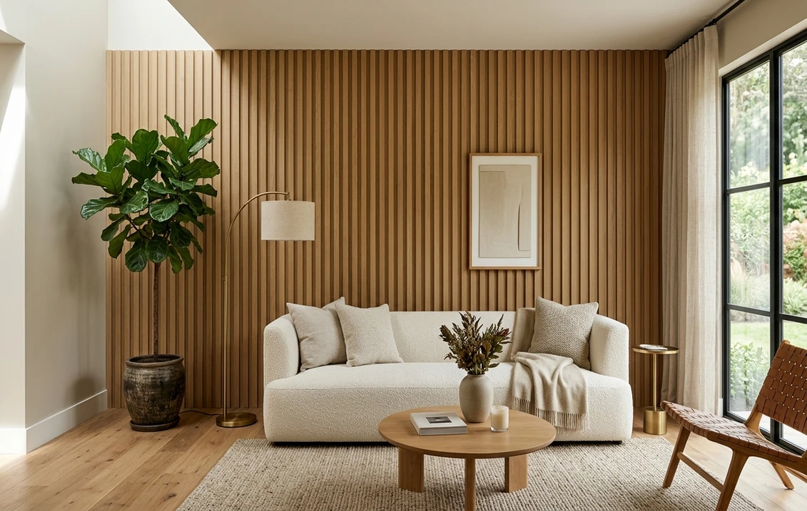
Best paint colors for gold and honey wood (white oak, maple)
White oak slat walls are the dominant 2026 look. The safest companions are warm whites and soft greiges that share the oak's yellow base without competing with it.
1. Sherwin-Williams Accessible Beige (SW 7036)
LRV 58. A warm greige built on a soft tan base, with just enough gray to stop it tipping yellow. Beside honey oak it sits back and reads as a calm, grounded neutral. The wood stays the star, and the color barely budges between north and south light.
2. Benjamin Moore White Dove (OC-17)
LRV 85. The country's best-selling soft white. Its yellow-cream base ties directly to oak's warmth, so the transition from wall to wood feels seamless. Choose it when you want the room bright and the wood to feel built-in rather than contrasted.
3. Sherwin-Williams Natural Tan (SW 7567)
LRV 65. A sandy warm tan for rooms where white feels too stark against substantial oak. It picks up the wood's gold and reads as a soft camel, ideal in a den or bedroom where you want low contrast and a softer, enveloping feel.
4. Benjamin Moore Pale Oak (OC-20)
LRV 69. Light warm greige between white and beige, and the safest "I am not sure" pick beside light oak: it never goes pink or green, it simply quiets down and lets the wood lead. A frequent designer default for open-plan rooms.
Best paint colors for cool and dark wood (walnut, espresso)
Dark walnut and espresso slats already carry drama, so the wall paint can go two ways: a crisp white to throw the wood into sharp relief, or a deep saturated color to lean into a moody, library feel.
5. Sherwin-Williams Pure White (SW 7005)
LRV 84. A clean, barely-warm white that gives walnut maximum contrast without going icy blue. The gallery-wall move: dark wood, white surround, nothing fighting.
6. Benjamin Moore Hale Navy (HC-154)
LRV 6. Deep, slightly gray navy that reads practically as a neutral beside warm walnut, a classic menswear pairing that looks rich rather than dark on walls. Best in a study, dining room, or any space lit warmly in the evening.
7. Sherwin-Williams Iron Ore (SW 7069)
LRV 6. A soft near-black charcoal. Wrapping the surrounding walls in Iron Ore turns a walnut accent into a sculptural object: high drama, surprisingly cozy in a media room, best with warm brass or aged-bronze hardware.
8. Benjamin Moore Revere Pewter (HC-172)
LRV 55. A warm gray-greige that bridges cool wood and a warm room. If your walnut leans slightly purple, its green-gray base balances that and stops the wall reading cold. The most forgiving mid-tone for dark wood in mixed light.
Best paint colors for red and orange wood (pine, cedar, cherry)
Orange-toned wood is where most pairings go wrong: the instinct is a warm wall, and that only intensifies the orange. The fix is to move toward green, sage, and muted blue-green, which sit opposite orange on the wheel and calm it down.
9. Sherwin-Williams Evergreen Fog (SW 9130)
LRV 30. A gray-green sage, named SW Color of the Year for 2022 and still a top seller. Against knotty pine or cedar it neutralizes the orange and turns the wall earthy and intentional: the single most reliable companion for a warm-red wood wall.
10. Benjamin Moore Saybrook Sage (HC-114)
LRV 45. Soft muted green with a gray undertone, slightly lighter than Evergreen Fog. It suits a cabin or sunroom where the pine should feel rustic but not loud, reading almost gray in low light and clearly sage in daylight.
11. Sherwin-Williams Sea Salt (SW 6204)
LRV 63. A pale green-blue that reads as the lightest spa color. Beside cedar it cools the orange without going dark: the go-to when the wood is red-toned but the room needs to stay light and airy.
12. Benjamin Moore Cloud White (OC-130)
LRV 85. When green is not the brief, skip cream (it amplifies orange) and choose a clean neutral-to-cool white. Cloud White is warm enough to feel soft yet neutral enough not to pull the orange forward: the safe white for cherry and pine.
Free AI interior visualizer. See how Evergreen Fog, Sea Salt, or White Dove read against your real wood before you buy a sample.
The 12 picks at a glance
| Paint color | Code | LRV | Best wood match |
|---|---|---|---|
| Accessible Beige | SW 7036 | 58 | White oak, honey woods |
| White Dove | BM OC-17 | 85 | Oak, maple, light teak |
| Natural Tan | SW 7567 | 65 | Substantial honey oak |
| Pale Oak | BM OC-20 | 69 | Light oak (safe default) |
| Pure White | SW 7005 | 84 | Walnut, espresso (contrast) |
| Hale Navy | BM HC-154 | 6 | Walnut (rich, moody) |
| Iron Ore | SW 7069 | 6 | Walnut (drench, drama) |
| Revere Pewter | BM HC-172 | 55 | Cool/violet-leaning wood |
| Evergreen Fog | SW 9130 | 30 | Pine, cedar (orange fix) |
| Saybrook Sage | BM HC-114 | 45 | Cabin pine, rustic cedar |
| Sea Salt | SW 6204 | 63 | Cedar, red wood (light room) |
| Cloud White | BM OC-130 | 85 | Cherry, pine (white option) |
Try it on your house
No photo? Try a sample
LRV (Light Reflectance Value) and color codes from Sherwin-Williams and Benjamin Moore technical data sheets, 2026. LRV runs 0 (black) to 100 (pure white); higher reflects more light.
How room light changes the pairing
Wood and paint shift under changing light, and at different rates. Three patterns tell you which way to lean before you commit:
- South and west rooms flood warm afternoon light that deepens the wood's gold or orange, so sage reads richer and a warm white can tip yellow. Lean a touch cooler here.
- North-facing rooms get cool, blue-tinged daylight that drains warmth from both surfaces, so warm greiges and creamy whites hold up better than crisp cool whites, which can read gray.
- Evening light matters most, since that is when accent walls are on show. Warm LED near 2,700 K pushes everything amber, flattering walnut and navy. Judge a sample under your actual night bulbs, not just at noon.
Sheen matters too: a flat or matte wall mutes undertone shifts and keeps the focus on the wood texture, so save satin and semi-gloss for trim. For how finish and color choice work together across a full repaint, see our 2026 best interior paint colors guide.
Trim, ceiling, and decor that tie the wall together
The paint color is only part of the result. Three more choices tip the wood wall toward looking designed, not accidental:
- Trim: keep trim in the same warm-white family as your wall whites (White Dove or Pure White trim beside an Accessible Beige wall reads clean). A cool bright white trim next to honey oak makes the oak look dirty.
- Ceiling: a soft white ceiling lifts the room above a dark drenched wall. With Iron Ore or Hale Navy walls, it stops the space from feeling like a box.
- Metals and decor: match metal finishes to the wood temperature. Warm woods love brass and aged bronze; cool walnut also takes matte black and brushed nickel. Repeating the wood tone in one small object across the room balances the visual weight.
Still weighing whether to drench, half-paint, or accent a single wall? The planning frameworks in our accent wall strategy guide and the prep-and-tape method in our how to paint an accent wall walkthrough will save you a redo.
Sherwin-Williams or Benjamin Moore for the surround?
Honestly, you can't go wrong here. Every group above has a strong match in both lines, so it comes down to which store is nearer and the exact undertone you want. The close pairs are SW Accessible Beige and BM Pale Oak beside oak, SW Evergreen Fog and BM Saybrook Sage beside pine, and SW Iron Ore and BM Hale Navy against walnut. For a full side-by-side on coverage and durability, see our Sherwin-Williams vs Benjamin Moore interior comparison, and our interior painting cost guide sets realistic 2026 budget expectations for the project.
How to test before you commit
Never judge a wall paint against wood from a fan-deck chip alone. A small chip reads up to a third lighter than the rolled wall and tells you little about how the two undertones interact. The reliable method:
- Paint a 12-inch peel-and-stick sample (or two coats on poster board) and tape it touching the wood.
- View it mid-morning, mid-afternoon, and at night under your normal bulbs. The night view decides it for most accent walls.
- Step back to the doorway, where undertone clashes show up.
The fastest no-paint option is to photograph the room with the wood wall in frame and preview each candidate digitally before buying a sample pot.
Upload your room and compare all 12 wood-wall paint colors side by side, free.
Frequently asked questions
What paint color goes with a wood accent wall?
It depends on the wood's undertone. Honey and white-oak walls pair best with warm whites and soft greiges (BM White Dove, SW Accessible Beige, BM Pale Oak). Dark walnut takes crisp white (SW Pure White) or deep saturated color (BM Hale Navy, SW Iron Ore). Red and orange woods like pine or cedar are calmed by muted greens (SW Evergreen Fog, BM Saybrook Sage). Echo the wood's temperature to harmonize, or pick its near-opposite to make it pop.
What color should I avoid next to orange-toned wood?
Avoid warm creams, peaches, and pinks beside knotty pine, cedar, or cherry, because they amplify the wood's orange and read loud and dated. Move toward the opposite side of the color wheel: gray-greens like SW Evergreen Fog and BM Saybrook Sage, a soft green-blue such as SW Sea Salt, or a clean neutral white like BM Cloud White neutralize the orange and let the wood look intentional.
Should the walls around a wood accent wall be light or dark?
Both work. Light walls (whites and greiges, LRV 55 and up) make the wood the focal point and keep the room bright, which suits most living rooms and bedrooms. Dark drenched walls (SW Iron Ore or BM Hale Navy, LRV 6) turn a dark wood wall into a moody, sculptural feature, best in studies, dining rooms, and media rooms lit warmly at night. Match the choice to the room's daylight and mood.
What is a foolproof paint color for a light wood wall?
Benjamin Moore Pale Oak (OC-20, LRV 69) is the most forgiving choice beside light oak or maple: a warm greige that never flips pink or green, it quiets down and lets the wood lead, and it holds in both north and south light. SW Accessible Beige (SW 7036, LRV 58) is the deeper, sandier alternative when a near-white feels too pale against substantial wood.
Preview all 12 picks on your actual room photo before buying a single sample pot.
Disclaimer: Sherwin-Williams color names and codes are trademarks of The Sherwin-Williams Company. Benjamin Moore color names and codes are trademarks of Benjamin Moore & Co. FacadeColorizer is an independent paint visualization service and is not affiliated with, endorsed by, or sponsored by Sherwin-Williams, Benjamin Moore, or Behr. Wood-tone undertone behavior varies by species, stain, and finish; on-screen color reproduction approximates the manufacturer's chip, so always confirm with a physical sample beside your actual wood before purchase. Sources: Sherwin-Williams technical data sheets 2026, Benjamin Moore technical data sheets 2026, and published designer color references including The Spruce and Benjamin Moore Color of the Year archives.
Trademarks mentioned (Sherwin-Williams, Benjamin Moore, Behr, Caparol, Brillux, Sto, Alpina, Valspar, PPG, Glidden, Dulux, Crown Trade, Sandtex, Farrow & Ball, Johnstone's, Leyland) are property of their respective owners. FacadeColorizer is independent and not affiliated with any of them. Nominative fair use under Lanham Act §1125.