
I have stood in a lot of living rooms holding a fan deck while a homeowner points at the wall behind the sofa and says, "something here, but I don't want to mess it up." That hesitation is the whole problem. A focal wall is the cheapest design move you can make: one gallon, maybe ninety dollars. Done right it gives the room a center of gravity. Done on the wrong wall, or in the wrong color, it just looks like you ran out of paint. This is a gallery of 25 living room accent wall ideas I have painted or watched land, grouped so you can skim to the look you already half-want.
Quick ground rule before the ideas, because it saves the most regret: in a living room the accent almost always belongs on the sofa wall or the fireplace wall, the surface your eye hits first when you walk in. Skip the wall with the biggest window (backlight kills any deep color and reads as a dark hole). If you want the full decision tree, our accent wall color strategy guide walks the five-step wall-pick rule and the 60-30-10 ratio.
Upload a photo of your real room and preview any accent color under your own light in about 30 seconds, free.
Deep and moody: the accent colors that anchor a room
Dark colors are what most people picture when they think focal wall, and for good reason. A low-LRV color recedes, making the room feel deeper and framing whatever sits in front of it. These are the five I reach for most:
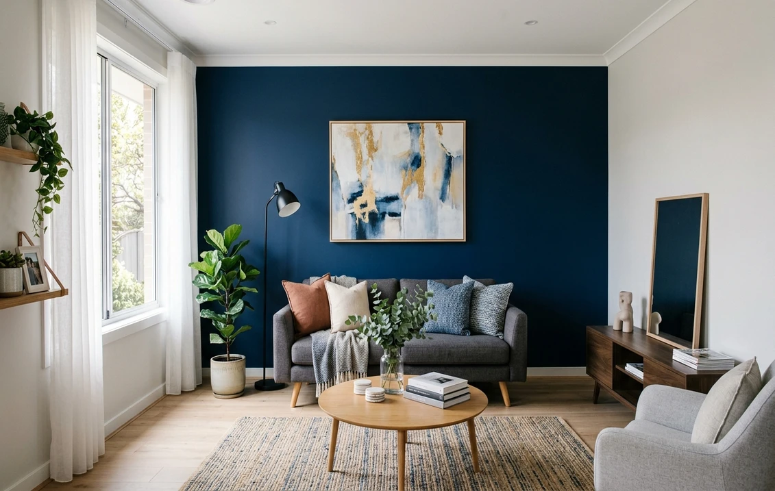
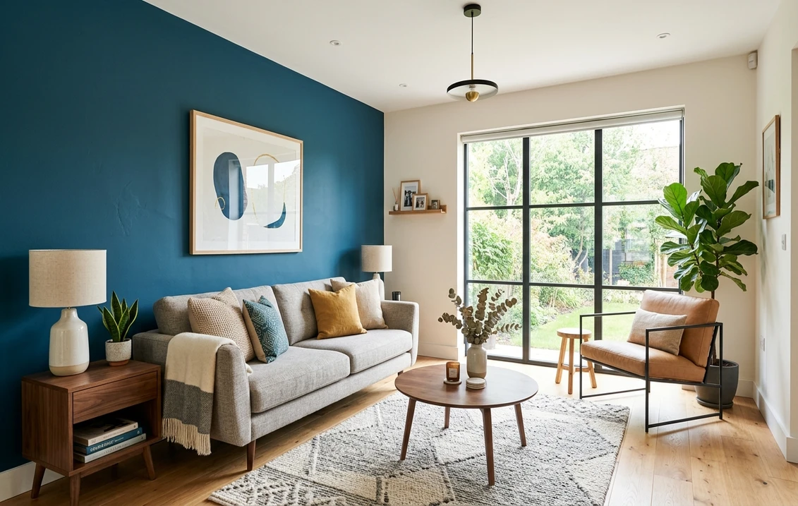
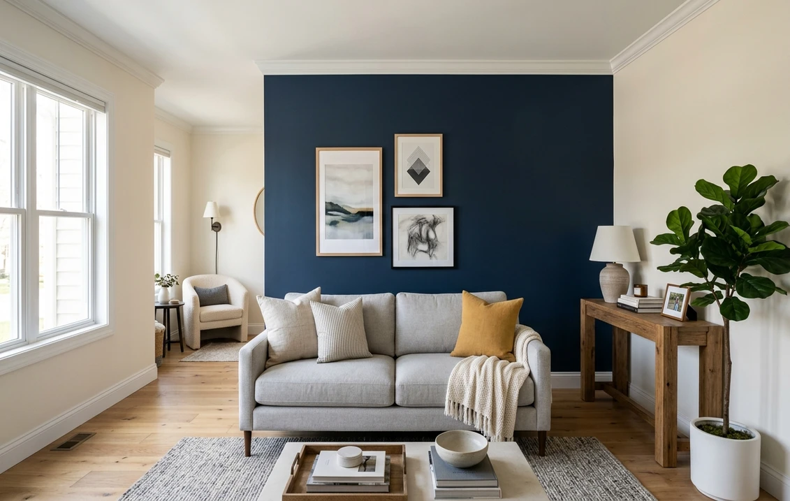
- 1. Navy behind the sofa. Benjamin Moore Hale Navy (HC-154, LRV 6.3) is the workhorse. It reads almost black at night and clearly blue by day, and it flatters brass lamps, leather, and white oak. The safest "dramatic" pick in the book.
- 2. True black, gallery style. SW Tricorn Black (SW 6258) on the fireplace wall turns the mantel into a focal object. Hang art in thin black or brass frames and it reads intentional, not heavy.
- 3. Warm near-black brown. SW Urbane Bronze (SW 7048) is a bronze-brown that feels cozier than a straight black. My pick for a media wall, because screens disappear into it.
- 4. Charcoal with a blue lean. A soft charcoal behind a low credenza grounds an open-plan living room without the commitment of black. It pairs cleanly with greige field walls.
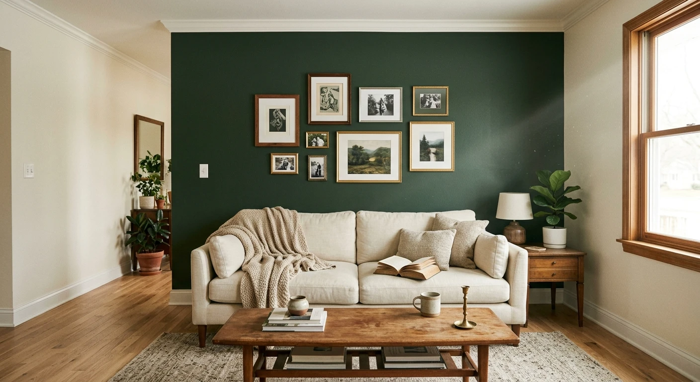
- 5. Deep forest green. A saturated green (think hunter, not sage) behind built-in shelving reads like a library, and loves warm wood and antique brass.
One honest warning on dark accents: they punish a bad cut-in. Where a deep color meets white trim, every wobble in your tape line shows. Use a quality painter's tape, press the edge down with a putty knife, and pull it while the second coat is still slightly wet. The technique matters more than the color here, and our step-by-step accent wall painting guide covers prep, tape, and finish in order.
Soft and tonal: accent walls that whisper
Not every focal wall needs to shout. Some of the most expensive-looking living rooms use a quiet, low-contrast accent you almost have to be told is there. These suit a smaller space, a rental, or anyone nervous about color:
- 6. Tonal greige. Take your field color (say SW Agreeable Gray) and put a shade two steps deeper on one wall. The shift is subtle and modern, and it never fights the furniture.
- 7. Muted gray-green. SW Evergreen Fog (SW 9130) behind the sofa is calm and current. It reads as a sophisticated neutral more than a color.
- 8. Soft blue-gray. A dusty blue-gray on the fireplace wall feels coastal without the theme. Good in a north-facing room where warmer colors fall flat.
- 9. Warm clay or terracotta. A muted earthy clay brings warmth without going bold. It flatters skin tones and warm lighting, a quiet win in a TV room.
- 10. Off-white on white. A creamier white on one wall against a cooler white field reads as architecture, not color.
For a wider color map, our roundup of the year's best living room paint colors for 2026 shows how these tones sit next to whole-room schemes, and our accent wall paint colors room by room guide stacks specific picks for living rooms against bedrooms and dining rooms.
Free AI visualizer. Test the accent on your real walls before buying a single sample pot.
Texture, wood, and material accents
Paint is the start, not the ceiling. Some of the strongest living room accent walls add a material or pattern so the wall has depth as well as color:
- 11. Vertical wood slats. A slat wall in stained oak or walnut behind the sofa adds warmth and shadow lines, and hides a TV well.
- 12. Painted board and batten. Simple vertical battens give a clean, slightly traditional grid. Paint the whole thing one deep color for the best effect.
- 13. Limewash for movement. A limewash or color-wash finish in a soft clay or charcoal gives a cloudy, old-plaster look that flat paint cannot.
- 14. Picture-frame molding. Applied molding boxes painted the same color as the wall add architecture to a builder-grade box, best on the fireplace wall.
- 15. Half-wall color block. Paint the lower two-thirds a deep color and the top a soft white, with a clean horizontal line. Great in a room with low ceilings.
- 16. Geometric or arch shape. A painted arch behind a console or plant reads playful and current. Tape it carefully and keep it asymmetric on purpose.
Wood is having a real moment, and it pairs with paint better than people expect. If a slat or plank wall is calling you, our wood accent wall paint color ideas guide covers which wall colors flatter oak, walnut, and stained pine.
Bold color and color-drench ideas
For anyone who wants the room to make a statement, these get the most "where is that from" reactions:
- 17. Color-drenched alcove. Paint a recessed nook (walls, ceiling, trim) one saturated color. The monochrome envelope feels custom.
- 18. Oxblood or deep burgundy. A wine-deep red behind the sofa is dramatic and warm. It loves candlelight and dark wood, less so cool LEDs.
- 19. Mustard or ochre. A warm yellow-gold accent wall is the energy pick. Keep the rest of the room neutral or it tips loud.
- 20. Teal or peacock. A blue-green deep enough to read jewel-tone behind shelving is rich and glamorous. Brass hardware makes it.
- 21. Full color drench. Paint walls, trim, and ceiling the same mid-tone color. In a small living room this reads more sophisticated than one bold wall.
Renter and low-commitment accent walls
You do not need a paintbrush or a deposit on the line. Four ideas that pull the same focal-wall trick without permanent paint:
- 22. Peel-and-stick wallpaper. A textured grasscloth or quiet geometric on one wall reads like a designed room and comes off cleanly.
- 23. Large-scale art wall. One oversized piece, or a tight grid of frames, makes a focal point with no paint.
- 24. Fabric or tapestry panel. A stretched fabric panel behind the sofa adds color and softens sound.
- 25. Removable wood-look panels. Peel-and-stick slat panels give the wood-wall look for renters, a lighter hit than real millwork.
Quick reference: which accent wall idea fits your room?
If you are torn between looks, match the idea to the problem you are trying to solve. This is roughly how I steer the decision at a consult:
| If your living room is... | Best accent direction | Why |
|---|---|---|
| Small or low-ceilinged | Tonal greige or full color drench | Low contrast keeps the room feeling larger, not chopped up |
| Bright and south-facing | Deep navy, charcoal, or forest green | Plenty of light to carry a low-LRV color without going cave-like |
| North-facing and cool | Warm clay, terracotta, or muted gray-green | Warm pigment fights the flat, cool light from north windows |
| Has a fireplace | Black, urbane bronze, or picture-frame molding | The architecture already pulls the eye; color amplifies it |
| A rental | Peel-and-stick wallpaper or an oversized art wall | Focal-wall effect with no paint and no deposit risk |
| Builder-grade and flat | Slat wood, board and batten, or limewash | Texture adds the depth that paint color alone cannot |
Sources: Sherwin-Williams and Benjamin Moore 2026 color data and trend coverage; designer field reports compiled by FacadeColorizer.
Try several accent colors on the same wall, side by side, before you buy anything.
How to choose between three accent walls (without three wasted gallons)
Most people who repaint an accent wall did not pick a bad color. They picked the right color for a 3-inch chip and the wrong color for a whole wall under their own light. A deep color especially looks completely different at scale. Two ways to get it right the first time:
- Sample big, sample on the actual wall. Roll a two-by-two-foot patch directly on the wall you plan to paint, not the one with the best light. Check it mid-morning, late afternoon, and at night under your normal bulbs. Deep colors shift the most.
- Preview it digitally first. Upload a real photo of your living room and drop three contenders onto the actual sofa or fireplace wall before you buy a single pot, with no dried sample squares to scrape off later. For the budget side, our interior house painting cost guide for 2026 lays out what one accent wall versus a whole room actually costs.
Preview three accent colors on your living room wall, side by side, free.
Frequently asked questions
Which wall should be the accent wall in a living room?
In most living rooms the accent belongs on the sofa wall or the fireplace wall, whichever your eye hits first when you walk in. Avoid the wall with the largest window, because backlight flattens any deep color and reads as a dark hole. If a wall has an architectural feature like a fireplace or built-ins, that surface is usually the strongest choice.
What is the most popular accent wall color for a living room?
Deep navy (such as Benjamin Moore Hale Navy HC-154) is the most reliably popular living room accent, because it reads dramatic at night, clearly blue by day, and flatters wood, brass, and leather. Charcoal, true black, muted gray-green, and warm clay round out the list. For a softer look, a tonal greige two shades deeper than your field color works without any bold commitment.
Are accent walls still in style in 2026?
Yes, but the style has shifted. The single bright-pop wall has given way to deeper, moodier colors, textured and wood-slat walls, and full color drenching where walls, trim, and ceiling share one color. The idea of a focal wall is very much current; the execution has just grown up from a lone red wall to a more considered, tonal look.
Should an accent wall be darker or lighter than the other walls?
Usually darker. A deeper color recedes, which makes the room feel larger and frames the furniture in front of it. Lighter accents can work in a dark or tonal scheme, but the most common and forgiving move is one wall a few steps deeper than the field. Keep contrast intentional: a half-step shift reads as a mistake, while a clear jump reads as a choice.
How do I test an accent wall color before painting?
Roll a large sample (about two by two feet) directly on the wall you plan to paint and check it morning, afternoon, and night under your own bulbs, since deep colors shift the most across a day. Faster still, upload a photo of your living room to a visualizer and preview several accent colors on the real wall first, so you only buy paint for the one that actually works.
Preview any of these 25 looks on your actual wall under your own light before buying a single sample.
Disclaimer: Sherwin-Williams, Evergreen Fog (SW 9130), Urbane Bronze (SW 7048), Tricorn Black (SW 6258), and Agreeable Gray (SW 7029) are trademarks of The Sherwin-Williams Company. Benjamin Moore and Hale Navy (HC-154) are trademarks of Benjamin Moore & Co. FacadeColorizer is an independent paint visualization service and is not affiliated with, endorsed by, or sponsored by Sherwin-Williams or Benjamin Moore. Color reproduction on screens approximates the manufacturer's chip; always confirm with a manufacturer sample under your own light before purchase. Sources: Sherwin-Williams and Benjamin Moore 2026 color data and trend coverage, designer field reports compiled by FacadeColorizer.
Trademarks mentioned (Sherwin-Williams, Benjamin Moore, Behr, Caparol, Brillux, Sto, Alpina, Valspar, PPG, Glidden, Dulux, Crown Trade, Sandtex, Farrow & Ball, Johnstone's, Leyland) are property of their respective owners. FacadeColorizer is independent and not affiliated with any of them. Nominative fair use under Lanham Act §1125.