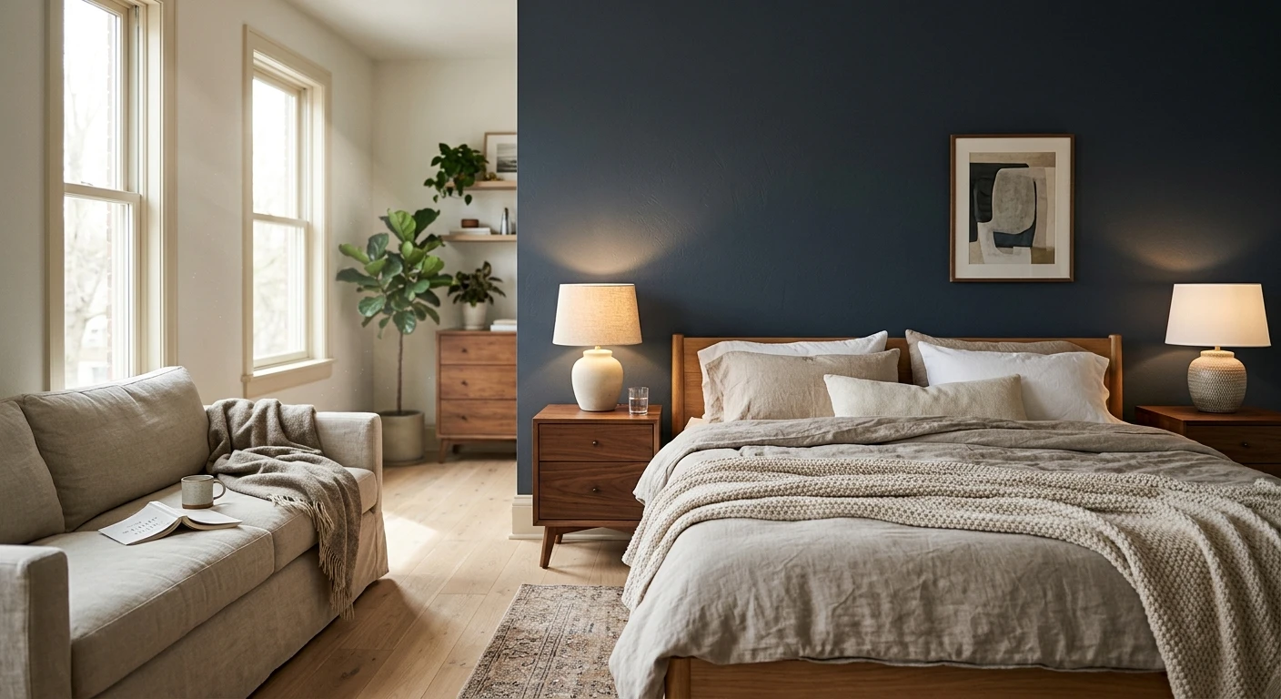

The wall behind the bed is the one you see last at night and first in the morning, and most bedrooms waste it. Paint just the headboard wall a deeper, richer color and the bed suddenly looks intentional, the room feels deeper, and you spent one quart instead of four. That is the whole pitch for a focal wall in here. Below are 22 bedroom accent wall ideas that hold up past the trend cycle, grouped by mood, with the exact colors, the wall to choose, and the one mistake that quietly ruins most of them.
One rule before the gallery. In a bedroom the accent wall is almost always the headboard wall, the one your bed sits against, because it frames the bed like a backdrop frames a stage. Painting a side wall or the door wall instead is the single most common error I see, and it makes the room feel lopsided. This is the bedroom-specific companion to our wider accent wall color strategy and the accent wall paint colors room by room breakdown: those cover theory and every other room, this one stays on the bed wall.
Upload a photo of your actual bedroom and preview any headboard-wall color under your own light in about 30 seconds, free.
First, pick the right wall (this matters more than the color)
A great color on the wrong wall still looks like a mistake. Run through this before you tape anything:
- Default to the headboard wall. It anchors the largest object in the room, and a darker color behind your head never makes the space feel smaller the way a dark wall opposite the bed can.
- Pick a wall with few interruptions. The cleaner the plane, the stronger the effect. A wall chopped up by two windows and a closet door fights the color instead of showcasing it.
- Watch the window wall. Painting the wall your windows sit on backlights the color, so you see glare and silhouette, not the paint. Skip it.
- One accent wall, not two. Two accent walls read as a half-finished color-drench, not a deliberate accent. If you love the color that much, drench the whole room instead.
Get the wall right and almost any of the 22 colors below will work. Get it wrong and the most beautiful navy in the catalog looks like an accident.
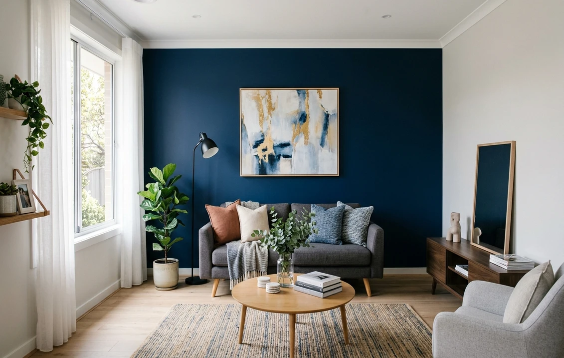
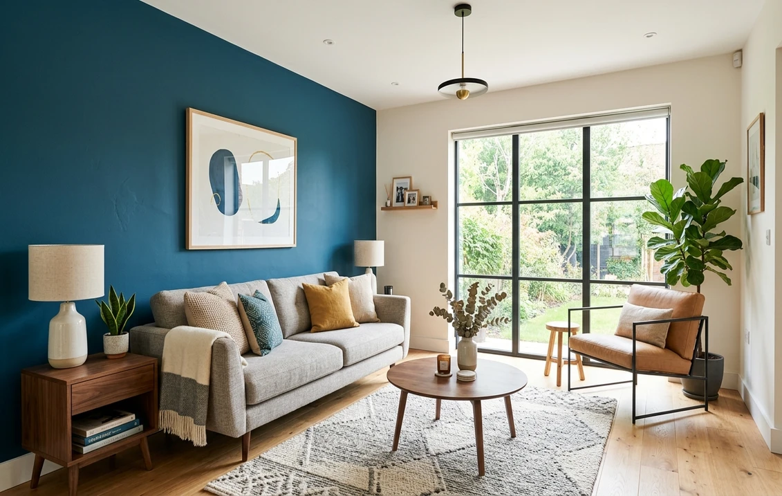
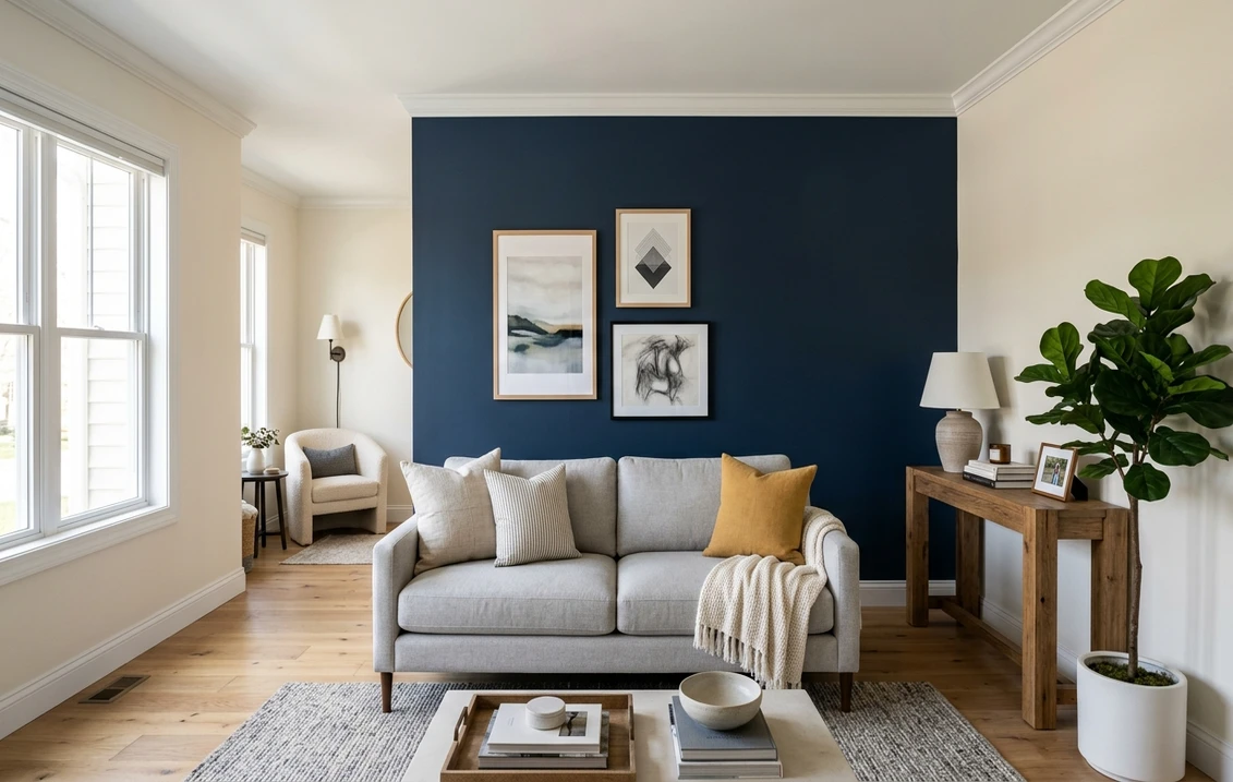
Moody and deep: navy, charcoal, and near-black
This is the most reliable category for a bedroom: a deep color behind the bed reads as cocooning rather than oppressive, because you are wrapping the spot where you sleep, not the spot where you work. The heavy hitters:
- 1. Benjamin Moore Hale Navy (HC-154): the gold-standard bedroom navy. LRV 6.3, with enough warmth that it never goes cold or corporate at night under lamp light. Pairs beautifully with white bedding and brass.
- 2. Sherwin-Williams Naval (SW 6244): a hair brighter and more saturated than Hale Navy, great if you want the navy to read clearly blue rather than near-black.
- 3. Sherwin-Williams Urbane Bronze (SW 7048): a warm near-black brown. The coziest of the deep options and the most forgiving in a low-light room, since the warmth keeps it from feeling like a cave.
- 4. Benjamin Moore Iron Mountain (2134-30): a soft, mineral charcoal that is gray rather than black, ideal if true black feels too stark over the bed.
- 5. A black accent wall bedroom done right: SW Tricorn Black (SW 6258) or BM Black Beauty for a graphic, modern look. Black behind the bed is dramatic and surprisingly restful, but only commit if the room gets decent natural light; in a dim room a warm charcoal serves you better.
Painter's note: deep colors need a tinted gray primer and almost always a full second coat to avoid roller streaks. A navy that looks blotchy in raking morning light is the fastest way to regret the project.
Free AI visualizer. Test Hale Navy or a charcoal on your real headboard wall before buying a single sample pot.
Calm and restful: green, blue, and spa tones
If deep and dramatic is not your speed, muted middle-value colors give you a focal wall that still whispers. They read soft and grown-up, and they are the easiest to live with long term:
- 6. Sherwin-Williams Evergreen Fog (SW 9130): a muted gray-green that has become the default sophisticated headboard color. Calm, slightly moody, never loud.
- 7. Benjamin Moore October Mist (1495): a soft sage-gray that flatters wood furniture and linen bedding.
- 8. Sherwin-Williams Sea Salt (SW 6204): a barely-there green-blue spa tone. The lightest accent here, for people who want depth without contrast.
- 9. Benjamin Moore Van Deusen Blue (HC-156): a smoky mid-blue, classic and timeless behind a bed.
- 10. Sherwin-Williams Riverway (SW 6222): a deep teal-green for a bolder calm, sits between the soft sages and the deep navies.
Sage in particular is having a long, deserved moment for sleep spaces. For the full lineup of greens and the pairings that go with them, see our sage green interior paint shades and pairings. To build the whole room around one of these accents, start from a coordinated palette in our bedroom color schemes and palettes guide.
Warm and cozy: terracotta, blush, and warm neutrals
Warm accent walls have quietly overtaken cool grays for bedrooms, because they read inviting under both daylight and 2700K bulbs:
- 11. Sherwin-Williams Cavern Clay (SW 7701): a soft terracotta with a vintage, sun-baked feel. Warm without going orange.
- 12. Benjamin Moore First Light (2102-70): a gentle, airy blush-pink that flatters skin tones at the mirror and never reads babyish in a master.
- 13. Sherwin-Williams Redend Point (SW 9081): a blush-beige with a clay undertone, one of the most flattering low-contrast accents on the list.
- 14. Benjamin Moore Caliente (AF-290): a confident true red for a bold, romantic headboard wall. Not subtle, and that is the point.
- 15. A tonal warm greige: take your field color (say Agreeable Gray) and go two to three shades deeper on the bed wall for a soft, no-drama accent that still gives the room dimension.
See the wall, your bed, and the trim together in one preview, free.
Texture, not just color: wood, paneling, and color-drench
Some of the best bedroom accent walls are not a different color at all, they are a different surface or technique. These add the most character:
- 16. Vertical wood slats: a slat wall behind the bed adds warmth and a quiet rhythm that flat paint cannot. Stain or paint to taste. Our wood accent wall paint color ideas covers the colors that flatter natural wood.
- 17. Board and batten (lower or full height): painted trim that adds structure and a custom, built-in feel. Reads classic, never trendy.
- 18. Picture-frame molding: simple applied moldings painted the same color as the wall, for understated French-apartment elegance.
- 19. Limewash or color-wash: a soft, cloudy mineral finish (often in a deep blue, green, or terracotta) that gives a headboard wall depth and movement a flat paint never will.
- 20. Color-drench the whole room: walls, trim, ceiling, and doors in one deep color. Not technically an accent wall, but it is where serious accent-wall lovers end up, and it turns a small bedroom into an enveloping cocoon.
- 21. Half-wall (color-block) accent: paint the bottom two-thirds of the headboard wall a deep color and leave the top in the field color, a softer way to introduce a bold tone.
- 22. A painted arch over the bed: no real headboard required, it frames the bed and fakes architecture in a plain box of a room.
For the technique side of any painted option here, taping a crisp line, the order of coats, and avoiding ridges, lean on our how to paint an accent wall guide.
Bedroom accent colors compared at a glance
Five of the most-requested options, side by side. LRV (Light Reflectance Value) tells you roughly how dark the wall will read: lower is deeper:
| Color | Code / LRV | Mood | Best for |
|---|---|---|---|
| Hale Navy | BM HC-154 / 6.3 | Deep, classic | Cocooning master with white bedding and brass |
| Urbane Bronze | SW 7048 / 8 | Warm near-black | Low-light rooms that need warmth, not chill |
| Evergreen Fog | SW 9130 / 30 | Muted, calm | Restful sophistication without high contrast |
| Sea Salt | SW 6204 / 63 | Soft, airy | Depth with almost no contrast, spa feel |
| Tricorn Black | SW 6258 / 3 | Graphic, modern | Bright rooms wanting a bold, gallery look |
Sources: Sherwin-Williams and Benjamin Moore color data 2026; designer field reports compiled by FacadeColorizer. LRV values rounded.
How to make the accent wall feel like part of the room
A focal wall fails when it looks bolted on. Three quick rules tie it back into the bedroom:
- Echo the accent color somewhere else. A throw, a lampshade, art, or a stripe in the rug. One repeat across the room and the wall reads designed instead of random.
- Keep the trim consistent. Run the same trim white around the accent wall as the rest of the room, or wrap the trim in the accent color for a drenched look. Switching trim colors at the corner looks unfinished.
- Mind the contrast level. High contrast (a near-black wall in a white room) energizes; low contrast (a tonal greige two shades deeper) soothes. Bedrooms usually want the softer end. For maximum drama, our black interior walls paint shades guide shows how to keep dark walls from swallowing the room.
And remember the accent wall is one move in a larger plan. If you are repainting the whole bedroom anyway, our calming master bedroom paint colors guide helps you pick a field color that the accent can sit against without clashing.
Test it on your own wall before you buy paint
A fan-deck chip lies about a deep color in a bedroom every time. Bedrooms tend to be dimmer than the showroom, and a navy that looked perfect on a 2-inch chip can read black, blotchy, or cold once it is on a full wall under your bedside lamp. Two better ways to choose:
- Roll a large swatch. Paint a 2-by-2-foot sample (or a peel-and-stick one) on the headboard wall and look at it at night under your real bulbs, not just in daylight. Bedrooms live after dark, so judge them after dark.
- Preview it digitally first. Upload a photo of your actual bedroom and apply two or three accent colors before you buy any samples, narrowing the field to the one worth a sample pot. Pricing context for the full repaint is in our interior house painting cost guide for 2026, and our living room accent wall ideas carry the same logic into the rest of the home.
Preview two or three accent colors on your real bedroom wall, side by side, free.
Frequently asked questions
Which wall should be the accent wall in a bedroom?
Almost always the headboard wall, the one your bed sits against. It is the natural focal point and a darker color behind your head never makes the room feel smaller the way a dark wall opposite the bed can. Avoid putting the accent on the window wall (the light backlights it into glare) or on a wall chopped up by doors and closets. Choose the cleanest plane you have.
Does a dark accent wall make a small bedroom look smaller?
Not on the headboard wall. A deep color behind the bed actually reads as cocooning and can make the room feel deeper, because the eye loses the back boundary. The version that does shrink a room is a dark wall directly opposite the bed or on a heavily interrupted wall. In a very small or dim bedroom, a warm near-black like Urbane Bronze flatters the space more than a cold, stark black.
What are the best colors for a bedroom accent wall?
The most reliable picks fall into three groups: deep and moody (Hale Navy, Urbane Bronze, a warm charcoal, or a true black in a bright room), calm and restful (Evergreen Fog, sage greens, Sea Salt, a smoky blue), and warm and cozy (terracotta like Cavern Clay, a soft blush like First Light, or a tonal greige two to three shades deeper than your field color). Match the depth to the room's light.
Is a black accent wall good in a bedroom?
Yes, if the room gets reasonable natural light. A black accent wall bedroom (Tricorn Black or a similar true black) behind the bed looks graphic, modern, and surprisingly restful, especially with white bedding for contrast. In a dim, low-light bedroom, a warm charcoal or near-black brown reads better than pure black, which can feel flat and heavy without enough light to give it depth.
How do I keep the accent wall from looking random?
Repeat the accent color somewhere else in the room (a throw, lampshade, art, or rug detail), keep the trim consistent around the accent wall, and match the contrast level to the mood you want: high contrast energizes, low contrast soothes. One repeat of the color across the room is usually enough to make the wall read as a deliberate design choice rather than an afterthought.
Preview your headboard wall in any color under your own light before buying a single sample.
Disclaimer: Sherwin-Williams, Naval (SW 6244), Urbane Bronze (SW 7048), Tricorn Black (SW 6258), Evergreen Fog (SW 9130), Sea Salt (SW 6204), Riverway (SW 6222), Cavern Clay (SW 7701), Redend Point (SW 9081), and Agreeable Gray (SW 7029) are trademarks of The Sherwin-Williams Company. Benjamin Moore, Hale Navy (HC-154), Iron Mountain (2134-30), October Mist (1495), Van Deusen Blue (HC-156), First Light (2102-70), Caliente (AF-290), and Black Beauty are trademarks of Benjamin Moore & Co. FacadeColorizer is an independent paint visualization service and is not affiliated with, endorsed by, or sponsored by Sherwin-Williams or Benjamin Moore. Color reproduction on screens approximates the manufacturer's chip; always confirm with a manufacturer sample under your own light before purchase. Sources: Sherwin-Williams and Benjamin Moore color data 2026, designer field reports compiled by FacadeColorizer.
Trademarks mentioned (Sherwin-Williams, Benjamin Moore, Behr, Caparol, Brillux, Sto, Alpina, Valspar, PPG, Glidden, Dulux, Crown Trade, Sandtex, Farrow & Ball, Johnstone's, Leyland) are property of their respective owners. FacadeColorizer is independent and not affiliated with any of them. Nominative fair use under Lanham Act §1125.