
A client texted me a photo last spring: one wall behind her bed painted a bright primary blue, the other three a soft greige. She hated it and could not say why. The problem was not the idea of an accent wall, it was the specific shade. The blue was too saturated and too cool for the warm grays around it, so the room looked like two arguments stapled together. That is the whole game with accent wall colors. The concept almost always works. The color choice is where people slip. This guide goes color by color, so you can match the wall to what you already own instead of guessing.
Quick framing before the picks. A good accent wall color is usually two to four steps darker or more saturated than the surrounding walls, with a related undertone so the two read as a family rather than a collision. Light Reflectance Value (LRV) is your best friend here: the lower the number, the deeper and more dramatic the wall. If you want the strategy behind which wall to paint and why, start with our accent wall color strategy guide. This article is the companion color directory: navy, green, black, charcoal, and warm tones, each with a specific paint and where it falls apart.
Upload a photo of your actual room and preview any accent color under your own light in about 30 seconds, free.
Accent wall colors at a glance: pick by LRV and mood
Before the room-by-room detail, here is the short list I reach for most. These are real, widely stocked colors with published LRV values you can take to a paint counter. The LRV tells you how dramatic the wall will feel: anything under 10 reads as a true statement wall, the 25 to 40 range gives you color without heaviness.
| Color | Paint pick | LRV | Best in |
|---|---|---|---|
| Navy | BM Hale Navy HC-154 | 6 | Bedroom, office, behind shelving |
| Muted green | SW Evergreen Fog SW 9130 | 30 | Living room, dining, entry |
| Black | SW Tricorn Black SW 6258 | 3 | Fireplace wall, modern living room |
| Charcoal | SW Iron Ore SW 7069 | 6 | Office, bedroom, media room |
| Deep green | BM Essex Green / dark hunter | 5 | Library, study, moody dining |
| Warm terracotta | Earthy clay / rust tones | 18 to 24 | Boho living room, bedroom |
Sources: Sherwin-Williams and Benjamin Moore color data 2026; designer field reports compiled by FacadeColorizer.
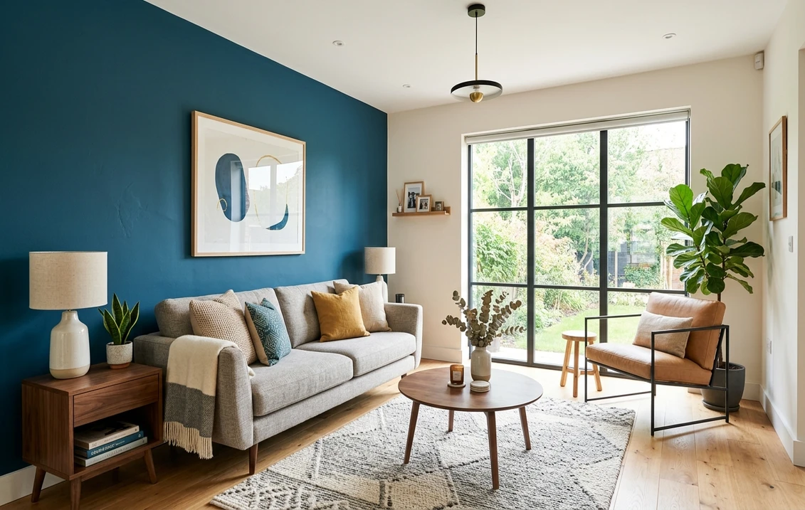
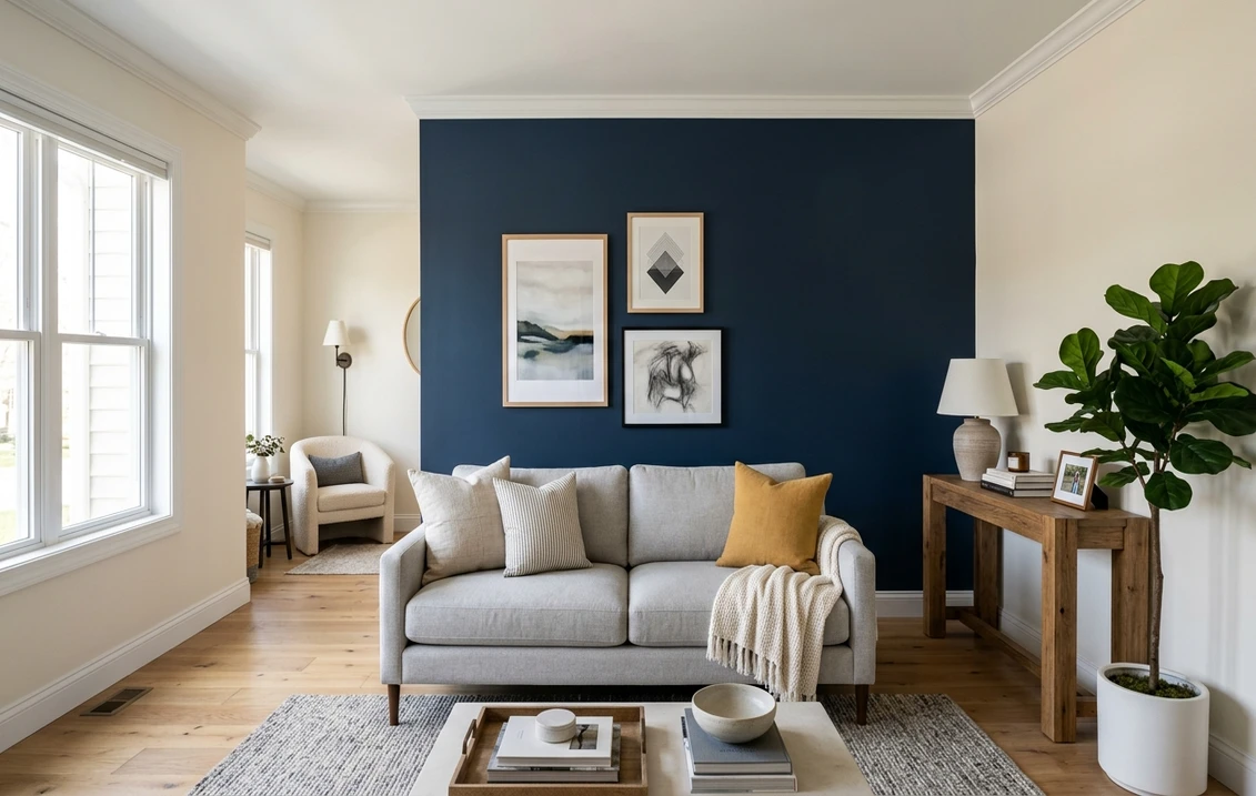
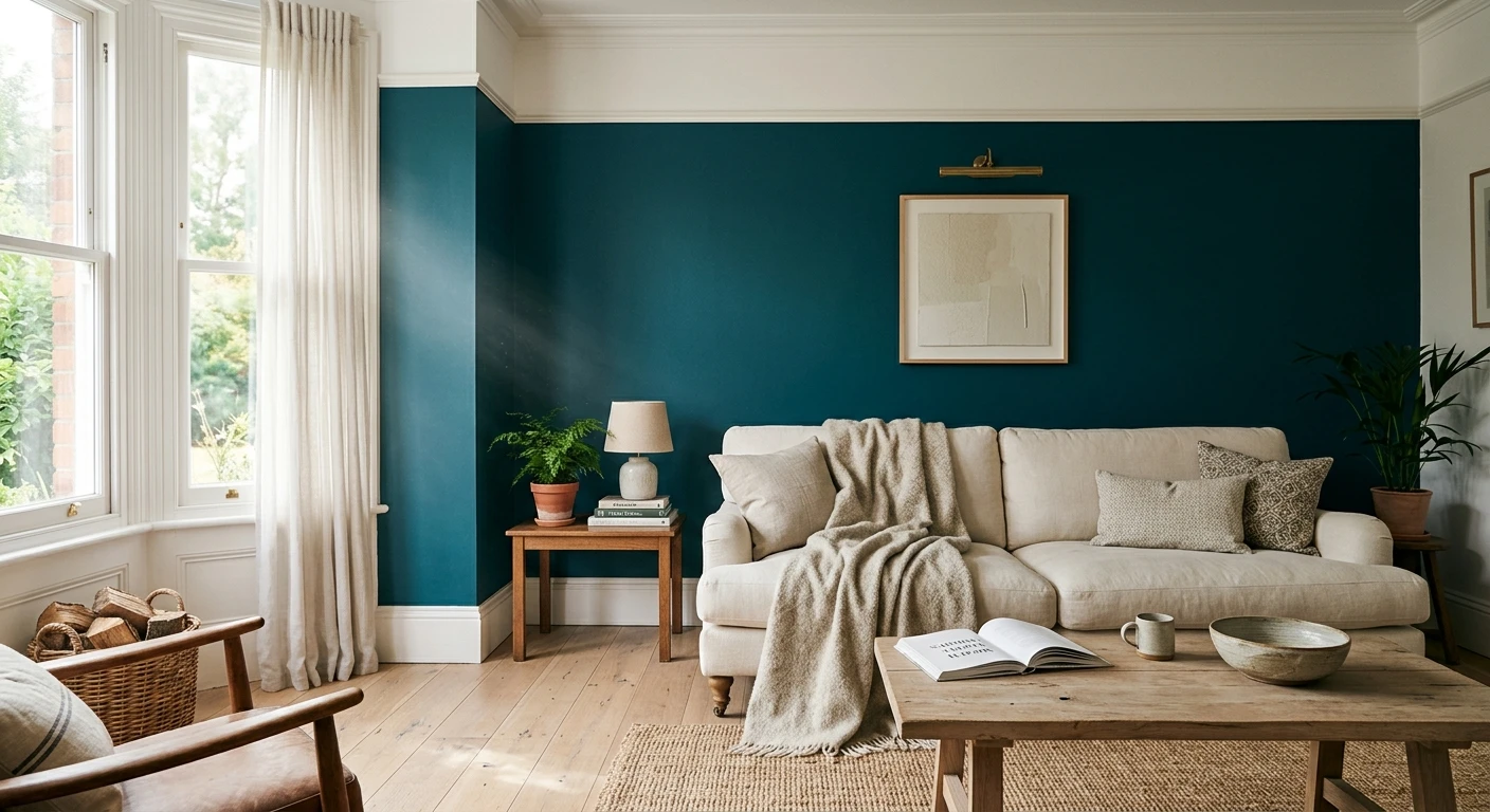
Blue accent wall: the safest dramatic choice
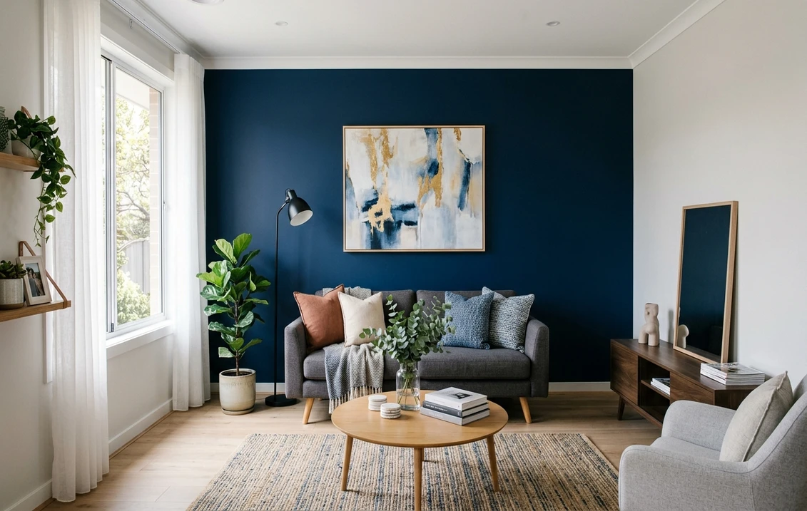
A blue accent wall is the one I recommend most often, because navy behaves. It is dark enough to feel intentional, neutral enough to pair with almost any flooring, and it does not date the way a trend color does. My default is Benjamin Moore Hale Navy (HC-154, LRV 6). It carries a faint gray that keeps it from looking like a kid's room, and it pairs cleanly with brass, white oak, and warm whites.
Here is the honest caveat. Bright, saturated blues (think true cobalt or a primary marine) almost never work as a whole accent wall in a home. They read juvenile next to neutrals and they fight warm wood. If you love blue, go deep and slightly grayed, not bright. For the full breakdown of how Hale Navy reads in different light, plus its trim, decor, and flooring pairings, see our Benjamin Moore Hale Navy HC-154 review.
Where a blue accent wall earns its keep: behind a bed with white bedding, in a home office on the wall behind the monitor (it reads calm on camera), and behind open walnut shelving where the navy makes the wood pop. Cut in carefully along the ceiling, because a dark wall punishes a wobbly line far more than a pale one.
Green accent wall: the color of the moment, done right
Green is where accent wall colors got interesting again. The trick is to pick a muted, grayed green rather than a clean Kelly or emerald, which can feel loud on a single wall. For most rooms I reach for Sherwin-Williams Evergreen Fog (SW 9130, LRV 30), a gray-green-with-a-whisper-of-brown that reads sophisticated and calm. It was a color-of-the-year pick for good reason. It flatters warm and cool rooms alike.
For a deeper, library-style green accent wall, a dark hunter such as Benjamin Moore Essex Green (LRV around 5) turns a study or dining nook genuinely moody. That is the version that wants brass sconces and a leather chair. If you want options across the whole green family with undertones and pairings spelled out (including what to put on the other three walls), our guide to sage green interior paint shades and pairings is the right next stop.
One thing that does not work: a yellow-leaning green (chartreuse, avocado) on an accent wall in a room with cool gray neutrals. The undertones clash and the wall looks slightly dirty. Keep accent wall colors green on the grayed, earthy side and they slot in easily.
Free AI visualizer. Test Evergreen Fog or a deep hunter on your real wall before buying a sample pot.
Black accent wall: maximum drama, minimum forgiveness
A black accent wall is the boldest move on this list, and the one with the smallest margin for error. Get it right and a fireplace wall or a TV wall looks gallery-grade. Get it wrong (cheap flat sheen, bad cut-in, too small a wall) and it reads like a mistake. My pick when a client wants true black is Sherwin-Williams Tricorn Black (SW 6258, LRV 3). It is one of the only blacks with essentially no undertone, so it stays crisp and does not go blue or brown on you.
Two rules I do not bend. First, a black accent wall needs a real light source nearby or it swallows the room. Second, use an eggshell or satin sheen, never dead flat on a high-traffic wall, because flat black shows every scuff and fingerprint. For the wider case (full black walls, the best shades, how dark to go, and how each one reads in different light), our guide to black interior walls and paint shades goes deeper.
Where black does not work: a small, north-facing room with one window. It will feel like a closet. In that case drop down to a soft charcoal instead, which gives you most of the drama with half the risk.
Accent wall color with gray walls: the most-asked question
This is the pairing people search for more than any other, so it gets its own section. If your three surrounding walls are gray, the accent color depends entirely on whether your gray is warm or cool. Match the temperature or the room fights itself.
- Cool gray walls (blue or violet undertone): go navy (Hale Navy), charcoal (Iron Ore), or a deep cool green. These share the cool family and read like a deliberate, layered scheme.
- Warm gray or greige walls: go with a muted green like Evergreen Fog, a warm terracotta, or a soft black such as Iron Ore. Avoid a cold true navy here, which can look harsh against warm walls.
- Best all-rounder with any gray: a charcoal accent wall in SW Iron Ore (LRV 6). It is a near-neutral, so it sits beside both warm and cool grays without a temperature clash. This is the safe answer when you are not sure what your gray is doing.
- Skip: a pure bright color (clean teal, bright blue) against gray. The saturation gap makes the gray look dull and the accent look loud.
If you are not sure which way your gray leans, our guide to colors that go with gray interior walks through warm versus cool grays and the accent colors that flatter each. The charcoal itself is profiled in our SW Iron Ore undertones and best rooms guide.
See the accent wall and your existing gray together in one preview, free.
Warm accent wall colors: terracotta, clay, and deep rust
Not every accent wall has to be dark or cool. Warm earthy tones (terracotta, clay, muted rust, deep ochre) make a fantastic accent wall in a bedroom or a boho-leaning living room, especially next to white oak and natural fiber rugs. These sit around LRV 18 to 24, so they bring color and warmth without going as heavy as a navy or black.
The watch-out with warm accent walls is pink. Some terracottas tip dusty-pink in cool north light, which is not always the look you wanted. Test the actual color on the wall before committing, because a clay that looks rich in the store can read salmon at home. For a full palette of these tones with where each one works, see our earthy warm interior paint colors guide.
How to choose and apply an accent wall color
Picking the color is half the job. The other half is choosing the right wall and laying the paint down cleanly. A few field notes:
- Pick the wall with a natural focal point: the one behind the bed, the fireplace wall, or the wall your eye lands on from the doorway. A random side wall reads like a leftover.
- Darker colors need two coats minimum: deep navy, black, and hunter green almost always want a tinted gray primer plus two finish coats, or the first coat looks patchy and streaky.
- Cut in slow on dark walls: a crisp line where the accent meets the ceiling and adjacent walls is what separates a designer look from a weekend-warrior one. Tape, then run a thin bead of the lighter wall color over the tape edge first to seal it.
- Sheen matters more on a feature wall: eggshell or satin gives depth on dark colors and is wipeable. Matte can look chalky on a near-black.
- Preview it digitally first: upload a real photo of the room and test two or three accent colors against your actual furniture and flooring before you buy a single sample pot.
For inspiration on which designs and layouts read best (not just color, but shape and placement), our roundup of accent wall designs shows real rooms across styles.
Preview your top accent colors side by side on your real wall, free.
Frequently asked questions
What is the best accent wall color?
There is no single best, it depends on your room, but the most reliable choices are a deep grayed navy like Benjamin Moore Hale Navy (HC-154), a muted gray-green like Sherwin-Williams Evergreen Fog (SW 9130), and a soft charcoal like SW Iron Ore (SW 7069). All three are dark enough to feel intentional, neutral enough to pair with most flooring, and forgiving across warm and cool rooms. Bright, fully saturated colors are the riskiest and date the fastest.
What accent wall color goes with gray walls?
Match the temperature of your gray. Cool gray walls pair well with navy, charcoal, or a deep cool green. Warm gray and greige walls pair better with a muted green, a warm terracotta, or a soft black. The safest all-rounder is a charcoal accent such as SW Iron Ore (LRV 6), which reads near-neutral and sits beside both warm and cool grays without clashing. Avoid pairing a bright saturated color with gray, since the saturation gap makes the gray look dull.
Should an accent wall be lighter or darker than the other walls?
Almost always darker or more saturated, typically two to four steps deeper than the surrounding walls, with a related undertone so the two read as a family. A lighter accent wall rarely creates enough contrast to look deliberate. Use LRV as your gauge: an accent under LRV 10 reads as a true statement wall, while the 25 to 40 range gives you color and depth without going heavy.
Does a black accent wall make a room look smaller?
It can, especially in a small room with only one window, where a black wall absorbs light and feels like a closet. In a room with good natural or layered lighting, a black accent wall actually adds depth and makes the space feel intentional rather than cramped. Use a black with no undertone like SW Tricorn Black (LRV 3) in an eggshell or satin sheen, and if the room is small and dim, drop down to a soft charcoal instead.
How many coats does a dark accent wall need?
Plan on a tinted gray primer plus two finish coats for deep navy, black, and dark green. Skipping primer or stopping at one coat is the most common reason a dark accent wall looks patchy and streaky, because rich pigments do not cover evenly in a single pass. Cut in carefully along the ceiling and adjacent walls, since a dark color shows a wobbly line far more than a pale one.
Preview navy, green, black, or charcoal on your actual wall under your own light before buying a single sample.
Disclaimer: Sherwin-Williams, Evergreen Fog (SW 9130), Tricorn Black (SW 6258), and Iron Ore (SW 7069) are trademarks of The Sherwin-Williams Company. Benjamin Moore, Hale Navy (HC-154), and Essex Green are trademarks of Benjamin Moore & Co. FacadeColorizer is an independent paint visualization service and is not affiliated with, endorsed by, or sponsored by Sherwin-Williams or Benjamin Moore. Color reproduction on screens approximates the manufacturer's chip; always confirm with a manufacturer sample under your own light before purchase. Sources: Sherwin-Williams and Benjamin Moore color data 2026, designer field reports compiled by FacadeColorizer.
Trademarks mentioned (Sherwin-Williams, Benjamin Moore, Behr, Caparol, Brillux, Sto, Alpina, Valspar, PPG, Glidden, Dulux, Crown Trade, Sandtex, Farrow & Ball, Johnstone's, Leyland) are property of their respective owners. FacadeColorizer is independent and not affiliated with any of them. Nominative fair use under Lanham Act §1125.