
The dining room in our last house had one short wall behind the table that nobody knew what to do with. White like the rest, it just sat there. We rolled two coats of a deep navy on it one Saturday, hung a thrifted mirror, and that corner went from forgotten to the spot everyone gravitated toward at dinner. That is the whole promise of an accent wall dining room project: one wall, a weekend, and a room that suddenly has a center of gravity. This is a gallery of 14 looks for dining rooms and kitchens, with exact colors, their LRVs, and an honest note on where each one works.
A quick word on strategy before the looks. An accent wall earns its place when it has a job: anchor a table, frame a buffet, give a banquette a backdrop, or stop a long open-plan kitchen from reading flat. Pick the wall the eye already lands on, not a random one. This piece is the dining-and-kitchen chapter of our broader accent wall color strategy, and our accent wall designs guide covers paneling and texture across every room. Here we stay at the table and the counter.
Upload a photo of your actual room and preview any accent color under your own light in about 30 seconds, free.
How to choose the accent wall in a dining room or kitchen
The wall matters as much as the color. In a dining room, the right candidate is almost always the one behind the table or the one holding a buffet, sideboard, or built-in. Avoid accenting a wall broken up by a doorway and two windows; there is not enough solid plane left to make a statement, and you cut in around trim all day for little payoff.
Kitchens are trickier, because cabinets and backsplash already do a lot of the talking. The best accent wall kitchen spots are the range wall above the backsplash, a banquette, the wall behind open shelving, or the side of an island that faces the living space. Skip the wall that is two-thirds upper cabinets; the effect disappears. One rule I hold to: a dark accent in a small, north-facing kitchen with no warm light can feel like a cave by 4 p.m. Test it first.
Dining room accent walls (looks 1 to 8)
Dining rooms tolerate drama better than almost any space in the house. You are in there in the evening, under warm light, so a saturated dining room accent wall reads cozy rather than oppressive. Here are eight that hold up.
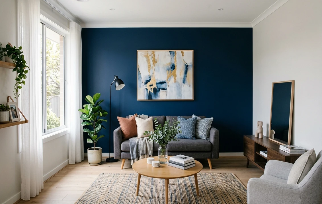
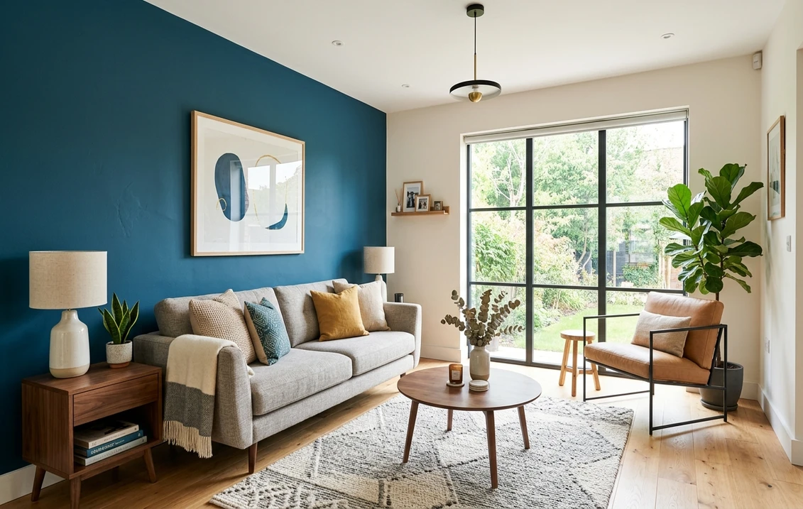
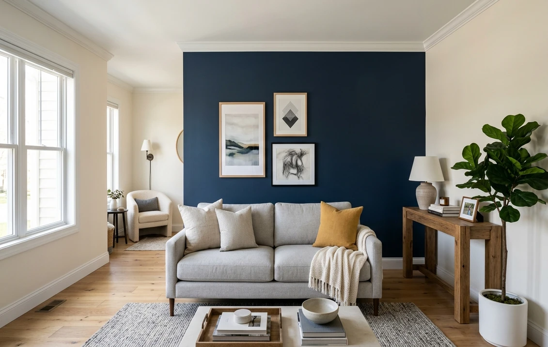
1. Deep navy behind the table
Benjamin Moore Hale Navy (HC-154, LRV 6.3) is the dinner-party classic for a reason. It is a navy with enough black in it to feel grown-up, and it makes brass sconces, gold frames, and warm wood pop. Cut in cleanly at the ceiling and trim, because a deep color shows every wobble. Our full Hale Navy review breaks down its undertones room by room.
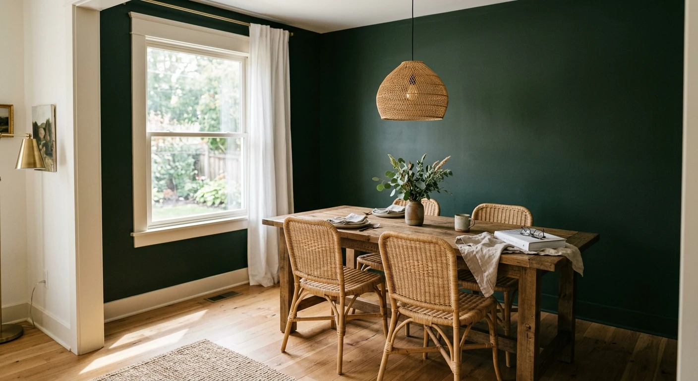
2. Muted gray-green for a calmer table
Sherwin-Williams Evergreen Fog (SW 9130, LRV 30) is the softer alternative to navy. It is a gray-green that feels earthy and current without shouting, and it flatters natural-wood chairs. At LRV 30 it darkens a dining wall without swallowing the light.
3. Warm near-black for a moody dining room
For full drama, Iron Ore (SW 7069, LRV about 6) is a warm soft black that reads charcoal in daylight and deep espresso at night. It is more forgiving than a true black because the warmth keeps it from feeling stark. Pair it with a warm-white ceiling so the room does not close in.
4. True black, gallery style
For a crisp, graphic backdrop behind framed art or a salon-style print wall, Tricorn Black (SW 6258, LRV 3) is the cleaner, cooler black. I would only use this in a dining room with decent natural or lamp light; in a dim space it can flatten. It looks sharp behind a pale oak table.
5. Oxblood or deep terracotta
A warm red-brown wall (a muted oxblood around LRV 8 to 12) is having a real moment in dining rooms. It is appetite-friendly and candlelit-cozy. Keep the rest of the room neutral so the wall stays the star. This is a confident pick, not a safe one, so preview it before you buy three gallons.
6. Tonal greige, two shades deeper
Not every accent has to be bold. Take your existing wall neutral and go two or three steps deeper on the same strip of the fan deck for a subtle accent behind a buffet. It is the lowest-risk look in this list for a rental or a quick refresh.
7. Picture-frame molding plus color
Add simple picture-frame molding to the accent wall and paint the wall and molding the same deep color (navy, green, or charcoal). The relief catches light and gives a builder-grade dining room instant architecture. More work, but it is the look that reads custom.
8. Color-drenched dining nook
For a small dining nook off the kitchen, color-drenching (walls, trim, and ceiling in one mid-to-deep tone) can work better than a single accent wall, because a tiny room has no good single wall to isolate. A muted green or a soft black wraps the nook into a cocoon. For the full palette behind these, our top dining room paint colors for 2026 is the companion read.
Free AI visualizer. Test the exact color on your real wall before buying a single sample pot.
Kitchen accent walls (looks 9 to 14)
Kitchens reward a lighter touch. Because cabinets, hardware, and backsplash already carry visual weight, the smartest kitchen accent supports them rather than competing. Here are six that play well with a working kitchen.
9. Gray-green on the range wall
Evergreen Fog (SW 9130) on the wall above the backsplash, behind the range, is the single most requested kitchen accent I see right now. It reads sage in daylight, deeper green at night, and it makes white or natural-wood cabinets look considered. It is also forgiving near food and grease because mid-tone greens hide a lot. Our Evergreen Fog undertones guide shows exactly how it shifts by light.
10. The island as the accent
You do not need a wall at all. Painting the island a deep color (navy, forest green, or soft black) while the perimeter cabinets stay light is the cleanest two-tone move in a modern kitchen. It anchors the room from the center and never fights the backsplash. For the broader cabinet logic, see our complete guide to kitchen cabinet colors.
11. Banquette and breakfast nook backdrop
A built-in banquette is the best accent-wall opportunity most kitchens have, because the seating frames a solid wall at the perfect height. A warm near-black like Iron Ore behind the bench, with a wood table in front, turns a corner into a little restaurant booth. This is my favorite kitchen accent, full stop.
12. Wall behind open shelving
If you have open shelves instead of upper cabinets, the wall behind them is begging for color. A deep green or navy makes white dishware read like a styled display. Paint the whole wall, not just the shelf gaps, so it looks intentional rather than patched.
13. Black, graphic, and modern
Tricorn Black (SW 6258) on a single kitchen wall, paired with brass or matte-black hardware, reads sharp and contemporary. The catch I mentioned earlier holds double in kitchens: only do this where there is real light. A black wall in a galley kitchen with one small window will feel heavy fast.
14. Where a kitchen accent wall does NOT work
Here is the honest opinion. If your kitchen is mostly upper cabinets with only a sliver of wall, skip the accent wall entirely; there is not enough surface to register, and you will spend more time taping than the result deserves. A bold backsplash, a painted island, or colored cabinets will do far more. Forcing an accent wall onto a busy kitchen is the most common mistake I get asked to fix.
See the color against your real cabinets and counters before committing, free.
Accent wall colors compared: dining vs kitchen
Use this to match a color to the room and wall you have, with real LRVs you can take to a paint counter:
| Color | LRV | Best wall | Watch out for |
|---|---|---|---|
| Hale Navy (BM HC-154) | 6.3 | Dining wall behind the table | Can read cool under bright daylight |
| Evergreen Fog (SW 9130) | 30 | Kitchen range wall, dining buffet | Leans grayer in low light |
| Iron Ore (SW 7069) | ~6 | Banquette nook, moody dining wall | Needs a warm-white ceiling beside it |
| Tricorn Black (SW 6258) | 3 | Gallery dining wall, modern kitchen | Flattens in any dim, windowless room |
| Tonal greige (deeper) | 40 to 55 | Subtle accent behind a sideboard | Too subtle if contrast is under two steps |
Sources: Sherwin-Williams and Benjamin Moore color data 2026 (SW 9130, SW 7069, SW 6258, BM HC-154); designer field reports compiled by FacadeColorizer.
Painting the wall: prep and finish that hold up
A deep accent color is unforgiving, so prep matters more than on a pale wall. A few things I do every time:
- Tint the primer gray for navy, green, and black accents. It means two finish coats cover instead of three, which saves a full gallon on a saturated color.
- Cut in carefully where the accent meets the field color. That line is the first thing the eye checks. Quality tape and a steady hand beat a rushed freehand edge.
- Plan on a real second coat. Dark colors almost never cover in one. The first coat looks patchy; the second coat is where it evens out.
- Finish matters in a kitchen. Use a scrubbable matte or eggshell near the range and table so splatters wipe off. Flat does not survive a working kitchen.
- Budget the whole job, not just the accent. Even one wall plus touch-ups adds up. Our interior house painting cost guide for 2026 has realistic per-room numbers.
And the step that saves the most regret: see the color in your actual room first. A fan-deck chip cannot show how a deep navy or gray-green behaves against your cabinets, floor, and evening light. The wall always reads deeper than the chip.
Preview your top accent colors side by side on your real wall, free.
Frequently asked questions
Which wall should be the accent wall in a dining room?
Choose the wall the eye already lands on: usually the one behind the table or the one holding a buffet, sideboard, or built-in. A deeper color there reads intentional. Avoid a wall broken up by a doorway and windows, because there is not enough solid plane to make a statement.
What is the best accent wall color for a dining room?
Deep navy like Hale Navy (BM HC-154, LRV 6.3) is the dinner-party classic because it flatters brass and warm wood. For a calmer look, a muted gray-green like Evergreen Fog (SW 9130, LRV 30) works, and for full drama a warm near-black like Iron Ore (SW 7069) reads cozy under evening light.
Do accent walls work in a kitchen?
Yes, but only where there is enough paintable surface. The best spots are the range wall above the backsplash, a banquette, the wall behind open shelving, or a painted island. Skip a kitchen wall that is mostly upper cabinets, because the sliver of paint left will not register and a bold backsplash or colored island does more.
How many coats of paint does a dark accent wall need?
Plan on two finish coats over a gray-tinted primer for navy, green, or black. Deep colors almost never cover in one coat; the first coat looks patchy and the second coat is where it evens out. Tinting the primer gray often saves a full gallon by letting two coats cover instead of three.
Will a dark accent wall make my dining room or kitchen look smaller?
A single dark accent wall usually adds depth rather than shrinking a room, especially behind a table or banquette where it reads cozy. The risk is a dark color in a small, north-facing, or windowless space, where it can feel heavy by late afternoon. Keep the ceiling a warm white and test the color in your own light first.
Preview navy, gray-green, or black on your actual dining or kitchen wall under your own light before buying a single sample.
Disclaimer: Sherwin-Williams, Evergreen Fog (SW 9130), Iron Ore (SW 7069), and Tricorn Black (SW 6258) are trademarks of The Sherwin-Williams Company. Benjamin Moore and Hale Navy (HC-154) are trademarks of Benjamin Moore & Co. FacadeColorizer is an independent paint visualization service, not affiliated with or endorsed by either brand. Screen color approximates the manufacturer's chip; always confirm with a sample under your own light before purchase. Sources: Sherwin-Williams and Benjamin Moore color data 2026, designer field reports compiled by FacadeColorizer.
Trademarks mentioned (Sherwin-Williams, Benjamin Moore, Behr, Caparol, Brillux, Sto, Alpina, Valspar, PPG, Glidden, Dulux, Crown Trade, Sandtex, Farrow & Ball, Johnstone's, Leyland) are property of their respective owners. FacadeColorizer is independent and not affiliated with any of them. Nominative fair use under Lanham Act §1125.