
The first time I cut in Sherwin-Williams Naval (SW 6244) around a window, the brush looked loaded with black. Then the afternoon light swung around, and the same wall bloomed into a deep, slightly dusty navy with real blue in it. That gap, between what Naval does in shadow and what it does in light, is the whole story of this color. It is one of the most-used deep blues in American homes because it behaves like a near-black neutral but never goes flat or cold. The question people actually type is some version of "is Naval too dark for my room," and the honest answer rides almost entirely on your light and your trim. Here is how it reads indoors.
Quick orientation before the deep dive. Naval has a published LRV of about 5 and a hex approximation of #2F3B4C (RGB 47, 59, 76). That is a deep, fairly muted navy: dark enough to read as a saturated near-black on a wall, with a soft, slightly grayed edge that keeps it from looking like a crayon. This profile is one stop in our wider Sherwin-Williams interior paint colors guide, and it is the indoor companion to our SW Naval 6244 exterior guide: that one covers the color on siding, shutters, and front doors, while this one stays on interior walls, rooms, undertones, and pairings. They are complementary, not duplicates.
Upload a photo of your actual room and preview SW Naval under your own light in about 30 seconds, free.
Naval at a glance: the numbers that matter
Before opinions, here are the verifiable specs straight from the Sherwin-Williams color library. These are the values you can take to a paint counter:
| Spec | Naval SW 6244 |
|---|---|
| SW number | 6244 |
| LRV (Light Reflectance Value) | About 5. A deep, light-absorbing navy: it reads as a near-black on a wall and needs good light to show its blue. |
| Hex / RGB (approx.) | #2F3B4C / 47, 59, 76. Blue channel sits highest and red lowest, the signature of a true cool navy. |
| Color family | Deep, slightly muted navy blue. A dark dramatic neutral, not a bright royal blue. |
| Undertones | Primarily clean navy, with a faint gray-green softening that keeps it from going purple. |
| Tint base / sheen | Mixed in a deep / ultra-deep base. A satin or eggshell sheen reads richest; flat can look chalky on a dark navy. |
The takeaway from those numbers: Naval is a dark dramatic neutral first and a "blue" second. At LRV 5 it absorbs most of the light that hits it, so in a dim room it behaves like a charcoal-black and only releases its navy identity when sun or lamps land on it directly. That muted, slightly grayed quality makes it feel grown-up rather than nautical-themed, and it is why it pairs so easily with brass, wood, and white. For where it sits among similar shades, our roundup of navy paint colors for interiors lines Naval up next to the other deep blues people shortlist.
Is Naval too dark, and what is the undertone?
Naval is a true navy: cool and clean, not warm. The reason it never looks cheap is that faint gray-green note riding under the blue, which mutes it just enough to keep it out of "primary blue" territory and far away from the purple cast that plagues some navies. Here is what is happening underneath.
In strong, direct light the blue dominates and Naval looks unmistakably navy, rich and a little velvety. As the light drops, the wall darkens fast because of that LRV 5: the blue retreats and the color reads as a deep blackened slate. This is why the same room can feel like "moody navy" at 2 p.m. and "almost black" at 9 p.m. People who say Naval "turned black on me" are describing a low-light, low-LRV color doing exactly what the number predicts. It does not flip to purple or teal, which is precisely why designers trust it.
Watch out for one quirk. Naval photographs brighter and bluer than it lives, especially on phone cameras that lift shadows. So if you are choosing from Pinterest photos alone, assume the real wall will land noticeably darker and more black-navy than the image suggests, particularly on any wall the sun does not touch.
| Indoor light | How Naval reads |
|---|---|
| South-facing (bright, warm) | Richest, most clearly navy read; the blue stays alive most of the day |
| West-facing (warm afternoon) | Warm light slightly softens the cool; deep navy that glows late in the day |
| East-facing (cool after noon) | Crisp navy in the morning, drifts toward blackened slate by afternoon |
| North-facing (cool, indirect) | Coolest and darkest; reads almost black, the blue only hints at itself |
| Artificial light at night | Warm 2700K bulbs revive the navy and feel cozy; cool 4000K bulbs push it toward stark blue-black |
Sources: Sherwin-Williams SW 6244 color data 2026; The Spruce dark-paint and undertone coverage; designer field reports compiled by FacadeColorizer.
Free AI visualizer. Test Naval on your real walls before buying a single sample pot.
Best rooms for Naval
Naval rewards commitment. It is not a "paint the whole open floor plan" neutral; it is a color you point at a specific room or surface to add depth and drama. These are the spaces where it consistently earns its keep:
Home offices, studies, and libraries
This is Naval's strongest play. On four walls of a study it wraps the room in a focused, cocooning depth that makes brass lamps and oak shelving look expensive. The low LRV that scares people off larger spaces is an asset here: you want the room enclosed and serious. Add a warm-white ceiling and the navy feels intentional rather than cave-like.
Dining rooms and powder rooms
Naval is a fantastic candlelit dining-room color, since you mostly use those rooms at night when the navy reads moody and elegant. Powder rooms are the lowest-risk way to try it at all: small, no all-day light demand, and the drama lands hard in a space guests notice. A blackened navy plus a marble vanity and gold fixtures is a reliably high-end combination.
Accent walls, cabinetry, and built-ins
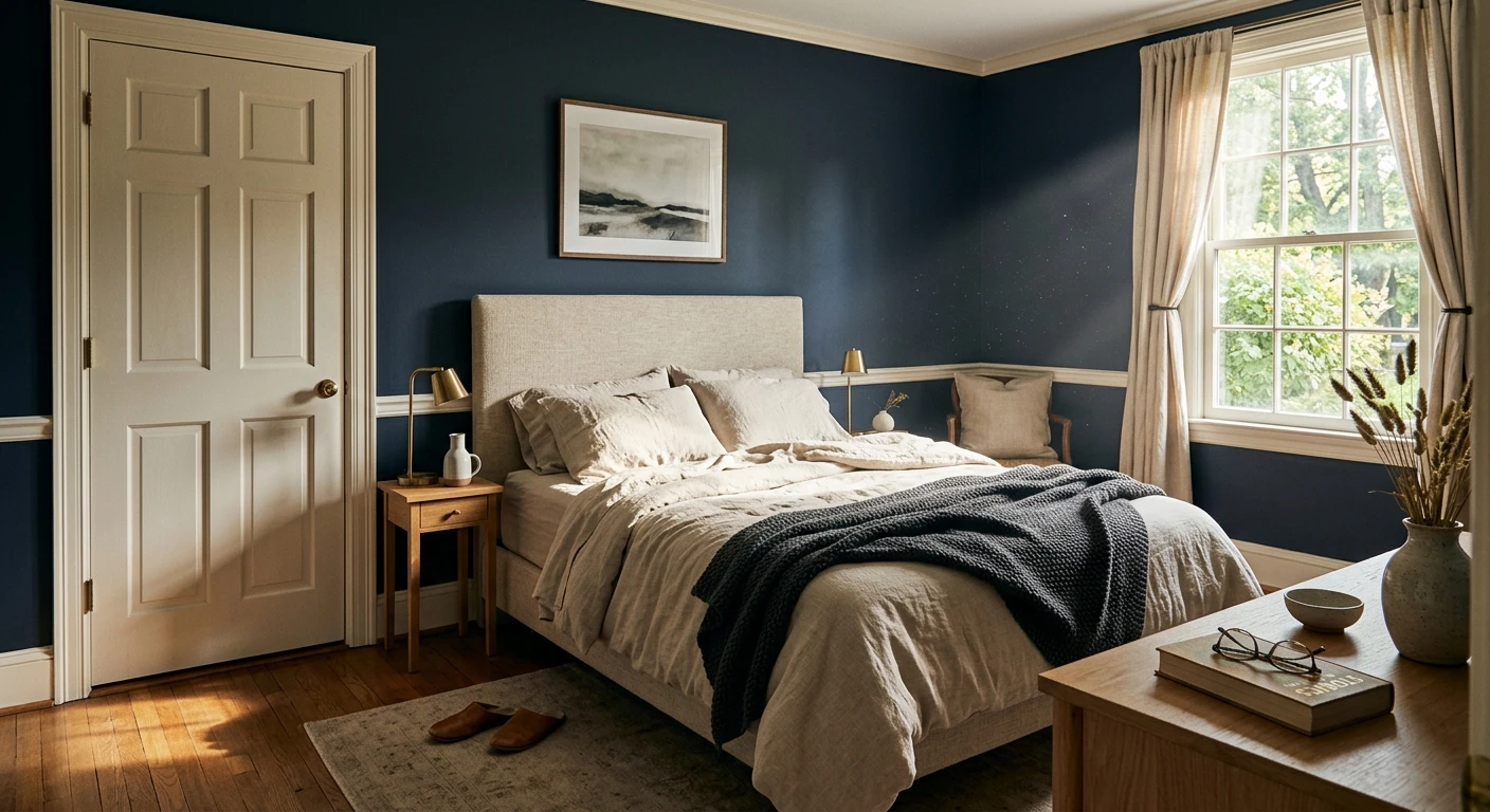
If you love Naval but fear the dark, use it as an accent: a single bedroom feature wall behind the headboard, a kitchen island, a run of lower cabinets, or a built-in bookcase. Against white walls and warm wood it reads tailored, not heavy. For broader pairings built around deep blue, our guide to colors that go with navy blue maps out the safe companion shades.
Where to think twice
A small, windowless room with only cool overhead LEDs is where Naval can tip from "moody" to "dim and closed in." It also fights very cool-gray floors, which leave the room cold and flat. If your space is dark to begin with, either lean into it fully (treat the darkness as the design) or step back to a lighter, friendlier blue. Our roundup of blue paint color shades for interiors is a useful map when Naval feels like one step too dark.
Trim, ceiling, and decor pairings
A deep navy lives or dies on contrast. Get the trim and the metals right and Naval looks like a designer did it; get them wrong and it can read flat, cold, or like a half-finished basement.
- Crisp white trim (highest contrast): SW Pure White (SW 7005) or Extra White gives Naval the sharp, current, high-contrast frame most people picture. This is the safe, graphic choice for modern and transitional rooms.
- Warm white trim (softer): SW Alabaster (SW 7008) eases the contrast and makes the room feel collected and traditional rather than stark. Best when you want depth without the hard edge.
- Metals: unlacquered brass, antique gold, and aged bronze are Naval's best friends; they warm up all that cool blue. Polished chrome works in a modern bath but can feel cold paired with the navy.
- Ceilings: a clean warm white keeps a navy room from feeling like a box. Painting the ceiling Naval too (the full envelope look) is gorgeous in a study but commits the room hard, so reserve it for spaces you want fully enclosed.
- Floors and decor: warm oak, white oak, walnut, rattan, brass, marble, and natural linen all reflect warmth back at the navy and bring its blue to life. Cool gray-washed floors do the opposite and can leave the room reading cold.
For a wall-color companion, soft warm whites and greiges balance Naval beautifully across an open plan: paint the focal room Naval, keep the connected walls in a warm neutral. If you want to compare Naval against the other famous navy before you buy, our Benjamin Moore Hale Navy HC-154 review breaks down the differences in undertone and depth.
See walls, trim, and floor together in one preview, free.
Naval vs the colors people confuse it with
Almost every Naval search ends in a comparison with another deep blue. The three that matter most indoors:
| Color | LRV (approx.) | How it differs from Naval |
|---|---|---|
| SW Naval (6244) | 5 | The baseline: deep, cool, slightly muted navy that reads near-black in low light |
| BM Hale Navy (HC-154) | 6 | A touch warmer and softer, the classic cozy navy; reads a hair less crisp than Naval |
| SW Indigo Batik (7602) | 9 | Lighter and slightly grayer-blue, easier in a darker room where Naval feels too heavy |
| SW Tricorn Black (6258) | 3 | A true near-black with no blue; pick this if you wanted black, not navy |
The short version: choose Naval when you want a crisp, slightly muted navy that holds its blue in good light. Choose Hale Navy if you want a hair more warmth and softness. Step up to Indigo Batik if your room is dark and Naval reads too close to black, and go to Tricorn Black if you secretly wanted black all along.
Spelling note: naval sw, naval blue sherwin williams, and sw 6244 all point to this same Naval. The exterior version of the color, for siding and front doors, lives in its own dedicated guide.
How to test Naval before you commit
A 3-inch fan-deck chip is the number-one reason people regret a dark navy: at this LRV the chip cannot show how much the color collapses toward black in shadow, or how alive it gets in sun. Two better methods:
- Paint a large swatch: roll a 2-by-2-foot sample (you need more area for a dark color to read true) on the wall you actually plan to paint, and a second one on a wall that gets the least light. Check both mid-morning, mid-afternoon, and at night under your normal bulbs, and apply a real second coat, since one thin coat of any deep navy looks patchy and wrong.
- Preview it digitally first: upload a real photo of your room and apply Naval (plus a softer Hale Navy and a lighter blue) before you buy any samples, narrowing three contenders to one worth painting. Pricing context for the full repaint, including the extra coats a dark color needs, is in our interior house painting cost guide for 2026.
Preview Naval against a softer and a lighter navy, side by side, free.
Frequently asked questions
What are the undertones of Naval SW 6244?
Naval is a true cool navy with a faint gray-green softening underneath. That muted note keeps it out of bright primary-blue territory and away from the purple cast some navies show. In strong light the clean blue dominates; in low light it retreats and Naval reads as a deep blackened slate, but it never flips to purple or teal, which is why designers trust it.
What is the LRV of Naval, and is it too dark?
Naval has a Light Reflectance Value of about 5, with a hex approximation of #2F3B4C (RGB 47, 59, 76). That makes it a deep, light-absorbing navy that reads near-black in dim light. It is not too dark for a study, dining room, powder room, or accent wall, where the drama is the point, but it can feel closed in for a small, windowless room with only cool overhead light.
What are the best rooms for Naval?
Home offices, studies, libraries, dining rooms, and powder rooms suit Naval best, because they are spaces where cocooning depth is an asset and you often use them at night. It also works beautifully as an accent: a bedroom feature wall, a kitchen island, lower cabinets, or a built-in bookcase. It is least reliable as an all-over color in small, dark rooms with only cool LEDs.
What trim and metals go with Naval?
Crisp white trim such as SW Pure White or Extra White gives the high-contrast, modern frame most people picture, while warm SW Alabaster softens the contrast for traditional rooms. For metals, unlacquered brass, antique gold, and aged bronze warm up the cool navy and look the most expensive; polished chrome reads colder against it.
How is Naval different from Hale Navy?
Naval (SW 6244, LRV about 5) is a crisp, slightly muted cool navy, while Benjamin Moore Hale Navy (HC-154, LRV about 6) reads a touch warmer and softer. Choose Naval for a sharper, cleaner navy that holds its blue in good light; choose Hale Navy for a hair more warmth and cozy depth. Both go near-black in low light. Naval also has a separate published exterior profile for siding and doors.
Preview SW Naval on your actual walls under your own light before buying a single sample.
Disclaimer: Sherwin-Williams, Naval (SW 6244), Indigo Batik (SW 7602), Tricorn Black (SW 6258), Pure White (SW 7005), Extra White, and Alabaster (SW 7008) are trademarks of The Sherwin-Williams Company. Benjamin Moore and Hale Navy (HC-154) are trademarks of Benjamin Moore & Co. FacadeColorizer is an independent paint visualization service and is not affiliated with, endorsed by, or sponsored by Sherwin-Williams or Benjamin Moore. Color reproduction on screens approximates the manufacturer's chip; always confirm with a manufacturer sample under your own light before purchase. Sources: Sherwin-Williams SW 6244 Naval color data 2026, Sherwin-Williams SW 7008 Alabaster and SW 7005 Pure White color data 2026, The Spruce dark-paint and undertone coverage, designer field reports compiled by FacadeColorizer.
Trademarks mentioned (Sherwin-Williams, Benjamin Moore, Behr, Caparol, Brillux, Sto, Alpina, Valspar, PPG, Glidden, Dulux, Crown Trade, Sandtex, Farrow & Ball, Johnstone's, Leyland) are property of their respective owners. FacadeColorizer is independent and not affiliated with any of them. Nominative fair use under Lanham Act §1125.


