
A client once handed me a fan deck open to a stack of whites and said, "every white I roll on looks dirty." That is the exact gap Sherwin-Williams Eider White (SW 7014) was built to fill. It is the off-white people reach for when a clean white feels too stark and a greige feels too gray, an in-between with just enough warmth to read soft and just enough gray to keep it from going cream. The recurring question is the one I get on every white: is Eider White paint actually warm, or is it a gray hiding in the white deck? The answer lives in your light. Here is how it behaves indoors.
Quick orientation before the deep dive. Eider White has a published LRV of about 73 and a hex approximation of #DEDAD0 (RGB 222, 218, 208). That is a soft warm white-gray: light enough to behave like an off-white, but with enough body that it never glares. It sits in the white family with a quiet greige lean, which is why so many designers treat it as the gentle bridge between true white and true gray. This profile is one stop in our wider Sherwin-Williams interior paint colors guide, and it sits next to the broader field in our best white paint for walls guide. Both are useful maps if you are still narrowing the white shortlist.
Upload a photo of your actual room and preview SW Eider White under your own light in about 30 seconds, free.
Eider White at a glance: the numbers that matter
Before opinions, here are the verifiable specs straight from the Sherwin-Williams color library. These are the values you can take to a paint counter:
- SW number: 7014.
- LRV (Light Reflectance Value): approximately 73. Bright enough to act like a white and bounce light, but a clear step softer than a crisp white at LRV 84 plus, so it never feels harsh.
- Hex / RGB: approximately #DEDAD0 / 222, 218, 208. The red channel sits highest and blue lowest, the mathematical signature of a warm tone, but the three values stay close together, which is why it still reads as a near-white rather than a beige.
- Color family: soft warm white-gray, an off-white with a quiet greige lean.
- Undertones: a warm gray-taupe primary with a faint cool whisper that can surface in shade; it is the warmth that keeps it from looking cold and the gray that keeps it from looking cream.
- Tint base: mixed in a white or light base. Push it into a deeper base and you lose the airy LRV 73 read that makes it work.
The takeaway from those numbers: Eider White is a white that leans warm-gray, not a gray pretending to be white. At LRV 73 it is noticeably lighter than a light greige like Repose Gray (LRV 58) yet has more depth and grounding than a bright white. That in-between position is exactly what lets it soften a room without committing to either extreme.
Is Eider White warm or gray? The undertone, decoded
Eider White is a warm color, but it is the most restrained kind of warm. People who call it gray are usually reacting to a north-facing room or to a bright white trim sitting right next to it, which drains the warmth by comparison. Here is what is happening underneath.
The warm gray-taupe base is dominant in most light, gentle enough that the wall reads as a soft, livable off-white rather than an obvious greige. But Eider White also carries a faint cool whisper. In warm or balanced light that cool note stays buried and the wall looks creamy. In cool, indirect light (a north room, deep shade) the warm wavelengths get subtracted and that cool note steps forward, so Eider White can read a half-step grayer and flatter than the chip promised. It will not flip to blue or lavender, which is what makes it a safe pick.
Watch out for one quirk. Eider White photographs cleaner and whiter than it lives, the way most off-whites do on a screen. So if you are judging it from Pinterest alone, assume the real wall will land a half-step warmer and a touch grayer than the image suggests.
| Indoor light | How Eider White reads |
|---|---|
| South-facing (bright, warm) | Soft creamy off-white, its most flattering and luminous read |
| West-facing (warm afternoon) | Leans warmer and creamier in late-day sun, very cozy |
| East-facing (cool after noon) | Warm and bright in the morning, settles to a balanced soft white by afternoon |
| North-facing (cool, indirect) | Reads grayer and a touch flatter; the cool whisper surfaces |
| Artificial light at night | Warm 2700K bulbs read creamy and soft; cool 4000K bulbs push it toward a clean gray-white |
Sources: Sherwin-Williams SW 7014 color data 2026; The Spruce white-paint undertone coverage; designer field reports compiled by FacadeColorizer.
Free AI visualizer. Test Eider White on your real walls before buying a single sample pot.
Best rooms for Eider White
Soft, warm, and bright all at once, Eider White is one of those off-whites you can carry across a whole floor plan without any single room feeling cold. Here are the spaces where it consistently earns its keep:
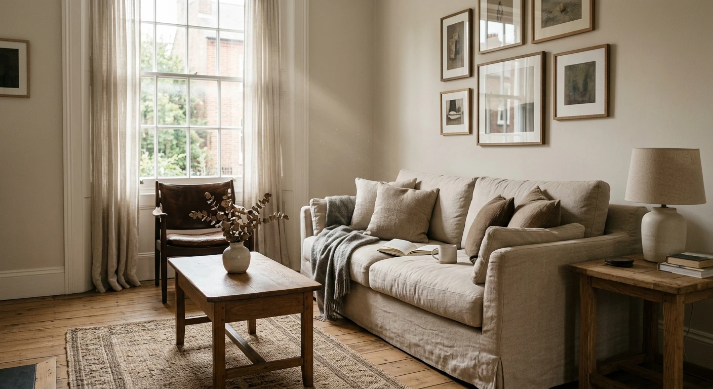
Open-plan living rooms and great rooms
On a large connected wall plane Eider White reads as a calm, luminous backdrop with just enough warmth to feel finished rather than builder-flat. It loves natural materials: warm oak floors, linen, and brass all glow against it. Pair it with a slightly brighter white trim for gentle, intentional contrast. For more whole-room schemes built around soft neutrals, see our top living room paint colors for 2026.
Primary bedrooms
Eider White makes a restful bedroom because the warmth keeps it cozy under lamp light at night, while the gray side keeps it from going nursery-cream. It is the off-white that reads grown-up and quiet rather than babyish. If a bedroom is your project, our guide to calming master bedroom paint colors shows how it sits next to other restful tones.
Trim, cabinets, and whole-home walls
Because it is a soft off-white rather than a stark one, Eider White is a popular choice for trim, doors, and cabinetry, where its low-contrast warmth keeps millwork from screaming. On cabinets it reads timeless rather than trendy, and on a whole main floor it gives that cohesive, light, soft-modern envelope a lot of homes want right now.
Where to think twice
Small, dim, north-facing rooms with no warm light source are where Eider White can fall flat and read slightly gray and cool. A windowless powder room or a basement under cool LEDs mutes its warmth and pushes the cool whisper forward. There, a warmer creamy white like Greek Villa or simply a warmer bulb (2700K) rescues it. To weigh it against the full white shortlist first, our best white paint for walls guide is a useful map.
Trim, ceiling, and decor pairings
An off-white body color lives or dies on what sits next to it. Get the trim right and Eider White looks soft and intentional; get it wrong and it can look dingy or, paired with the wrong bright white, suddenly drab.
- Brighter white trim (most popular): SW Pure White (SW 7005, LRV 84) is the designer default beside Eider White. The gentle step up in brightness gives crisp, low-contrast definition without making the walls look dirty. This is the safe, cohesive pick for most rooms.
- Same color, top to bottom (soft-modern): running Eider White on walls, trim, and ceiling creates that enveloping, shadow-soft look that flatters architecture. Best in rooms with good natural light, where the subtle warmth carries the whole envelope.
- Avoid: a stark blue-white like SW Extra White as trim against Eider White. The cool contrast can make the walls read gray and slightly muddy by comparison.
- Ceilings: a clean bright white or the trim color keeps the room lifted. A heavy cool-white ceiling over Eider White amplifies any cool-light flatness on the walls.
- Floors and decor: warm oak, white oak, rattan, brass, and natural linen reflect warmth back onto the walls and bring out the cream. Cool gray-washed floors do the opposite and can leave Eider White feeling flat.
For contrast and millwork drama, a warm near-black on doors and built-ins reads sophisticated against the soft white, and a true light greige makes a natural transition color in adjoining hallways. If you want to see how Eider White relates to a clear gray on the wall, our SW Repose Gray undertones and best rooms guide is the right next read.
See walls, trim, and floor together in one preview, free.
Eider White vs the colors people confuse it with
Almost every Eider White search ends in a comparison. The three that matter most indoors:
- vs SW Pure White (SW 7005): Pure White is a brighter, cleaner white at LRV 84 with far less gray; Eider White is softer, grayer, and warmer. Choose Eider White when a true white feels too stark, choose Pure White when you want clear, crisp brightness. They also pair together beautifully, walls in Eider, trim in Pure. See our SW Pure White undertones guide for the full read.
- vs SW Repose Gray (SW 7015): Repose Gray is a clear light greige at LRV 58, noticeably darker and more obviously gray. Eider White is the lighter, whiter, more luminous of the two. Pick Repose Gray when you want gray to read as gray, pick Eider White when you want a white with a gray soul.
- vs SW Greek Villa (SW 7551): Greek Villa is a warmer, creamier white with more obvious yellow-cream warmth and a touch more brightness. Eider White is cooler and grayer by comparison. Pick Greek Villa for cozy creamy rooms, Eider White when you want softness without the cream. See our SW Greek Villa undertones guide.
Spelling note: eider white, eider white sherwin williams, and sw eider white 7014 all point to this same SW 7014.
How to test Eider White before you commit
A 3-inch fan-deck chip is the number-one reason people pick a white that disappoints: it reads cleaner and whiter than a rolled wall and cannot show the undertone shift across a day. Two better methods:
- Paint a large swatch: roll a 12-by-12-inch sample on two different walls and check it mid-morning, mid-afternoon, and at night under your normal bulbs. Cut in a clean edge to see how it reads next to your trim, and lay a second coat, since thin off-whites read patchy until fully covered. Watch for cool-light grayness in any dim corner.
- Preview it digitally first: upload a real photo of your room and apply Eider White (plus a brighter and a creamier alternative) before buying any samples, narrowing three contenders to one worth painting. Pricing context for the full repaint is in our interior house painting cost guide for 2026.
Preview Eider White against a brighter and a creamier white, side by side, free.
Frequently asked questions
Is Eider White warm or cool?
Eider White (SW 7014) is a warm color, but a restrained one. It is a soft off-white with a dominant warm gray-taupe undertone and only a faint cool whisper that surfaces in cool, indirect light. In most rooms it reads as a soft creamy off-white; in a north-facing or dimly lit space it can look grayer and a touch flatter, but it never turns blue or lavender the way some grays do.
What is the LRV of Eider White?
Eider White has a Light Reflectance Value of about 73 on the Sherwin-Williams color data, with a hex approximation of #DEDAD0 (RGB 222, 218, 208). That makes it a soft warm white-gray: bright enough to behave like an off-white and bounce light, but with enough depth to feel grounded rather than stark like a high-LRV bright white.
What are the best rooms for Eider White?
Open-plan living rooms, primary bedrooms, and whole-home walls, trim, and cabinetry are where Eider White shines, because its warmth and light reflectance flatter wood and brighter whites together. It is least reliable in small, windowless, or north-facing rooms with only cool light, where it can read gray and flat; a warmer creamy white or a 2700K bulb helps there.
What trim color goes with Eider White?
SW Pure White (SW 7005) is the most popular trim because its gentle step up in brightness gives crisp, low-contrast definition without making Eider White look dirty. Running Eider White on walls, trim, and ceiling for a soft-modern envelope also works in well-lit rooms. Avoid a stark blue-white like Extra White as trim, which can make the walls read gray and muddy by contrast.
Is Eider White a white or a gray?
Eider White is a white that leans warm-gray, not a true gray. At LRV 73 it sits in the off-white family with a soft greige undertone, so it reads clearly lighter and whiter than a light greige like Repose Gray (LRV 58). It is best described as the bridge between a clean white and a true gray, which is exactly why designers use it when both extremes feel wrong.
Preview SW Eider White on your actual walls under your own light before buying a single sample.
Disclaimer: Sherwin-Williams, Eider White (SW 7014), Pure White (SW 7005), Repose Gray (SW 7015), Greek Villa (SW 7551), and Extra White are trademarks of The Sherwin-Williams Company. FacadeColorizer is an independent paint visualization service and is not affiliated with, endorsed by, or sponsored by Sherwin-Williams. Color reproduction on screens approximates the manufacturer's chip; always confirm with a manufacturer sample under your own light before purchase. Sources: Sherwin-Williams SW 7014 Eider White color data 2026, Sherwin-Williams SW 7005 Pure White and SW 7015 Repose Gray color data 2026, The Spruce white-paint undertone coverage, designer field reports compiled by FacadeColorizer.
Trademarks mentioned (Sherwin-Williams, Benjamin Moore, Behr, Caparol, Brillux, Sto, Alpina, Valspar, PPG, Glidden, Dulux, Crown Trade, Sandtex, Farrow & Ball, Johnstone's, Leyland) are property of their respective owners. FacadeColorizer is independent and not affiliated with any of them. Nominative fair use under Lanham Act §1125.


