
Short answer first: Sherwin-Williams Kilim Beige (SW 6106) is a warm, true tan beige, not a greige and not a gray. It carries a soft pink-gold warmth that makes it one of the friendliest beiges Sherwin-Williams sells for rooms with oak floors, brick, or honey-toned wood trim. With a published LRV of about 57 it sits in that comfortable mid-light range: bright enough to keep a space open, deep enough to feel cozy rather than washed out. The reason people keep searching it, spelled a dozen different ways, is that it can swing from a clean warm tan to an almost dusty rose depending on the light. Here is exactly how it behaves indoors, the rooms it flatters, and how it differs from the greige everyone cross-shops it against.
Quick orientation before the deep dive. Kilim Beige has an LRV near 57 and a hex approximation of #CFBFA9 (RGB 207, 191, 169). That makes it a warm tan beige with a subtle pink-gold undertone and only a faint green-gray in the wings. It is noticeably warmer and more clearly beige than the popular Accessible Beige, which leans greige. This profile is one stop in our wider Sherwin-Williams interior paint colors guide, and it sits in the same warm-neutral family as our beige paint colors and undertones guide. If LRV is a new term to you, our guide to LRV and light reflectance value explains why the number matters more than the chip.
Upload a photo of your actual room and preview SW Kilim Beige under your own light in about 30 seconds, free.
Kilim Beige at a glance: the numbers that matter
Before opinions, here are the verifiable specs straight from the Sherwin-Williams color library. These are the values you can take to a paint counter:
| Spec | Kilim Beige SW 6106 |
|---|---|
| SW number | 6106 |
| LRV (Light Reflectance Value) | About 57: light enough to feel open, low enough to feel warm and grounded |
| Hex / RGB (approx) | #CFBFA9 / 207, 191, 169: red highest, blue lowest, the signature of a warm beige |
| Color family | Warm tan beige (true beige, not greige), with a soft pink-gold lean |
| Undertones | Pink-gold warmth primary, with a faint green-gray that can surface in cool, shaded light |
| Tint base | Mixed in a light or Extra White base; a deep base reads muddy and misses LRV 57 |
The takeaway from those numbers: Kilim Beige is a real beige with warmth you can see, not a hedge-your-bets greige. At LRV 57 with a pink-gold undertone, it reads clearly warmer and more beige than Accessible Beige (SW 7036), and far warmer than a cool gray such as Agreeable Gray (SW 7029). It belongs to the broad warm-neutral family covered in our greige paint colors guide, but it sits at the beige end of that range rather than the gray end. That pink-gold warmth is exactly what makes it sing next to oak, brick, and travertine.
Is Kilim Beige warm or cool? The undertone, decoded
Kilim Beige is a warm color, full stop. Anyone who calls it cool is usually reacting to a north-facing room or a stark white trim sitting right next to it. Here is what is happening underneath.
The pink-gold base is dominant in most light. That faint rosy warmth is the color's signature, and it is what separates Kilim Beige from a flat, yellow tan. In warm or balanced light the wall reads as a soft, inviting tan with a gentle glow. But Kilim also carries a whisper of green-gray underneath, the same softening pigment found in many tan beiges. In cool, indirect light, a north room, an overcast afternoon, deep shade, the warm wavelengths get subtracted and that residual green-gray can step forward, making the wall look slightly dustier or duller than the chip promised. In strong warm light the opposite happens: the pink can bloom enough to read almost rose, which surprises people expecting a plain neutral.
Watch out for one quirk. Kilim Beige photographs more neutral and grayer than it lives. So if you are judging it from Pinterest photos alone, assume the real wall will land warmer, pinker, and a touch deeper than the image suggests. That is the number-one reason people are surprised after the first coat goes up.
| Indoor light | How Kilim Beige reads |
|---|---|
| South-facing (bright, warm) | Glowing warm tan; the pink-gold can bloom toward soft rose in strong sun |
| West-facing (warm afternoon) | Rich, golden tan in late-day sun, its coziest read |
| East-facing (cool after noon) | Warm and pink-gold in the morning, settling to a balanced tan by afternoon |
| North-facing (cool, indirect) | Quieter and a touch dustier; the faint green-gray can surface |
| Artificial light at night | Warm 2700K bulbs read cozy and golden; cool 4000K bulbs flatten it toward a plain tan |
Sources: Sherwin-Williams SW 6106 color data 2026; The Spruce neutral-paint undertone coverage; designer field reports compiled by FacadeColorizer.
Free AI visualizer. Test Kilim Beige on your real walls before buying a single sample pot.
Best rooms for Kilim Beige
Warm, light, and quietly rosy all at once, Kilim Beige is a natural fit for rooms with wood and stone you cannot or do not want to change. Here are the spaces where it consistently earns its keep:
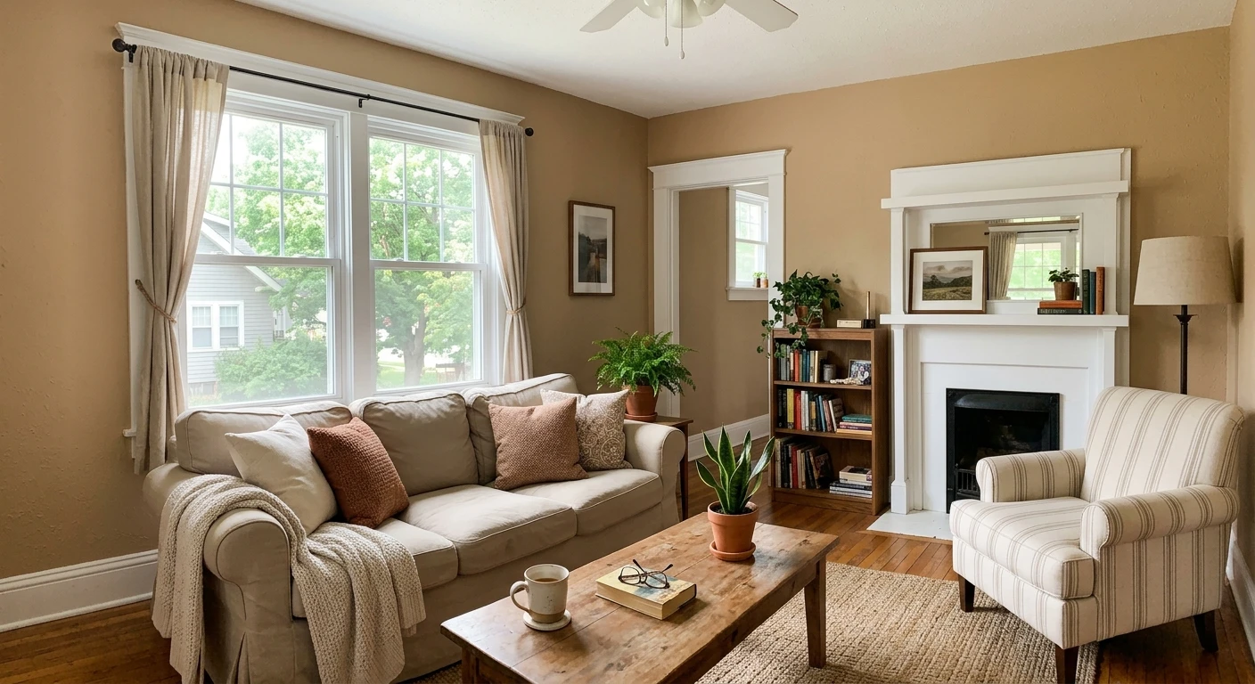
Living rooms with oak floors or wood trim
This is Kilim Beige's home turf. Its pink-gold warmth echoes honey oak, white oak, and golden wood tones instead of fighting them, which is why it is a go-to in homes with builder-grade wood trim that is not changing soon. On a connected wall plane it reads as a calm, warm backdrop that lets furniture and art carry the room. For more whole-room schemes built around warm neutrals, see our top living room paint colors for 2026.
Primary bedrooms
Kilim Beige makes a genuinely restful bedroom because the warmth stays cozy under lamp light at night, and the LRV near 57 makes it feel a little more enveloping than a paler beige. Think warm, grown-up retreat. If a bedroom is your project, our guide to calming master bedroom paint colors shows how it sits next to other restful neutrals.
Open hallways, stairwells, and great rooms
Because it forgives wood and stone so well, Kilim Beige is a strong whole-floor color for connected hallways, stairwells, and great rooms where you want one warm tone to carry. It pairs beautifully with travertine, beige stone, and brick, which is why it shows up so often in transitional and traditional homes.
Where to think twice
Small, dim, north-facing rooms with only cool light are where Kilim Beige can drift dusty and slightly muddy as the green-gray surfaces. It can also clash with cool gray-blue tile, stark white quartz, or gray-washed floors, where its warmth reads orange or pink by comparison. In those rooms a grayer, more neutral pick behaves better; our Accessible Beige undertones guide covers the closest greige alternative.
Trim, ceiling, and decor pairings
A warm beige body color lives or dies on what sits next to it. Get the trim right and Kilim Beige looks intentional; pair it with the wrong white and it can look dingy, or push pink.
- Warm trim (most harmonious): SW Alabaster (SW 7008, LRV 82) is the designer default. Its soft cream bias flatters Kilim Beige's warmth instead of exposing it, and the contrast stays gentle and cohesive. The safe pick for traditional and transitional rooms.
- Creamy trim (classic with wood): SW Creamy (SW 7012) keeps the whole scheme warm and works especially well alongside honey oak and brick.
- Avoid: a stark blue-white like SW Extra White next to Kilim Beige. The cool contrast can make the walls read pink or muddy and slightly dirty by comparison.
- Ceilings: a clean warm white (or the trim color) keeps the room bright. A heavy cool-white ceiling over Kilim Beige amplifies any cool-light dustiness.
- Floors and decor: honey oak, white oak, walnut, rattan, brick, travertine, and natural linen reflect warmth back and bring out the pink-gold. Cool gray-washed floors and blue-gray tile do the opposite and can leave the room feeling off.
For accents and millwork drama, a warm near-black such as SW Iron Ore or a deep bronze like SW Urbane Bronze on doors and built-ins reads grounded and sophisticated against the soft tan. On hardware, aged brass and oil-rubbed bronze warm it further, while polished chrome and matte black pull it toward its quieter, more neutral side.
See walls, trim, and floor together in one preview, free.
Kilim Beige vs Accessible Beige and the colors people confuse it with
Almost every Kilim Beige search ends in a comparison, and the one that matters most is Accessible Beige. They are not the same color and they do not behave the same way.
| Color | LRV | Read and best use |
|---|---|---|
| Kilim Beige SW 6106 | ~57 | Warm true tan with pink-gold; best with oak, brick, and stone you keep |
| Accessible Beige SW 7036 | ~58 | Grayer, more neutral greige; the safer pick next to cool grays and modern finishes |
| Agreeable Gray SW 7029 | ~60 | Lighter, cooler greige; choose when you want gray to stay reading as gray |
- vs SW Accessible Beige (SW 7036): Nearly identical in lightness (LRV 58 vs 57), but Accessible Beige is grayer and more neutral while Kilim Beige is warmer and clearly more beige with that pink-gold lean. Choose Kilim when your room is full of warm wood, brick, or stone you want to flatter; choose Accessible Beige when you have cooler grays, modern finishes, or want a more hedge-your-bets neutral. Our Accessible Beige undertones guide walks through that decision in detail.
- vs SW Agreeable Gray (SW 7029): Agreeable is lighter (LRV 60), cooler, and a true greige. Pick Agreeable when you want gray to stay reading as gray; pick Kilim when you want unmistakable warmth. Our Agreeable Gray undertones guide compares them side by side.
- vs SW Macadamia (SW 6142): Macadamia is a touch darker and more clearly tan-brown. Kilim Beige stays a half-step lighter and keeps more of its pink-gold softness, making it the more flexible whole-room option.
Spelling note: killim beige, kilim beige sw 6106, and kilim beige sherwin williams all point to this same SW 6106.
How to test Kilim Beige before you commit
A 3-inch fan-deck chip is the number-one reason people pick a beige that disappoints: it reads more neutral and grayer than a rolled wall and cannot show the pink-gold bloom or the cool-light dust across a day. Two better methods:
- Paint a large swatch: roll a 12-by-12-inch sample (or a peel-and-stick sample) on two different walls and check it mid-morning, mid-afternoon, and at night under your normal bulbs. Watch for the pink to bloom in warm afternoon sun and for any dustiness in a dim corner.
- Preview it digitally first: upload a real photo of your room and apply Kilim Beige (plus a grayer and a warmer alternative) before you buy any samples, narrowing three contenders to one worth painting. Pricing context for the full repaint is in our interior house painting cost guide for 2026.
Preview Kilim Beige against a grayer and a warmer neutral, side by side, free.
Frequently asked questions
Is Kilim Beige warm or cool?
Kilim Beige (SW 6106) is a warm color. It is a true tan beige with a dominant pink-gold undertone and only a faint green-gray that can surface in cool, indirect light. In most rooms it reads as a soft, inviting warm tan; in a north-facing or dimly lit space it can look slightly dustier, and in strong sun the pink can bloom toward soft rose.
What is the LRV of Kilim Beige?
Kilim Beige has a Light Reflectance Value of about 57 on the Sherwin-Williams color data, with a hex approximation of #CFBFA9 (RGB 207, 191, 169). That makes it a mid-light warm beige: bright enough to keep a room open, but with enough depth to feel cozy and grounded rather than washed out.
What is the difference between Kilim Beige and Accessible Beige?
They are close in lightness (Kilim ~57, Accessible Beige ~58) but different in character. Kilim Beige is warmer and clearly more beige with a pink-gold lean, which flatters oak, brick, and stone. Accessible Beige (SW 7036) is grayer and more neutral, a safer greige next to cool grays and modern finishes. Choose Kilim for warm wood-filled rooms and Accessible Beige for cooler or more contemporary ones.
What are the best rooms for Kilim Beige?
Living rooms with oak floors or wood trim, primary bedrooms, and open hallways, stairwells, and great rooms are where Kilim Beige shines, because its warmth flatters wood, brick, and stone. It is least reliable in small, windowless, or north-facing rooms with only cool light, and it can clash with blue-gray tile or stark white quartz.
What trim color goes with Kilim Beige?
SW Alabaster (SW 7008) is the most harmonious trim because its soft cream bias flatters Kilim Beige's warmth. SW Creamy (SW 7012) is another warm option that works well with honey oak and brick. Avoid a stark blue-white like Extra White next to it, which can make the walls read pink or dingy by contrast.
Preview SW Kilim Beige on your actual walls under your own light before buying a single sample.
Disclaimer: Sherwin-Williams, Kilim Beige (SW 6106), Accessible Beige (SW 7036), Agreeable Gray (SW 7029), Macadamia (SW 6142), Alabaster (SW 7008), Creamy (SW 7012), Extra White, Iron Ore, and Urbane Bronze are trademarks of The Sherwin-Williams Company. FacadeColorizer is an independent paint visualization service and is not affiliated with, endorsed by, or sponsored by Sherwin-Williams. Color reproduction on screens approximates the manufacturer's chip; always confirm with a manufacturer sample under your own light before purchase. Sources: Sherwin-Williams SW 6106 Kilim Beige color data 2026, Sherwin-Williams SW 7036 Accessible Beige and SW 7029 Agreeable Gray color data 2026, The Spruce neutral-paint undertone coverage, designer field reports compiled by FacadeColorizer.
Trademarks mentioned (Sherwin-Williams, Benjamin Moore, Behr, Caparol, Brillux, Sto, Alpina, Valspar, PPG, Glidden, Dulux, Crown Trade, Sandtex, Farrow & Ball, Johnstone's, Leyland) are property of their respective owners. FacadeColorizer is independent and not affiliated with any of them. Nominative fair use under Lanham Act §1125.


