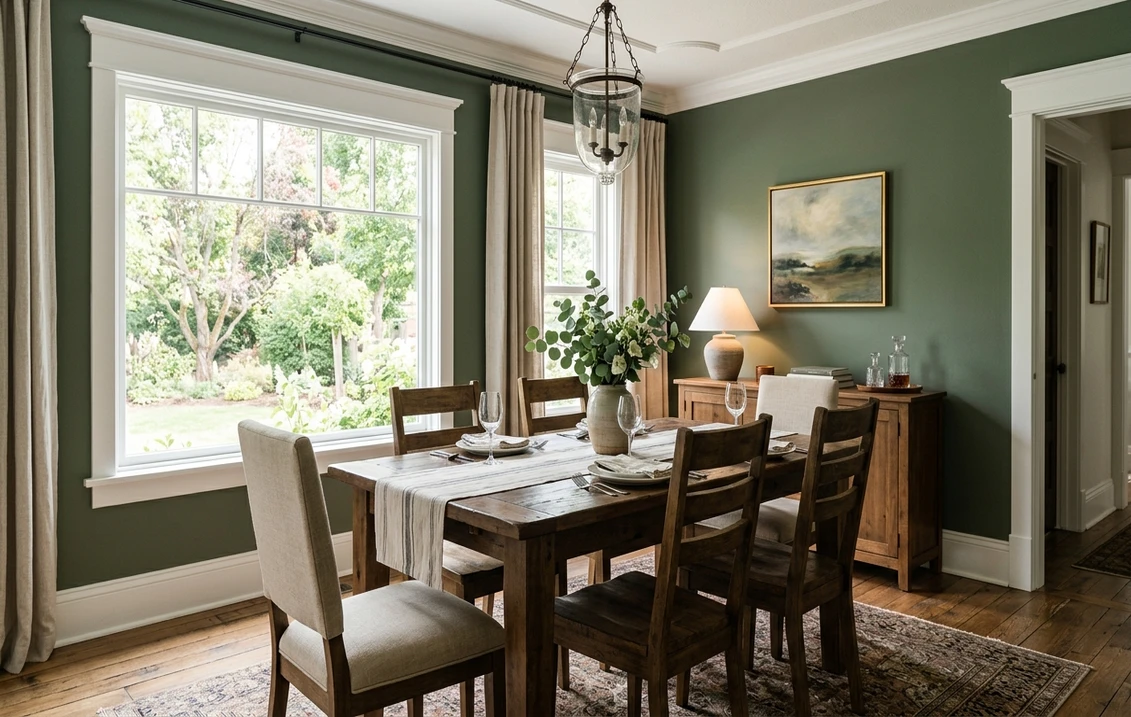

Sherwin-Williams Rosemary (SW 6187) is the green you reach for when a soft sage is not enough. It is a deep, grounded green with a gray heart, the kind of color that turns a dining room or a study into something that feels considered rather than decorated. In a sunlit room it reads like a mature, herbal sage. After dusk, under lamplight, it sinks toward a near-forest green that wraps the walls and makes the room feel smaller and warmer on purpose. That dramatic swing is the whole appeal, and it is also the thing that catches people off guard when they hold a tiny chip up to a bright window and assume it will stay that bright.
This profile is for the homeowner already leaning toward Rosemary: what its undertones actually are, the published LRV and why such a low number changes every decision you make around it, the rooms it flatters, how it behaves under each orientation and bulb temperature, and the trim that keeps it crisp instead of muddy. It is one of the deeper greens in our wider Sherwin-Williams interior paint colors guide, and you can see where saturated greens fit in our best interior paint colors for 2026 roundup.
Upload one photo and preview SW Rosemary under your room's actual light in about 30 seconds, free.
The numbers behind Rosemary SW 6187
Start with the published data. With a deep color like this, the LRV predicts the wall far better than the fan-deck chip does, because dark colors read very differently at chip scale than at wall scale. These figures come from the Sherwin-Williams color tools:
| Spec | Value |
|---|---|
| SW code | SW 6187 Rosemary |
| HEX (screen approximation) | #5B6151 |
| RGB approximation | 91, 97, 81 |
| LRV (Light Reflectance Value) | 12 |
| Hue family | Deep sage green with a gray base and a faint warm cast |
| Color strip | Same SW strip as Dried Thyme (SW 6186), one step deeper |
| Closest SW relatives | Pewter Green (SW 6208), Dried Thyme (SW 6186), Rookwood Sage (SW 2812) |
Sources: Sherwin-Williams SW 6187 Rosemary color data, retrieved 2026; The Spruce paint undertone references.
The LRV of 12 is the headline. That is a genuinely dark color, reflecting only about 12 percent of the light that hits it. For comparison, a light sage like SW Sea Salt sits at 63 and a soft greige hovers in the 50s. At 12, Rosemary will swallow light, not bounce it, which means it is built for drama and depth, not for brightening a room. In a space with little natural light it can read almost charcoal-green after dark; in a bright room it holds its herbal sage character through the day. That single number tells you Rosemary belongs in rooms where you want to be enveloped, not in a dim hallway you were hoping to open up. For a green you can use at near-white scale instead, the airy end of the family lives in our SW Sea Salt profile.
Rosemary's undertones: green over gray, with a warm whisper
Rosemary is not a pure, saturated green. It is a green built on a gray foundation, which is what keeps it sophisticated rather than loud. Three things are happening in the can at once:
- The dominant green. The hue itself is unmistakably herbal, the dusty green of the namesake plant rather than a clean grass or emerald. It is muted, never electric, which is why it works on big walls without overwhelming.
- The gray base. Under the green sits a substantial gray that tones everything down. That gray is why Rosemary never reads as a children's-room green; it adds maturity and lets the color sit quietly beside neutrals and woods.
- A faint warm cast. Compared to a cooler green-gray, Rosemary carries a slight warmth, a barely-there olive lean that keeps it from feeling cold or clinical. It is not as warm or olive as Pewter Green, but it is warmer than a true blue-green.
Because the green is muted and the value is so dark, the room's light moves Rosemary less in hue than it moves it in apparent depth. The bigger swing is how dark it looks, not which color it becomes. The interior color families guide explains why deep neutrals behave this way. Typical behavior across the four Northern Hemisphere orientations:
| Room orientation | Daylight character | How Rosemary reads |
|---|---|---|
| South-facing | Warm, abundant midday light | Brightest, greenest version, a rich living herbal sage with the warm cast showing |
| West-facing | Cool by day, very warm at sunset | Gray-green and deep by day, glowing warm forest green in late-afternoon sun |
| East-facing | Warm early sun, neutral later | Lively green in the morning, settling darker and grayer by afternoon |
| North-facing | Cool, indirect, no direct sun | Darkest and coolest version, the gray base dominates, can read near charcoal-green |
Sources: American Institute of Architects daylight reference; Sherwin-Williams SW 6187 color data; designer field notes on deep green paints.
Bulb temperature matters just as much as orientation here. A warm 2700K lamp pushes Rosemary toward its cozy, slightly olive forest side, which is usually the read people want at night in a study or dining room. A cooler 4000K bulb pulls the gray base forward and can make it feel flatter and more slate-green. Daylight LEDs above 5000K tend to drain the warmth and emphasize the gray, so reserve those for task corners rather than whole-room ambience. If you want a green that holds far closer to one read across light, the lighter and more even SW Dried Thyme on the same strip is the steadier choice.
The rooms Rosemary was made for
A deep green at LRV 12 is a commitment color, and it rewards rooms where you want depth and intimacy rather than brightness. That steers it toward a clear set of spaces:
- Dining rooms: the natural home for Rosemary. Deep green flatters skin tones in candlelight and lamplight, makes food and table settings pop, and turns an ordinary dining room into the kind of room people compliment. It is a top choice for moody, dinner-party walls.
- Home offices and studies: the gray-grounded green reads focused and calm, an ideal backdrop for built-in shelving and dark wood. It photographs well on video calls and hides the visual clutter of a working room.
- Kitchen cabinets: Rosemary is a strong cabinet green, especially on lowers or an island under crisp white uppers and warm wood or brass hardware. It reads custom and timeless rather than trendy. Our guide to green kitchen cabinet paint colors shows how deep sages like this pair with counters and metals.
- Powder rooms: a small windowless bath is exactly where a dark color shines, because you are not fighting to brighten it anyway. Rosemary plus a brass mirror and a stone vanity top makes a jewel-box powder room.
- Accent walls and built-ins: in a brighter living room, Rosemary on a single fireplace wall or a bank of bookshelves adds depth without committing the whole space to a dark green.
Where to be careful: do not use Rosemary to try to make a dim, north-facing room feel bigger; at LRV 12 it will only deepen the gloom. And in a large open-plan great room, wall-to-wall Rosemary can feel heavy, so many designers use it on a single anchor wall or in a defined zone instead. If you are budgeting the repaint, our interior house painting cost guide covers what a deep, multi-coat color like this realistically runs, since dark greens often need an extra coat for even coverage.
Free AI visualizer: test Rosemary on a dining wall, office, or on cabinets before you buy a sample.
Trim, ceiling, and coordinating colors
With a color this deep, the contrast you set with trim decides the whole mood. High contrast makes Rosemary crisp and architectural; low contrast makes it enveloping and cocoon-like. Both are valid, and Sherwin-Williams has clean partners for each direction:
- Crisp, high-contrast trim: Sherwin-Williams Pure White (SW 7005, LRV 84) or Extra White (SW 7006, LRV 86). A bright white frames Rosemary sharply, the classic look for paneled dining rooms and cabinet fronts where you want the green to read deliberate and tailored.
- Warmer, softer trim: SW Alabaster (SW 7008, LRV 82). A creamy white that lowers the contrast a notch and warms the whole scheme, good when you want Rosemary cozy rather than sharp.
- Tone-on-tone, low-contrast: a lighter green like Dried Thyme (SW 6186) on trim or an adjacent wall keeps the room immersive and quiet, a more enveloping take.
- Ceiling: a flat white ceiling lifts the room and keeps a dark-walled space from feeling boxed in. Painting the ceiling Rosemary too is a bold cocoon move that only works in a room with good light and decent height.
- Coordinating accents: warm woods (white oak, walnut), brass and aged-brass hardware, cream and oatmeal textiles, and warm terracotta or rust accents all sing against Rosemary. Cool chrome and stark gray-blue accents can fight its warm side.
For the adjoining rooms, ground Rosemary with a warm neutral so the green feels intentional rather than abrupt. A greige like SW Agreeable Gray in the connecting spaces lets Rosemary be the moment without the whole floor going dark. If you are weighing whether to source the color from one brand or another, our Sherwin-Williams vs Benjamin Moore interior comparison covers how the two brands' deep colors cover and wear.
Rosemary vs the greens people cross-shop
Rosemary lives in a crowded neighborhood of deep SW sages, and the near-twins are close enough that the wrong sample is a real risk. Here is how it separates from the three colors shoppers most often line up beside it:
- vs SW Pewter Green (SW 6208, LRV 12): the most common cross-shop, and the closest in value. Pewter Green is the warmer, slightly more olive and earthy of the two; it is the cabinet green that went viral. Rosemary is a hair cooler and a touch more straightforwardly green-over-gray, reading a little fresher and less olive. They sit at nearly the same LRV, so the choice is purely about that olive-versus-clean-green lean. Sample both side by side, because in some lights they nearly merge.
- vs SW Dried Thyme (SW 6186, LRV around 22): these two are on the same SW color strip, with Dried Thyme one step lighter. Dried Thyme is a dustier, more muted mid-tone sage that brightens a room where Rosemary darkens it. If you love the family but find Rosemary too heavy for your light, Dried Thyme is the built-in step up in value. Choose Rosemary for drama, Dried Thyme for an everyday livable sage.
- vs SW Rookwood Sage (SW 2812, LRV around 19): a historic-collection sage that is warmer, more golden-olive, and a bit lighter than Rosemary. Rookwood Sage leans traditional and slightly yellow-green, where Rosemary stays cooler and grayer. Pick Rookwood Sage for a period or craftsman feel, Rosemary for a more modern, grounded green.
If after these comparisons you find you actually want a deeper green-gray cabinet color with more olive, our SW Pewter Green profile and our SW Dried Thyme profile walk through each in the same detail, so you can land on the exact green before you open a can.
How to test Rosemary before you commit
A dark color is the worst case for a fan-deck chip. At chip scale, the small area surrounded by white makes Rosemary look lighter and grayer than it ever will at wall scale, where the color stacks on itself and deepens considerably. The reliable physical method is a large peel-and-stick sample (Sherwin-Williams sells one) taped to at least two walls and viewed mid-morning, mid-afternoon, and after dark under your actual bulbs; the after-dark, lamp-lit version is the one you will live with in a dining room or study, and it is always darker than the daytime chip suggests. The faster, no-paint first pass is a digital visualizer: upload a photo of the room and apply Rosemary beside Pewter Green and a lighter sage like Dried Thyme to see how dark your specific light makes each one, ruling out the greens that were never going to work in your space.
Preview Rosemary beside Pewter Green and a lighter sage under your real light, free.
Frequently asked questions
What undertones does SW Rosemary have?
Rosemary (SW 6187) is a deep sage green built on a substantial gray base, with a faint warm, slightly olive cast. The green is muted and herbal rather than bright or grassy, and the gray foundation is what keeps it looking sophisticated and grown-up. It is warmer than a true blue-green but cooler and less olive than its close relative Pewter Green. In warm light the green and the faint warmth show; in cool or north light the gray base takes over and it reads darker and more slate-green.
What is the LRV of SW Rosemary?
Rosemary has a Light Reflectance Value of 12, which makes it a genuinely dark color that absorbs light rather than reflecting it. For context, a light sage like Sea Salt sits at 63. At LRV 12, Rosemary is built for depth and drama in rooms like dining rooms, studies, and powder rooms, and it will read near charcoal-green in low or north light. It is not a color for brightening a dim room; it is a color for making a room feel deeper and more enveloping.
What trim color goes with Rosemary?
For a crisp, high-contrast look, Sherwin-Williams Pure White (SW 7005, LRV 84) or Extra White (SW 7006) frames Rosemary sharply, the classic choice for paneled dining rooms and cabinet fronts. For a softer, warmer scheme, SW Alabaster (SW 7008) lowers the contrast and cozies the room up. A flat white ceiling keeps a dark-walled room from feeling boxed in. Warm woods, brass, and cream textiles all flatter it.
What is the difference between Rosemary and Pewter Green?
They sit at nearly the same LRV (both around 12), so the difference is the lean, not the depth. Pewter Green (SW 6208) is the warmer, more olive and earthy of the two, the cabinet green that went viral. Rosemary (SW 6187) is a hair cooler and reads a little more straightforwardly green-over-gray, slightly fresher and less olive. They can nearly merge in some lights, so sample both side by side. Choose Pewter Green for an earthy olive lean, Rosemary for a cleaner deep sage.
Is Rosemary good for a north-facing room?
It can be, but go in with eyes open. In north light, Rosemary's gray base dominates and the color reads at its darkest and coolest, close to a charcoal-green. That works beautifully if you want a cozy, enveloping study or dining room, but it will make an already dim room feel even smaller. Lean on warm 2700K bulbs to bring back its herbal warmth at night, and use crisp white trim to keep some contrast in the space.
See SW Rosemary under your real light, beside Pewter Green and a lighter sage, before you buy. One free HD preview plus 3 variations.
Disclaimer: Sherwin-Williams and SW 6187 Rosemary are trademarks of The Sherwin-Williams Company. Benjamin Moore and Behr are trademarks of their respective owners. FacadeColorizer is an independent paint visualization service and is not affiliated with, endorsed by, or sponsored by Sherwin-Williams, Benjamin Moore, or Behr. Screen color approximates the manufacturer's sample; always confirm with a physical sample before purchase. Sources: Sherwin-Williams SW 6187 Rosemary color data 2026, Sherwin-Williams Pewter Green SW 6208, Dried Thyme SW 6186, and Rookwood Sage SW 2812 color data, Sherwin-Williams Pure White SW 7005 and Alabaster SW 7008 color data, The Spruce paint undertone references, and designer field notes on deep green paints.
Trademarks mentioned (Sherwin-Williams, Benjamin Moore, Behr, Caparol, Brillux, Sto, Alpina, Valspar, PPG, Glidden, Dulux, Crown Trade, Sandtex, Farrow & Ball, Johnstone's, Leyland) are property of their respective owners. FacadeColorizer is independent and not affiliated with any of them. Nominative fair use under Lanham Act §1125.


