
Sherwin-Williams Soft Sage (SW 9647) is the green you reach for when you want sage but not a statement. It is muted, slightly grayed, and quietly warm, the kind of color that looks like it has always been on the wall rather than freshly chosen. Where a brighter sage announces itself, Soft Sage settles into a room like a worn linen napkin. That restraint is its whole appeal, and it is also why so many people sample three near-identical SW greens and cannot tell them apart on a tiny chip.
This profile is for the homeowner choosing between Soft Sage and its lookalikes: what undertone it actually carries, its published LRV, how it behaves in north versus south light, the rooms it flatters, the trim that keeps it clean, and the two SW greens it gets confused with most. It is one of the muted hues in our wider Sherwin-Williams interior paint colors guide, and you can see where soft greens rank in our best interior paint colors for 2026 roundup.
Upload one photo and preview SW Soft Sage under your room's actual light in about 30 seconds, free.
The numbers behind Soft Sage SW 9647
Start with the published data; these figures predict the wall far better than a fan-deck chip seen under store light. They come from the Sherwin-Williams color tools:
| Spec | Value |
|---|---|
| SW code | SW 9647 Soft Sage |
| HEX (screen approximation) | #C3C7B4 |
| RGB approximation | 195, 199, 180 |
| LRV (Light Reflectance Value) | 53 |
| Hue family | Muted gray-green sage with a soft warm cast |
| Closest SW cousins | Svelte Sage (SW 6164), Softened Green (SW 6177), Coastal Plain (SW 6192) |
Sources: Sherwin-Williams SW 9647 Soft Sage color data, retrieved 2026; The Spruce paint undertone references.
The LRV of 53 is the spec that defines Soft Sage's personality. It sits squarely in the middle of the scale: light enough to keep a room feeling open and easy, yet dark enough to read as a genuine color with body rather than a tinted off-white. That is the difference between Soft Sage and the wispy spa-sages people often cross-shop. It is also a full step lighter than a true enveloping green like SW Evergreen Fog (LRV 30), which is why Soft Sage feels relaxed and airy where a low-LRV green feels cozy and dim. For that moodier direction, our SW Evergreen Fog profile shows how a darker green reshapes the same rooms.
The undertone: a gray-green that leans earthy, not minty
Soft Sage is not a clean, candy green. Its base is a desaturated green with a clear gray pulling it down and a faint warm note keeping it from going cold. That combination is what makes it read as a calm, natural sage rather than a vivid or minty green. Three things to know about how it behaves:
- The gray is doing the heavy lifting. Because so much gray sits in the mix, Soft Sage stays muted and grounded. It almost never reads "bright," which is exactly why it works as a quiet whole-room color instead of an accent.
- A whisper of warmth, not yellow. Unlike sages that tip distinctly yellow-green (more olive or chartreuse), Soft Sage keeps a balanced, slightly warm green that does not turn pea-soup under incandescent light. The warmth shows up most as a softening, not a color shift.
- No blue side. This is the big difference from spa colors like Sea Salt. Soft Sage has essentially no blue in it, so it never flips to a seafoam or aqua read. What you get is sage that drifts between greener and grayer, never green-to-blue.
Because the undertone is balanced rather than extreme, the direction a room faces nudges Soft Sage instead of transforming it, as the colors that go with green guide explains. Typical behavior across the four Northern Hemisphere orientations:
| Room orientation | Daylight character | How Soft Sage reads |
|---|---|---|
| South-facing | Warm, abundant midday light | Greenest and warmest version; the most clearly "sage" read, lively and restful |
| West-facing | Cool by day, very warm at sunset | Grayer and quieter by day, glowing into a warm sage late afternoon |
| East-facing | Warm early sun, neutral later | Green and fresh in the morning, settling to a soft gray-green by afternoon |
| North-facing | Cool, indirect, no direct sun | Coolest and grayest version; the green recedes and it reads as a quiet gray-sage |
Sources: American Institute of Architects daylight reference; Sherwin-Williams SW 9647 color data; designer field notes on muted greens.
The practical takeaway: a north room will gray Soft Sage out, sometimes enough that the green nearly disappears into a soft greige. If you want the sage to stay visible there, lean your bulbs warm (2700K) to push the green back forward. In a south or east room you barely need to think about it; the color holds its sage character on its own. Bulb temperature matters as much as the window: under a 2700K warm-white lamp Soft Sage reads its greenest and most relaxed, while a 4000K cool-white drains some warmth and tips it toward gray-green, the version that can feel flat after dark.
The rooms Soft Sage was made for
Because Soft Sage is muted and mid-toned, it is one of the most flexible greens in the SW deck. It does not fight a room, so it slots into spaces where a brighter sage would feel like a commitment:
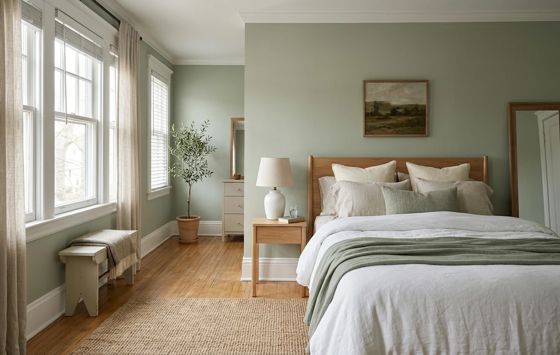
- Bedrooms: the standout use. The grayed-down green is genuinely calming without being cold, and the mid LRV keeps it restful rather than sleepy. It layers beautifully under white, cream, oatmeal, and natural-linen bedding.
- Home offices and studies: green reads as focused and grounded, and Soft Sage's muted character avoids the eye strain of a saturated color on every wall during long work sessions.
- Living rooms, full coverage: unlike many sages that are best as an accent, Soft Sage's restraint lets it work wall to wall in a living room without overwhelming the space, especially with warm wood and brass accents.
- Kitchens, on cabinets: increasingly popular on lower cabinets or an island, where the earthy sage reads custom and timeless against white uppers and warm wood counters. For how the brands' cabinet finishes wear, our Sherwin-Williams vs Benjamin Moore interior comparison covers the durability question.
- Mudrooms and laundry: it hides scuffs better than a flat white and adds quiet character to a hardworking space.
Where to be careful: a dim, north-facing room with no warm lighting can gray Soft Sage out until it looks more dirty-greige than sage, losing the green you chose it for. And in a room with strong yellow-toned wood floors or heavy gold-yellow light, the warmth can stack up and push it slightly olive. Sample both walls before committing. For the bigger picture on choosing among soft greens, see our guide to the best interior green paint shades.
Free AI visualizer: test Soft Sage in a bedroom, office, or on cabinets before you buy a sample.
Trim, ceiling, and decor that keep it clean
Soft Sage is forgiving with white, but the right white still decides whether it reads fresh-sage or dull. Because Soft Sage carries warmth, both bright and creamy whites work; the choice steers the mood:
- Best all-around trim: Sherwin-Williams Pure White (SW 7005, LRV 84). Bright and only faintly warm, it gives Soft Sage a crisp, clean frame and keeps the green looking intentional rather than faded.
- For a warmer, softer scheme: SW Alabaster (SW 7008, LRV 82). A creamy white that flatters Soft Sage's warm side and reads more organic and lived-in, ideal in a bedroom or living room.
- Ceiling: a flat white keeps the room open and lets the sage stay the star. Soft Sage on the ceiling can work in a cottage room with a low LRV like this, but test it first; it can feel heavy in a small space.
- Deeper coordinating tones: for an accent, built-in, or door, step down to SW Svelte Sage (SW 6164) for an in-family olive-gray, or contrast with a warm charcoal like SW Urbane Bronze (SW 7048) for a grounded, modern-organic look.
- Decor and finishes: white oak and warm woods, brass and aged bronze hardware, natural linen, rattan, and terracotta all flatter it. Cold steel-gray accents and stark blue-whites can fight its warmth and make it read muddy.
To flow Soft Sage into adjoining rooms, the easiest partners are warm neutrals and greiges. Our profile of SW Agreeable Gray sits beside Soft Sage cleanly because both share that warm, grounded base, giving you a sage room and a neutral room that read as one palette.
Soft Sage vs the SW greens people confuse it with
This is where most wrong samples happen. Soft Sage has two near-twins in the Sherwin-Williams deck plus one deeper cousin, and on a paper chip they look almost identical. On a wall, the differences are real:
- vs SW Svelte Sage (SW 6164, LRV 30): the deeper, earthier sibling. Svelte Sage is noticeably darker and grayer, a true olive-gray that envelops a room, where Soft Sage stays light and airy. Choose Svelte Sage for a moody study or dining room; choose Soft Sage when you want sage that keeps the room feeling open.
- vs SW Softened Green (SW 6177, LRV 55): the closest in lightness, but cleaner and a touch more clearly green. Softened Green reads a hair fresher and more "mint-adjacent," while Soft Sage is grayer and more muted. If your samples both look right and you cannot decide, Soft Sage is the quieter, more neutral-leaning of the two.
- vs SW Evergreen Fog (SW 9130, LRV 30): a different category. Evergreen Fog is a deep, sophisticated gray-green made famous as a 2022 Color of the Year. It is dramatically darker and reads as a statement color, where Soft Sage is a soft, everyday backdrop. They are not interchangeable: one wraps a room in green, the other lightly tints it.
The simplest way to keep them straight: Soft Sage is the light, grayed, easy one. Softened Green is its slightly cleaner light twin. Svelte Sage is the dark earthy version, and Evergreen Fog is the deep statement green. If a designer or a Pinterest pin just says "sage," that ambiguity is exactly why you should confirm the SW code before sampling. We untangle the SW versus Benjamin Moore green options in our Sherwin-Williams vs Benjamin Moore interior comparison.
How to test Soft Sage before you commit
Soft Sage is a textbook case where a 3-inch fan-deck chip will not tell you enough, because the very thing that defines it (a muted gray-green that drifts between green and gray with the light) is invisible on a tiny sample under store fluorescents near 4000K. The reliable physical method is a large peel-and-stick sample taped to at least two walls and checked mid-morning, mid-afternoon, and after dark under your own bulbs; the after-dark, warm-bulb version is the one you will actually live with most evenings. The faster, no-paint first pass is a digital visualizer: upload a photo of the room and apply Soft Sage beside Softened Green and the deeper Svelte Sage to see which way your light pulls it, ruling out the greens that were never going to work in your space.
Preview Soft Sage beside Softened Green and Svelte Sage under your real light, free.
Frequently asked questions
What undertone does SW Soft Sage have?
Soft Sage (SW 9647) is a muted gray-green with a faint warm cast and essentially no blue. The gray in the mix keeps it grounded and quiet rather than bright or minty, and the touch of warmth stops it from going cold. It reads greenest in warm south light and grays out toward a soft greige in cool north light, but it never flips to a blue or aqua tone the way a spa color like Sea Salt does.
What is the LRV of Soft Sage SW 9647?
Soft Sage has a Light Reflectance Value of 53, a true mid-tone. That is light enough to keep a room feeling open but dark enough to read as a real color with body rather than a tinted white. It is far lighter than a deep statement green like Evergreen Fog (LRV 30), which is why Soft Sage works as an easy whole-room backdrop while Evergreen Fog wraps a room in color.
What is the difference between Soft Sage and Softened Green?
They are very close in lightness (LRV 53 vs 55) but differ in character. Softened Green (SW 6177) is a touch cleaner and more clearly green, while Soft Sage (SW 9647) is grayer and more muted. If you want sage that reads a little fresher, choose Softened Green; if you want the quieter, more neutral-leaning version that almost reads as a green-greige in cool light, choose Soft Sage.
What trim color goes with Soft Sage?
Sherwin-Williams Pure White (SW 7005, LRV 84) is the most reliable all-around trim, giving Soft Sage a crisp, clean frame. For a warmer, more lived-in scheme that flatters Soft Sage's warm side, use SW Alabaster (SW 7008). A flat white ceiling keeps the room open. For an in-family accent, step down to the darker SW Svelte Sage (SW 6164) or contrast with a warm charcoal like Urbane Bronze.
See SW Soft Sage under your real light, beside Softened Green and Svelte Sage, before you buy.
Disclaimer: Sherwin-Williams and SW 9647 Soft Sage are trademarks of The Sherwin-Williams Company. Benjamin Moore and Behr are trademarks of their respective owners. FacadeColorizer is an independent paint visualization service and is not affiliated with, endorsed by, or sponsored by Sherwin-Williams, Benjamin Moore, or Behr. Screen color approximates the manufacturer's sample; always confirm with a physical sample before purchase. Sources: Sherwin-Williams SW 9647 Soft Sage color data 2026, Sherwin-Williams Svelte Sage SW 6164, Softened Green SW 6177, Evergreen Fog SW 9130, Pure White SW 7005 and Alabaster SW 7008 color data, The Spruce paint undertone references, and designer field notes on muted greens.
Trademarks mentioned (Sherwin-Williams, Benjamin Moore, Behr, Caparol, Brillux, Sto, Alpina, Valspar, PPG, Glidden, Dulux, Crown Trade, Sandtex, Farrow & Ball, Johnstone's, Leyland) are property of their respective owners. FacadeColorizer is independent and not affiliated with any of them. Nominative fair use under Lanham Act §1125.


