
Sherwin-Williams Big Chill (SW 7648) is the cool light gray people reach for when every "gray" they tried turned beige, purple, or dingy on the wall. It is genuinely cool, genuinely light, and genuinely quiet, an airy gray with the faintest blue-green whisper that keeps it from going clinical. The name is the giveaway: this is the gray that reads fresh and a little crisp, the one that makes white trim look brilliant and a modern room feel calm rather than cold. The flip side of that coolness is the part that catches people off guard, and that is exactly what this profile is for.
Here you will find how Big Chill's undertone behaves, the published LRV and hex, the rooms it flatters, how its four-walls read changes with orientation and bulb temperature, the trim and decor that keep it crisp, and how it differs from the near-twins shoppers cross-shop against it: Light French Gray, Morning Fog, and Krypton. It is one of the cool grays in our wider Sherwin-Williams interior paint colors guide, and you can see where it sits among the year's picks in our best interior paint colors for 2026 roundup.
Upload one photo and preview SW Big Chill under your room's actual light in about 30 seconds, free.
The numbers behind Big Chill SW 7648
Start with the published data; for a cool light gray these figures predict the wall far better than a 3-inch chip in store light. They come from the Sherwin-Williams color tools:
| Spec | Value |
|---|---|
| SW code | SW 7648 Big Chill |
| HEX (screen approximation) | #DBE0DD |
| RGB approximation | 219, 224, 221 |
| LRV (Light Reflectance Value) | 74 |
| Hue family | Light cool gray with a faint blue-green undertone |
| Color collection | Living Well, Rejuvenate (SW soothing neutrals) |
| Closest SW cousins | Light French Gray (SW 0055), Morning Fog (SW 6255), Krypton (SW 6247) |
Sources: Sherwin-Williams SW 7648 Big Chill color data, retrieved 2026; The Spruce and designer references on cool gray undertones.
The number that defines Big Chill is the LRV of 74. That is a genuinely light gray, well up in the bright end of the scale, only about ten points below a soft white. In practice that means Big Chill behaves more like a "barely there" gray than a true mid-tone: it keeps rooms feeling open and reflective, and it can wash close to off-white in a sun-flooded room. If you want a gray with more visible body and a steadier read, a true mid-tone is a different tool, and our profile of SW Repose Gray (LRV 58) shows how a deeper neutral holds its color where a light one can disappear.
The undertone: cool gray with a blue-green whisper
Big Chill's defining trait is that it is a clean cool gray that mostly avoids the two traps cool grays fall into. Many "grays" carry a hidden violet or blue cast that surfaces under LED and turns the wall faintly lilac or icy. Big Chill instead leans very slightly green within its coolness, a barely-there sage-blue whisper that keeps it reading as a calm, soft gray rather than a stark or purple one. Think of it as the cool gray that stays neutral-feeling instead of swinging cold.
- The clean-gray read. In good balanced daylight, Big Chill reads as exactly what most people want from a light gray: soft, airy, calm, neither warm nor obviously colored. This is the version on the chip.
- The blue read. Under cool, indirect light (a north window, an overcast sky, a 5000K daylight LED), the coolness amplifies and Big Chill can step toward a pale blue-gray, the version that feels crisp in a bath but can feel chilly in a bedroom.
- The soft-green read. Beside warm wood or under a warm bulb, that faint green undertone surfaces just enough to keep the wall from going icy, settling it into a restful gray-sage rather than a cold one.
What you almost never get from Big Chill is the surprise purple that ruins so many gray projects. That reliability is its real selling point. Because the undertone is so light, though, the room's orientation moves it more than it moves a saturated color, much as the interior color families guide describes for any low-chroma neutral. Typical behavior across the four Northern Hemisphere orientations:
| Room orientation | Daylight character | How Big Chill reads |
|---|---|---|
| South-facing | Warm, abundant midday light | Warmest version, softest and most neutral, can wash close to off-white at noon |
| West-facing | Cool by day, very warm at sunset | Clean cool gray by day, briefly warmer and golden late afternoon |
| East-facing | Warm early sun, neutral later | Soft and warm in the morning, settling to a true cool gray by afternoon |
| North-facing | Cool, indirect, no direct sun | Coolest and bluest version, where the chill in the name shows most |
Sources: American Institute of Architects daylight reference; Sherwin-Williams SW 7648 color data; designer field notes on cool light grays.
Bulb temperature matters just as much. Under a warm 2700K bulb at night, Big Chill softens and the faint green keeps it from feeling cold; under a 4000K or 5000K LED it sharpens into its crispest, coolest self. For a bright open room you want to read soft and airy, lean toward 2700K to 3000K bulbs. For a bathroom where you want clean and fresh, a 4000K bulb leans into the blue side. If you want a neutral that holds far steadier across orientation and bulb, our profile of SW Agreeable Gray is the warm-greige counterpoint that barely shifts.
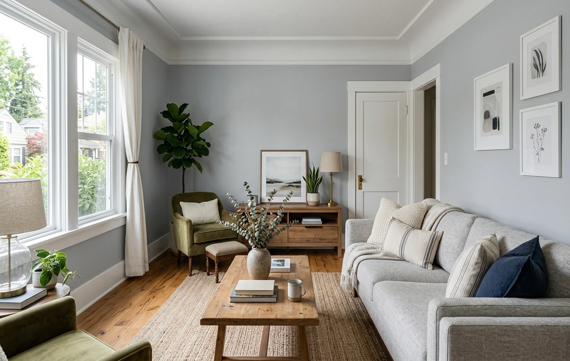
The rooms Big Chill was made for
Big Chill's high LRV and clean coolness point it at light, modern, calming spaces. Its airiness is the whole appeal, so it shines where you want the wall to recede and the light to bounce:
- Living rooms and open-plan main floors: the high LRV keeps a large space bright and the cool gray reads contemporary without going stark. It is a strong whole-floor neutral when you want gray, not greige.
- Bathrooms and powder rooms: the blue side reads clean and spa-fresh against white tile, marble, and chrome or brushed-nickel fixtures, while the faint green keeps it from feeling like a hospital.
- Bedrooms, with warm light: Big Chill can be genuinely restful in a bedroom as long as you keep the bulbs warm; under cool LEDs a north bedroom can tip chilly, so this is a lighting decision.
- Home offices and modern kitchens: the clean cool gray reads sharp and focused, and on cabinets or an island it gives a crisp, custom look against white uppers and stainless or marble.
- Laundry, mudrooms, and hallways: the brightness opens up small or windowless transition spaces, and the gray hides scuffs better than a flat white.
Where to be careful: a north-facing room with cool LED bulbs and little warm decor can push Big Chill toward genuinely cold, the trap its name half-warns you about. A windowless room with warm builder bulbs, on the other hand, can flatten its crispness toward a dull gray. The fix in both cases is to control the bulb and add a warm material or two (wood, brass, linen). Our interior house painting cost guide covers what the repaint itself should run.
Free AI visualizer: test Big Chill in a living room, bath, or on cabinets before you buy a sample.
Trim, ceiling, and decor that keep it crisp
Big Chill is cool, so the white beside it decides whether it reads fresh and modern or flat and cold. The trim should be clearly brighter than the wall (Big Chill's LRV 74 is already high), and ideally clean rather than creamy:
- Best all-around trim: Sherwin-Williams Pure White (SW 7005, LRV 84). Bright and only faintly warm, it gives Big Chill clean contrast without fighting its coolness or going icy. The safest default.
- For the crispest, most modern look: SW Extra White (SW 7006, LRV 86), a cool, true white that doubles down on Big Chill's contemporary edge. Use it when you want sharp, gallery-clean lines.
- To warm the scheme slightly: SW Snowbound (SW 7004, LRV 83), a soft white with a barely-there warmth that takes the chill off a north room without muddying the gray.
- Ceiling: a flat bright white (Pure White or a ceiling white) keeps the room open. Big Chill's high LRV means a tinted ceiling is rarely needed.
- Deeper coordinating tones: for an accent wall, built-in, or vanity, a deep cool charcoal like SW Cyberspace (SW 7076) or a navy like SW Naval (SW 6244) gives a clean, contemporary step down that suits Big Chill's cool family.
- Decor and finishes: white oak and light woods, chrome and brushed nickel, glass, marble, and crisp white textiles all keep it fresh. Heavy warm yellows and orange-toned woods will fight the cool undertone and make it look "off."
If you want a warm neutral in adjoining rooms to balance all that cool, the greiges are the natural partners; a soft greige like Agreeable Gray flows easily beside a clean cool gray without clashing. For a softer, color-shifting cool option in the same airy register, our SW Sea Salt profile shows a blue-green-gray that brings a touch more color to the same kind of calm, light room.
Big Chill vs the cool grays people cross-shop
Big Chill has three near-twins shoppers line up against it, and they are close enough that the wrong sample is an easy mistake. Knowing the LRV and undertone difference saves a repaint:
- vs SW Light French Gray (SW 0055, LRV 53): the most common confusion, because the names sound interchangeable but the colors are not. Light French Gray is a true mid-tone gray, roughly twenty LRV points darker than Big Chill, so it reads as a clearly visible "real" gray with more body and a slightly bluer, more steel-toned cast. Big Chill is the airy, barely-there version; Light French Gray is the one you choose when you want the gray to actually show. If your Big Chill sample looks too pale to read as gray, Light French Gray is usually the answer.
- vs SW Morning Fog (SW 6255, LRV 36): a much deeper cool gray-green, around half the LRV of Big Chill. Morning Fog has a far more pronounced green-gray character and reads as a moody, enveloping mid-deep tone rather than an airy light one. They share a cool sensibility, but Morning Fog is the cozy, dramatic option for a feature wall or a small room you want to feel intimate, where Big Chill keeps things open and light.
- vs SW Krypton (SW 6247, LRV 53): another near-name-twin that is actually a mid-tone. Krypton is a blue-gray with a slightly stronger blue lean and more visible depth, sitting close to Light French Gray in brightness but cooler and bluer. Choose Krypton when you want an unmistakable soft blue-gray with body; choose Big Chill when you want a much lighter, more neutral-feeling cool gray that mostly reads as "clean gray" rather than "blue."
The simplest way to keep them straight: Big Chill is the lightest of the four by a wide margin (LRV 74), and the most neutral in feel. Light French Gray and Krypton are mid-tones with more visible color, and Morning Fog is the deep, cozy outlier. If your room is small or dim and you want a gray to actually register, one of the darker three will serve you better than Big Chill. For how Sherwin-Williams compares with the other big US brand on formula, coverage, and finish, see our full Sherwin-Williams vs Benjamin Moore interior comparison.
How to test Big Chill before you commit
Big Chill is a textbook color for getting fooled by the chip. At LRV 74 it sits close enough to white that a small fan-deck sample, especially under store light near 4000K, can read as a soft off-white and hide both how cool it goes in north light and how close to white it washes in full sun. The reliable physical method is a large peel-and-stick sample (Sherwin-Williams sells one) taped to at least two walls, one near a window and one on an interior wall, and checked mid-morning, mid-afternoon, and after dark under your normal bulbs. Pay special attention to the north or coolest wall after sunset under your actual LEDs, because that is where the chill shows and decides whether Big Chill feels calm or cold in your home. The faster, no-paint first pass is a digital visualizer: upload a photo of the room and apply Big Chill beside a deeper alternative (Light French Gray) and a moodier one (Morning Fog) to see which depth your space actually wants, ruling out the colors that were never going to read.
Preview Big Chill beside a deeper and a moodier cool gray under your real light, free.
Frequently asked questions
What undertone does SW Big Chill have?
Big Chill (SW 7648) is a light cool gray with a faint blue-green undertone. Unlike many cool grays, it mostly avoids a hidden purple cast, which is its main appeal. In cool or north light it leans slightly blue and reads crisp; beside warm wood or under warm bulbs the soft green whisper surfaces and keeps it from going icy. Most of the day, in balanced light, it reads as a clean, neutral-feeling soft gray.
What is the LRV of SW Big Chill?
Big Chill has a Light Reflectance Value of 74, which makes it a genuinely light gray, only about ten points below a soft white. That high LRV keeps rooms bright and open and lets the color bounce light, but it also means Big Chill can wash close to off-white in a sun-flooded room and may look too pale to read as gray in a small or dim space. The screen-approximate hex is #DBE0DD.
What is the difference between Big Chill and Light French Gray?
The names sound similar but the colors are not. Big Chill (SW 7648) has an LRV of 74, an airy, barely-there light gray. Light French Gray (SW 0055) has an LRV of 53, roughly twenty points darker, a true mid-tone gray with more body and a slightly bluer, steel-toned cast. Choose Big Chill when you want a very light, neutral-feeling gray that keeps a room open; choose Light French Gray when you want the gray to clearly read as gray.
What trim color goes with SW Big Chill?
Sherwin-Williams Pure White (SW 7005, LRV 84) is the safest all-around trim, bright and only faintly warm for clean contrast without going icy. For the crispest modern look, SW Extra White (SW 7006) leans into Big Chill's cool side; to warm a north room slightly, SW Snowbound (SW 7004) takes off the chill without muddying the gray. Keep the ceiling a flat bright white to maintain the airy effect.
Is Big Chill too cold for a bedroom?
It can be, but it does not have to be. In a north-facing bedroom under cool 4000K to 5000K LEDs it can tip genuinely chilly. The fix is lighting and materials: use warm 2700K to 3000K bulbs and add wood, brass, or linen, and Big Chill's faint green undertone settles into a restful, calm gray rather than a cold one. In a warm south or east room it reads soft and inviting with little effort.
See SW Big Chill under your real light, beside a deeper and a moodier cool gray, before you buy.
Disclaimer: Sherwin-Williams and SW 7648 Big Chill are trademarks of The Sherwin-Williams Company. Benjamin Moore and Behr are trademarks of their respective owners. FacadeColorizer is an independent paint visualization service and is not affiliated with, endorsed by, or sponsored by Sherwin-Williams, Benjamin Moore, or Behr. Screen color approximates the manufacturer's sample; always confirm with a physical sample before purchase. Sources: Sherwin-Williams SW 7648 Big Chill color data 2026, Sherwin-Williams Light French Gray SW 0055, Morning Fog SW 6255, Krypton SW 6247, Pure White SW 7005, Extra White SW 7006 and Snowbound SW 7004 color data, The Spruce paint undertone references, and designer field notes on cool light grays.
Trademarks mentioned (Sherwin-Williams, Benjamin Moore, Behr, Caparol, Brillux, Sto, Alpina, Valspar, PPG, Glidden, Dulux, Crown Trade, Sandtex, Farrow & Ball, Johnstone's, Leyland) are property of their respective owners. FacadeColorizer is independent and not affiliated with any of them. Nominative fair use under Lanham Act §1125.


