
Sherwin-Williams Comfort Gray (SW 6205) is the color that fooled half the internet into calling it a gray. Paint it on a wall and "gray" is the last word most people reach for: by daylight it is a soft, dusty green-gray with a quiet spa cast, and after dark it deepens into a moody, almost teal-tinged hush. The name is a holdover from an older naming convention, not a description. If you want the calm of Sea Salt with more weight, more shadow, and a grown-up moodiness, Comfort Gray is the one people land on.
This profile is for the person already circling Comfort Gray: exactly how its green, gray, and blue undertones trade places, the published LRV and what that mid-tone depth does to a room, the spaces it flatters, the trim that keeps it from going murky, and how to tell it apart from the near-twins it sits beside on the rack. It is one of the deeper soft hues in our wider Sherwin-Williams interior paint colors guide, and you can see where it ranks among our best interior paint colors for 2026.
Upload one photo and preview SW Comfort Gray under your room's actual light in about 30 seconds, free.
The numbers behind Comfort Gray SW 6205
Start with the published data; these figures predict the wall far better than a small fan-deck chip. They come from the Sherwin-Williams color tools:
| Spec | Value |
|---|---|
| SW code | SW 6205 Comfort Gray |
| HEX (screen approximation) | #BBBFB1 |
| RGB approximation | 187, 191, 177 |
| LRV (Light Reflectance Value) | 36 |
| Hue family | Green-gray with a soft blue undertone, a muted spa color rather than a true gray |
| Closest SW cousins | Sea Salt (SW 6204), Oyster Bay (SW 6206), Rainwashed (SW 6211), Halcyon Green (SW 6213) |
Sources: Sherwin-Williams SW 6205 Comfort Gray color data, retrieved 2026; The Spruce paint undertone references.
The LRV of 36 is the single most useful number on the page, and the one that separates Comfort Gray from its famous sibling. At 36 it is a true mid-tone: it reflects only just over a third of the light that hits it, so it reads as a real, saturated color with shadow and depth, not a tinted near-white. That is roughly half the reflectance of Sea Salt (LRV 63). Same color family, very different rooms: Sea Salt floats and freshens, Comfort Gray grounds and envelops. If you have been disappointed that Sea Salt washed out to almost nothing in your bright bathroom, Comfort Gray is usually the fix.
Three undertones, weighted toward green-gray
Comfort Gray belongs to the same color-shifting family as Sea Salt, so it carries green, gray, and blue. The balance is different, though: where Sea Salt holds all three at close to equal weight, Comfort Gray leans more firmly green-gray, with the blue showing up as a mood rather than a clear hue.
- The green-gray read. The default. In most daylight it lands as a soft, dusty sage-gray: clearly a color, clearly muted, with green just ahead of gray. This is the version on the fan deck and the one most people picture.
- The blue read. Under cool, indirect light (a north window, an overcast sky, a 5000K daylight LED), the warmth drains and the blue steps forward, pulling Comfort Gray toward a deep, calm spa-teal. The surprise read for anyone expecting a flat gray.
- The moody read. At night under warm bulbs, or in a low-light room, the depth of LRV 36 takes over and Comfort Gray goes rich and shadowy, almost a soft eucalyptus or smoked green. This is its signature trick: a wall that feels light by day and cocooning after dark.
Because the undertones are finely balanced, the direction a room faces moves Comfort Gray more than it would move a committed beige or true gray, as our interior color families guide explains. Typical behavior across the four Northern Hemisphere orientations:
| Room orientation | Daylight character | How Comfort Gray reads |
|---|---|---|
| South-facing | Warm, abundant midday light | Greenest and most relaxed, a warm dusty sage-gray that stays inviting |
| West-facing | Cool by day, very warm at sunset | Blue-gray by day, glowing soft green at golden hour |
| East-facing | Warm early sun, neutral later | Green-leaning in the morning, settling to a deeper gray-green by afternoon |
| North-facing | Cool, indirect, no direct sun | Bluest and moodiest, can read as a deep spa-teal; lovely but cool, watch the depth |
Sources: American Institute of Architects daylight reference; Sherwin-Williams SW 6205 color data; designer field notes on color-shifting neutrals.
Want the soft sage you fell for? Put Comfort Gray in a south or east room and keep your bulbs warm (2700K). Chasing that deep spa-teal mood for a powder room or a bedroom feature wall? A north exposure with daylight (4000K to 5000K) bulbs delivers it. Just respect the LRV: in a small north room with little light, 36 can tip from cozy to dim, so the steadier, lighter members of the family may suit better. For a neutral that barely shifts at all, our profile of SW Repose Gray is the predictable counterpoint.
The rooms Comfort Gray was made for
Comfort Gray rewards rooms where you want calm with a little drama, the spa feeling of Sea Salt but with more presence. Its mid-tone depth steers it toward a clear set of spaces:
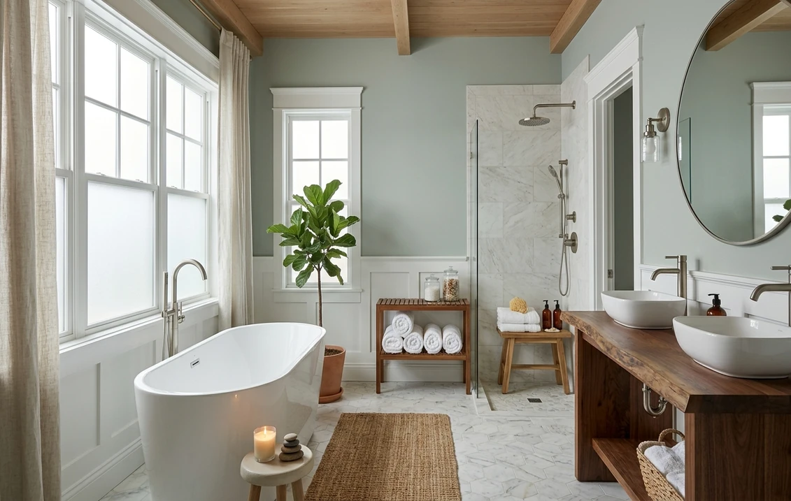
- Bathrooms and powder rooms: the standout use. Against white tile, marble, and chrome or brushed-nickel fixtures it reads like a high-end spa, and the depth gives a small windowless powder room a confident, jewel-box feel that a pale color cannot.
- Bedrooms: arguably its best room. The blue-green calm plus the after-dark moodiness makes a genuinely restful retreat; it layers beautifully under white, oatmeal, or sage-toned bedding and loves warm wood.
- Studies, libraries, and home offices: the saturation gives a focused, grounded backdrop without the heaviness of a charcoal or navy.
- Kitchen cabinets and islands: a favorite for lower cabinets or an island, where the green-gray reads custom and coastal against white uppers and warm-wood counters. For the cabinetry call, our Sherwin-Williams vs Benjamin Moore interior comparison covers how the two brands' finishes wear.
Where to be careful: a large, bright, wall-to-wall application in an open great room can feel like a lot of cool color, so many designers use Comfort Gray on a feature wall, the cabinetry, or the moodier rooms rather than across an entire open plan. And in a dim north room it can go heavy, so test it against a lighter sibling first. Our interior house painting cost guide covers what the repaint should run.
Free AI visualizer: test Comfort Gray in a bathroom, bedroom, or on cabinets before you buy a sample.
Trim, ceiling, and decor that keep it fresh
Because Comfort Gray is a saturated soft color, the white beside it does a lot of work: the right trim makes it look spa-fresh, the wrong one makes it look dingy. Crisp, slightly warm whites win:
- Best all-around trim: Sherwin-Williams Pure White (SW 7005, LRV 84). Bright and only faintly warm, it frames Comfort Gray cleanly and lets the green-gray stay fresh without going icy. The reliable default.
- For a warmer, softer scheme: SW Alabaster (SW 7008, LRV 82). A creamy white that pulls Comfort Gray toward its greener, cozier side, good in a warm-light bedroom or bath.
- Ceiling: keep it a flat white to hold the room open; with LRV 36 on the walls, a colored ceiling can feel closed-in fast.
- Going darker in-family: for a vanity, a built-in, or a deeper feature, SW Oyster Bay (SW 6206) steps down within the same strip, and a navy like SW Naval (SW 6244) reads as a natural deep partner.
- Decor and finishes: white oak and warm woods, natural linen, rattan, aged brass, and matte black hardware all flatter it. Avoid heavy cool grays and gray-washed floors, which drag it toward murky.
To carry a Comfort Gray scheme into adjoining rooms with a warm neutral, the greiges are the obvious partners; our profiles of SW Accessible Beige and SW Agreeable Gray both flow naturally beside a deep blue-green-gray and keep the open plan from feeling all-cool.
Comfort Gray vs the colors people cross-shop
Comfort Gray sits in a crowded part of the SW deck, and three near-twins trip people up most often. Knowing the difference saves a wrong sample:
- vs SW Softened Green (SW 6177): the most useful contrast for the "green or gray?" shopper. Softened Green is a clearer, warmer, more committed sage with very little blue, so it reads as an unmistakable soft green; Comfort Gray is grayer, cooler, and more shape-shifting, reading green-gray by day and blue-teal in cool light. Choose Softened Green for a true green you can rely on, Comfort Gray for a moody color that moves. Our SW Softened Green profile walks through that warmer read in full.
- vs SW Oyster Bay (SW 6206): the direct neighbor on the same paint strip, one step darker. Oyster Bay is greener and a touch deeper, with less of the blue-gray Comfort Gray shows in cool light. Side by side, Comfort Gray looks like the cooler, grayer twin and Oyster Bay the greener, earthier one. People who find Comfort Gray tips too blue often land on Oyster Bay.
- vs SW Halcyon Green (SW 6213): the deeper, mossier blue-green a few steps down. Halcyon Green is noticeably darker and more saturated, a true mid-deep color for a dramatic room; Comfort Gray is the lighter, more livable version of the same mood. Reach for Halcyon Green when Comfort Gray feels too pale for the drama you want.
And the comparison everyone makes: Comfort Gray vs Sea Salt (SW 6204). They are the same family with very different LRVs. Sea Salt at 63 is the airy, spa-fresh, light version; Comfort Gray at 36 is the deeper, moodier, more saturated sibling. Want a room to feel open and bright? Sea Salt. Want it to feel cozy, grounded, and a little dramatic, especially at night? Comfort Gray. Our SW Sea Salt profile covers the lighter end of this exact pairing.
How to test Comfort Gray before you commit
Comfort Gray is a textbook case where a 3-inch fan-deck chip lies to you. Under store light near 4000K the chip lands on a balanced gray-green that may be none of the three reads you get at home, and because the LRV is a true mid-tone, the depth matters as much as the hue: a chip cannot show you how dark it goes after sunset. The reliable physical method is a large peel-and-stick sample (Sherwin-Williams sells one) taped to at least two walls and checked mid-morning, mid-afternoon, and after dark under your normal bulbs; the night-time moody read is the version you live with most evenings. The faster, no-paint first pass is a digital visualizer: upload a photo of the room and apply Comfort Gray beside its lighter sibling (Sea Salt) and a greener neighbor (Oyster Bay or Softened Green) to see which way your light pulls it, ruling out the colors that were never going to work before you spend on samples.
Preview Comfort Gray beside a lighter and a greener alternative under your real light, free.
Frequently asked questions
Is Comfort Gray actually gray, green, or blue?
Despite the name, Comfort Gray (SW 6205) is not really a gray. It is a green-gray with a soft blue undertone, a muted spa color that shifts with the light. In most daylight it reads as a dusty sage-gray, in cool or north light the blue surfaces and it leans toward a deep spa-teal, and at night under warm bulbs it deepens into a moody eucalyptus-green. The "Gray" in the name is a holdover from an older naming system, not a description of the color you will see on the wall.
What is the LRV of SW Comfort Gray?
Comfort Gray has a Light Reflectance Value of 36, a true mid-tone. It reflects only just over a third of the light that hits it, so it reads as a real, saturated color with depth and shadow rather than a tinted near-white. That is roughly half the reflectance of its lighter sibling Sea Salt (LRV 63), which is why Comfort Gray feels cozy and enveloping where Sea Salt feels airy and spa-fresh. In a dim north room, watch the depth, as 36 can tip from cozy to dark.
What is the difference between Comfort Gray and Sea Salt?
They belong to the same blue-green-gray family but have very different LRVs. Sea Salt (SW 6204) sits at LRV 63, an airy, light, spa-fresh version that brightens a room. Comfort Gray (SW 6205) sits at LRV 36, the deeper, moodier, more saturated sibling that grounds a room and goes rich after dark. Choose Sea Salt to keep a space feeling open and light, and Comfort Gray when you want cozy depth and a little drama, especially in a bedroom, study, or windowless bath.
What trim color goes with Comfort Gray?
Sherwin-Williams Pure White (SW 7005, LRV 84) is the most reliable trim pairing. It is bright and only faintly warm, so it frames Comfort Gray crisply and keeps the green-gray reading fresh rather than dingy. For a softer, warmer scheme that nudges Comfort Gray toward its green side, use SW Alabaster (SW 7008). Keep the ceiling a flat white to hold the room open, since the mid-tone depth on the walls can otherwise feel closed-in.
Is Comfort Gray a good bedroom color?
Yes, the bedroom is arguably its best room. The blue-green calm reads as restful by day, and the after-dark depth at LRV 36 turns the walls into a cocooning, moody retreat at night. It layers easily under white, oatmeal, or sage-toned bedding and pairs well with warm wood, brass, and matte black hardware. For a warmer, cozier feel pair it with SW Alabaster trim and warm 2700K bulbs; for a cooler spa mood use crisp white trim and daylight bulbs.
See SW Comfort Gray under your real light, beside a lighter and a greener alternative, before you buy.
Disclaimer: Sherwin-Williams and SW 6205 Comfort Gray are trademarks of The Sherwin-Williams Company. Benjamin Moore and Behr are trademarks of their respective owners. FacadeColorizer is an independent paint visualization service and is not affiliated with, endorsed by, or sponsored by Sherwin-Williams, Benjamin Moore, or Behr. Screen color approximates the manufacturer's sample; always confirm with a physical sample before purchase. Sources: Sherwin-Williams SW 6205 Comfort Gray color data 2026, Sherwin-Williams Sea Salt SW 6204, Oyster Bay SW 6206, Softened Green SW 6177, Halcyon Green SW 6213, Pure White SW 7005 and Alabaster SW 7008 color data, The Spruce paint undertone references, and designer field notes on color-shifting neutrals.
Trademarks mentioned (Sherwin-Williams, Benjamin Moore, Behr, Caparol, Brillux, Sto, Alpina, Valspar, PPG, Glidden, Dulux, Crown Trade, Sandtex, Farrow & Ball, Johnstone's, Leyland) are property of their respective owners. FacadeColorizer is independent and not affiliated with any of them. Nominative fair use under Lanham Act §1125.


