
Sherwin-Williams Copen Blue (SW 0068) is the blue people reach for when sky-blue feels too sweet and navy feels too heavy. It sits squarely in the middle: a medium, slightly grayed denim blue with the relaxed, lived-in quality of an old chambray shirt. It carries enough saturation to read clearly as a real color rather than a tinted gray, yet enough gray in its base to stay calm on a full wall instead of buzzing. That combination is why it keeps turning up in dining rooms, studies, and built-ins where homeowners want color with a grown-up restraint.
This profile is for the person already circling Copen Blue: how its undertones behave, the published LRV and hex, the rooms it flatters, how the light in your house will move it, and the trim and decor that keep it crisp instead of dull. It is one of the bolder picks in our wider Sherwin-Williams interior paint colors guide, and you can see how it stacks up against other shades in our best interior blue paint colors for 2026 roundup.
Upload one photo and preview SW Copen Blue under your room's actual light in about 30 seconds, free.
The numbers behind Copen Blue SW 0068
Start with the published data; these figures predict how the wall will read far better than a 3-inch fan-deck chip. Copen Blue belongs to the Sherwin-Williams archive collection of revived historic colors, which is why it feels slightly muted and vintage rather than crisp and modern.
| Spec | Value |
|---|---|
| SW code | SW 0068 Copen Blue |
| HEX (screen approximation) | #748B97 |
| RGB approximation | 116, 139, 151 |
| LRV (Light Reflectance Value) | 28 |
| Hue family | Medium grayed blue, denim or chambray with a faint green-gray steadiness |
| Collection | SW historic / archive revived color |
| Closest SW cousins | Moody Blue (SW 6221), Windy Blue (SW 6240), Distance (SW 6243) |
Sources: Sherwin-Williams SW 0068 Copen Blue color data, retrieved 2026; The Spruce and designer paint undertone references.
The number that matters most here is the LRV of 28. That is a medium-depth color, well into the saturated half of the scale and a long way from a pale wash. At LRV 28 Copen Blue will read as a confident mid-blue in a bright room and noticeably deeper and moodier in a dim one. It is dark enough that a small, low-light space can feel closed in, and bright enough that a sunny room keeps its denim cheer. If you want the same family of blue but airier, you are really looking at a higher-LRV shade; we map the whole spectrum from soft to deep in our blue-gray paint undertones and shades guide.
Undertones: the gray that keeps it honest
Copen Blue's dominant undertone is, of course, blue, but the character that makes it usable comes from its secondary cast. Unlike a clean primary blue, Copen Blue is softened with gray, and underneath that gray sits the faintest whisper of green. That trio is what keeps it from going either childish-sky or icy-cold.
- The gray base. The grayed-down quality is the whole point of this color. It is what lets Copen Blue behave like a sophisticated neutral-with-color rather than a bright accent. In flatter, balanced light the gray steps forward and the blue reads more muted, almost a dusty slate.
- The green whisper. Look closely against a pure blue and you will see Copen Blue is not perfectly clean; a trace of green keeps it from going purple or periwinkle. This is the single biggest thing separating it from its near-twins, which lean cleaner and bluer-violet.
- The blue lead. In good warm or bright light, the blue dominates and the chambray-denim read most people picture comes through, friendly and a little vintage.
Because the saturation is medium rather than pale, Copen Blue holds its identity better than a low-LRV blue-gray, but the gray base still means light steers it. Understanding which undertone wins in your room is the difference between a denim you love and a slate-gray you tolerate. Our interior color families guide explains why grayed colors swing more than saturated ones.
How light and orientation move Copen Blue
At LRV 28 with a gray base, Copen Blue is sensitive to both the direction your windows face and the color temperature of your bulbs. Here is how it typically behaves across the four Northern Hemisphere orientations:
| Room orientation | Daylight character | How Copen Blue reads |
|---|---|---|
| South-facing | Warm, abundant midday light | Brightest, friendliest denim; the green whisper warms it slightly and keeps it inviting |
| West-facing | Cool by day, very warm at sunset | Cool slate-blue by morning, glowing and richer in the golden evening light |
| East-facing | Warm early sun, neutral later | Cheerful chambray in the morning, settling to a grayer mid-blue by afternoon |
| North-facing | Cool, indirect, no direct sun | Coolest and deepest; the gray takes over and it can read as a moody dusty slate |
Sources: American Institute of Architects daylight reference; Sherwin-Williams SW 0068 color data; designer field notes on medium blues.
Bulb temperature matters just as much. Under a warm 2700K bulb, Copen Blue softens and the denim feels cozy and a touch warmer, which is the most flattering choice for a living or dining room. Under a neutral or cool 4000K bulb, the blue reads truer and crisper, closer to the chip, which suits a study or a bath. Avoid very cool 5000K-plus daylight bulbs in a north room unless you specifically want the moody slate version, because cool light on a cool gray-blue can tip the whole space toward gray and chilly. The single safest move with a medium blue like this is to see it under your own light before you commit, not under store fluorescents.
Free AI visualizer: test SW Copen Blue in your room and watch how your daylight shifts it.
The rooms Copen Blue suits best
Copen Blue's medium depth and easygoing denim character point it toward rooms where you want color and personality but not high drama. It is a workhorse mid-blue rather than a statement navy or a barely-there pastel.
- Dining rooms: a sweet spot. At LRV 28 it gives a dining room an enveloping, dinner-party warmth without going as dark as navy, and candle or warm overhead light makes it glow.
- Home offices and studies: the grayed denim is calm and focused, blue enough to feel composed and gray enough to avoid distraction. It pairs beautifully with wood desks and brass.
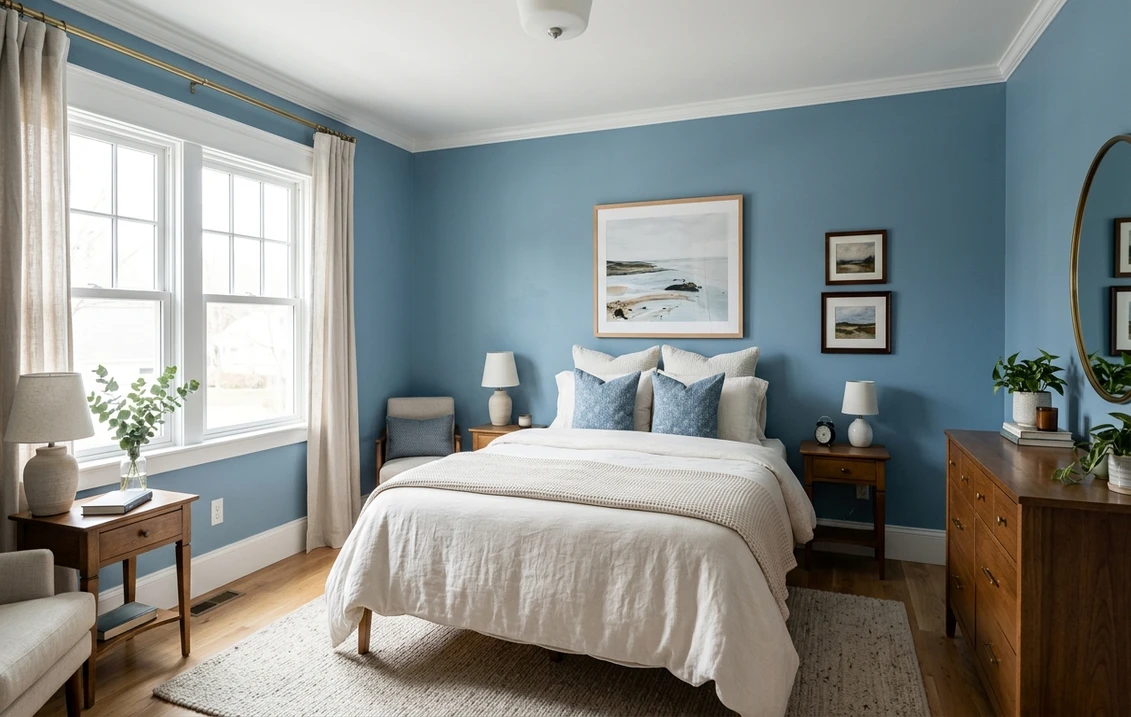
- Bedrooms: restful and a little vintage. In a bright bedroom it stays cheerful; in a darker one it leans cocooning, which many people want in a bedroom.
- Built-ins, cabinetry, and islands: Copen Blue shines on millwork. On a kitchen island, a bank of library shelves, or a mudroom bench it reads custom and characterful against white walls and warm counters.
- Powder rooms: a small windowless powder room is the one place the moody side is a feature, not a flaw; paired with brass and a good mirror it feels jewel-box rich.
Where to be careful: a small north-facing room with poor light can let the gray base pull Copen Blue toward a flat, chilly slate, so reserve those rooms for the deliberate moody look or brighten them with warm bulbs. And a very large open-concept great room wrapped entirely in a medium blue can feel like a lot of color; many designers use Copen Blue on a feature wall, the lower two-thirds in a board-and-batten treatment, or on the cabinetry there instead of floor-to-ceiling. For more on placing a confident mid-tone, see how it sits among the picks in our best interior paint colors for 2026 guide.
Trim, ceiling, and decor that flatter it
Because Copen Blue carries a gray base, the white you set beside it decides whether it reads crisp denim or dull slate. With a medium blue, contrast is your friend; a clean bright white sharpens the color.
- Best all-around trim: Sherwin-Williams Pure White (SW 7005, LRV 84). Bright and barely warm, it gives Copen Blue the crisp contrast it wants and keeps the denim looking fresh, not muddy. The default designer choice for a clean blue scheme.
- For a softer, vintage scheme: SW Alabaster (SW 7008, LRV 82). A creamy off-white that leans into Copen Blue's historic, slightly warm side, good in a dining room or bedroom where you want cozy over crisp.
- Ceiling: a flat white keeps a Copen Blue room from feeling top-heavy. In a powder room or study you can run the blue onto the ceiling for a fully enveloped jewel-box look, but only where you want the room to feel smaller and richer.
- Deeper coordinating tones: for an accent or a connected room, a true navy like SW Naval (SW 6244) steps down naturally from Copen Blue; see our SW Naval profile for that deeper anchor.
- Decor and finishes: warm metals are Copen Blue's best friend. Brass and aged bronze light it up, while natural and white-oak woods, rattan, cream linen, and warm whites balance its coolness. Hard, cool grays and stark black-and-white schemes can drag it toward chilly.
For warm neutrals in adjoining rooms that let Copen Blue stand out without clashing, the greiges and soft whites are the safest bridge; our SW Agreeable Gray profile shows the kind of warm neutral that flows comfortably next to a denim blue.
Copen Blue vs its near-twins: Moody Blue, Windy Blue & Distance
Copen Blue is regularly cross-shopped against three other Sherwin-Williams blues, and the differences are real enough to send you home with the wrong gallon if you only judge by name. Here is how they actually separate:
- vs SW Moody Blue (SW 6221, LRV ~24): the trickiest comparison because the depths are close. The hue is the divide. Moody Blue is a cleaner, more saturated periwinkle that leans gently purple-violet, while Copen Blue is grayer and carries that green whisper instead of purple. Put them side by side and Moody Blue looks brighter and slightly more "pretty"; Copen Blue looks dustier and more grown-up. Choose Moody Blue for a clean periwinkle, Copen Blue for vintage denim.
- vs SW Windy Blue (SW 6240, LRV ~52): the easiest to tell apart once you see the numbers. Windy Blue is far lighter and softer, a gentle grayed sky blue at roughly double the LRV. It gives a barely-there cool wash, where Copen Blue is a committed mid-tone with real presence. If Copen Blue feels too dark for your room, Windy Blue is the airy, low-commitment alternative in the same family.
- vs SW Distance (SW 6243, LRV ~13): the moodier sibling. Distance is a deep, dramatic slate-blue that can read almost navy in low light, noticeably darker and more enveloping than Copen Blue. Choose Distance when you want a dim, cocooning study or powder room; choose Copen Blue when you want color and depth but still want the room to feel open and friendly.
The short version: Copen Blue is the medium, grayed, slightly-green denim in the middle of this group. Moody Blue is its cleaner, more violet near-equal in depth; Windy Blue is the light airy version; Distance is the deep moody version. The single most common mistake is sampling Moody Blue expecting Copen Blue, because the names feel interchangeable but the periwinkle-versus-denim hue split is the most visible difference of all four.
How to test Copen Blue before you commit
A medium blue at LRV 28 is exactly the kind of color where a fan-deck chip lies. Under store light the chip looks like a friendly denim, then it goes a shade darker and grayer on a real wall in real light, and people get nervous. The reliable physical method is a large peel-and-stick sample taped to at least two walls and checked in the morning, mid-afternoon, and after dark under your normal bulbs, because the after-dark read is the version you will live with most evenings. The faster, no-paint first pass is a digital visualizer: upload a photo of the actual room and apply Copen Blue beside Moody Blue (cleaner, more violet) and Windy Blue (lighter) to see which depth and hue your light actually wants, ruling out the ones that were never going to work before you spend on samples.
Preview Copen Blue beside Moody Blue and Windy Blue under your real light, free.
Frequently asked questions
What undertones does SW Copen Blue have?
Copen Blue (SW 0068) is a medium blue led by blue but built on a gray base, with the faintest whisper of green. The gray is what keeps it sophisticated and easygoing rather than a bright primary, and the green trace is what stops it from reading purple or periwinkle. In bright warm light the friendly denim blue dominates; in flat or cool light the gray steps forward and it reads as a dustier slate.
What is the LRV of Copen Blue SW 0068?
Copen Blue has a Light Reflectance Value of about 28, which makes it a medium-depth color, well into the saturated half of the scale. It reads as a confident mid-blue in a bright room and noticeably deeper and moodier in a dim one. It is dark enough that a small low-light space can feel closed in, so it is best in rooms with decent light or where you actually want a cozy, enveloping effect.
What is the difference between Copen Blue and Moody Blue?
They are close in depth but differ in hue. SW Moody Blue (SW 6221) is a cleaner, more saturated periwinkle that leans slightly purple-violet, while SW Copen Blue (SW 0068) is grayer and carries a green whisper instead of purple. Side by side, Moody Blue looks brighter and prettier; Copen Blue looks dustier and more vintage. Choose Moody Blue for a clean periwinkle and Copen Blue for a grayed denim look.
What trim and rooms work best with Copen Blue?
A bright, clean white like Sherwin-Williams Pure White (SW 7005) gives Copen Blue the crisp contrast it needs; SW Alabaster (SW 7008) suits a softer, more vintage scheme. It works best in dining rooms, home offices, bedrooms, powder rooms, and on cabinetry and built-ins, where its medium denim depth feels characterful without going as dark as navy. Warm metals like brass and natural woods flatter it most.
See SW Copen Blue under your real light, beside its near-twins, before you buy. One HD preview plus 3 variations, no account needed.
Disclaimer: Sherwin-Williams and SW 0068 Copen Blue are trademarks of The Sherwin-Williams Company. Benjamin Moore and Behr are trademarks of their respective owners. FacadeColorizer is an independent paint visualization service and is not affiliated with, endorsed by, or sponsored by Sherwin-Williams, Benjamin Moore, or Behr. Screen color approximates the manufacturer's sample; always confirm with a physical sample before purchase. Sources: Sherwin-Williams SW 0068 Copen Blue color data 2026, Sherwin-Williams Moody Blue SW 6221, Windy Blue SW 6240, Distance SW 6243, Pure White SW 7005, Alabaster SW 7008 and Naval SW 6244 color data, The Spruce paint undertone references, and designer field notes on medium blues.
Trademarks mentioned (Sherwin-Williams, Benjamin Moore, Behr, Caparol, Brillux, Sto, Alpina, Valspar, PPG, Glidden, Dulux, Crown Trade, Sandtex, Farrow & Ball, Johnstone's, Leyland) are property of their respective owners. FacadeColorizer is independent and not affiliated with any of them. Nominative fair use under Lanham Act §1125.


