
You picked Sherwin-Williams Natural Choice (SW 7011) because the name promised "safe," and it mostly delivers: it is one of the most-specified off-whites in the country, the color builders reach for when they want walls that disappear without going cold. But Natural Choice is not actually a white. It is a warm off-white greige, a pale neutral with just enough body that, in the wrong light, it can read closer to a soft beige than the crisp backdrop you imagined. That gap between "looks white on the chip" and "reads warm on the wall" is exactly what this profile is here to close.
This page is for the homeowner who has narrowed it down to Natural Choice and wants to know what they are really getting: its undertones, the published LRV and hex, the rooms it suits, how it moves by orientation, and the trim and decor that keep it looking intentional instead of dingy. It is one of the warm neutrals in our wider Sherwin-Williams interior paint colors guide, and it sits squarely in the family we cover in our warm greige paint colors guide.
Upload one photo and preview SW Natural Choice under your room's actual light in about 30 seconds, free.
The numbers behind Natural Choice SW 7011
Start with the published data; these figures tell you more about how the wall will behave than any small chip held up in the store. They come from the Sherwin-Williams color tools:
| Spec | Value |
|---|---|
| SW code | SW 7011 Natural Choice |
| HEX (screen approximation) | #E8E1D2 |
| RGB approximation | 232, 225, 210 |
| LRV (Light Reflectance Value) | 73 |
| Hue family | Warm off-white greige, soft yellow-beige base with a faint gray steadier |
| Closest SW cousins | White Sand (SW 7551), Shoji White (SW 7042), Antique White (SW 6119) |
Sources: Sherwin-Williams SW 7011 Natural Choice color data, retrieved 2026; The Spruce paint undertone references.
The LRV of 73 is the figure people misjudge. At 73 Natural Choice is genuinely light and reflective, so it brightens a room, but it is well below the 80s where true whites live. That ten-to-fifteen-point gap is why it never reads stark: it has enough depth to show as a soft, warm tone rather than a clean white. For context, our pillar guide on SW White Sand (LRV 75) sits a couple of points lighter and softer, while a creamier white-white like Greek Villa runs into the low 80s. If you wanted a backdrop that vanishes completely, Natural Choice will feel like more color than you expected; if you wanted warmth without committing to beige, it lands right in the pocket.
The undertones: a warm beige base with a gray brake
Natural Choice is built on a soft yellow-beige base, which is what gives it the cozy, organic feel the name suggests. Sherwin-Williams steadies that warmth with a quiet gray component, the "brake" that stops it from reading as a dated tan or a yellow cream. The result is a balanced warm greige that leans more beige than gray: in most rooms you will see the warmth first and the gray only as a calming influence in the background.
- The warm read. Under direct sun or 2700K bulbs, the yellow-beige base steps fully forward. Natural Choice glows as a soft, sandy off-white, the look most people picture when they say "warm white."
- The neutral read. In balanced midday light, the gray steadier holds the warmth in check and Natural Choice reads as a clean, soft greige, neither yellow nor cold. This is its most flattering state and why it pairs with almost anything.
- The risk read. Under heavy warm incandescent or against true bright whites, the beige can deepen and edge toward a flat tan. Beside a stark white trim it can momentarily look slightly dirty before your eye adjusts. The fix is choosing the right trim, covered below.
What Natural Choice does not have is a pink, green, or purple flash. That clean, single-direction warmth is the whole reason it is a builder default: it behaves predictably and rarely surprises anyone, the opposite of a tricky color-shifter. The interior color families guide explains why a tightly controlled undertone like this travels so well from room to room.
How light and orientation move it
Because Natural Choice has a real warm undertone rather than a near-white neutral, the direction a room faces nudges it more than you might expect for an "off-white." Typical behavior across the four Northern Hemisphere orientations:
| Room orientation | Daylight character | How Natural Choice reads |
|---|---|---|
| South-facing | Warm, abundant midday light | Warmest and most flattering: a soft, glowing sandy off-white |
| West-facing | Cool by day, very warm at sunset | Reads as a balanced greige by day, deepens to honey-warm at golden hour |
| East-facing | Warm early sun, neutral later | Creamy in the morning, settling to a clean soft greige by afternoon |
| North-facing | Cool, indirect, no direct sun | Its best use: cool light tames the warmth so it reads as a clean, soft off-white instead of beige |
Sources: American Institute of Architects daylight reference; Sherwin-Williams SW 7011 color data; designer field notes on warm off-whites.
The headline takeaway runs against intuition: Natural Choice is often best in north-facing rooms. The cool, blue-leaning northern light that turns crisp whites gray and clinical instead balances the warmth in Natural Choice, landing it on a clean, soft neutral. In a sun-flooded south room it can tip noticeably warm, which is great if you want cozy and a problem if you wanted bright-and-clean. Bulb temperature is the other lever: 2700K bulbs push it warmer and creamier, while 4000K bulbs hold it neutral. For night-heavy rooms, sample under the bulbs you actually own, not store light near 4000K.
The rooms Natural Choice was made for
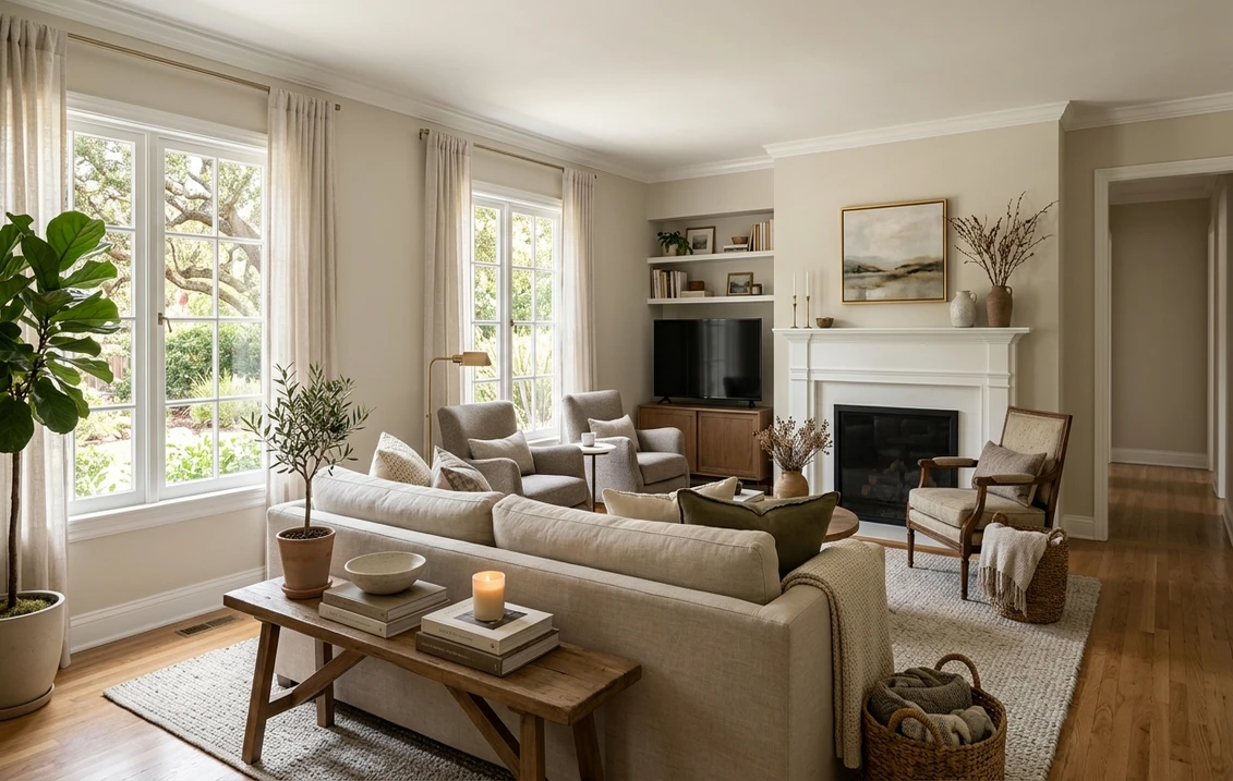
Natural Choice is a whole-house workhorse, which is precisely why builders love it: it flows through open plans without a jarring transition and flatters a wide range of finishes. The rooms where it shines:
- Open-concept living and dining: its single, gentle warmth carries seamlessly across a great room, kitchen, and hall, so you can paint everything one color without a sterile, flat-white feel.
- North-facing rooms of any kind: the standout use. Where a true white would go cold and gray, Natural Choice stays soft and inviting.
- Bedrooms: the low-key warmth is genuinely restful and forgiving with cream, linen, and natural-wood furniture.
- Trim and cabinets in a warm scheme: increasingly used on doors, built-ins, and even cabinetry where a stark white would clash with warm floors and counters; it reads soft and custom rather than builder-grade.
Where to be careful: in a small, dark, south-or-west room with warm bulbs and no daylight, Natural Choice can compound into a flat tan and lose its freshness. And paired beside a bright white trim it can look slightly dirty until your eye adjusts, so the trim choice below matters more here than with most off-whites. Our interior house painting cost guide covers what a whole-house repaint in one color like this should run.
Free AI visualizer: test Natural Choice in a north room, a bedroom, or on trim before you buy a sample.
Trim, ceiling, and decor that keep it crisp
Because Natural Choice is a warm off-white rather than a true white, the white you set beside it decides whether it reads soft-and-intentional or dingy. The classic mistake is framing it with a cold, blue-white trim, which makes Natural Choice look muddy by contrast. Warm whites win:
- Best all-around trim: Sherwin-Williams Alabaster (SW 7008, LRV 82). A creamy, warm white that sits in the same temperature family, so it reads crisp beside Natural Choice without making it look dirty. The default designer pairing.
- For more contrast: SW Pure White (SW 7005, LRV 84). Slightly cooler and brighter; it gives a cleaner trim line while still being warm enough not to fight the wall. Use it when you want trim to pop.
- Ceiling: a flat white, or Natural Choice itself at a lighter sheen for a soft, enveloping look in a low-key bedroom.
- Deeper coordinating tones: for an accent wall, island, or built-in, a soft greige like SW Accessible Beige (SW 7036) steps down in the same warm family, while SW Urbane Bronze (SW 7048) gives a rich, earthy contrast.
- Decor and finishes: warm woods (oak, walnut, hickory), brass and aged bronze hardware, cream and camel textiles, and travertine or limestone all flatter it. Cold chrome, stark blue-grays, and pure-white linens can make it look beige by comparison.
To pair Natural Choice with a deeper warm neutral in adjoining rooms, the obvious partner is a true greige: our profile of SW Agreeable Gray sits a step grayer and works beautifully one room over from Natural Choice for a layered, tonal scheme.
Natural Choice vs its near-twins
Natural Choice gets cross-shopped against a handful of warm off-whites that look nearly identical on a chip but behave differently on the wall. Knowing the difference saves you a wrong gallon:
- vs SW White Sand (SW 7551, LRV 75): the closest sibling. White Sand is a couple of LRV points lighter and reads a hair softer and less committed to color, edging marginally toward a clean off-white. Natural Choice holds a touch more visible warmth and depth. Pick White Sand if you want it to lean a little more "white," Natural Choice if you want slightly more body and a cozier read. Our White Sand profile covers it in full.
- vs SW Shoji White (SW 7042, LRV around 74): very similar in lightness, but Shoji White carries a stronger yellow-green cast that makes it read distinctly creamier and, in some light, can flash faintly green. Natural Choice is the cleaner, more neutral warm of the two with no green risk. Choose Shoji White for a deliberately creamy, organic feel; choose Natural Choice when you want warmth that stays straightforward. See our Shoji White profile for the green-flash details.
- vs SW Antique White (SW 6119, LRV around 70): Antique White is noticeably warmer and more golden, a clear creamy beige rather than a balanced off-white, and slightly deeper. It reads as a soft color first, where Natural Choice still reads as a near-neutral. Pick Antique White if you want unmistakable warmth and old-world coziness; Natural Choice if you want the warmth dialed back to "barely there." Our cream and antique white paint colors guide covers that creamier end of the family.
The short version: all four are warm off-whites, ranked roughly from cleanest to creamiest as White Sand, Natural Choice, Shoji White, Antique White. Natural Choice sits second from the clean end, the safest "warm but not yellow" pick of the group, which is exactly why it became a builder standard.
How to test Natural Choice before you commit
Natural Choice is a textbook case for sampling, because the whole question with it is "how warm will it actually read in my light," and a 3-inch chip under store lighting near 4000K answers that wrong nearly every time. The reliable method is a large peel-and-stick sample (Sherwin-Williams sells one) taped to at least two walls, including one near a window and one on an interior wall, and checked mid-morning, mid-afternoon, and after dark under your normal bulbs. Pay attention to how it sits next to your trim and your flooring, since those neighbors decide whether it reads clean or beige. The faster, no-paint first pass is a digital visualizer: upload a photo of the room and apply Natural Choice beside a slightly cleaner alternative (White Sand) and a creamier one (Shoji White) to see which way your light pulls it, ruling out the directions that were never going to work before you buy a single sample.
Preview Natural Choice beside a cleaner and a creamier off-white under your real light, free.
Frequently asked questions
Is Natural Choice a white or a beige?
Neither, exactly. Natural Choice (SW 7011) is a warm off-white greige: a pale neutral built on a soft yellow-beige base with a quiet gray steadier. At LRV 73 it is light and reflective enough to brighten a room, but it sits well below the 80s where true whites live, so it always reads as a soft warm tone rather than a crisp white. In cool north light it leans cleaner and more off-white; in warm light it leans creamier and closer to a pale beige.
What is the LRV of SW Natural Choice?
Natural Choice has a Light Reflectance Value of 73. That is a light, reflective off-white, bright enough to open up a room but with enough body to read as a soft warm color rather than a true white. For comparison, White Sand sits a couple of points lighter at LRV 75, and a clean warm white like Alabaster runs in the low 80s. The gap is why Natural Choice never reads stark or clinical.
What trim color goes with Natural Choice?
Sherwin-Williams Alabaster (SW 7008, LRV 82) is the most reliable trim pairing. It is a creamy, warm white in the same temperature family, so it frames Natural Choice crisply without making the wall look dirty by contrast. For a brighter, higher-contrast trim line, SW Pure White (SW 7005) works as long as you want trim to pop. Avoid cold, blue-white trims, which make Natural Choice read muddy.
Is Natural Choice good for north-facing rooms?
Yes, it is one of its best uses. North-facing rooms get cool, indirect, blue-leaning light that turns most true whites gray and clinical. That same cool light balances the warmth in Natural Choice, landing it on a clean, soft off-white instead. In sun-flooded south rooms it can tip noticeably warm toward beige, so north and east exposures generally show its most flattering, balanced read.
See SW Natural Choice under your real light, beside a cleaner and a creamier off-white, before you buy.
Disclaimer: Sherwin-Williams and SW 7011 Natural Choice are trademarks of The Sherwin-Williams Company. White Sand (SW 7551), Shoji White (SW 7042), Antique White (SW 6119), Alabaster (SW 7008), Pure White (SW 7005), Accessible Beige (SW 7036), Agreeable Gray (SW 7029), and Urbane Bronze (SW 7048) are also trademarks of The Sherwin-Williams Company. FacadeColorizer is an independent paint visualization service and is not affiliated with, endorsed by, or sponsored by Sherwin-Williams. Screen color approximates the manufacturer's sample; always confirm with a physical sample under your own light before purchase. Sources: Sherwin-Williams SW 7011 Natural Choice color data 2026, Sherwin-Williams White Sand SW 7551, Shoji White SW 7042, Antique White SW 6119, Alabaster SW 7008 and Pure White SW 7005 color data, The Spruce paint undertone references, and designer field notes on warm off-whites.
Trademarks mentioned (Sherwin-Williams, Benjamin Moore, Behr, Caparol, Brillux, Sto, Alpina, Valspar, PPG, Glidden, Dulux, Crown Trade, Sandtex, Farrow & Ball, Johnstone's, Leyland) are property of their respective owners. FacadeColorizer is independent and not affiliated with any of them. Nominative fair use under Lanham Act §1125.


