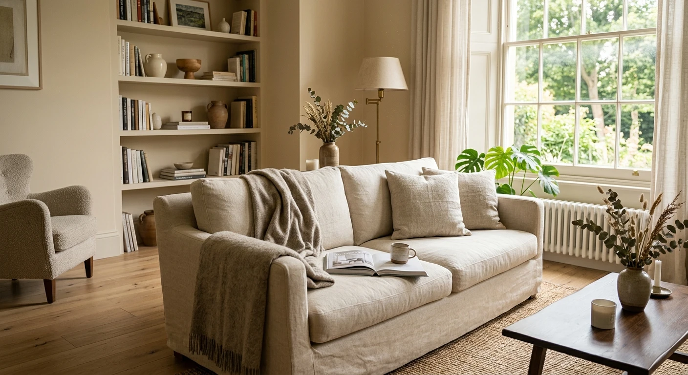

The first time a client asked me to "warm up" a room without going beige, I rolled a bright white on the north wall, and we both stood there at dusk feeling like we were inside a dentist's office. The fix was not more light. It was a cream. We rolled a soft, low-yellow cream the next weekend, and under the same lamps the room finally felt like somewhere you would want to read a book. That is the whole appeal of cream paint colors: they give you the brightness of white with the chill switched off. This guide walks the full family, the best shades for 2026, real LRVs, and which rooms each one flatters.
Quick definition first, because the labels get muddy. Cream is a white carrying a soft yellow or yellow-beige undertone, usually landing between LRV 78 and 84. Antique white paint is its deeper, more aged cousin: a cream pulled toward greige or soft gold so it reads "old plaster" rather than "fresh paint." Both sit warmer than a crisp white and lighter than a true beige. For the wider map of how every neutral relates, start with our interior paint color families guide, then come back for the cream chapter.
Upload a photo of your actual room and preview cream and antique white shades under your own light in about 30 seconds, free.
Cream paint colors at a glance: the specs that matter
Before opinions, here are the verifiable numbers for the most-painted cream shades in 2026, the values to take to the paint counter and the comparison that decides most projects:
| Color | Brand / code | LRV | Undertone | Best use |
|---|---|---|---|---|
| Creamy | SW 7012 | 81 | Clean cream, faint yellow | Whole-home walls, modern cream |
| White Dove | BM OC-17 | 85 | Barely cream, soft gray-yellow | Trim, cabinets, white-but-warm walls |
| Dover White | SW 6385 | 83 | Warm cream-yellow | Traditional trim, old-house millwork |
| Navajo White | BM OC-95 | 79 | Golden, classic antique white | Warm cottages, Southwest look |
| Antique White | SW 6119 | 73 | Deep cream-greige | Aged-plaster, low-light rooms |
Sources: Sherwin-Williams and Benjamin Moore color data 2026; The Spruce neutral-paint undertone coverage; designer field reports compiled by FacadeColorizer.
The takeaway from that table: cream is a range, not a single color, and the LRV slide from 85 down to 73 is the slide from "white with a hint of warmth" to "true antique white." Pick higher (Creamy, White Dove) for brightness, lower (Navajo White, Antique White) for that lived-in, golden glow. For where these sit next to other soft neutrals, our warm greige paint colors guide lays out the whole field.
Cream vs white vs antique white: the undertone, decoded
The single thing that separates these from a stark white is the yellow channel. A clean white reflects red, green, and blue almost evenly. A cream nudges the blue down and the yellow up, which your eye reads as warm. Push that yellow further toward gold or greige and you get antique white. None of it is subtle once two chips sit side by side on a wall.
Here is the honest opinion, and where some cream paint colors do not work. A heavy, saturated cream (think builder-grade "almond" or a 1990s buttercream) reads dated fast, especially in a small room under warm bulbs, where it tips past creamy into yellow. The modern move is to stay on the cleaner, lower-chroma side of the family (Creamy, White Dove) unless you are deliberately chasing a vintage, antique-white look in an older home.
Watch out for one quirk. Cream photographs whiter than it lives. So if you are pulling an "aesthetic white" room off Pinterest and the walls look crisp and bright, the real paint is almost always a cream or off-white doing quiet work, not a true white. Assume the real wall sits a half-step warmer than the photo promised.
| Indoor light | How cream reads |
|---|---|
| South-facing (bright, warm) | Soft, glowing, and clean: cream's most flattering read |
| West-facing (warm afternoon) | Can amplify the yellow late in the day; stay lower-chroma here |
| East-facing (cool after noon) | Golden in the morning, settles to a calm warm white by afternoon |
| North-facing (cool, indirect) | Cream shines here: the warmth fights the cool light and keeps the room from going gray |
| Artificial light at night | 2700K bulbs read cozy and buttery; 4000K bulbs strip the warmth and can look plain white |
Sources: brand color data 2026; designer field reports compiled by FacadeColorizer.
Free AI visualizer. Test cream wall paint on your real walls before buying a single sample pot.
The best cream and antique white shades for 2026
These five are the ones I reach for, ordered from cleanest to most antique. Each does a specific job:
SW Creamy (SW 7012): the modern whole-home cream
If you want one cream to run through a whole house, this is it. LRV 81, just enough yellow to feel warm, not so much that it dates. It plays beautifully against white trim and pairs with both warm wood and black hardware: the safe, current pick for anyone nervous about cream going buttery.
BM White Dove (OC-17): the cream that passes for white
White Dove is the designer default for a reason. At LRV 85 it reads white in bright light and barely-cream in shade, the most flexible color on this list. It is my top pick for trim and cabinets when you want warmth without committing to obvious cream. We break it down fully in our Benjamin Moore White Dove OC-17 review.
SW Dover White (SW 6385): warm trim for older homes
Dover White is a touch more golden than Creamy, which makes it lovely on traditional millwork and crown molding in a home with character. On stark-white-trimmed new builds it can look slightly yellow, so match it to the house.
BM Navajo White (OC-95): the classic antique white
This is the antique white paint most people picture: a warm golden cream at LRV 79 that suits cottages, Southwestern interiors, and rooms built around terracotta, leather, and rattan. It is unapologetically warm, so use it on purpose.
SW Antique White (SW 6119): aged-plaster depth
The deepest pick here at LRV 73, with a cream-greige weight that mimics old plaster. It is cozy in a low-light den or a room you want to feel enveloping; in a bright open plan it can read heavy.
See a clean cream, a warm cream, and an antique white side by side, free.
Best rooms for cream paint colors
Cream is one of the few warm neutrals you can carry across a whole floor plan without a single room pushing back. Here is where it consistently earns its keep:
Living rooms and open-plan great rooms
On a large connected wall plane, cream reads as a soft, glowing backdrop that flatters wood floors, linen, and warm metals. It is the easy way to get the bright, "aesthetic white" look that photographs so well, without the cold edge a true white brings at night. For full schemes built around it, see our top living room paint colors for 2026.
Bedrooms
Cream makes a restful bedroom because the warmth keeps it from feeling clinical under lamp light, while the high LRV keeps it open and airy. It is the grown-up version of soft and cozy, and it layers beautifully with oatmeal and linen bedding.
Kitchens and on cabinetry
Cream cabinets are the warm answer to the cool-white kitchen, and they hide everyday wear better than a stark white. Creamy and White Dove both make excellent cabinet colors. Our white kitchen cabinet paint colors guide shows how these warm whites sit next to crisper cabinet picks.
Where to think twice
A bright, sun-blasted west room with warm LED bulbs is where a saturated cream tips into outright yellow by late afternoon. There, drop to a cleaner cream (Creamy or White Dove) or cool the bulbs to 3000K. For a broader comparison against bright whites, our best white paint for walls guide is a useful map.
Trim, ceiling, and pairing cream the right way
Cream walls live or die on what sits next to them. The most common mistake I cut in around is a stark, blue-white trim against a warm cream wall: the contrast makes the cream look dirty and the trim cold. Keep the family warm and it all reads intentional.
- Trim (most harmonious): a slightly brighter warm white from the same brand, or White Dove, keeps trim crisp without going icy. Stay in the warm lane.
- Avoid: a stark blue-white trim like SW Extra White against a yellow-leaning cream. The cool contrast exposes the cream's yellow and can read dingy.
- Ceilings: the trim white (or a clean warm white) keeps the room bright. A heavy cool-white ceiling over cream walls fights the warmth and flattens the room.
- Floors and decor: warm oak, walnut, rattan, leather, brass, and natural linen reflect warmth back and make cream sing. Cool gray-washed floors and chrome leave it feeling slightly off.
- Accents: sage green, muted navy, soft black, and terracotta are cream's natural partners. Our sage green interior shades and pairings guide works especially well with antique white.
For accent walls and millwork drama, a soft black or warm charcoal on a single wall or built-in reads sophisticated against cream and stops the room feeling flat. The contrast does the heavy lifting; the cream stays the calm backdrop.
See walls, trim, and floor together in one preview, free.
How to test cream before you commit
A 3-inch fan-deck chip is the number-one reason people pick a cream that disappoints: surrounded by white pages it looks creamy, but rolled across a whole wall the yellow reads far stronger, especially after a second coat builds the color. Two better methods:
- Paint a large swatch: roll a 12-by-12-inch sample (or a peel-and-stick sample) on two different walls and check it mid-morning, mid-afternoon, and at night under your normal bulbs. Watch the west wall at sunset, where cream yellows most.
- Preview it digitally first: upload a real photo of your room and apply a clean cream, a warm cream, and an antique white before buying samples, narrowing three contenders to one worth painting. Budget context for the repaint is in our interior house painting cost guide for 2026.
Preview cream against a brighter white and a warm antique white, side by side, free.
Frequently asked questions
What is the difference between cream and antique white paint?
Cream is a white carrying a soft yellow or yellow-beige undertone, usually LRV 78 to 84, so it reads bright but warm. Antique white is its deeper, more aged cousin: a cream pulled further toward gold or greige (often LRV 73 to 79) so it reads like old plaster. Cream feels current and airy; antique white feels traditional and cozy.
What are the best cream paint colors for 2026?
SW Creamy (SW 7012) is the cleanest whole-home cream, BM White Dove (OC-17) is the most flexible cream-white for trim and cabinets, and SW Dover White (SW 6385) suits warm traditional millwork. For a true antique white look, BM Navajo White (OC-95) or SW Antique White (SW 6119) bring the golden, aged depth.
Does cream paint make a room look yellow?
It can, in the wrong conditions. A high-chroma cream in a bright west room under warm 2700K bulbs at sunset is where yellow shows most. To avoid it, stay on the cleaner side of the family (Creamy or White Dove), cool the bulbs to 3000K, and always test a large swatch on the actual wall rather than judging from a small chip.
Is cream paint good for north-facing rooms?
Yes, cream is one of the best choices for north-facing rooms. Cool, indirect north light tends to gray out a true white and make it feel flat, while cream's built-in warmth pushes back against that and keeps the room feeling soft and inviting instead of clinical.
What trim color goes with cream walls?
Keep the trim in the warm lane: a slightly brighter warm white from the same brand, or a flexible cream-white like White Dove, looks crisp without going cold. Avoid a stark blue-white such as Extra White next to a yellow-leaning cream, because the cool contrast can make the walls read dirty and the trim look icy.
Preview cream and antique white on your actual walls under your own light before buying a single sample.
Disclaimer: Sherwin-Williams, Creamy (SW 7012), Dover White (SW 6385), Antique White (SW 6119), and Extra White are trademarks of The Sherwin-Williams Company. Benjamin Moore, White Dove (OC-17), and Navajo White (OC-95) are trademarks of Benjamin Moore & Co. FacadeColorizer is an independent paint visualization service and is not affiliated with, endorsed by, or sponsored by Sherwin-Williams or Benjamin Moore. Color reproduction on screens approximates the manufacturer's chip; always confirm with a manufacturer sample under your own light before purchase. Sources: Sherwin-Williams and Benjamin Moore color data 2026, The Spruce neutral-paint undertone coverage, designer field reports compiled by FacadeColorizer.
Trademarks mentioned (Sherwin-Williams, Benjamin Moore, Behr, Caparol, Brillux, Sto, Alpina, Valspar, PPG, Glidden, Dulux, Crown Trade, Sandtex, Farrow & Ball, Johnstone's, Leyland) are property of their respective owners. FacadeColorizer is independent and not affiliated with any of them. Nominative fair use under Lanham Act §1125.


