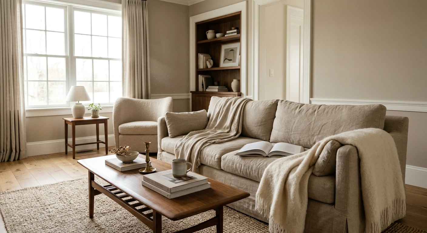

The first house I ever repainted top to bottom, the owners had picked a cool builder gray for every wall, and by November the living room felt like a dentist's waiting area. We swapped it for a warm greige and a creamy trim, and the same room, same furniture, suddenly read calm and lived-in. That is the whole story of neutral paint colors: they are the quiet backbone of a home, but the wrong one goes cold and clinical fast, and the right one disappears in the best way. This guide is the family hub. It maps the neutral spectrum from greige to warm white, gives you real LRV and undertone numbers, and tells you which to pick for your light instead of a Pinterest screenshot.
A quick word on what counts. A neutral is any low-chroma color that recedes and lets your furniture, art, and wood do the talking: the off-whites, greiges, beiges, soft grays, taupes, and muted earth tones. None of them are truly without color, which is the part most people miss. Every neutral carries an undertone (warm cream, cool blue-gray, green, violet, pink), and that undertone is what decides whether a room feels cozy or cold. This page sits under our broader interior paint color families guide, and it links out to the deeper single-family pages so you can go as deep as your project needs.
Upload a photo of your actual room and preview any neutral under your own light in about 30 seconds, free.
The neutral spectrum, decoded by undertone
Stop shopping neutrals by name and start shopping them by undertone and LRV (Light Reflectance Value, how much light the color bounces, 0 black to 100 white). Those two numbers predict how a color behaves in your room far better than the swatch name. Here is the family laid out, warmest at the top:
| Neutral family | Typical undertone | Typical LRV | Best for |
|---|---|---|---|
| Warm white | Cream, soft yellow | 78 to 88 | Trim, ceilings, north rooms, whole-home brightening |
| Beige / sand | Warm yellow, gold | 55 to 72 | Cozy bedrooms, low-light dens, traditional homes |
| Greige | Cream-beige plus gray | 48 to 65 | Open-plan whole-home, the safe default |
| Taupe / mushroom | Brown-gray, soft violet | 35 to 55 | Moody studies, accent walls, grounding a bright room |
| Soft / balanced gray | Blue, green, or violet | 45 to 68 | Modern rooms, bright south light, crisp contrast |
| Earthy warm neutral | Clay, olive, putty | 40 to 60 | Organic-modern interiors, warmth without going dark |
Sources: Sherwin-Williams and Benjamin Moore color data 2026; The Spruce neutral-paint undertone coverage; designer field reports compiled by FacadeColorizer.
The single most useful habit: match the undertone to your light, not to the trend. South-facing rooms get warm sun most of the day and can carry a cooler gray without going cold. North-facing rooms get flat, cool, indirect light all day, and that light strips warmth out, so a cool gray there reads steel-blue and a warm neutral keeps the room livable. Get that one decision right and almost any name on the list below works.
15 timeless neutral picks, grouped by warmth
These are the neutrals I see specified again and again because they age well and behave predictably. I have grouped them so you can shop by the read you want.
The warm greiges (the safe whole-home zone)
Greige is gray plus beige, and it is the most-painted neutral in America for a reason: it flatters oak floors, white trim, and warm wood instead of fighting them. My standby trio is SW Agreeable Gray (SW 7029, LRV 60), BM Revere Pewter (HC-172, LRV 55), and the warmer SW Accessible Beige (SW 7036, LRV 58). Agreeable Gray is the most versatile, Revere Pewter runs a touch greener and deeper, and Accessible Beige is the cozy one for dim rooms. For the full family with light-by-light behavior, see our warm gray-beige greige shades guide.
The warm beiges and sands
When a room is starved of light, a true beige does what gray cannot: it adds warmth that reads as comfort rather than dinginess. SW Kilim Beige (SW 6106), BM Shaker Beige (HC-45), and the soft SW Natural Linen (SW 9109) are the dependable three. The trap is the 1990s gold-beige that goes orange under incandescent bulbs, so check the undertone in person. Our guide to beige undertones breaks down which read pink, which read yellow, and which stay clean.
The soft grays (cooler, more modern)
A well-chosen gray still looks crisp and current, especially with black windows and modern furniture. BM Classic Gray (OC-23, LRV 74) is so light it almost reads off-white, SW Repose Gray (SW 7015) is the balanced mid-tone, and BM Stonington Gray (HC-170) brings a clean blue-gray edge. My honest opinion: skip the cold, blue-leaning grays in a north room. They are the number-one reason people say a neutral made their house feel cold. Compare the shades in our interior gray shades guide and the lighter end in our light gray undertones and rooms guide.
The taupes and earthy warm neutrals
These are the neutrals having a real moment in 2026: mushroom, putty, clay, and muted olive. They ground a bright room and read sophisticated on a study or an accent wall. BM Balboa Mist (OC-27) and SW Anew Gray (SW 7030) are gentle taupes, SW Worldly Gray (SW 7043) leans a touch warmer and dustier, and for real clay-leaning depth I reach for SW Macadamia (SW 6142) or the cozy mushroom of BM Pashmina (AF-100). Go deeper in our taupe undertones and rooms guide and the cozy end in our earthy warm interior paint colors guide.
The warm whites (trim, ceilings, and the brightest walls)
A warm white is still a neutral, and it is the one that ties the other fourteen together. SW Alabaster (SW 7008, LRV 82) is the creamy, near-universal trim and ceiling pick, and BM White Dove (OC-17, LRV 85) is the slightly softer, barely-warm alternative that almost never goes yellow. Either one over warm walls reads bright without going cold. The full breakdown of which warm whites stay clean is in our warm white undertones guide.
Free AI visualizer. Test a warm and a cool neutral side by side before buying a single sample pot.
How to build a neutral color palette that does not go flat
A whole-house neutral scheme reads either serene or boring, and the difference is contrast and undertone discipline. Three rules I hold to on every job:
- Pick a temperature and commit. Run your neutrals all warm or all cool. A warm greige wall next to a cold blue-gray trim is the most common clash I get called to fix. The walls suddenly look dirty and the trim looks icy, even though both colors are fine on their own.
- Build contrast with value, not color. Keep one undertone family, then vary the LRV. A greige wall at LRV 58, warm-white trim at LRV 82, and a taupe accent at LRV 40 reads layered and intentional. Same family, three values.
- Let one neutral lead. Choose a main wall color, a brighter trim or ceiling, and one deeper grounding tone for built-ins or a feature wall. Three steps is plenty for a calm, collected room.
For trim and ceilings, a warm white is almost always the right partner over warm neutrals because it brightens without going cold. Our warm white undertones guide covers the safe picks like SW Alabaster and BM White Dove. Avoid a stark blue-white next to a warm greige: the cool contrast can make the walls read green-gray and slightly drab by comparison.
Best neutral by room and by light
The same color is not the best neutral for every space. Here is where each family earns its keep:
- Open-plan living and great rooms: a warm greige (Agreeable Gray, Revere Pewter) reads calm across a big connected plane and lets wood and art lead.
- North-facing or dim rooms: lean warm. A beige or warm greige holds up where a cool gray goes steel-blue. Add a 2700K bulb to push the warmth further.
- Bright south-facing rooms: you have the most freedom. A soft gray stays crisp here without feeling cold because the sun adds warmth all day.
- Bedrooms: a warm greige or soft taupe reads restful at night under lamp light, where pure grays can feel chilly.
- Studies, libraries, accent walls: taupe, mushroom, and earthy warm neutrals add depth and a grown-up calm without going full dark.
- Trim and ceilings everywhere: a warm white. It is the connective tissue that makes the whole palette feel deliberate.
See walls, trim, and floor together in one preview, free.
How to test a neutral before you commit
Here is the painter truth no fan deck tells you: a 3-inch chip lies. It reads lighter and a half-step cooler than a rolled wall, and it cannot show how the undertone shifts from morning to lamp-lit night. Neutrals are the colors most punished by this, because their whole job is to react subtly to your light. Two reliable methods:
- Roll a large swatch. Brush a 12-by-12-inch sample (cut in the edges, then a full second coat for true opacity) on two different walls. Check it mid-morning, mid-afternoon, and at night under your normal bulbs, and watch any dim corner for cool-light flatness.
- Preview it digitally first. Upload a real photo of your room and apply a warm, a balanced, and a cool neutral before you spend a dime on samples. That narrows five contenders to the one worth painting. Budget context for the whole repaint is in our interior house painting cost guide for 2026.
Frequently asked questions
What are the best neutral paint colors for interiors?
The most reliable interior neutrals are warm greiges like SW Agreeable Gray (SW 7029) and BM Revere Pewter (HC-172), warm beiges like SW Kilim Beige and BM Shaker Beige, soft grays like BM Classic Gray, and warm whites like SW Alabaster for trim. The best one for your home depends on your light: lean warm in north-facing or dim rooms, and you can go cooler in bright south-facing rooms.
What is the difference between a warm and a cool neutral?
It comes down to undertone. Warm neutrals carry cream, yellow, gold, or clay undertones and feel cozy and inviting, which is why they suit bedrooms and low-light rooms. Cool neutrals carry blue, green, or violet undertones and feel crisp and modern, which suits bright south-facing rooms and contemporary furniture. The wrong temperature for your light is the most common reason a neutral disappoints.
How do I build a neutral color palette for a whole house?
Pick one temperature and commit to it across the home, then build contrast with value rather than color: a main wall neutral, a brighter warm white for trim and ceilings, and one deeper grounding tone like a taupe for built-ins or a feature wall. Keeping a single undertone family while varying the LRV is what makes a neutral scheme read layered and intentional instead of flat.
What is the best neutral for a north-facing room?
Lean warm. North light is flat and cool all day and strips warmth out of a color, so a cool blue-gray can read steel-blue and chilly there. A warm greige or a soft beige holds up far better, and a 2700K bulb pushes the warmth further. Save your cooler grays for bright south-facing rooms where the sun adds warmth back.
Why does my neutral paint look different on the wall than the chip?
A small fan-deck chip reads lighter and a touch cooler than a fully rolled wall, and it cannot show how the undertone shifts across the day. Neutrals are hit hardest by this because their job is to react to light. Roll a large two-coat sample on two walls and check it morning, afternoon, and at night under your own bulbs, or preview it on a photo of the actual room first.
Preview any neutral on your actual walls under your own light before buying a single sample.
Disclaimer: Sherwin-Williams, Agreeable Gray (SW 7029), Accessible Beige (SW 7036), Kilim Beige (SW 6106), Natural Linen (SW 9109), Repose Gray (SW 7015), Anew Gray (SW 7030), Worldly Gray (SW 7043), Macadamia (SW 6142), and Alabaster (SW 7008) are trademarks of The Sherwin-Williams Company. Benjamin Moore, Revere Pewter (HC-172), Shaker Beige (HC-45), Classic Gray (OC-23), Stonington Gray (HC-170), Balboa Mist (OC-27), Pashmina (AF-100), and White Dove (OC-17) are trademarks of Benjamin Moore and Co. FacadeColorizer is an independent paint visualization service and is not affiliated with, endorsed by, or sponsored by Sherwin-Williams or Benjamin Moore. Color reproduction on screens approximates the manufacturer's chip; always confirm with a manufacturer sample under your own light before purchase. Sources: Sherwin-Williams and Benjamin Moore color data 2026, The Spruce neutral-paint undertone coverage, designer field reports compiled by FacadeColorizer.
Trademarks mentioned (Sherwin-Williams, Benjamin Moore, Behr, Caparol, Brillux, Sto, Alpina, Valspar, PPG, Glidden, Dulux, Crown Trade, Sandtex, Farrow & Ball, Johnstone's, Leyland) are property of their respective owners. FacadeColorizer is independent and not affiliated with any of them. Nominative fair use under Lanham Act §1125.


