
The first time I rolled a yellow on a client's north-facing kitchen, the chip looked like fresh butter and the wall dried the color of a school bus left in the rain. That is the whole problem with yellow in one sentence. No color family swings harder between the fan deck and the finished wall, and none punishes a bad undertone read faster. Done right, though, a good yellow does something no gray ever will: it pours warmth into a room before a single lamp is on. These are the yellow paint colors I actually trust indoors, sorted from barely-there pale to confident gold, with the undertones and rooms that make each one behave.
This page is one stop in our wider interior paint color families guide, the hub that maps every color family against light and undertone. Here we stay on yellow: how a buttery yellow paint differs from a true golden yellow wall, why a pale yellow paint sometimes reads green, and what to put on the trim so none of it turns sour. If you want the partner colors that sit beside yellow in a scheme, that lives in our companion piece below; this article is about choosing the yellow itself.
Upload a photo of your actual room and preview any yellow under your own light in about 30 seconds, free.
How to read a yellow before you buy it
Yellow is the trickiest family to sample because two numbers decide almost everything: the LRV and the undertone. Get both straight and you skip the school-bus disaster.
- LRV (Light Reflectance Value): a pale yellow at LRV 75 plus behaves like a warm off-white and is safe almost anywhere. Drop to LRV 60 or below and the yellow turns into an actual color decision that fills the whole room with reflected light. The brighter and more saturated it is, the smaller the wall plane it should cover.
- Undertone: every yellow leans one of three ways. A green-yellow (chartreuse lean) goes acidic in cool north light. A gold or amber lean stays warm and rich. A cream or buttery lean is the most forgiving, reading soft rather than loud. Tilt the chip away from the window and watch which one steps forward.
- Light direction: south and west rooms add warmth and can push a strong yellow toward orange by late afternoon. North and east rooms cool it down, and that is exactly where the green undertone surfaces and a wall reads sour.
- Saturation, the honest opinion: a fully saturated lemon or marigold on all four walls of an average room does not work. It bounces colored light onto skin and ceilings and tires the eye fast. Save real saturation for one accent wall, a powder room, or a front door.
One more painter's note: yellow is a low-hide pigment. It almost always needs a tinted primer and two full coats, sometimes a third on the saturated golds, or the wall dries patchy. Budget that extra coat before you start.
12 yellow paint colors that work indoors
Here is the working shortlist, grouped by how much yellow you actually want in the room. LRV values are approximate manufacturer figures; always confirm with a sample.
| Shade | Lean & LRV | Best use |
|---|---|---|
| SW Lemon Chiffon (SW 6686) | Pale buttery, LRV 79 | Whole rooms, nurseries, hallways with little light |
| BM Hawthorne Yellow (HC-4) | Soft warm gold, LRV 68 | Classic kitchens, dining rooms, entries |
| SW Friendly Yellow (SW 6680) | Clean light yellow, LRV 76 | Cheerful kitchens and breakfast nooks |
| BM Concord Ivory (OC-90) | Creamy pale, LRV 75 | Living rooms wanting warmth, not color |
| SW Daybreak (SW 6664) | Soft pastel, LRV 78 | Bedrooms, bathrooms, kid rooms |
| BM Yellow Highlighter (2021-40) | Saturated mid, LRV 58 | One accent wall, mudroom, laundry |
| SW Glad Yellow (SW 6694) | Warm light yellow, LRV 76 | Sunny kitchens with good south light |
| BM Mellow Yellow (347) | Golden, LRV 55 | Accent wall, study, front door |
| SW Goldenrod (SW 6677) | Rich amber-gold, LRV 45 | Powder room, library, statement door |
| BM Banana Cream (275) | Pale buttery, LRV 68 | Open-plan walls, sunrooms |
| SW Lantern Light (SW 6687) | Soft warm cream-yellow, LRV 72 | Whole-home warm neutral with a glow |
| BM Sunburst (2023-40) | Bold marigold, LRV 50 | Single feature wall only, never four walls |
Sources: Sherwin-Williams and Benjamin Moore published color data 2026; The Spruce and Better Homes & Gardens yellow-paint coverage; designer field reports compiled by FacadeColorizer. LRV figures approximate.
Free AI visualizer. Test a pale and a golden yellow side by side before buying a single sample pot.
Pale yellow paint: the warm neutral nobody calls a color
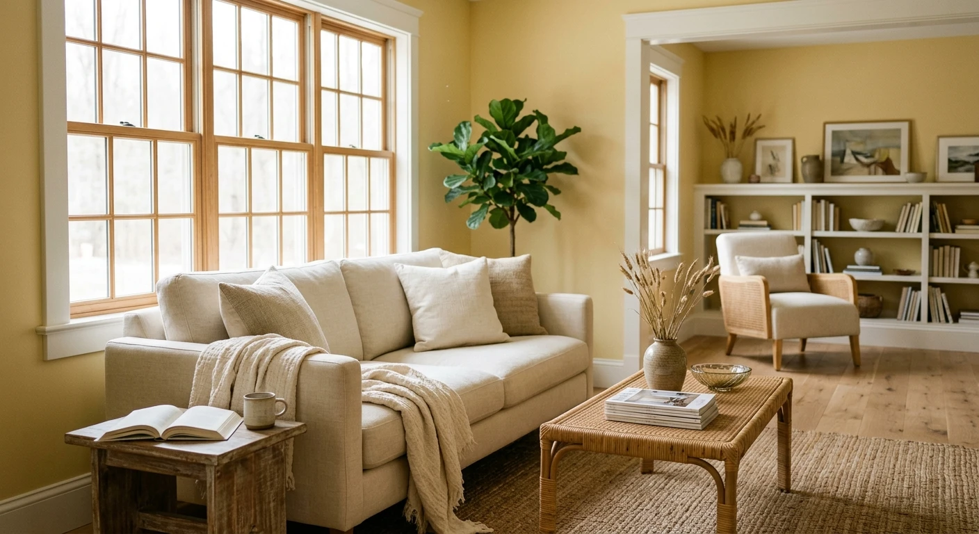
If you have only ever pictured yellow as bright, the pale end will surprise you. A good pale yellow paint at LRV 68 to 80 (Concord Ivory, Banana Cream, Lemon Chiffon, Daybreak) functions like a warm off-white. From across the room it reads as soft, sunny neutral; only up close do you catch the yellow. This is the safest yellow you can choose, and the one I steer most clients toward for whole rooms.
It shines in spaces that need borrowed sunlight: north-facing hallways, windowless stairwells, small bathrooms, and nurseries. Because the saturation is so low, the green undertone that wrecks brighter yellows stays asleep even in cool light. One caution: pair a pale yellow with a clean warm white, never a stark blue-white, or the wall can look dingy by contrast. For the full range of warm whites that sit beside it, see our warm white paint colors and undertones guide. And if your real goal is a barely-there warm neutral, our greige paint colors guide covers the warm-neutral alternatives that sit right beside a pale yellow.
Buttery yellow paint: the cozy middle ground
A buttery yellow paint is the in-between zone, more color than a pale, softer than a true gold. Hawthorne Yellow, Lantern Light, and Friendly Yellow live here. These are the colors that make a classic kitchen feel like morning even on a gray day, and they pair beautifully with white cabinets, butcher block, and cream subway tile.
Hawthorne Yellow deserves a special mention. It is the one I reach for in traditional homes because the gold in its base keeps it from ever going acidic, and it photographs almost exactly as it lives, which is rare for yellow. A buttery yellow does want decent light, though. In a truly dark room it loses its glow and can flatten toward beige, so test it on the actual wall before committing. If you are also choosing what sits beside it (the cabinet color, the island, the accent), our interior color schemes guide does that pairing work.
Golden yellow wall: real saturation, used with restraint
Now the bold end. A golden yellow wall (Goldenrod, Mellow Yellow, Sunburst, Yellow Highlighter) is a genuine color statement, amber-rich and full of energy. I love these, and I almost never use them on all four walls. Saturated yellow bounces colored light everywhere; on a whole room it tints the ceiling, the trim, and people's faces, and the room turns relentless fast.
Where a golden yellow earns its place is contained drama: one accent wall behind a bed or sofa, a small powder room, a study, a mudroom, or a front door. In those doses the saturation reads confident and warm rather than exhausting. South and west rooms suit it best, since their warm light deepens the gold; in a cool north room the same color can flip flat or muddy. For where a yellow feature wall lands among the year's statement colors, our top living room paint colors for 2026 shows it beside the other accents people choose.
See the wall, trim, and floor together in one preview before you buy paint, free.
Trim, ceiling, and the colors that flatter yellow
Yellow lives or dies on what sits next to it. The right neighbors make it look intentional; the wrong white makes it look like a mistake.
- Warm white trim (almost always right): a soft warm white such as BM White Dove or SW Alabaster keeps the relationship harmonious and lets the yellow glow. This is the default for buttery and pale yellows alike.
- Crisp white trim (for the bold golds): a cleaner white like SW Pure White sharpens a saturated golden yellow wall and keeps it from feeling dated. Best when the yellow is the star and you want a modern edge.
- Avoid blue-whites: a stark cool white next to any yellow exaggerates the green undertone and can make the wall read sour or dirty. This is the single most common yellow pairing error I see.
- Ceilings: keep them a clean warm white. A cool-white ceiling over a yellow room throws the temperature off and dulls the warmth you painted in.
- Partner colors: yellow loves navy, charcoal, warm gray, sage green, and natural wood. A little black on a door or window frame grounds a sunny room and stops it reading childish. For deeper companion schemes built around cream and warm neutrals, see our off-white paint colors and undertones guide.
How to test a yellow before you commit
A fan-deck chip is the number-one reason people end up with the wrong yellow: the small sample reads softer and lighter than a full wall, and it cannot show how the undertone shifts across a day. Two better methods:
- Paint a large swatch: roll a 12-by-12-inch sample (or a peel-and-stick sample) on two different walls and check it mid-morning, mid-afternoon, and at night under your normal bulbs. Watch for the green undertone in any cool corner and for an orange tip in late-day sun.
- Preview it digitally first: upload a real photo of your room and apply a pale, a buttery, and a golden yellow before you buy any samples, narrowing three contenders to one worth painting. It is the fastest way to see saturation at room scale, which is exactly what a chip hides.
Preview a pale and a golden yellow against your real walls, side by side, free.
Frequently asked questions
What is the best yellow paint color for a kitchen?
A soft warm gold like Benjamin Moore Hawthorne Yellow (HC-4) or a buttery Sherwin-Williams Lantern Light is the safest kitchen choice. Both carry a gold base that keeps them from going acidic, they flatter white cabinets and wood, and they photograph close to how they live. For a brighter, more cheerful look in a kitchen with good south light, SW Friendly Yellow or Glad Yellow work well.
Why does my yellow paint look green?
Most yellows carry either a green-yellow or a gold undertone. In cool, indirect light (a north-facing room, an overcast day) the warm wavelengths drop out and the green undertone steps forward, so the wall reads sour. Choosing a gold-leaning or buttery yellow instead of a chartreuse-leaning one, and pairing it with a warm white rather than a blue-white trim, fixes it.
Is a pale yellow paint a good whole-room color?
Yes. A pale yellow at LRV 68 to 80, such as Banana Cream, Concord Ivory, or Lemon Chiffon, behaves like a warm off-white and is one of the safest whole-room choices, especially for dark hallways, small bathrooms, and nurseries. Its low saturation keeps the green undertone from surfacing even in cool light.
Should I paint a whole room a golden yellow?
Usually not. A saturated golden yellow wall on all four walls bounces colored light onto the ceiling, trim, and faces, and the room turns tiring fast. Use real saturation in small doses instead: one accent wall, a powder room, a study, or a front door. Keep the brightest golds to spaces you pass through rather than live in for hours.
What trim color goes with yellow walls?
A soft warm white like Benjamin Moore White Dove or SW Alabaster is the most harmonious trim for buttery and pale yellows. For a bold golden yellow you can use a crisper white such as SW Pure White for a modern edge. Avoid a stark blue-white next to any yellow: it exaggerates the green undertone and can make the wall read dingy.
Preview pale, buttery, and golden yellows on your actual walls under your own light before buying a single sample.
Disclaimer: Sherwin-Williams, Lemon Chiffon (SW 6686), Friendly Yellow (SW 6680), Daybreak (SW 6664), Glad Yellow (SW 6694), Goldenrod (SW 6677), Lantern Light (SW 6687), Alabaster, and Pure White are trademarks of The Sherwin-Williams Company. Benjamin Moore, Hawthorne Yellow (HC-4), Concord Ivory (OC-90), Yellow Highlighter (2021-40), Mellow Yellow (347), Banana Cream (275), Sunburst (2023-40), and White Dove are trademarks of Benjamin Moore & Co. FacadeColorizer is an independent paint visualization service and is not affiliated with, endorsed by, or sponsored by Sherwin-Williams or Benjamin Moore. LRV figures are approximate and color reproduction on screens approximates the manufacturer's chip; always confirm with a manufacturer sample under your own light before purchase. Sources: Sherwin-Williams and Benjamin Moore published color data 2026, The Spruce and Better Homes & Gardens yellow-paint coverage, designer field reports compiled by FacadeColorizer.
Trademarks mentioned (Sherwin-Williams, Benjamin Moore, Behr, Caparol, Brillux, Sto, Alpina, Valspar, PPG, Glidden, Dulux, Crown Trade, Sandtex, Farrow & Ball, Johnstone's, Leyland) are property of their respective owners. FacadeColorizer is independent and not affiliated with any of them. Nominative fair use under Lanham Act §1125.


